WIA2022 Judges’ Highlights from the Professional Shortlist
See some of the judges’ highlights from the WIA2022 Professional Shortlist, alongside their comments on what makes these projects sing!
ggemgemi: Bon Voyage, shortlisted in the Professional Alternative Publishing Category
I love the overall feel of this project. The artist has illustrated over the top of existing travel documents in such a lovely loose style and has demonstrated immense skill with the mix of mediums and colours they have chosen. The way the publication is presented and bound perfectly portrays the artist’s theme of travel and life melting into one.
Allison Colpoys, Designer and Illustrator, Australia
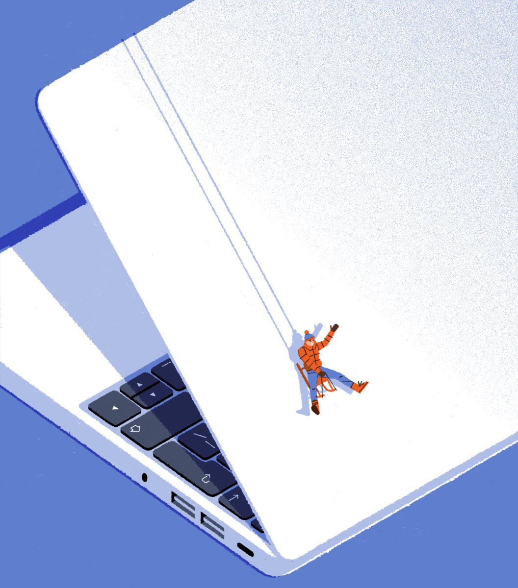
Matt Harrison Clough: Embrace a Snow Day, shortlisted in the Professional Editorial Category, sponsored by Procreate
The the cleverness of the concept is underscored by the simplicity of the execution. It is understood immediately. The use of laptop imagery has been tirelessly used this year but the chosen composition feels fresh. Though the color palette is limited, it adds an additional layer to the storytelling. The texture is also additive to the idea and does not feel purely decorative.
Amanda Soto – Art Director, USA
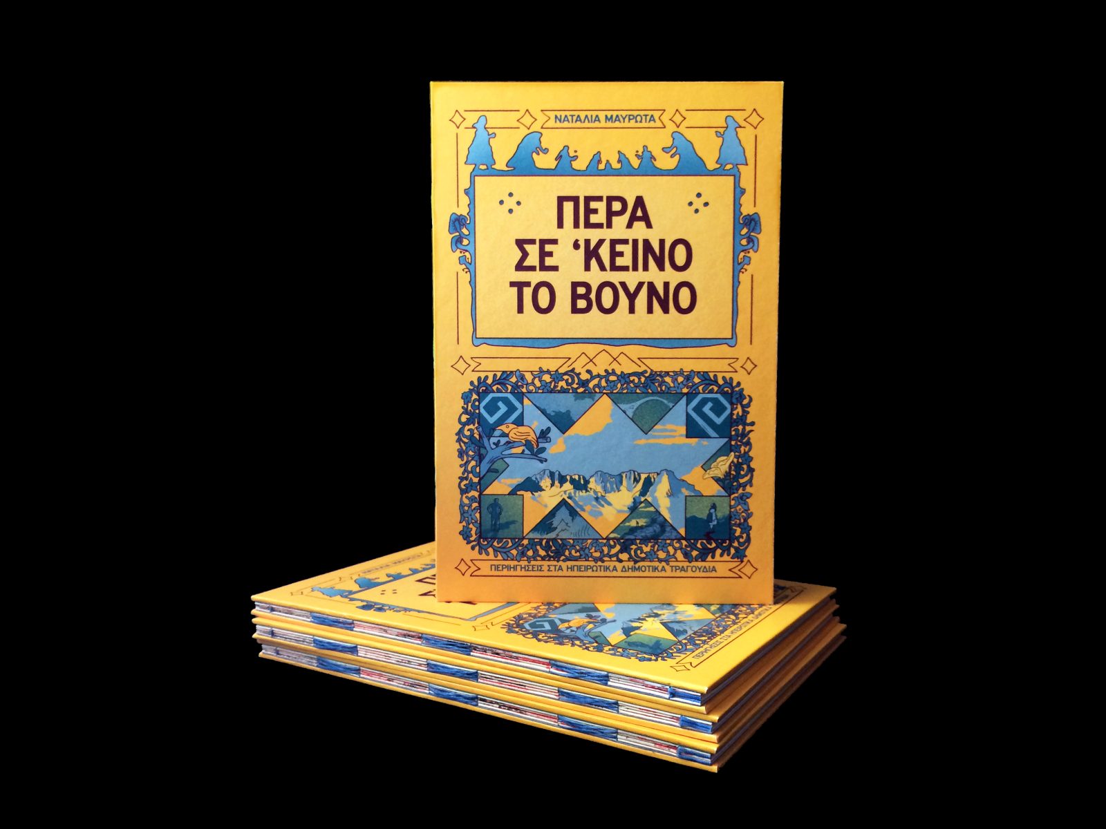
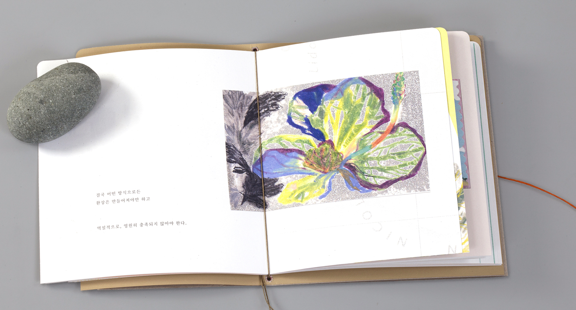
Natalie Mavrota: Over that Mountain, shortlisted in the Professional Alternative Publishing Category
I like how this project explores the possibilities of print media and interactivity in reading. You see a lot of comics work which pushes the boundaries of page/panel design, but the physical interactivity of these pages is particularly creative and interesting. The illustrations and use of colour are evocative and seem well suited to the folk song theme.
Katriona Chapman, Head of Marketing, Avery Hill Publishing, UK
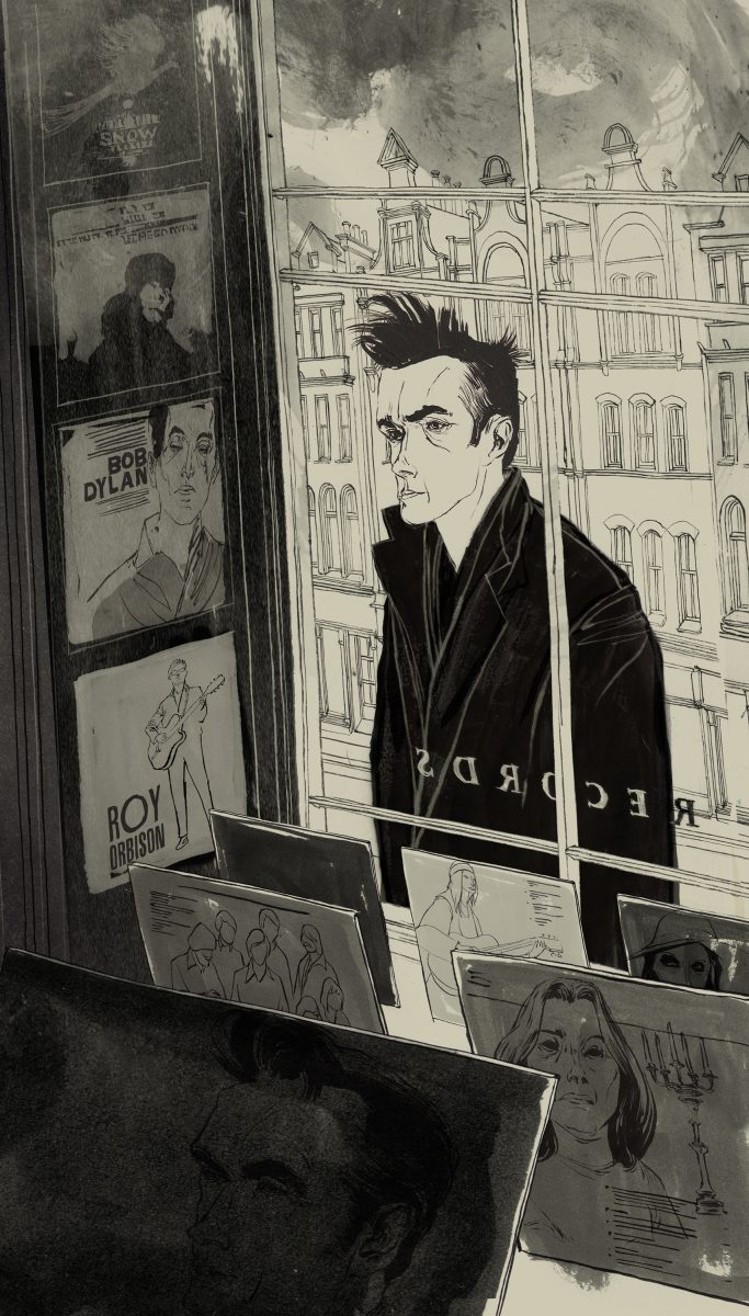
Lars Henkel: Morrissey, California Son, shortlisted in the Professional Editorial Category, sponsored by Procreate
The artist’s style feels unique and I can understand why the art director selected them to capture Morrissey. It’s an interesting way to capture the crux of the story. Others may have gone with a more straightforward portrait. This additional layer of storytelling is quite clever and instantly understood. It feels special to the artist.
Amanda Soto – Art Director, USA
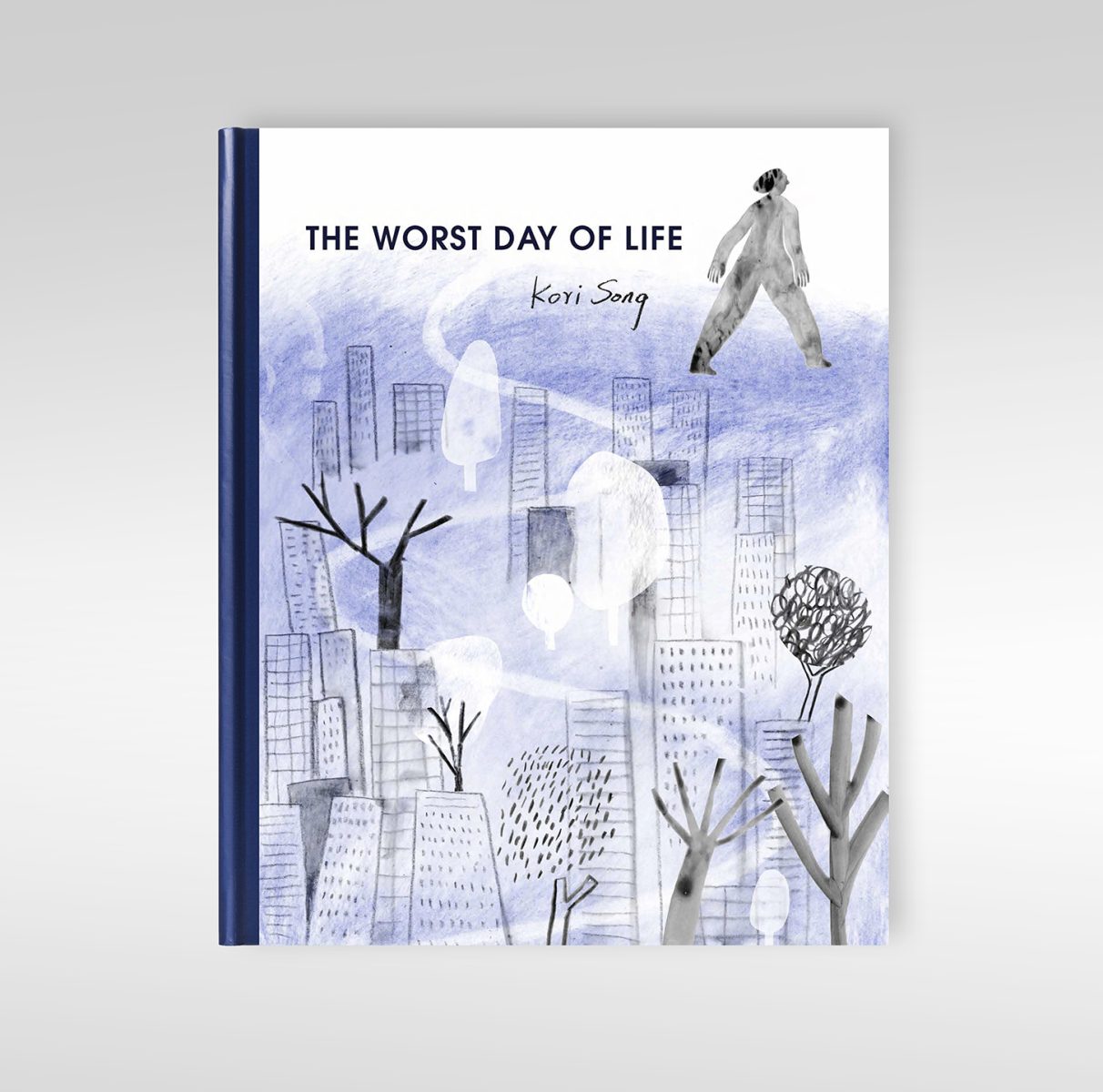
Kori Song: THE WORST DAY OF LIFE, shortlisted in the Professional Alternative Publishing Category
This is a very beautiful little body of work that explores the journey through the stages of grief in such a striking way. The mixed media approach and mark making is so well done. I really like the transition from heavier and blocky shapes and bold and thick lines to flowy lines and colour and ink washes to show the change in moods. Great stuff.
Dapo Adeola, Illustrator, UK
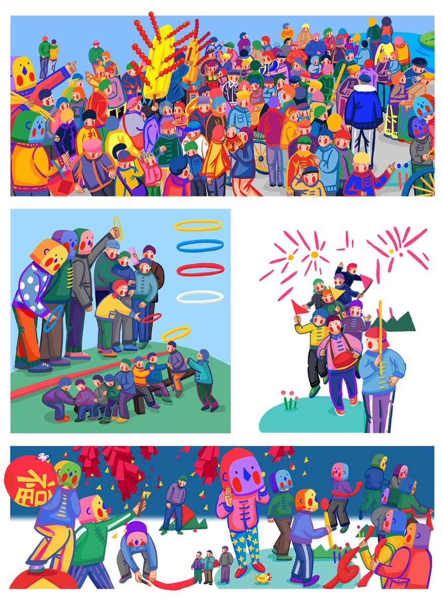
RUOYAO WU: NEW YEAR ADVENTURE, shortlisted in the Professional Alternative Publishing Category
The theme for this work is wonderful and the artist has communicated it in such an engaging and arresting way! The artist has a highly, highly original and confident style. The colours are vibrant and the compositions are complex and energetic. I love that they have also translated some of their unique characters into stunning 3D textile objects as well. These pieces, together with physical scroll and animated version of the story, demonstrate the incredible vision and skill that this artist has, and the breadth of their project.
Allison Colpoys, Designer and Illustrator, Australia
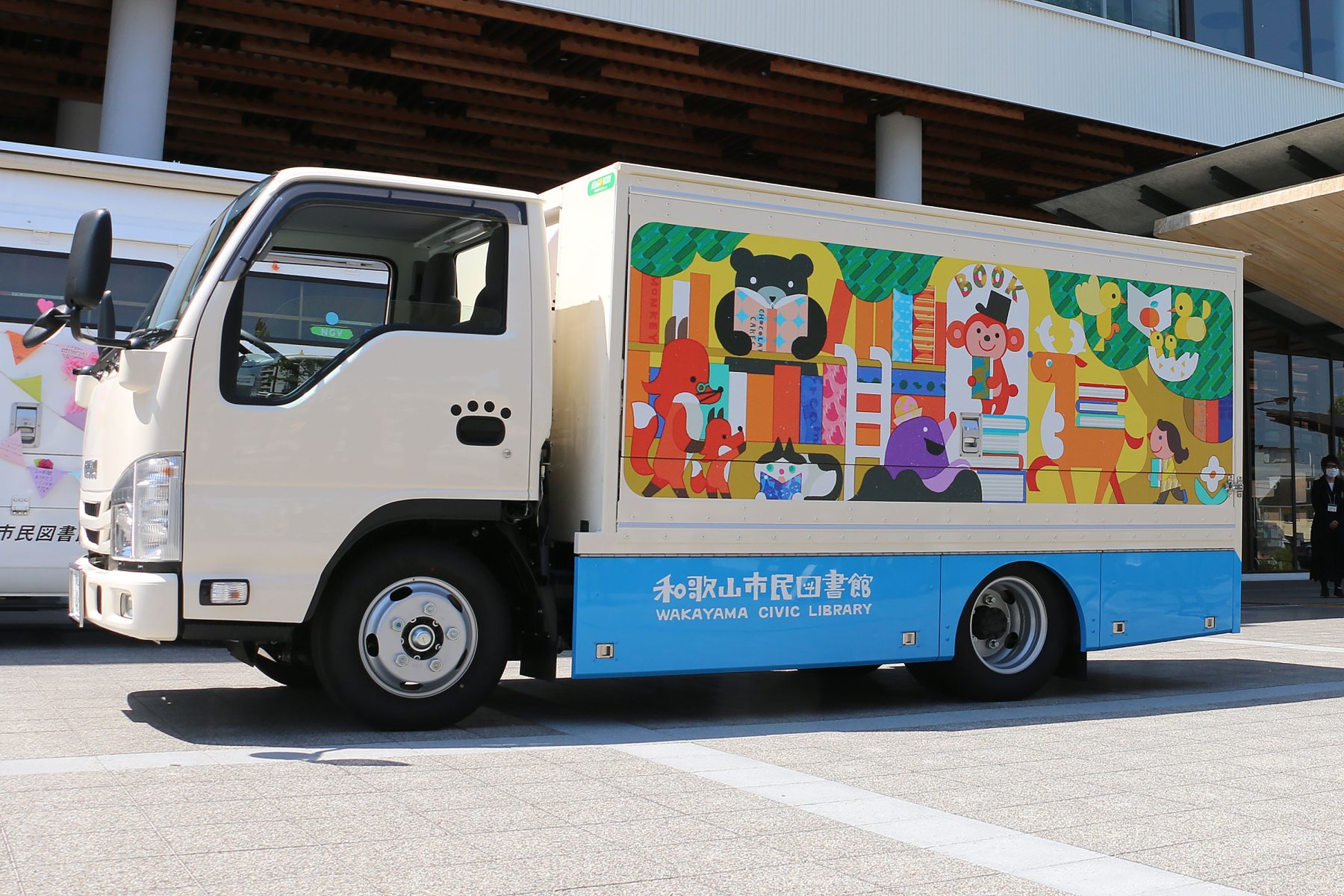
Lositoloca: Bookmobile, shortlisted in the Professional Site Specific Category
The shapes and forms used in this illustration allow it to communicate effectively with the people who pass by the artwork. They are very inviting to look inside so they perfectly serve their purpose. The illustrations inside and outside the “bookmobile” are consistent with each other and with the surface on which they are used too. The style fits perfectly for the occasion. The shapes and forms are simple, which fits to the children audience but the whole illustration is a complex work.
Gábor Patkós, Director, Patkós Studio, Hungary
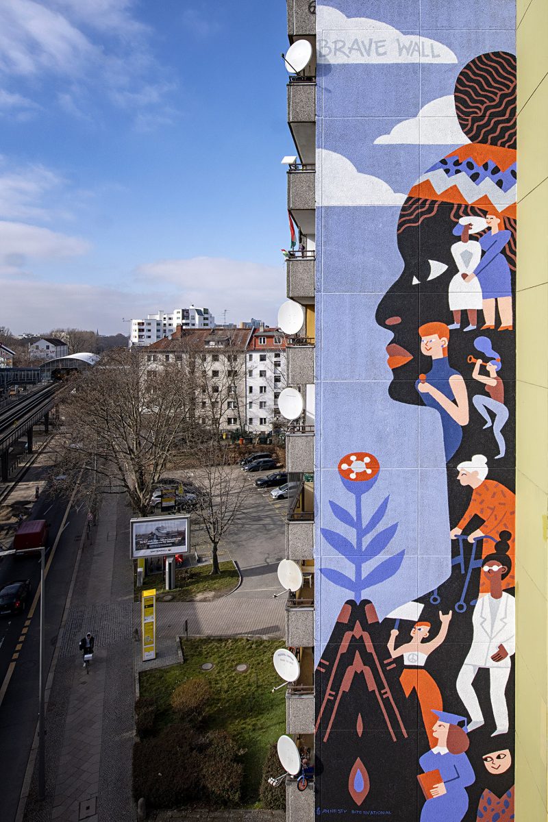
Katerina Voronina: Brave Wall. Portrait of Marielle Franco, shortlisted in the Professional Site Specific Category
The use of colors and shapes are outstanding. The artwork definitely has a huge impact on its environment, it is emphatic but does not overrule its context, it fits in it. Despite the huge surface the illustration is very consequent and its message is clearly transmitted.
Gábor Patkós, Director, Patkós Studio, Hungary
Brendan Totten: (Not) At Your Service, shortlisted in the Professional Editorial Category, sponsored by Procreate
I find this piece to be a compositionally interesting which leads to an unexpected take on a subject matter that has been covered many times. The emotion captured in the body language of the figure is felt, despite a facial expression being absent. At first I thought they were on a glacier/island alone (also isolating) but upon closer inspection realized it was a plate. I’m not sure if that was intentional, but the shards are an impactful part of the storytelling.
Amanda Soto – Art Director, USA
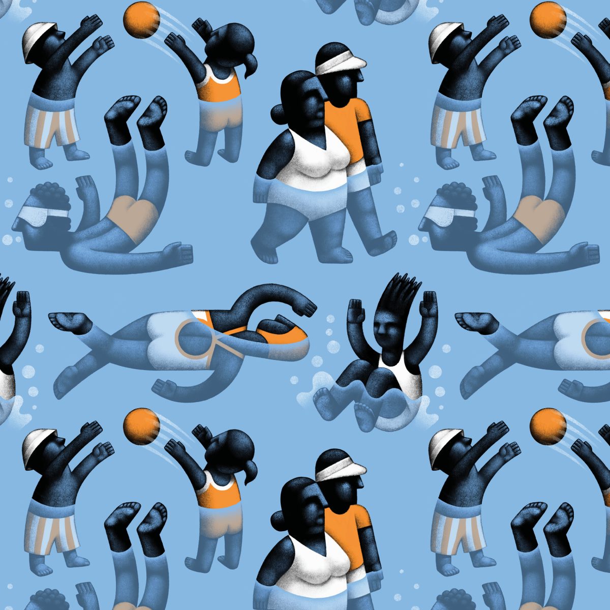
Miriam Martincic: Pool, shortlisted in the Professional Exploration Category.
The colour palette is contained and works well with just a pop of orange to make it very visually pleasing. I like the use of a repeat pattern to create an illustration – it makes it versatile and actually takes a minute to spot which is interesting. It’s constructed well with a consistent use of empty space. The character design is very interesting, almost like stone carvings, creating the feeling of a classical painting in a modern rendering.
Abel Reverter, Director at Cabeza Patata