Illustration in Advertising features in our everyday lives, whether we’re catching a train, watching a new film or grabbing a drink.
Illustration adds a playful human element to campaigns, that raises brand awareness and connects with audiences worldwide.
Our WIA2024 Advertising Category highlights some of the best work across this sector. We’ve pulled together a curated list of stand out projects, along with our category judges thoughts and illustrator insights!
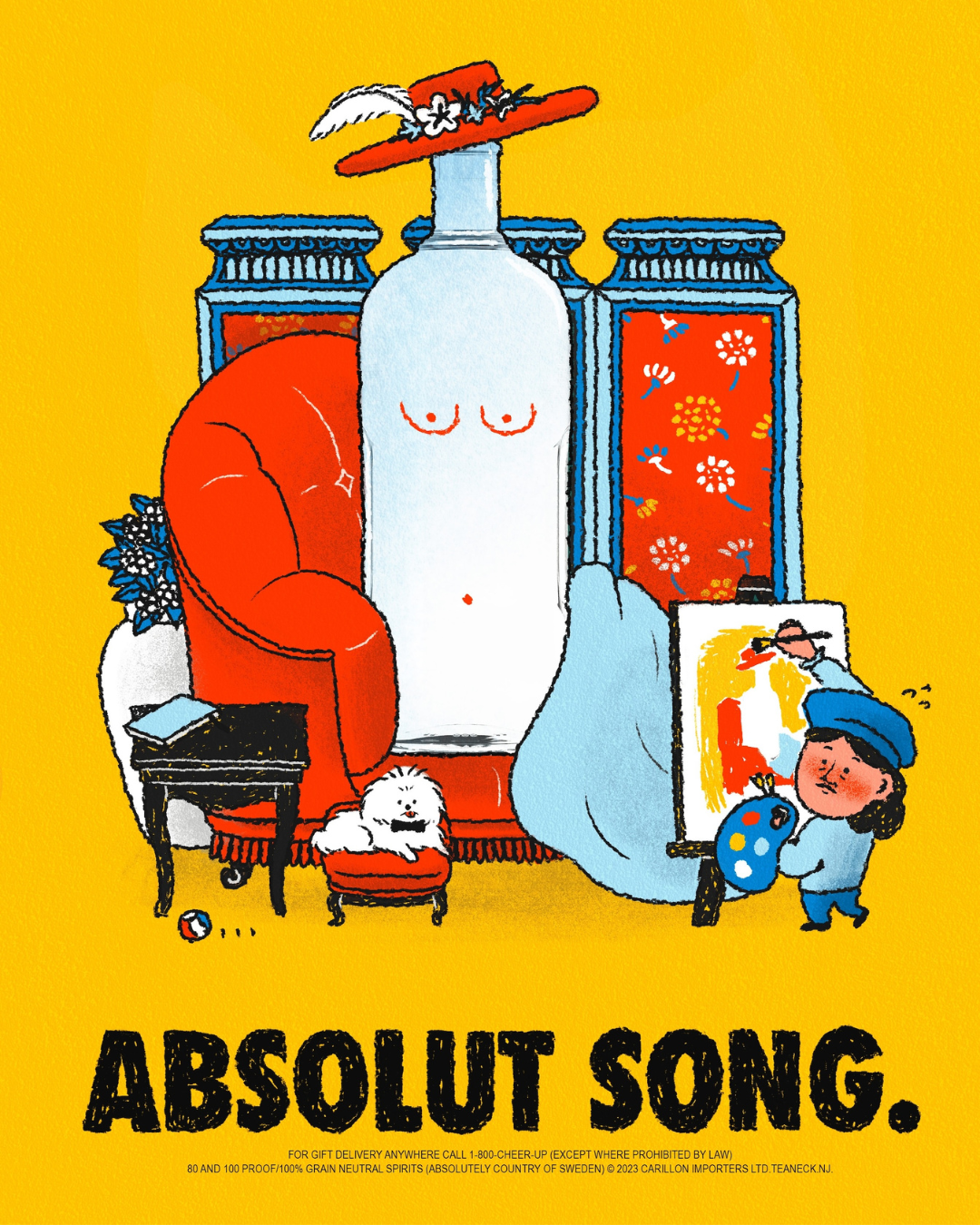
Originally created as a school project at The Rhode Island School of Design. This vibrant Absolut Vodka campaign showcases an artist using the iconic bottle as its muse.
Combined with subtle humour and playful characters the piece feels energetic and new.
This is a great example of how you can use illustration to convey a brands tone of voice with no words – it’s cheeky, charming and fun. The Absolut branding feels part of the image and doesn’t feel at all forced or out of place. It’s full of personality and executed really well.
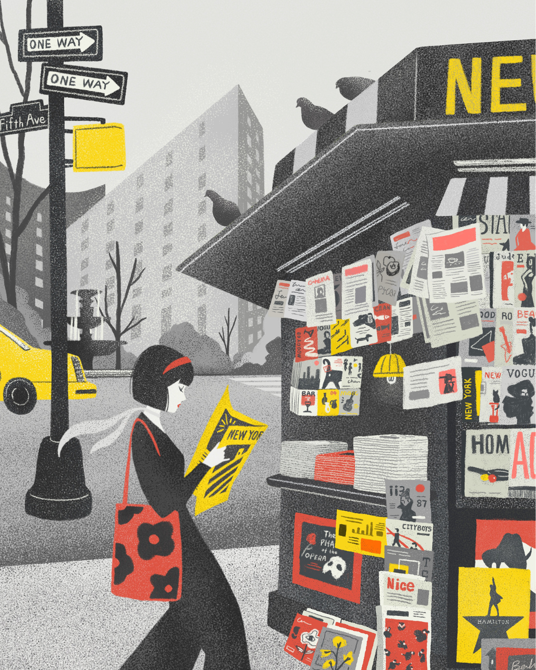
This was so beautiful to look at… The illustrator has a lovely art style and I love the way they have created these frame-able shots of New York using a bold colour pallet on B&W. I can see they have perhaps had inspiration from art-nouveau portraits with their character’s profile. Looking at Art on Ink it’s also a perfect ad. Love it.
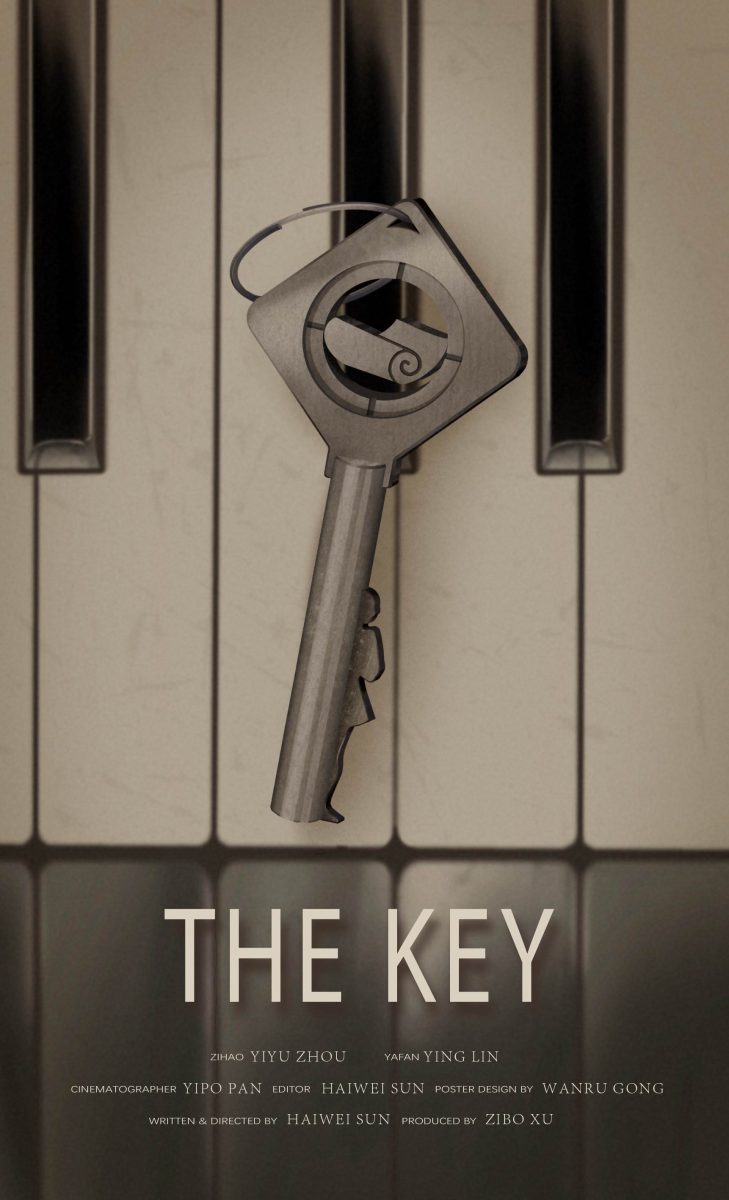
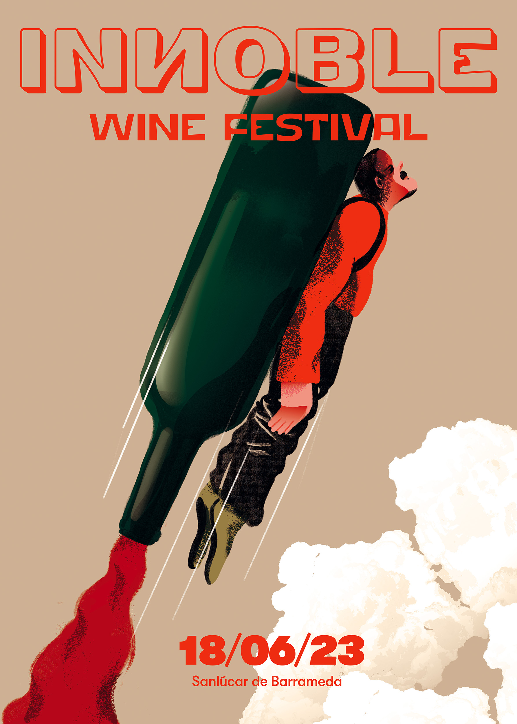
Commissioned as a movie poster from director Haiwei Sun.
The piece has a melancholic mysterious feel. With desaturated colours and an overall gloomy feel.
The tone hints to the darker subject matter, exploring the dynamic of a high school girl facing the pressure from her mother and all of life’s pressures. The key acting as a symbol of hope.
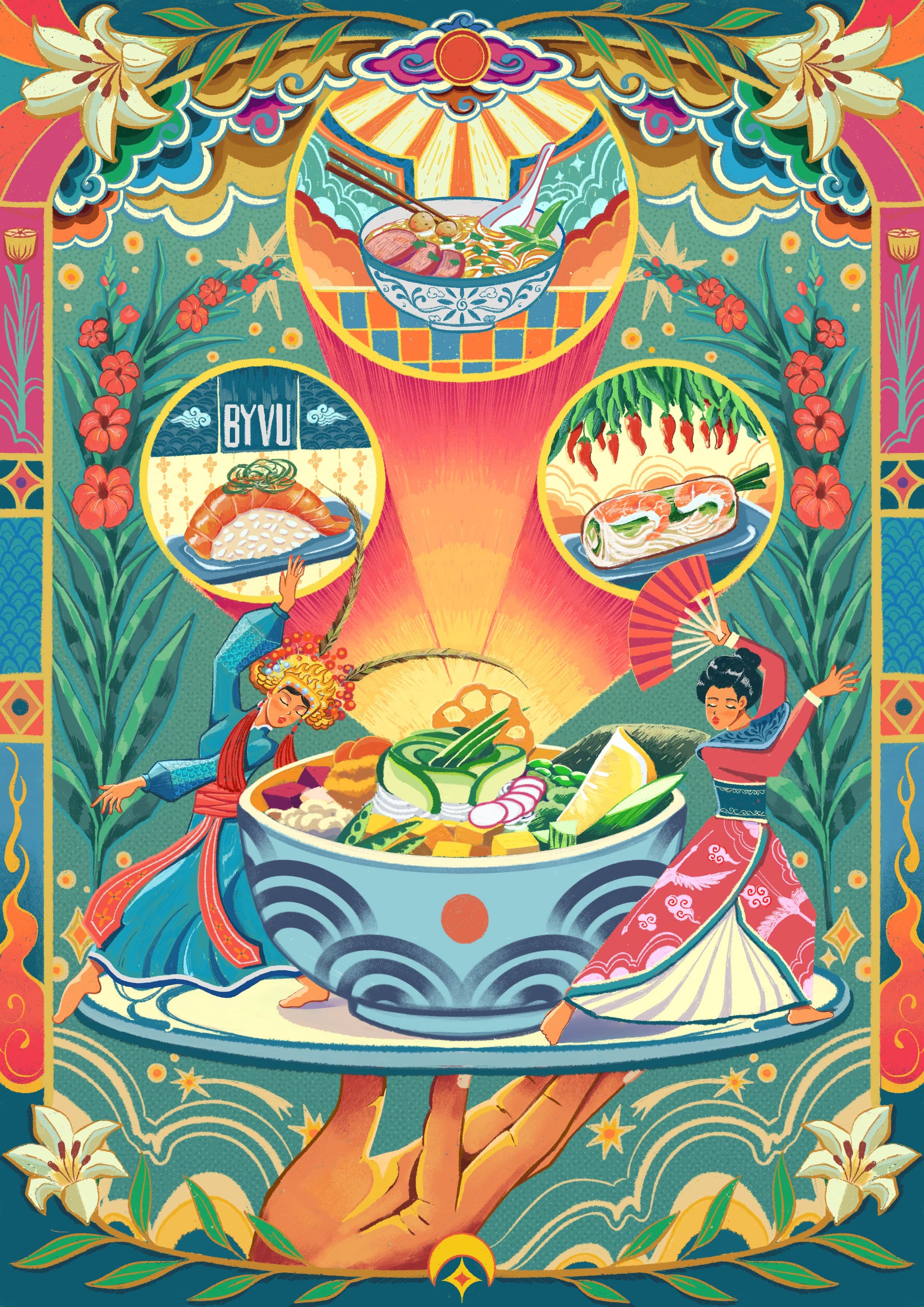
This beautiful poster was commissioned by a fusion restaurant in Munich, Germany.
Showcasing the two cuisines, Vietnamese and Japanese, Hoan picked iconic details from both cultures. Fusing them together with harmonious patterns from folk paintings.
Hoan Phan is an illustrator he was born and raised in Vietnam, currently based in Japan.
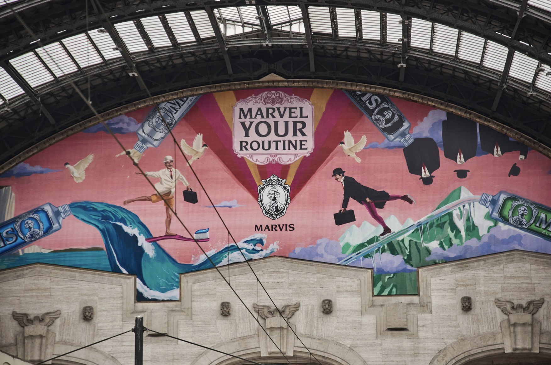
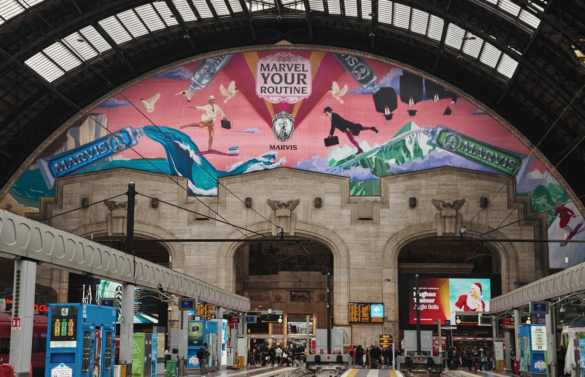
This idea is like nothing I have ever seen before for something as boring as toothpaste, it’s engaging, fun and put a massive smile on my face. The illustrations have brought the idea to life in a totally original and fun way – making a toothpaste full of personality.
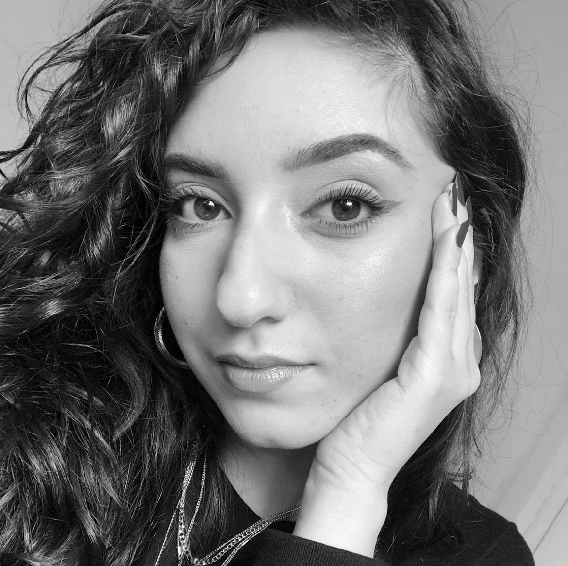
This image is inspired by a quote from Walt Whitman’s poem, ‘Song of Myself, 51’. It is a celebration of all the contradictions that coexist in a single individual. If you zoom in, the only thing you can see is a chaotic mix of colors and textures. But then, zooming out, you realise all these fragments are in perfect balance with each other and that each contribute to creating the central figure.
If you enjoyed reading this curated list, be sure to keep explore the rest of the WIA2024 Shortlist Showcase. We will be adding new materials all throughout August.