WIA2022 Judges’ Reflections on some of the WIA2022 Award Winning projects!
Read on for the judges’ commentary on what made this year’s Award-Winning works shine…
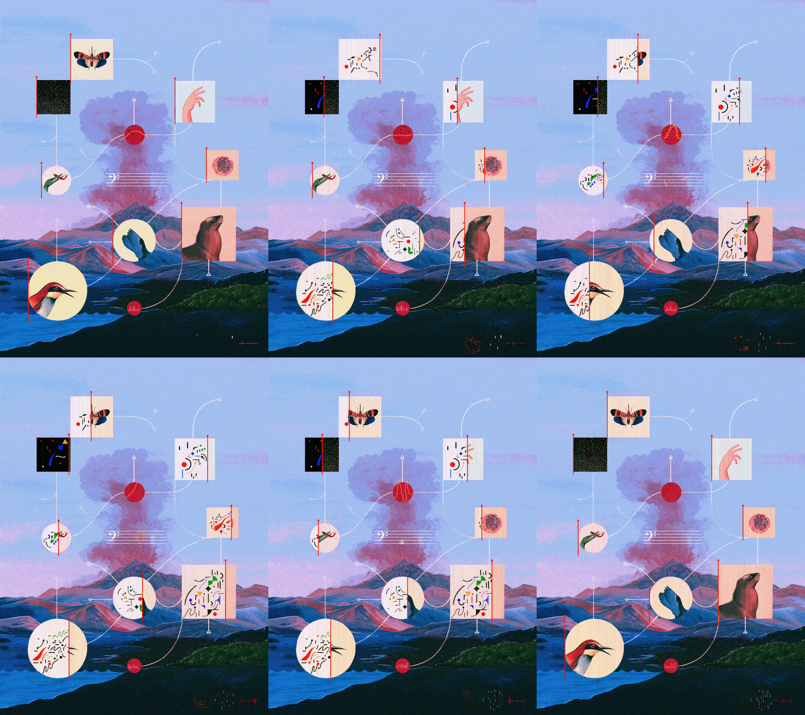
Daniel Liévano: Sounds Wild and Broken, Professional Overall Winner, and winner of the Professional Science & Technology Category
I love everything about this. Not only is it beautifully rendered, but it shows something you can’t visualize. I appreciate the complexity of having to create art of something invisible. The combination of beautifully detailed and realistic animals with abstract shapes is also very clever and well done. I also love the animation and texture. This piece is truly perfect in every way.
Elena Lacey, Art Director, WIRED, USA
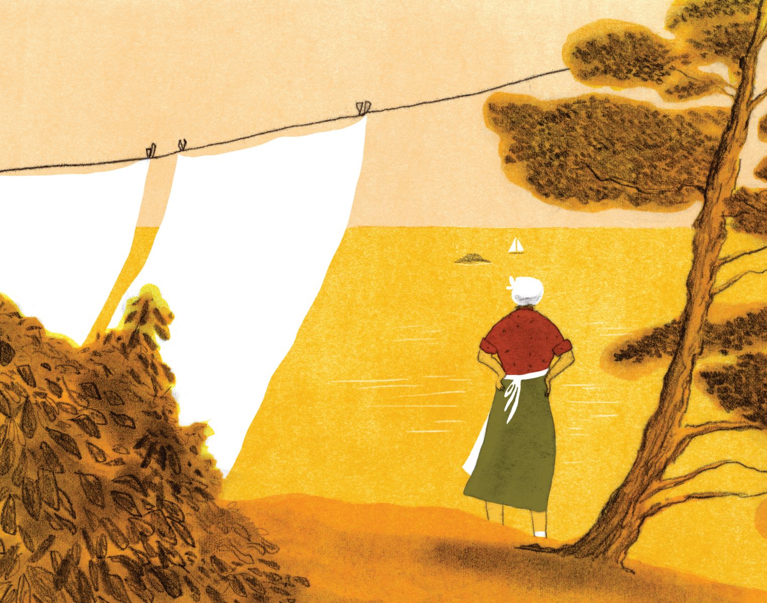
Carole Bouvier: On a Spring Day, Winner of the SAA Agents Award for New Talent
Carole’s entry really stood out and we were all very impressed with her strong compositions, use of colour and her visual storytelling – On a Spring Day is a fresh approach at picture book illustration. Carole’s imagery has personality and she shows a sensitivity to the subject matter. We believe her work has a broad commercial appeal that could be applied to all manner of creative solutions. She’s a worthy winner!
Caroline Thomson, Arena Illustration / Society of Artists Agents
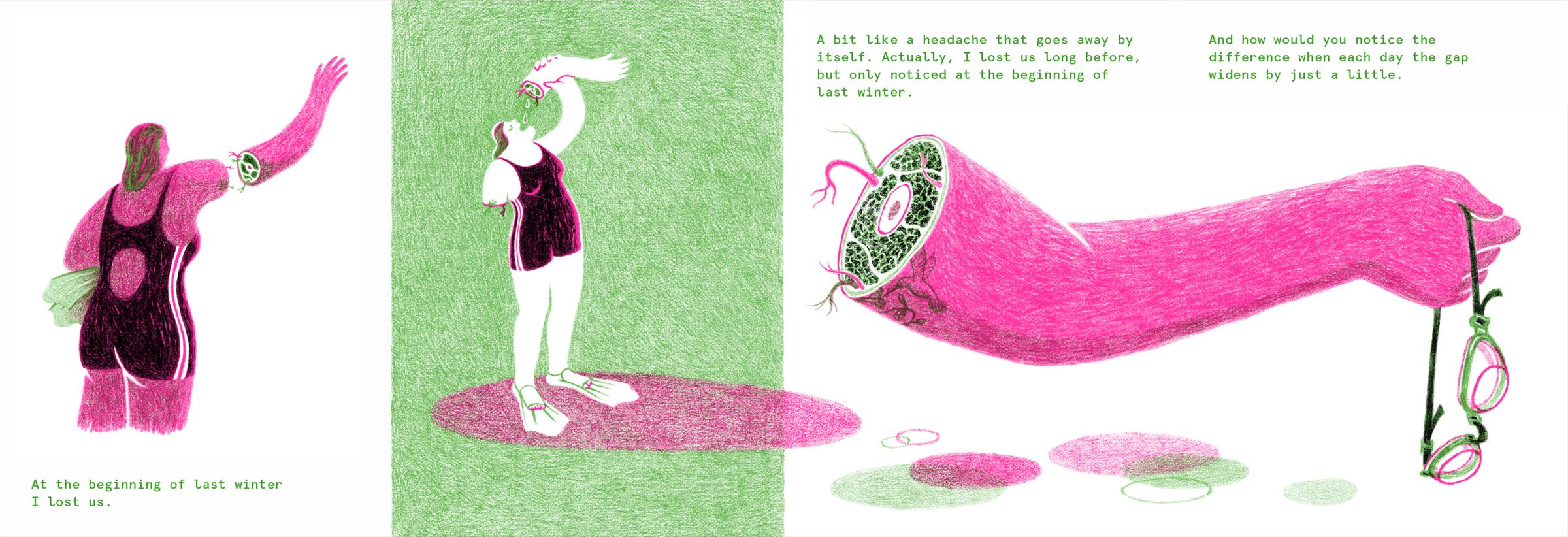
Ofra Amit: Undercover, winner of the Professional Alternative Publishing Category
A tremendous level of skill has been demonstrated in these beautiful, delicate and highly detailed pencil illustrations. The illustrator’s style remains consistent throughout the entire publication. The colours and typography chosen are really well considered. I really admire the unique way they have chosen to visually represent their thoughtful concept, and that their publication emanates such a strong and distinct feeling. It feels dream-like, gentle and melancholy.
Allison Colpoys, Designer and Illustrator, Australia

Haoshu: Metaverse, winner of the New Talent Science & Techology Category
Fantastic level of detail and the use of colour means it still feels coherent despite the complexity.
Marcus Webb, CoFounder, Slow Journalism Company, UK
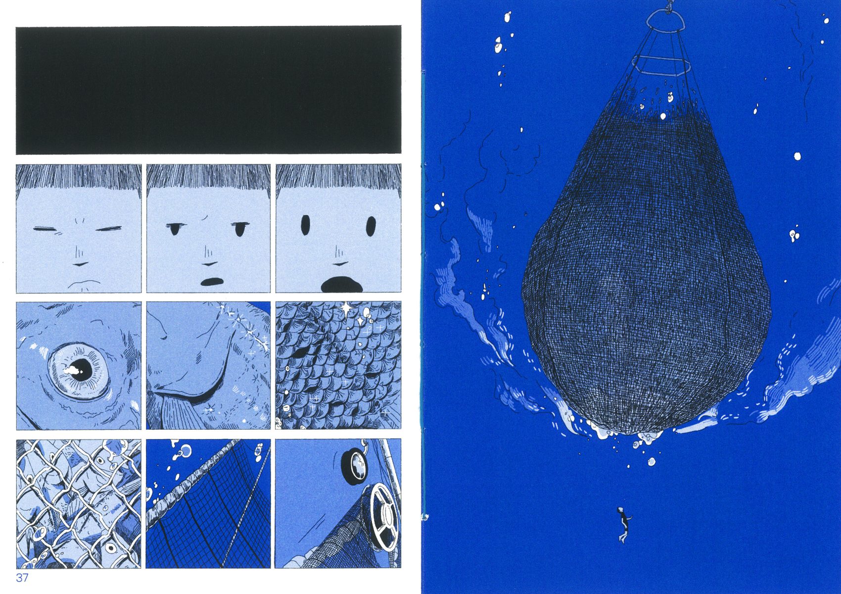
Soojin Kim: Scales and Shards, winner of the Professional Alternative Publishing Category
Really impressive intricate line work, that appears hand rendered, even though the illustrator has done so digitally using Procreate. I really appreciate the level of skill the illustrator has with the software to successfully generate this feel. Their desire to emphasise scale and the vastness of the ocean has been fully realised in this project and is to be congratulated. The work is also beautifully printed by the artist – they have created a beautiful and magical publication.
Allison Colpoys, Designer and Illustrator, Australia
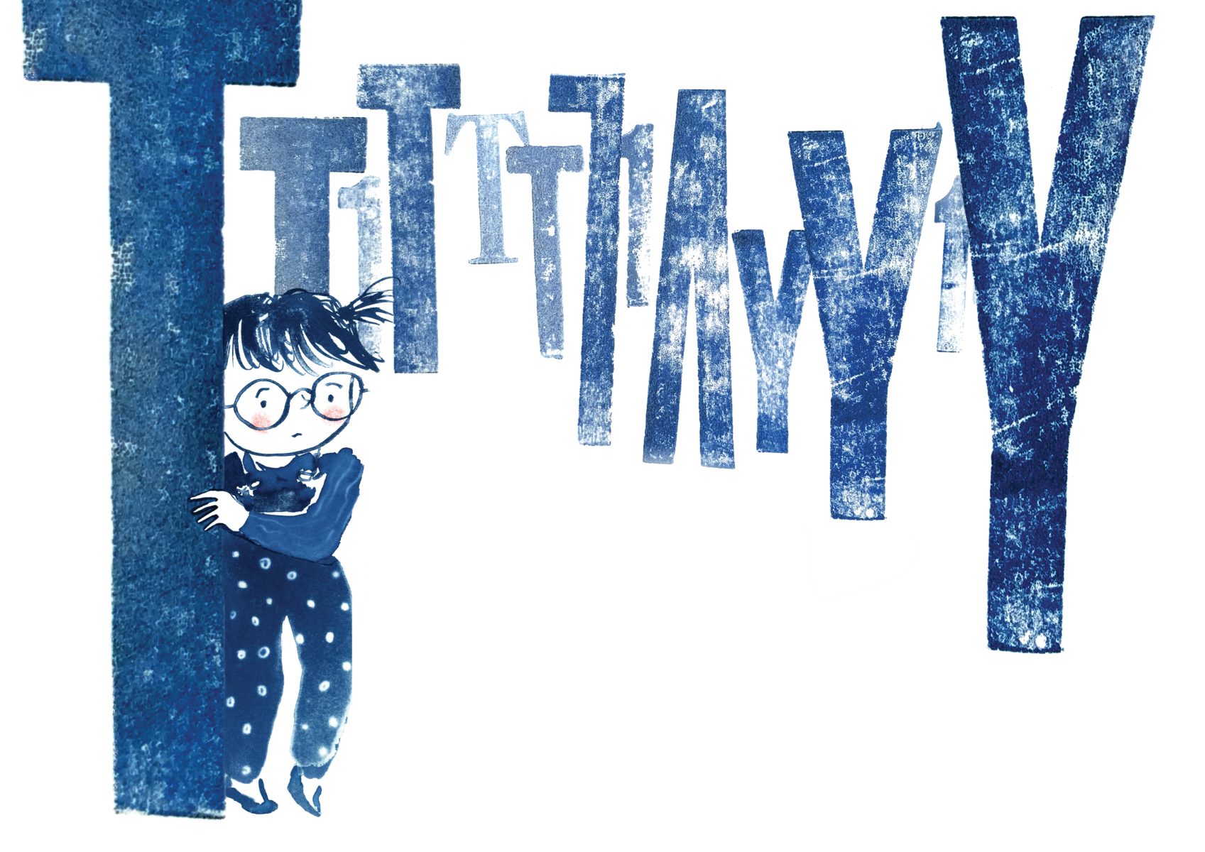
Kate Rolfe: Navigating Dyslexia, winner of the New Talent Children’s Publishing Category, sponsored by Walker Books UK
Navigating Dyslexia simple yet very explicit expression in form, and in colour, a depressed small child vs big letters, slightly vague,and in blue, a color representing the mood of the child who is entraped in the difficulty in reading letters.
Mingzhou Zhang, President, IBBY, China
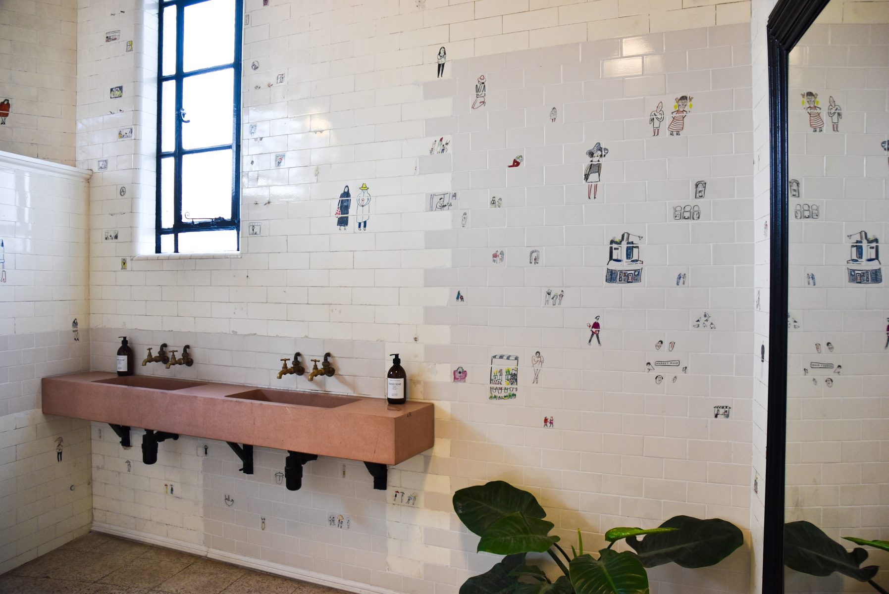
Miriam Pritchard: Story Tiles, winner of the New Talent Site Specific Category
The way that the illustrations interact with the architectural space is original, sophisticated and playful. The concept allows for a really compelling sense of discovery as the alternate world of the illustrated community unfolds throughout the space. The individual illustrations are full of charm and personality, demonstrating great skill and competence as an illustrator.
Antra Svarcs, Illustrator and Illustration Director at Alltrue
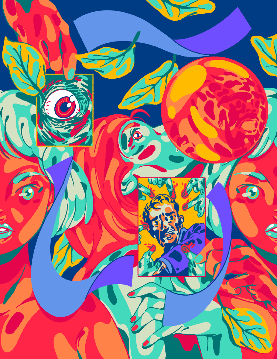
Duke +1 : NOISE (LÄRM), winner of the Professional Editorial Category sponsored by Procreate
The illustrator used the commission as a springboard to explore how the plays’ themes related to their personal experience. This has resulted in real energy and originality. The layers of imagery and the limited but vibrant palette are combined with great flair
Kevin Wilson, Head of Editorial Design, Financial Times
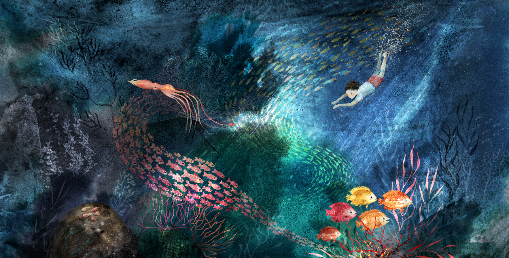
Dorien Brouwers, SAIL, Winner of the DI Award
We selected Dorien based on her depth of talent. Dorien went beyond digital and used water color, ink, printmaking and digital. We are inspired by the uplifting theme in SAIL of overcoming challenges — it’s highly relevant to the times we are in. We are also inspired by any artist who creates work from their own initiative, not waiting for a job to get started. This shows a love for art as well as belief in self. We always encourage artists to create during slow times, as I believe it helps to keep their passion for art alive as well as helping them potential gaining more work. And finally, Dorien’s work has a classic appeal that seems timeless.
Sara Jaqua / Director of Business Development and Sr. Marketing Consultant / Directory of Illustration
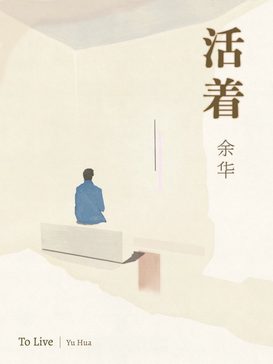
Dexin Chen: To Live, winner of the New Talent Book Covers Category
I loveee these illustrations, the muted colours, the use of negative space and how the image interacts with the type. Even thought it is so quiet, there’s a real immediacy to this, and I feel like I’m sharing a private moment with the characters in their special space.
Hazel Lam, Senior Designer, HarperCollins ANZ
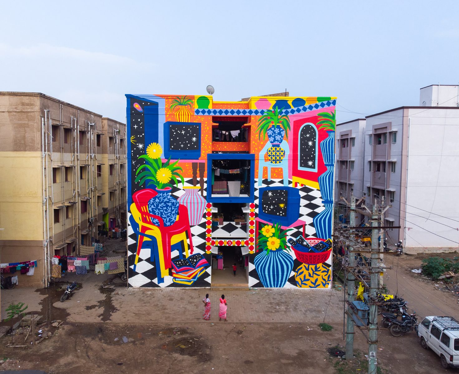
Kneethee, Veedu/Home, winner of the Professional Site Specific Category
The use of colors and shapes are outstanding. The artwork definitely has a huge impact on its environment, it is emphatic but does not overrule its context, it fits in it. Despite the huge surface the illustration is very consequent and its message is clearly transmitted.
Alice Oehr, Artist and Designer, Australia
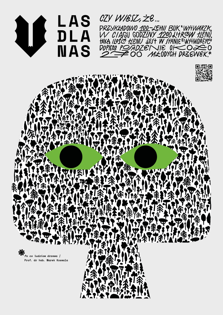
Iga Nawara: Forest for Us, winner of the New Talent Design, Product & Packaging Category
Fresh and strong style! Simple and effective. It has a lot of personality and works well with the type. Easily stands out from others.
Bárbara Malagoli, Artist and lllustrator, UK
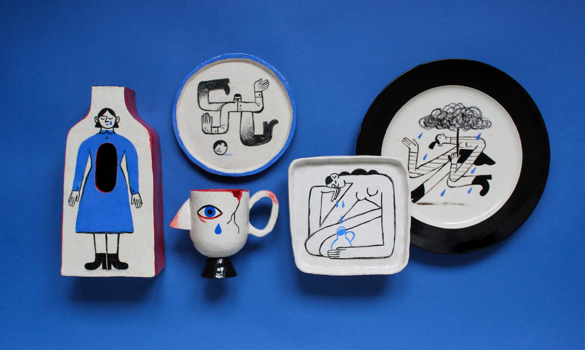
Tatyana Yakunova, Ordinary Despair, winner of the Professional Exploration Category
This is a beautiful exploration of different media and making each illustration fit to its format. Talking about isolation within fragile objects present in the home creates a strong message; the use of the broken mug in the piece of art is fantastic.
Abel Reverter, Director at Cabeza Patata
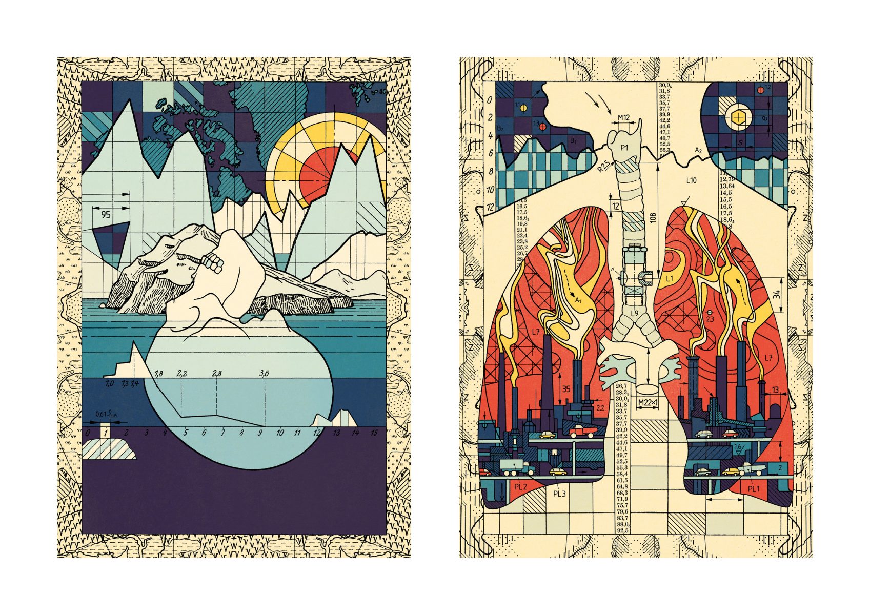
Christian Gralingen: Climate Change, winner of the Professional Commercial Publishing Category
I love the use of a historical aesthetic to represent today’s environmental crisis. The style of illustration brings to mind questions of the roles and responsibilities of scientists, and the fact that humanity has been building toward this crisis for centuries. But it also allows the artist to create complex and interesting compositions that effectively tell the story of environmental degradation.
Mirabelle Korn, Editor, Chronicle Books, USA
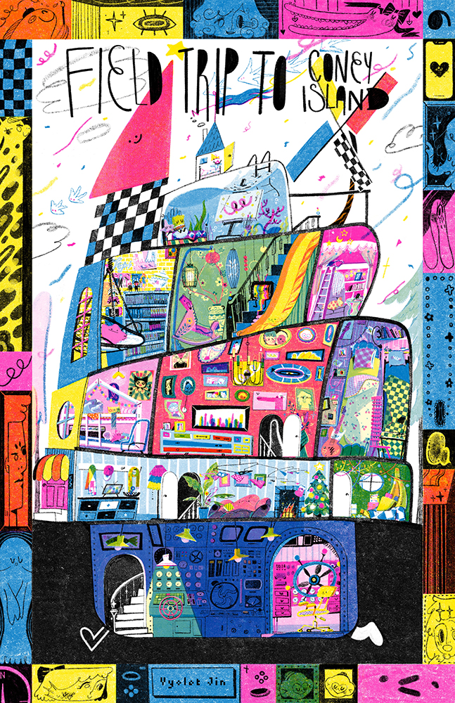
Vyolet Jin: Coralie’s Doll House, winner of the New Talent Exploration Category
I like the use of risograph printing and the amount of detail in the image is difficult to achieve in this technique. The illustration style comes across as effortless and relaxed but at the same time is creating a complex image that shows a lot of hidden work.
Abel Reverter, Director at Cabeza Patata
