Projects from across the WIA2023 shortlist which use illustration for commissioned (and prospective) product design, branding, and advertising campaigns, often across multiple digital and printed platforms.
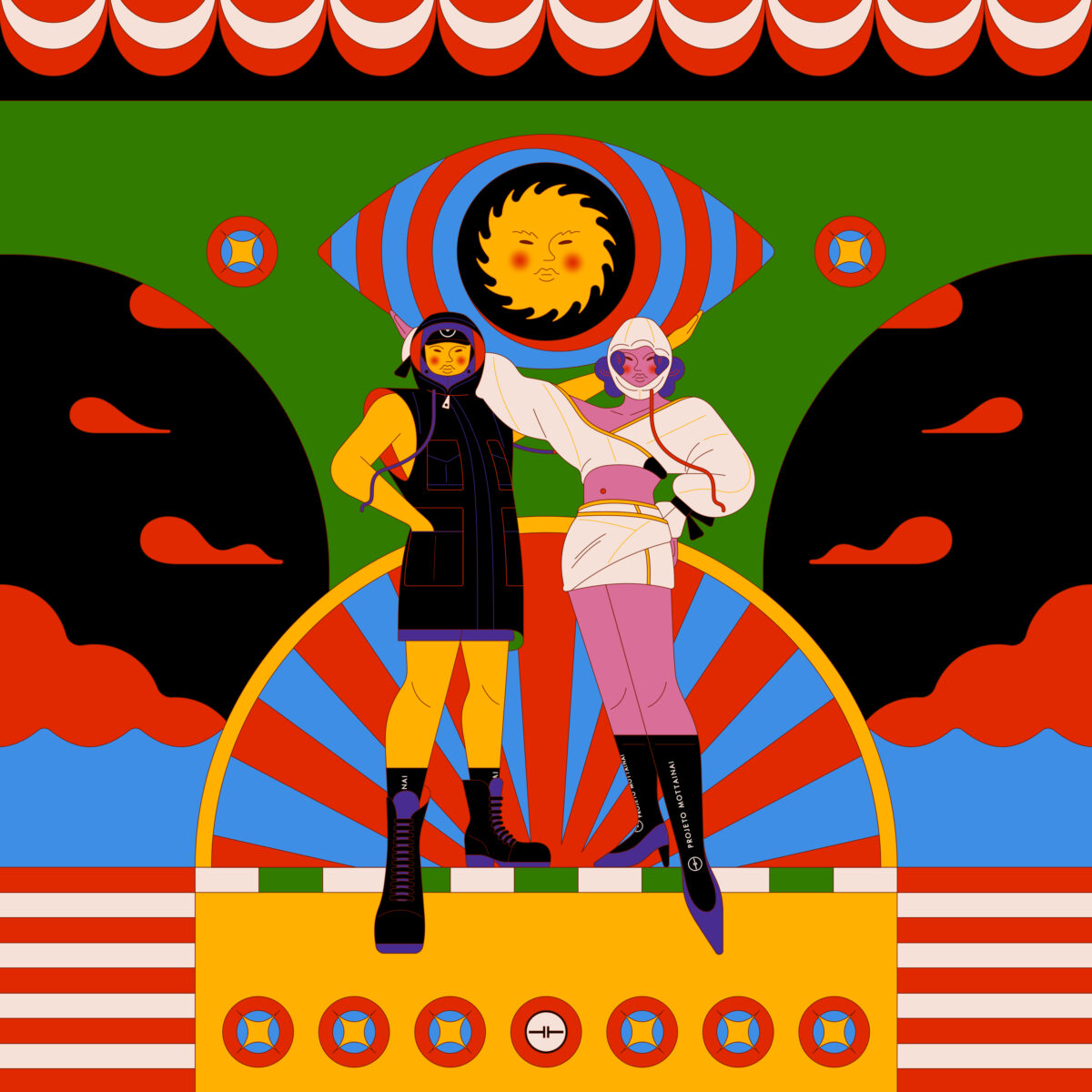
Projeto Mottainai is a Brazilian upcycling fashion brand. They invited Jun to collaborate on their 22-23 collection, which had its debut on the runway at Casa dos Criadores.
Along with Pablo Monaquezi and João Ribeiro, Jun was part of a creative team that came up with this collection’s concept, imagery and storytelling.
Jun also created the campaign’s illustrations, prints and hand-painted pieces.
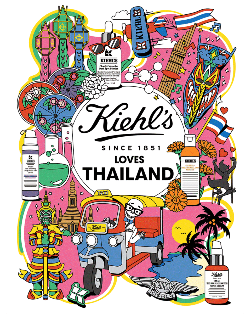
Working closely with the Kiehl’s team, Linda was asked to illustrate 48 mini kits including key visuals, patterns, icons and character art specific to each location.
All are crafted to depict the distinctive style of local culture and landmarks.
The artwork was used on limited edition packaging, POS, events, digital assets and more in each nation.
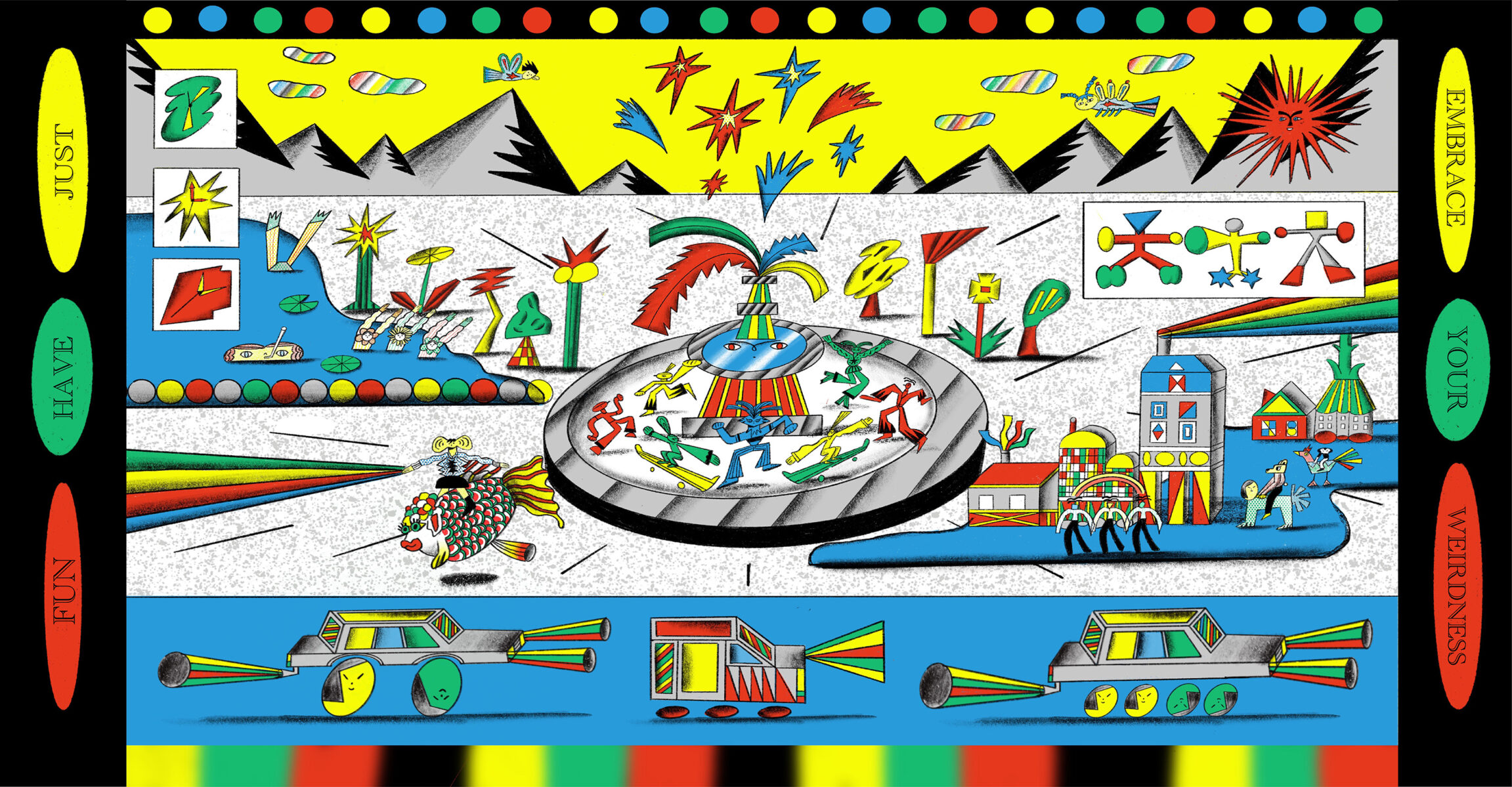
This project was created as a brand identity for a concept brand Jocelyne Fan. Jocelyne Fan is a creative brand with a quirky aesthetic, in which the keywords are diversity, absurdity and playfulness.
Its aim is to encourage people to embrace weirdness and promote atypical lifestyles. Life is short, play more. Joining this absurd world, Let’s celebrate weirdness and diversity together.
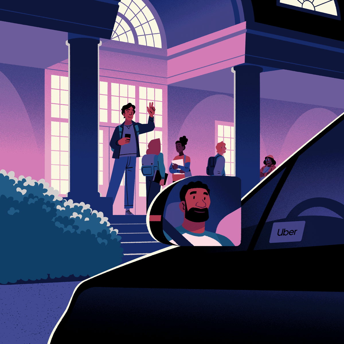
This advertising campaign was commissioned by Uber to raise awareness of rideshare safety on college campuses.
The GIFs for this project were created in Photoshop and After Effects, and were to be used in various formats such as 16:9, 9:16 and square for email and apps.
The posters were also created in Photoshop and were designed to be conveniently printed off by colleges on standard US paper sizes.
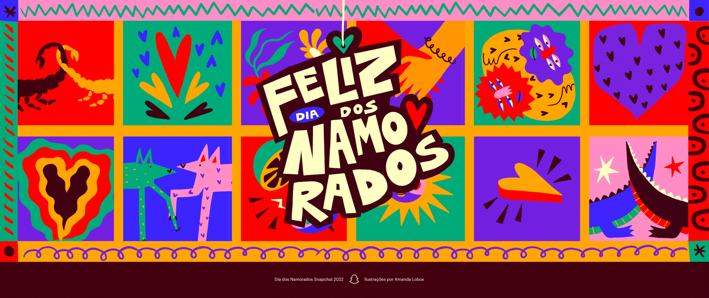
This project was a commissioned by Snapchat to create Mass Snap and Stickers for the Brazilian Valentine’s Day, Dia dos Namorados.
The idea of the campaign was to celebrate different shapes and forms of love between a couple without bringing literal humans to the scene, making it more ludic and embracing.
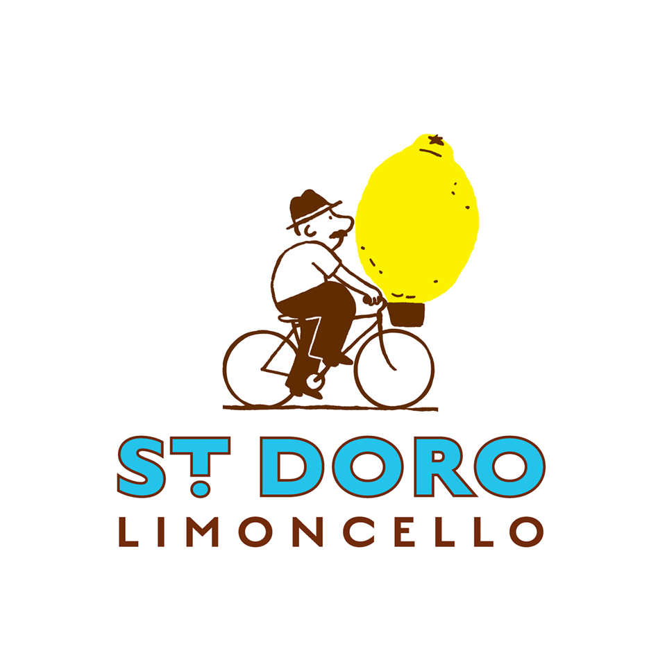
Michael worked with Wide Open Studio to create a branding identity for St Doro Limoncello, which reflects the rustic home-grown nature of the business and celebrates their journey from humble beginnings.
These illustrations were used for the logo and other branding collateral, including tote bags, business cards and t-shirts.
We use cookies. By browsing our site you agree to our use of cookies, Find out more.