The Varoom Report: Empathy V25
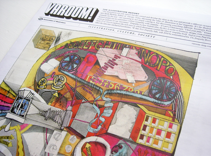
The Empathy Issue
THE ILLUSTRATION REPORT Spring 2014
ISSUE 25
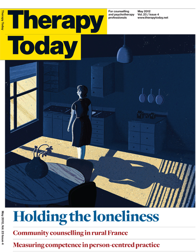
“The illustrations not only mirror, but also extend and develop the ideas in the text and provide a different viewpoint,” says Sarah Browne, Editor of Therapy Today, discussing the value of illustration in her magazine.
It’s illustrator’s empathy for the text – not repeating it, not simply echoing them it, but discovering something different. Sociologist Richard Sennett points out we sometimes confuse sympathy with empathy – it’s not a Clintonesque ‘I feel your pain.” Empathy is not an embrace it’s an ‘encounter’. Empathy is a hot-button idea, the key it seems to business, design, even evolution. Issue 25 of Varoom explores the rich ways in which illustrators extend the idea of empathy itself. And as ever, Paul Davis takes the idea into uncharted territories, “If this New Empathy fails, will 2014 be re-membered for The Empathy Riots?”
1.1 Context and Vision
In her feature exploring the deeper issues emerging from the two new Illustrated news publications – Symbolia and La Revue Dessinee – Jane Stanton writes that, “because the artist has ‘made’ rather than ‘taken’ the images themselves, there is an individual voice involved, and therefore new ways of seeing through drawing, which connect and elicit empathy, understanding and deeper exploration from the viewer.” It’s an idea Stanton teases out from critic Susan Sontag’s book Regarding The Pain of Others. Empathy around news events, Stanton argues, comes from an image-maker giving a context, a perspective, a vision – Sontag gives the example of Goya’s Disasters of War, a series of prints made between 1810-1820.
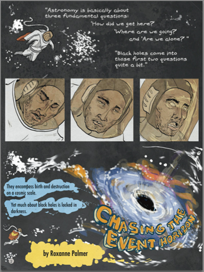
Roxanne Palmer, Chasing the Event Horizon, Symbolia, 2014
1.2 Newsfeed or Dripfeed
Empathy is essential for any kind of action – either a basic emotional response or a practical active engagement – as imagery, especially the flow of news imagery in our 24/7 news culture can be numbing in its sheer volume, brutality and lack of a way in to understanding complicated events. Elsewhere in Regarding The Pain of Others Sontag writes, “Making photographs loom larger, by globalising it, may spur people to feel that the sufferings and misfortunes are too vast, too irrevocable, too epic to be much changed by any local political intervention.” Too much visual information can be a barrier to Empathy.
1.3 Business and Empathy
The word ‘Empathy’ is relatively young, coined in 1909 by a German psychologist, literally meaning ‘feeling into’. According to a review in The Guardian of Professor of Developmental Psychopathology, Simon Baron Cohen’s book Zero Degrees of Empathy, it’s only since the 1960s that scientists have really begun tuning in to the concept. And it’s only over the last decade or so that Empathy has become an object of fascination in the worlds of Business and Design, a word whose emotional and creative component shifts the functional and pragmatic aspects of these professional worlds.
1.4 Noticing Notice
In a well-read 2008 article for The Harvard Business Review, Tim Brown of design firm IDEO identified Empathy as a core feature of those who wish to think as designers, to apply the thinking of design to any business problem. A Design Thinker, “can imagine the world from multiple perspectives – those of colleagues, clients, end users, and customers (current and prospective). By taking a ‘people first’ approach, design thinkers can imagine solutions that are inherently desirable and meet explicit or latent needs. Great design thinkers observe the world in minute detail. They notice things that others do not and use their insights to inspire innovation.”
2.1 Climb Into His Skin
Some readers might be surprised at the popularity of Brown’s observation. Not surprised at its good sense, but as illustrators used to creating characters, narrative detail and images designed to connect with a specific group of people, illustrators might have taken for granted the idea that Empathy would be part of a process (Business) that is about connecting with people. The notion of Empathy has had a rich history in popular culture. In To Kill a Mockingbird, published in 1960, author Harper Lee wrote for the character Atticus Finch, “You never really know a man until you consider things from his point of view… until you climb into his skin and walk around in it.” It’s a lovely idea-image by Harper Lee – physical, material, getting inside someone’s skin, then going for a walk, seeing how it fits, how your skin fits with the world around you as you take this skin out and about.
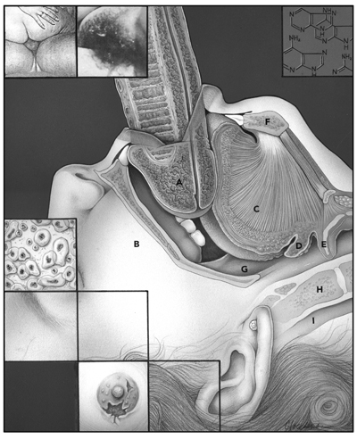
Phoebe Gloeckner, Chapter 6, The Atrocity Exhibition, 1990, Re/Search Publication
2.2 As An Encounter
In a way, Empathy is a word designed for our times, it’s aura seems to sit with our media, with our social media, of ‘likes’, of sharing how we feel about things. You disagree? That’s OK, I feel your pain. But what’s really interesting about Empathy, is that it’s not ultimately about feeling. Sociologist Richard Sennett points out in Together (the follow up to The Craftsman) sympathy is an embrace, Empathy is “an encounter”. Sympathy takes it back to me, “I feel your pain” is ultimately about me, about my ego, Empathy is more demanding – “Curiosity,” writes Sennett, “figures more strongly in empathy than in Sympathy.” Empathy he argues, is an encounter with the different.
3.1 Publisher’s Lack of Empathy
Adrian Holme’s feature on Phoebe Gloeckner’s illustration for J.G. Ballard’s The Atrocity Exhibition explores a series of images Gloeckner created for a special issue of Re/Search magazine in 1990. With brutalist chapter titles such as “The Assassination of John Fitzgerald Kennedy Considered as a Downhill Motor Race,” and “Love and Napalm: Export USA” the original 1970 edition was pulped by the publishers through fears of being sued by celebrities featuring in the book. It gathered a cultish following among literary outsiders including Joy Division’s, Ian Curtis who’s song of the same title was partly inspired by the book.
3.2 Media Violence And Trauma
Ballard’s book emerged from a period of violence, wars and assassinations in the 1960s, much of it delivered for the first time into people’s homes as TV footage or photographs in newspapers and magazines. Adrian Holme refers to the idea of the “death of affect”, as exposed to a depersonalised image-mash of celebrity and violence we lose the capacity for empathy.
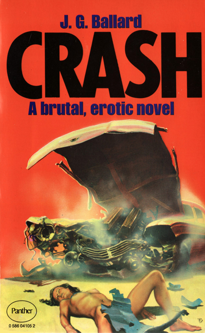
Chris Foss, Panther, 1975
3.3 The Waking Dream
Ballard writes in an annotation to the book, “What actually happens on the level of our unconscious minds when, within minutes on the same TV screen, a prime minister is assassinated, an actress makes love, an injured child is carried from a car crash? Faced with these charged events, prepackaged emotions already in place, we can only stitch together a set of emergency scenarios, just as our sleeping minds extemporise a narrative from the unrelated memories that veer through the cortical night. In the waking dream that now constitutes everyday reality, images of a blood-spattered widow, the chromium trim of a limousine windshield, the stylised glamour of a motorcade, fuse together to provide a secondary narrative with very different meanings.”
3.4 Mixing Genres
Phoebe Gloeckner’s images have the capacity to shock, partly no doubt because of the cool, physiological clarity she brings from her training as a medical illustrator. Using the visual or narrative forms of a genre outside its traditional subject area is always shocking – it’s the reasons the Benetton ads in the 1990’s with images such as a bloody new born baby, or the clothes of a dead Bosnian soldier generated so much heat.
3.5 Emotional Undercurrent
But Gloeckner’s images do more than shock, her skill as an image-maker is to give a narrative vision and make the subtle notes of Ballard’s work accessible to the reader. As Holme suggests about Gloeckner’s image which we feature on our cover, the “illustration somehow achieves the feat of capturing the death of affect while suggesting the powerful emotional currents that lurk underneath.” Such a crafted image is a different conceptual and emotional entry-point to the text. In the language of Richard Sennett it’s where the image emerges from an ‘encounter’ between the illustrator and author.
4.1 Extending Textual Ideas
This notion of encounter is alluded to by Sarah Browne, editor of Therapy Today. The magazine has been using illustration on its covers since the redesign by Esterson Associates in 2009, the images playing off simple and direct cover lines, to give different tonalities and mood to a magazine that deals with complex human issues to a sophisticated audience of professional psychotherapists. The illustrations highlight the creative difference between simplicity and the simplistic, the images never reduce the manifold issues at stake, offering a different line of thought into a theme. “Our profession has for the past 20 years been challenged to become more of an evidence-based science than an art form,” says Browne, “the illustrations counter that and remind us of the creative side of therapy. The illustrations not only mirror but also extend and develop the ideas in the text and provide a different viewpoint.”
4.2 Temporary Connection
In this way we need to think of empathy as a creative activity, demanding conceptual and craft skills, an imaginative journey that makes a temporary connection between two separate entities (text and image in the example above) and both sides of this visual connection are changed. In the act of the imagination, the illustrator becomes someone different, and the sense of the text is transformed through the image.
4.3 Horizon of Empathy
Author Leslie Jamison tells in her forthcoming book The Empathy Exams of her part-time job as a Medical Actor, which means acting out symptoms of diseases for medical students to diagnose. Like Sennett, Jamison’s experience reveals that Empathy demands curiosity rather than a textbook methodology. She writes, “Empathy isn’t measured just by checklist item 31 – ‘Voiced empathy for my situation/problem’ – but by every item that gauges how thoroughly my experience has been imagined. Empathy isn’t just remembering to say ‘That must really be hard’, it’s figuring out how to bring difficulty into the light so it can be seen at all. Empathy isn’t just listening, it’s asking the questions whose answers need to be listened to. Empathy requires inquiry as much as imagination. Empathy requires knowing you know nothing. Empathy means acknowledging a horizon of context that extends perpetually beyond what you can see: an old woman’s gonorrhoea is connected to her guilt is connected to her marriage is connected to her children is connected to the days when she was a child.” Empathy is about being aware of ambient signals, an awareness of environment, and environment as, Jamison suggests, is something that is extensive, that extends beyond what is immediately visible.
Shh! We Have a Plan by Chris Haughton
5.1 The Tangible and Accessible
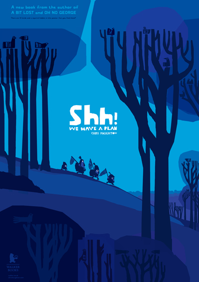
Bridget Strevens-Marzo writes in the Children’s Books section about Chris Haughton’s new book, Shh! We Have A Plan and Michael Roher’s illustrations for Elisabeth Steinkellner’s My New Granny. Roher’s imagery is for a book about a grandparent with dementia and the insight for his imagery comes from his experience (research) working with the old and the handicapped. “I had to drop the idea that children’s books have to be bright and colourful,” says Roher, “and I also had to convince my publisher that the rather monochrome pictures would fit very well with the topic.” This decision enables the reader to follow the drawn detail, the kind of detail that connects the child to the Granny, reshaping the experience of dementia from something unknowable and fearful for a child, to something tangible and accessible, connecting Granny then-and-now.
5.2 The Child Reader
Chris Haughton on the other hand demonstrates the kind of empathy that seems to push-pull certain people into illustration. The utterly simple shapes, movement and comedy sizes of his characters immediately clue the reader into this tragi-comic crew of would-be braves. With this wonderfully dumb and hapless bunch we enter the world of childish slapstick – the skill of the adult illustrator is in negotiating a narrative unfolding that’s credible and doesn’t patronize the imagination of the child. As Strevens-Marzo writes, “the place of the child reader is not often discussed in terms of illustration. As creators for children we’re often drawing with the sense of ourselves as we were and what we liked as children – and that’s as different as any one of us is at any age.”
6.1 Tools Shape Empathy
Empathy is also about tools and objects. I’m finishing writing this in longhand with a transparent plastic pen, in black ink, in a black notebook slightly smaller than A5. It’s a grey Sunday morning, I have been awake for many chapters of the night listening to Oliver Sacks’ Hallucinations on audiobook, my head is foggy, my legs ache, I haven’t quite smoothed over the boundaries between the cloud of everyday stuff, Oliver Sacks and the concentration required for writing. Or it’s just that I just lack the empathy that writing on empathy demands. The tap of the laptop keyboard, the backlit screen, the grey metal – feels too loud, too bright, too cold. But these other objects, the pen and paper, their shape and touch, the way they sculpt my thumb and finger into a certain shape, with a certain pressure, feels like they are conductors of thinking.
John Vernon Lord’s Pens
6.2 Idea Conductors
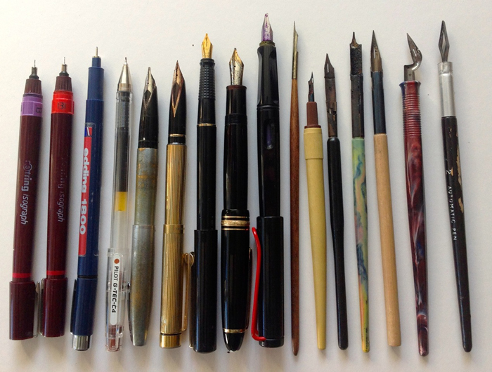
Like John Vernon Lord’s pens, which he discusses in our feature Materials Matter, the tools for work in his new book Drawn To Drawing. But it’s not just the pen nibs, “I think the paper you choose to draw on is obviously crucial too,” says Vernon Lord, “a paper that is conducive to the way you want to work and how it reacts to different pen nibs. The ink has to be right too, as you know.” Materials are conductors for the idea, for how an idea connects with us, and the means by which the idea begins to shape itself in our hands.
6.3 Empathy Machine
We shouldn’t be surprised then that it was an illustrator who gave us the paradoxically unempathetic vision of an Empathy machine, a machine whose visual form speaks the opposite of empathy. Concept artist and visual futurist Syd Mead most famously worked on Blade Runner drawing the Voight-Kampf machine – by scanning the iris during a sequence of questions, the machine could identify whether the subject had a capacity for empathy. According to Mead, Ridley Scott wanted something large and dangerous. Mead decided that by making it ‘breathe’ the machine itself feels alive. In an interview on one of the many online fan sites Mead says, “My rationale for this was that the machine would draw in air samples in the immediate area. When you are scared or apprehensive, our body gives off an odour. And I think it’s minute molecular detachments of protein or something that your sweat glands give out. So your chemistry changes when you’re tense. You unfold the machine and it starts itself as soon as the subject walks in the room; its arm moves around and focuses at the subject’s eye. It’s sort of alive in a way all by itself, and its very, very threatening.”
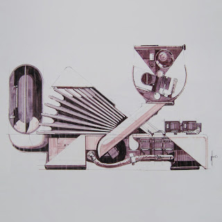
Voight Kampff Machine – Empathy Detector, Bladerunner Sketchbook, Blue Dolphin Enterprises, 1982
6.4 The Client Encounter
So it comes down to this. The worst-case scenario for a professional illustrator is to be at one end of a Voight-Kampf machine and the client at the other. As Stephanie Alexander-Jinks from the Artworks agency says in our Match-Makers feature, the worst challenge for an agent and illustrator is when “when the client doesn’t want to commit to clear guidelines and goes for a ‘I’ll know it when I see it’ approach.” The best work for the client comes out of an ‘encounter’ a collaboration. “A client who is willing to trust me totally to match-make is one that is usually open to much freer ideas,” says Alexander-Jinks, “and many of ours do this, which is great for an agent, it allows us to use our experience. They are usually the ones who enjoy the best collaborations because of it.” Trust the empathy of the illustrator.
Back to News Page
