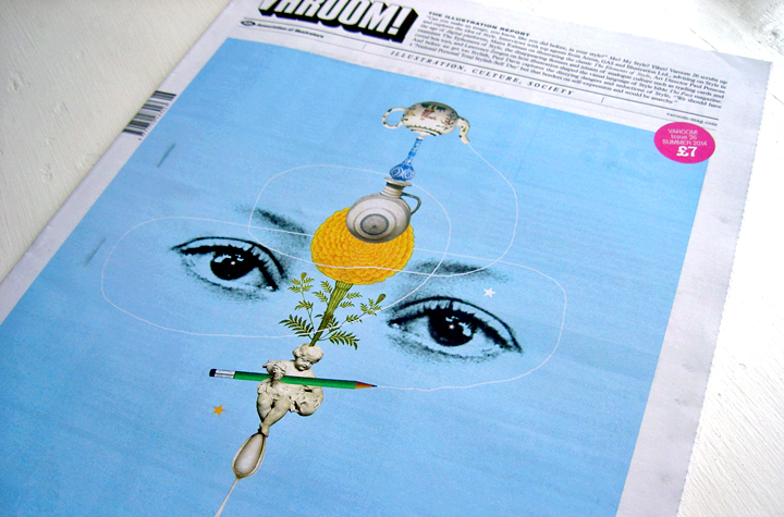
The Varoom Report: Style V26
Style
THE ILLUSTRATION REPORT Summer 2014
ISSUE 26
The Style issue endeavours to answer the unanswered questions revolving around ‘Style’, delving deep into its depths and challenging the definition of style, from typography to fashion, the preconceived ideas to the actualities, the creators to the observers.
Varoom gets under the skin of ‘Style’, from Creative Review Art Director, Paul Pensom’s examination of The Ephemera of Style – the disappearing flotsam and jetsam of analogue culture such as trading cards and cereal box toys, to the work of French street artist Horfee who is described as an artist who, “takes the expected norms of graffiti style and metaphorically proceeds to shred them through a mechanical mince-grinder to produce something more organic and unexpected.”
1.1 The Normal
‘Style’ is like politics – there’s no escaping it. I was reminded of this when reading a document from trend forecasting group K-Hole who identified a way of life, a ‘style’ of life you might say, called ‘normcore’. Being ‘normcore’ they argued, fitting into any situation, by being nothing special, leads to a feeling of liberation, enables you to belong in any situation. Inevitably not standing out, being unstylish is inescapably stylish. ‘Normality’ is a ‘style’. First lesson of ‘style’ – it’s a paradox.
1.2 The Elements of Style
This issue of Varoom is devoted to the issue of ‘style’. As a writer, my first port of call was The Elements of Style by William Strunk and E.B. White. My edition is the recent 2007 one, with illustrations by Maira Kalman. The book was originally written by Cornell University English Professor William Strunk Jr. in 1918, published in 1920 then enlarged and revised by Strunk’s student E.B. White in 1959. White was a staff writer and contributor for The New Yorker for nearly six decades. The Elements of Style is more than a set of rules, ‘style’ for Strunk and White is as much a methodology, a collection of practices, good habits – from correct grammar through to advice on revision and re-writing.
1.3 Faux-Pas
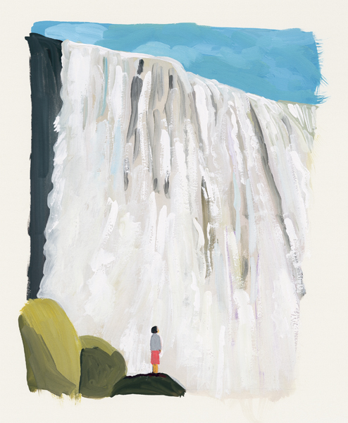
Maira Kalman’s imagery gently teases out the humour of the book, it’s occasional knowingness, with a visual humour that gently notes the eccentricity of such a prescriptive book on style in the 21st Century. The tone occasionally reads like one of those classic books of etiquette, not just describing best practice but letting the reader know the kinds of social signals being sent by poor ‘style’. I’m going to commit a faux-pas.
1.4 Drawing Attention
In the section “Colloquialisms”, the book advises, “If you use a colloquialism or a slang word or phrase, simply use it; do not draw attention to it by enclosing it in quotation marks. To do so is to put on airs, as though you were inviting the reader to join you in a select society of those who know better.’ Which brings us to ‘style.’ ‘Style’ is often a colloquialism, idiomatic, see Tristan Manco’s discussion of street artist Horfee, so let’s join the select society of those who know better – ‘style’ is getting quotation marks.
2.1 Gestures of Style
The quotation marks aren’t because we know the secret meaning of ‘style’. For this issue of Varoom we wanted to explore the many dimensions, surfaces, gestures of ‘style’. We wanted to imagine that we didn’t know what ‘style’ is, that we weren’t oppressed by the sense that ‘style’ something that corrupts our originality, is inauthentic, or alternatively that it’s the instrument of the illustrator’s originality, the idea of ‘style’ as the ‘voice’ of the illustrator.
2.2 Functions of Style
Like many ideas which have social, psychological, economic and artistic power, it’s more productive to consider not what ‘Style’ is, but how it functions, is used and deployed. There’s Swiss Style, International Style, Lifestyle, all the styles which pursue the universal, the utopian and the aspirational – ‘style’ as the aspiration to becoming something else, to becoming different. There are ways in which ‘style’ is portrayed, ways in which ‘style’ is discussed, ways in which ‘style’ is worn, ways in which ‘style’ is used as an instrument of power, ways in which ‘style’ is used to order and police expression, and ways in which ‘style’ is used to escape and create.
2.3 Style = Fart
While educators worry about the impact of context-free images via blogs and social sharing on the work of students, and young graduates worry about needing to find a style that’s identifiably theirs for commercial reasons, ‘style’ as an issue for commercial creatives is often regarded as an irritant. In the early 1990s designer Stefan Sagmeister famously hung a sign in his office – “Style = Fart”. Sagmeister explained in an interview in designboom, “it was the headline of a theory that style and stylistic questions are just hot air and meaningless. I discovered that this is simply not true. Through experience I found that if you have content that is worthwhile the proper expression of that content, in terms of form and style is actually very important. It can be a very useful tool to communicate that content. I don’t think that it is actually hot-air anymore.” Sagmeister’s original equation, ‘style’ as a smell, ‘style’ as a digestive process with an olfactory expression, had more ‘style’ than his conventional prosaic equation of ‘style’ as form.
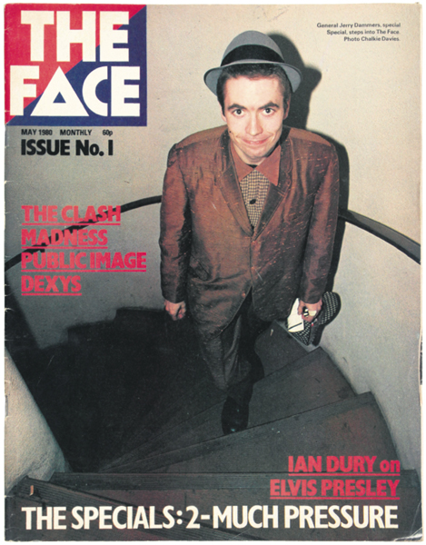
The Face, Issue No. 1, Photo by Chalkie Davies, May 1980
3.1 Decoding
Sagmeister’s early 90s anxiety came at the end of what was known as the Style Decade. And if there was one magazine that simultaneously celebrated ‘style’ as curiosity, of how young people sketch out an image of themselves in the world as ‘style’ it was The Face magazine. Lawrence Zeegen, no slouch when it comes to matters of sartorial ‘style’, unpacks the impact of illustration in defining ‘style’. In The Face, ‘style’ meant sensibility, a way of experiencing and understanding 80s Britain through the visual expression of youth fashion, illustrators and strangely for this reader, through typography. Neville Brody’s experimental typography trained the reader into regarding the contents of the magazine as something to be decoded by the likeminded.
3.2 Style has direction
The Face did have its critics. Dick Hebdige, from 1984 until 1992, reader in communications at the department of media and communications, Goldsmiths College, London wrote in an essay, “The Bottom Line on Planet One: Squaring up to The Face” that during the recession of the early 1980s the magazine promoted “consumer aesthetics and multiple style elites.” Hebdige was comparing the warm response by his students to The Face versus their tepid response to the influential photography magazine Ten.8. It’s arguable that in his comparative study of the two magazines Hebdige did what he accused The Face of doing to politics and culture – flattening things out. Fashion is flat, ‘style’ (derived from the Latin ‘stilus’, a writing instrument) has a point. Fashion is a slice of taste in a given period of time, ‘style’ has direction.
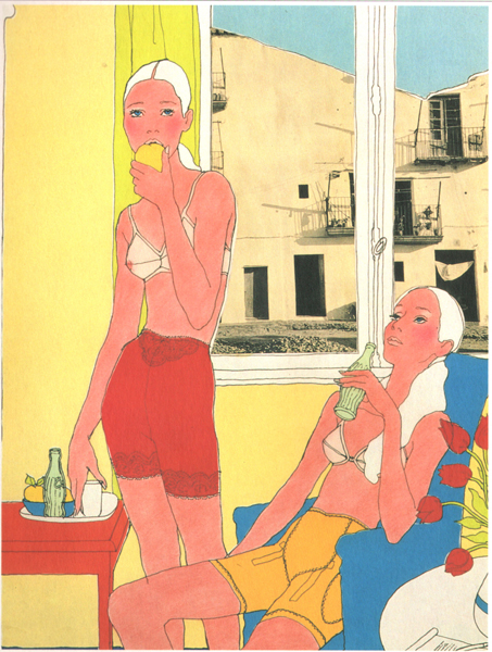
Antonio, French Elle, 1966. Courtesy of the Antonio Lopez Foundation
3.3 Visual Conventions
Zoe Taylor cites Dick Hebdige’s 1979 book Subculture The Meaning of Style in a feature exploring how in different ways fashion illustrator Antonio Lopez, and illustrator/artist Tom of Finland moved familiar visual codes into a different space – style as the unflattening of visual conventions. So ‘Antonio’ (the single name marks a ‘style’ in fashion) inserted photos into the background of his classic fashion drawings. Taylor writes, such as those of rundown houses pasted behind the two bored-looking white girls in the 1966 lingerie illustration), made for French Elle. Caranicas recalls how the illustration was originally submitted with a photograph showing police brutality at the civil rights protests in Selma, Alabama, in 1965.”
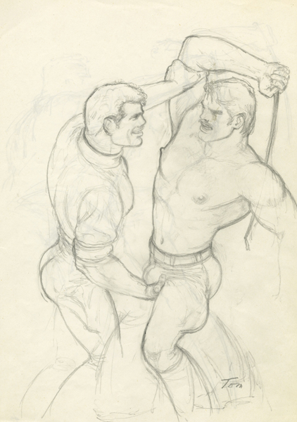
Tom of Finland, Untitled, 1978. Copyright Tom of Finland ® Foundation. Courtesy Stuart Shave/Modern Art, London
3.4 Inhabiting Style
These photos inserted in background windows disrupt not just the fantasy of the fashion drawing (the medium of the photograph is already a signifier of ‘realism’) but turn the whole drawing itself from a 2 dimensional picture into a 3 dimensional window on the world. Likewise Tom of Finland transformed the iconography of 50s muscular, heterosexual masculinity whereby invisible, oppressed gay men could become visibly gay through turning up the volume, amplifying a particular ‘style’. Taylor writes, “Tom’s drawings are considered to be the inspiration behind the leather scene and, more significantly, his unabashed representations of gay men are regarded as precursors of the 1960s pride movements. They were bold and politically charged at a time when, for instance, Supreme Court judges felt free to declaim homosexuality as ‘immoral’”.In this instance amplifying ‘style’ creates a way of inhabiting different kinds of personal and social relationships.
4.1 Confronting Style
In this way ‘style’ is often the way we encounter ourselves, or the strangeness we discover when we encounter ourselves as being different to ourselves – we’re not what we thought we were. Like Roderick Mills’ visit as an undergraduate student to an illustration exhibition, where the work left him feeling like he didn’t recognize himself as an illustrator – and not as the creative, productive, unsettling experience we have when confronted with something new and original. Mills remembers his thoughts on leaving the exhibition, “on my way home later I did have to wonder why I was on an illustration course, as what I saw on display of the great and the good of the industry left me disconnected. In contrast the book that I had only just bought earlier that evening, Plains Indian Drawings 1865-1935 by Jane Catherine Berlo, had an authenticity about the work, an openness in the drawings, which the stylistic mannerisms of the illustration work didn’t have for me.”
4.2 Style as Self-Plagiarism
In a 1973 interview with journalist Arthur Knight for Oui magazine, Alfred Hitchcock mused, “Who is it that once said that self-plagiarism is style? I think that sums it up in a way.” ‘Style’ is how we plagiarize ourselves, but paradoxically, and this is the real head-spinner, the self that Hitchcock refers to only emerges through being plagiarized. Think of ‘David Bowie’ and his self-definition via different versions of himself featured in Ian Wright’s spread from The Face opposite which expresses the idea of hair as the expression of self in Kevin Rowland, Vivienne Westwood and Bryan Gregory of The Cramps – hair-style as the soul.
4.3 Teaching Style
Adrian Holme, notes Susan Sontag’s essay ‘On Style’ where she reverses the traditional way of seeing ‘style’ on the outside, explores the architecture of Lincoln Cathedral, Sir John Soane’s pasticcio museum and an image by Matthew Richardson. “There is a certain tendency to avoid the troublesome question of style in contemporary art education,” writes Holme. He makes the case for teaching style, for not taking the notion of ‘style’ for granted, that studying ‘style’ is an analytic and creative, commercial and artistic benefit to students. Sontag’s reversal of the notion of ‘style’ remains to an idea of ‘style’ as something to be considered within the viewpoint of the ‘inside’ and ‘outside’, of interiors and exteriors, of shallows and depths.
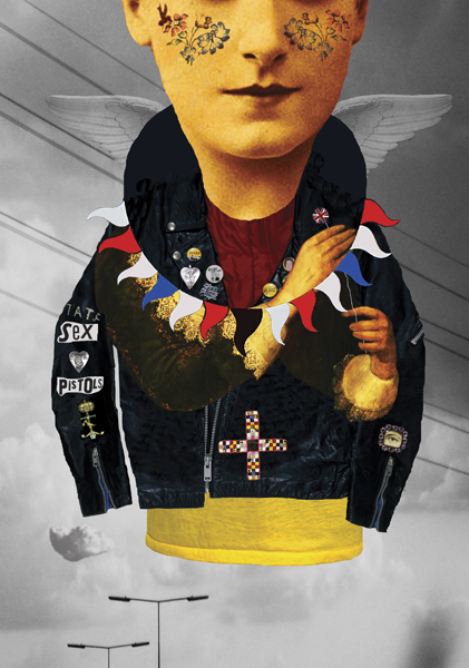
Matthew Richardson, Postmodern Angel, ©V&A, 2012
4.4 Naïve Camp
Holme moves this forward and is unquestionably correct regarding the teaching and debate around ‘style’ for illustration students, his observation regarding the lack of an interrogation of ‘style’ brings to mind the thought by Creative Director Michael Salu from Varoom 19 on Taste. It’s a thought I am occasionally haunted by. As a medium, Salu wrote, illustration, “might need to do more than vocationalise aesthetics and cultivate a broader palate of profundity for its own survival.” Does the lack of a critical debate on ‘Style’ in illustration for example, mean that illustration is merely mannerist, aping artistic techniques? To nod to another essay by Sontag ‘Notes on Camp’, that illustration is a naïve kind of Camp? That it’s a charming, seductive copyist?
5.1 Style as Look
If this is true, it’s partly because some Brands and clients often demand this, they want illustrators and photographers with a ‘style’, rather than sensibility, they want something that is ‘on-trend’. In the language of trend-forecasters K-Hole it’s illustration as the ultimate in ‘normcore’, something that fits in. It’s the idea of ‘style’ as a ‘look’, where ‘style’ crosses into fashion. Which doesn’t make it wrong, or bad, or immoral. It only becomes that when this kind of illustration practice is the only option for illustrators.
5.2 Not Obsessed Enough
In truth, we’re not enough obsessed by ‘style’. Argentinian author Jorge Luis Borges wrote a short story “Pierre Menard Author of the Quixote” about a writer who wants to write Cervantes’ Don Quixote in the 20th Century – not copy it but create it, to create even a few pages. How would you create not just the words but the ‘style’? “The first method he conceived,” writes Borges, “was relatively simple. Know Spanish well, recover the Catholic faith, fight against the Moors or the Turk, forget the history of Europe between the years 1602 and 1918, be Miguel de Cervantes. Pierre Menard studied this procedure (I know he attained a fairly accurate command of seventeenth-century Spanish) but discarded it as too easy. Rather as impossible! my reader will say. Granted, but the undertaking was impossible from the very beginning and of all the impossible ways of carrying it out, this was the least interesting.”
5.3 Style as Impossibility
‘Style’ is all too oppressive as possibility, as a limited palette, as an off-the-peg choice. When ‘style’ becomes something like an impossible task for a creative, such as in the story by Borges, it becomes seriously compelling. When ‘style’ is a matter of discovering your authorial voice it feels like an exercise in vanity rather than art. As our cover illustrator Matthew Richardson reflects on his practice, “Commissioned images had begun to feel overly ‘authorial’ and self-consciously ‘styled’ to the exclusion of finding new ideas and new ways of thinking about illustration and how it could work.” When ‘style’, when illustration escapes the ‘style’ it’s been allocated, things begin to move.
6.1 Removing the Scabs of Literature
First published in Paris in 1947, Raymond Queneau’s Exercises in Style told the same story in 99 different ways – a man being jostled on a busy bus, later he meets a friend who tells him his coat needs a new button. Beginning with ‘Notation’ and ending with ‘Unexpected’, rather than the performance of ‘style’ being a dead-end, this story of a man on a bus explores different directions in which ‘style’ takes the reader. Queneau wrote, “the finished product may possibly act as a kind of rust-remover to literature, help to rid it of some of its scabs.”
6.2 Dickens, Design, Sci-Fi
I found my own rust being removed by Lucienne Roberts and Rebecca Wright’s tightly conceived Page 1: Great Expectations asked 70 graphic designers to deliver the first page of Dickens’ work. As a reading experience, what starts as an experiment in style, soon becomes a work of sci-fi, each genetic variation of the design code resets your brain each time, taking you to the same but different place. It’s style as something generative rather than restrictive.
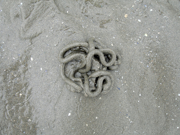
Lugworm’s coiled casting, photo by Peter Nencini
6.3 Style as Transitive
Peter Nencini pushes this generative idea of illustration idea in his experimental, The Emissions of Style looking at the emergence of ‘style’, of illustration, in the objects and things surrounding us. Nencini makes a similar point to that by Ina Blom, Associate Professor at the Department of Philosophy, Classics, History of Art and Ideas at the University of Oslo, writing for Art Forum magazine. Blom argues, “a real account of style must move beyond the tendency to always see style as an attribute of something else and instead see it as a transitive quality or as a form of being always in the making, acting of its own accord and not on behalf of some other project or quality.”
6.4 Style as Change Device
Style isn’t goal-oriented, or an object. When ‘style’ stops being a thing that we should aspire, to or own, or imitate, or something that’s timely and on-trend, of the moment, when style becomes a mechanism for changing us, for changing a way of making, that’s when ‘style’ gets creative. As Maira Kalman says in The Elements of Style, “Style is not about style. It is about questions and reading and listening to music and going to museums and taking walks. It is about life.” ‘Style’ doesn’t stand still, ‘style’ moves us in new directions.
Varoom 26 is available here
Back to News Page

