Varoom 36: the Rhythm of Materials
What do you think about your Materials?
Illustrators talk iPads, mono-printing and calligraphy/sign-writing in new Varoom 36.

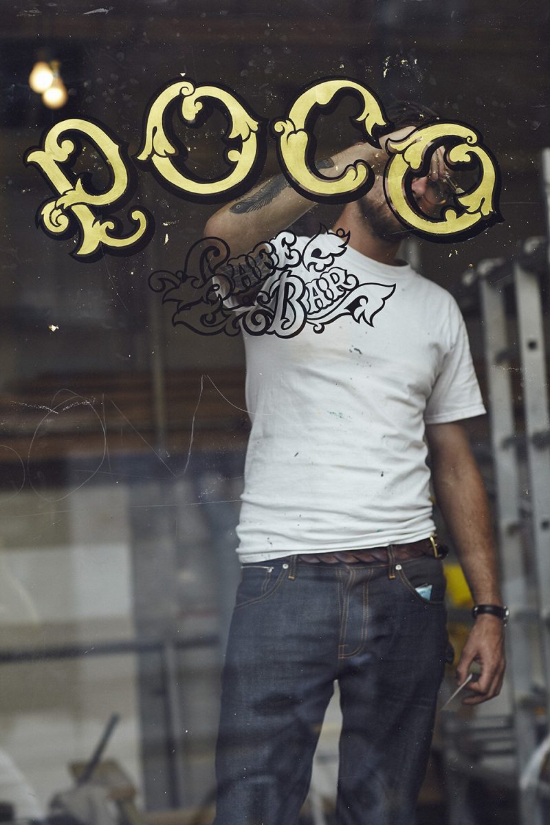
‘Rhythm is interesting,’ say letterer Ged Palmer, ‘When you’re working on technical lettering it is very exacting and laborious. Sketching a perfect Spencerian lettering piece where all the weights, angles and curves flow gracefully and all the positive and negative space is balanced is very time consuming. With calligraphy and brush lettering it is a lot more rhythmic. Loading the brush with paint or ink, pulling strokes.’
Palmer also comments on how sign writers talk about the ‘swing’ of a brush, ‘That’s the little flick you get when you are painting a curve – your hand stops and the brush just kind of completes the curve with a little snap and that’s where you get the energy and the bounce that makes work look so lively. You can never reproduce that with pixels.’

Also read about Brian Grimwood, ‘I started using the iPad about three years ago mainly to produce roughs for paintings, but then it took over,’ and World Illustration Award winner Marguerite Carne’s materials, ‘Drawing on location and capturing a fleeting moment requires the artist to be fast. I like using pencil because it is a tool which tolerates very quick and lively mark-making. I consider it crucial to draw on site; you come to a deeper understanding of your surroundings,’ in Varoom – the Rhythm issue
Back to News Page
