The Varoom Report: The Rules V21
The Report
The Rules of the Rules
THE ILLUSTRATION REPORT Spring 2013
ISSUE 21
There are Rules to be made and those to be broken. Illustrator Katherina Koall, on creating an image for children’s magazine The Loop, had one important rule – “remember that this was a piece of work for children – clients that are much smarter than I am.”
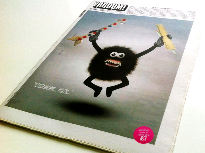
Geneviève Gauckler when considering her Varoom cover thought it would be necessary to find an object that represents Rules, “I thought of the ruler and an arrow, that kind of makes sense. Right now, I like using texture such as fur to com- pose the body of my babies! I still like when they look be- wildered, stupefied.” As editor John O’Reilly, concludes, “Creative rules are acts of imagination, and great illustration helps us find them.” Editor, John O’Reilly introduces this issue:
1.1 Rules of Attribution
LA Comedy writer Matt Roller recently wrote on Twitter, “It’s sad how Wile E. Coyote is remembered for his violence, and not for his brilliantly realistic paintings of tunnels.” Commenters on Twitter remarked wryly that the coyote and his style was years ahead of Banksy. The reason he was never remembered as an illustrator? No credits.
1.2 Wile E. Coyote, Illustrator of Space
For readers unfamiliar with the Warner Brothers cartoons, Wile E. Coyote spent his cartoon life trying to catch the Road Runner, and one of his most important tools was imagery – paintings. The Wile E. Coyote oeuvre mainly specialized in trompe l’oeil, images of roads unfolding to a vanishing point, which masked the edge of a cliff. Or alternatively the image on a canvas of an open road stretching into the distance, masking a wall. Wile E Coyote was a master of classic perspective, his imagery a perfect simulation of space, a street artist of the canyons and mountains of the American desert. His images which the Road Runner would run through tested the rules of reality. They are portals to what is known as the world of “cartoon physics”.
Marian Bantjes’ Spread
1.1 Rules of Cartoon Physics
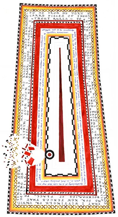
John Morgan, a Professor at Berkeley’s Haas School of Business, has collected a whole list of these laws which are really visual rules: “Explosive weapons cannot cause fatal injuries. They merely turn characters temporarily black and smoky”; “Anybody passing through solid matter will leave a perforation conforming to its perimeter”; “Anybody suspended in space will remain in space until made aware of its situation.” The image-maker creates images with their own rules. And these rules given to us in the image by the illustrator, train us, and help us to see and interact with the world in specific ways. As Marian Bantjes says in her piece Rules “every time I make a new piece of work I create a new set of rules.”
2.1 No More Rules
This spring, 10 years after its first publication, Laurence King release a new edition of design writer and critic Rick Poynor’s No More Rules: Graphic Design and Postmodernism. A casual flick through the book – the kind of thing you might have done in a bricks-and-mortar bookshop in 2003 – reveals an array of images from illustrators such as: Jake Tilson and his layered mysterious travelogue Breakfast Special; Chris Ware’s graphic novel Jimmy Corrigan which invited the reader to travel across the page in new encounters of text and image; Graham Rawle’s collaged novel Diary of An Amateur Photographer, whose cut-and-paste aesthetic expressed the diary/scrapbook form of the amateur enthusiast.
2.2 Reading versus Navigation
These works of illustration don’t feel dated – the experience of reading through Rawle’s book again feels thoroughly contemporary in the way it makes the reader attentive to the act of reading, and of navigation. In fact, Diary of An Amateur Photographer feels uncannily of the moment in the way that it positions the person holding the book, less like a reader and more like a “user” – in the way “user experience” is now a default idea – as you find your way around the page. Poynor’s book feels both dated and more relevant than ever.
2.3 Rules of Criticism
No More Rules stands out as a short-lived high-point of print-published professional criticism. At the very moment when design publications would begin to close, and design criticism and design writing courses begin to mushroom, Poynor was one of the few remaining commentators to make a living writing as a professional critic. No More Rules demonstrates writing around the image that is critically engaged in exploring what the image reveals about the world, and how a wider cultural understanding informs insight into the image. The first rule of criticism, and perhaps the only rule, one which Poynor exploits to the full in No More Rules is to find the rules of criticism, each time, in the work.
3.1 Rules of Listening and Friendship
Think back, if you can, to 2003. It was the year a young Harvard launched a software project called Facemash, which placed portraits of students side-by-side and asked users to choose “hot or not”. As of December 2012 son of Facemash has a billion monthly active users, and it changed the rules of ‘friendship’, and the idea of the ‘social’. Apple’s iTunes opened in 2003 and the facility to download the single would change the rules of listening to music – the given narrative of the album would slowly decline. And the world’s first illustrated weekly paper, The Illustrated London News, closed.
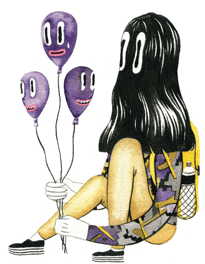
Andrea Wan, from the series Hamburgers, 2012
3.2 Celebrity versus Fictional Characters
Since 2003 the world has got more ‘social’ – though not in the older political sense of the word. Type “Illustration Blogs” into Google and it spits out 54,900,000. Results. Eminem topped the most popular search for Men list in 2003, Britney Spears topped the Women’s list while The Simpsons were the most popular fictional characters. The fact that illustrated characters topped the list is noteworthy, and echoes issues raised by Pictoplasma’s Lars Denicke and Peter Thaler in this issue. It’s also worth noting that the future-facing Google still finds it useful to maintain a category distinction between celebrities and fictional characters.
3.3 Context-Free Imagery
While we haven’t yet completed our exhaustive survey of the 54,900,000 illustration blogs (our intern is gaining invaluable experience), it’s fair to say they extend and confirm tendencies existing in 2003 – critical engagement around imagery and image-making is not a major feature. And there’s no reason why it should be, blogs can be virtual pinboards (Pinterest). On those with text, the official (or unofficial) press-release is sometimes the context for the images. Often there’s no context, or name at all. One of the rules we’ve lost from the age of professional journalism is ‘attribution’ and for readers and writers, a name is a useful context, information around an image.
4.1 Vibrant New Communities
It’s an issue that came up recently at a Crowdtalks event at the Print Club, one of the new, invaluable discussion platforms set up by recent graduates who want to extend the debate they have in college into their professional careers (The Limner Journal on illustration put together by recent Camberwell graduate Peter Willis and Alice Lindsay is another catalyst for debate). Run by Roz Edenbrow, Laura Gordon, and Matt Dreyer three Brighton 2012 Graphic Design graduates, they worked on two Brighton Graphic Design + Illustration exhibitions – Up To Now and Now What, and wanted to further develop the discussion-based events that took place at both shows. Both Crowdtalks and Limner are examples of how vibrant debate and ideas have been freed up since 2003.
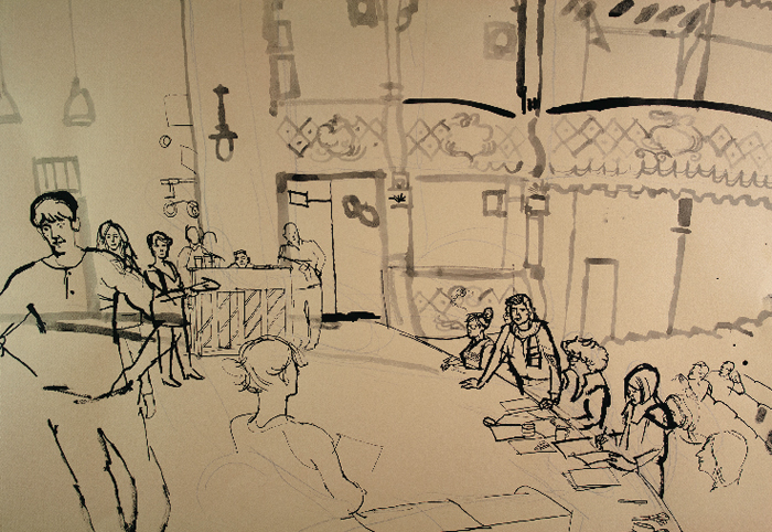
Lucida Rogers
4.2 Authors and Readers
The Crowdtalks debate around visual trends concluded with one member of the audience declaring that the trend she’d see like to see happen, is images being credited to illustrators on blogs. There was some debate around whether the lack of accreditation was linked to the idea that we are in the age of the “Death of The Author”, an idea and 1967 essay written by French thinker Roland Barthes which challenged the idea that we would find the ultimate meaning of the work in the “author” of the text, that the author is a final authority. Barthes famously concludes his essay with a neat soundbite of quotable symmetry – “we know that to give writing its future, it is necessary to overthrow the myth: the birth of the reader must be at the cost of the death of the Author.”
4.3 Interpretive Adventure
Barthes, or at least the body of ideas he was attached to, was influential in much of the work in Rick Poynor’s book. Engaging with the images in No Rules is an interpretive adventure for a viewer faced with the jagged arrangements of photos, drawing, and typography. And discussion after the Crowdtalks event argued that bloggers posting images without credits was an expression of this idea.
4.4 The Rules of Love
And there is something to be said for that, though its equally arguable that the lack of credits is a sign of other things: the low-esteem and value which people, even illustrators and designers, view commercial images (as Sam, in her sweet sub-Freudian wisdom says to Charlie in The Perks of Being a Wallflower, “Charlie, we accept the love we think we deserve”); that strictly speaking, while novelists, poets, playwrights got to be “authors”, designers and illustrators never even made it that high up the creative-food-chain, so it doesn’t matter much that we don’t get a credit; that a minimal critical engagement with images such as being aware of the image-maker is irrelevant to using images for inspiration; that the uncritical form of Postmodernism, with its view of history as a moodboard, is now simply how we relate to any image and object among the 59 million illustration blogs.
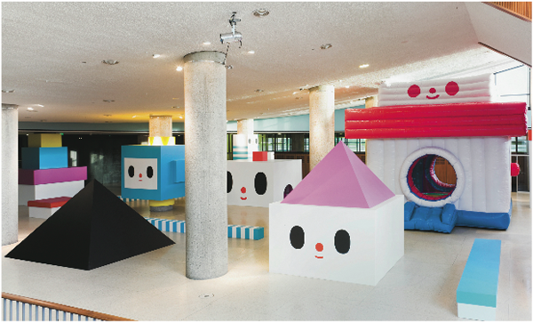
FriendsWithYou, Fun House, Prepare for Pictoia, 2009
5.1 Discovering the Rules
Technology changed the rules. Lars Denicke and Peter Thaler set up Pictoplasma in Berlin in 1999. They didn’t just chronicle and archive this emergent form of illustration, Pictoplasma publications, exhibitions and conferences established Character Art (a term they borrow form animation) as a new field of knowledge. Their Picto-Prophets essay details how this new species evolved out of the age of the internet: these lo-res forms were the perfect form for slow internet connections; with their lack of cultural detail, words, (simply shape and colour) they became what Denicke and Thaler call a “Graphic Esperanto.” These “smiling web icons served as friendly gatekeepers, happy monsters that were telling us not to be afraid of the unknown territories and help us overcome our technological angst.”
5.2 Discovering the Rules
If as Denicke and Thaler argue, Characters connected us to a global village, it was more like a slightly bonkers global kindergarten, like a montessori space where viewers were free to discover the rules around each set of characters whose meaning was entirely open. And in some ways the pleasure of these characters is that there was no meaning at all beyond the affect of the sheer rush of glee on encountering a character by say, Genevieve Gauckler.
5.3 Rules of Children’s Illustration
Meanwhile children’s illustration got grown-up. In 2006 Anorak magazine was launched by Cathy Olmedillas, formerly of style magazines The Face and Sleaze Nation, with Rob Lowe (Supermundane) as Art Director. Lowe, says Olmedillas (Anorak chosen by Jeremy Leslie in his Publications page) chose illustrators he knew who “did work in comics, fine art or graphic design, but for grown-ups.” Anorak changed the rules of illustration and created a thriving business and critically lauded magazine. The Huffington Post wrote, “Anorak is what would happen if Monty Python, Ralph Steadman and René Magritte decided to make a magazine for children.”
5.4 Structures of Thinking and Feeling
The people cited by The Huffington Post are illustrators/animators who have changed the rules a little. Anorak is a great example of changing rules which happen to be habits that over time have become rules which structure how we think and feel. Non-children’s book illustrators doing a children’s magazine subtly changes ways of seeing and reading.
5.5 Patterning Experience
Rules help us pattern experience, and anticipate what’s next, allow us to plan ahead. And the pleasure of breaking rules is not just a childish act of rebellion, though ‘childish’ acts of rebellion are essential events of growing up – breaking rules, change our relationship with the world, how we see things, just like animation and the Laws of Cartoon Physics.
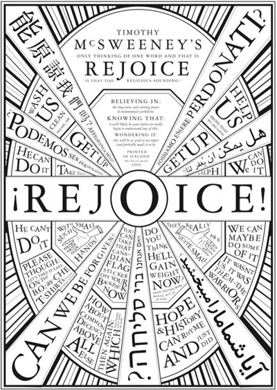
Timothy McSweeney’s Quarterly Concern issue no.30. Designed by Dave Eggers
6.0 Rules of Knowledge
Take for example McSweeney’s magazine. It’s conventionally argued that the idea of the “Literary” emerged in western culture in the 18th Century. The category we call “Literature”, or the Literary, confers the idea that there are certain kind of writing more culturally significant than others – analogous to the distinction between Fine Art and Illustration. The idea that the Literary contains some kind of truth, is also linked to the rise of science in the Age of Enlightenment, as defenders of the written word seek to maintain its value as a type of knowledge.
6.1 Shifting Rules of Reading
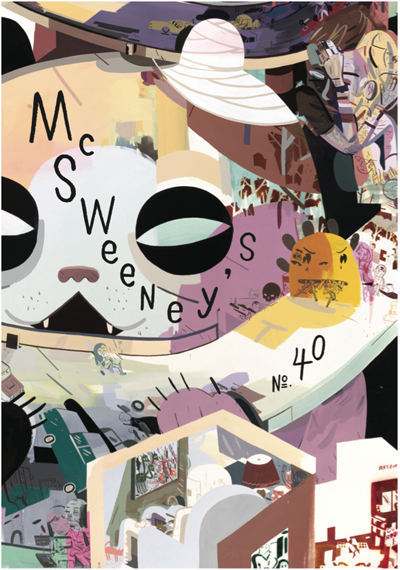
In the hands of McSweeney’s Art Directors such as Brian McMullen, the traditional hierarchy of illustration/designs relationship to the “Literary” is reversed. Imagery and design in all McSweeney’s is central to the experience of the words, provides the rules of how the reader is supposed to experience the stories.
Likewise the Madefire app offers a new way of experiencing comics, using the touchscreen to change how we navigate through the stories, creating something that changes how we interact with narratives. Whereas experiment with format used to be the province of the avant-garde, the digital-world, and especially the media of the touchscreen continually shifts the rules of interaction.
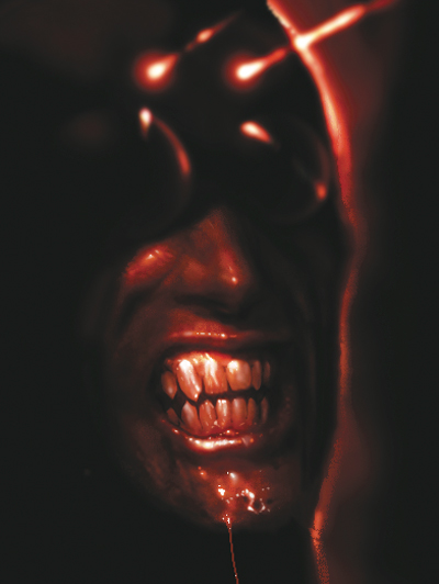
Liam Sharp,Captain Stone is missing… 2012
6.2 Fashion versus Creative Intelligence
It’s why another illustration book released in 2003 had a title that was wonderfully prescient – Hand to Eye, by Angus Hyland and Roanne Bell. The book looked at a trend in 2003 as there seemed to be a move away from computer-made imagery (which they documented in Pen and Mouse) to the growth of handmade imagery. The longevity of the image-makers in that book are a testament to the fact that the rules of fashion may change but creative intelligence is adaptive.
6.3 Becoming the Hand-To-Eye
The book’s title feels very 2013, in the era of the touchscreen, the Hand-to-Eye is increasingly everyone’s perception process – our environment is both tactile and visual. What’s more, the Hand-To-Eye is just a great descriptor of an illustrator, of the physiological intelligence of the image-maker. It’s a much more captivating idea than that of an “author”. Imagine the Hand-To-Eye as an illustrated character, as the archetype of the illustrator, it feels like an idea, a descriptor coming from illustration, indigenous to illustration, rather than literature. As illustrators know, the pleasure of creation is losing yourself in the craft, the discipline, becoming for a moment the line, the colour, the shape that gives rise to an image, an idea – when you find yourself in the zone of the Hand-To-Eye.
7.0 Rules of Interaction
But as technology is fast-changing the rules of how we interact with the world – the kinds of work we make, the different platforms it’s used on, how users interact with it – citizens will need trusted names to help us find our way through these different experiences. For example in our age of augmented reality, when the built environment is increasingly layered with images, either on our phones, or screens in the street or via the much-speculated Google-Glasses, we will need illustrators to help citizens navigate the space.
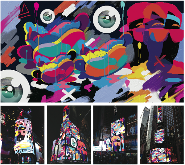
Live drawings onto digital billboards by Jimi Crayon, for the launch of Windows 8 and the Fresh Paint App
7.1 New Guides, New Rules, New Navigators
The rules of how illustrators see themselves as makers of imagery are changing, not just one kind of image-maker. I’m thinking of Jimi Crayon’s work for Windows 8, shown on Times Square, a virtual canvas scaling up the side of the building – in the future it’s not just Street Artists who will do this. While other illustrators create children’s books and magazines, the skill-set of children’s illustrators, helping people emotionally negotiate different kinds of social and spatial interaction will become as important as environmental designers. Or maybe it’s illustrators like Graham Rawle, Chris Ware or Jake Tilson who are master at showing us how to navigate space differently. And somewhere in that future where illustrators will be credited as the Guides and Navigators, Wile E Coyote will come out of seclusion, reinventing himself as a software illustrator, and Unit Editions will do the monograph, and Coyote will do a TED lecture (mostly facial expressions of futility, disbelief and resignation) someone will credit his work on a blog. There are always rules, rules of beginnings, rules of endings, it’s the stuff in-between that makes creating images interesting. That’s all folks.
Back to News Page

