The Varoom Report: Experiment V22
Experiment, Play, Adaptation
THE ILLUSTRATION REPORT Summer 2013
ISSUE 22
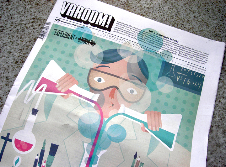
In “7 Thoughts on the Cult of the Sketchbook” Jane Stanton writes that the point of the sketchbook is it gives you permission not to come to conclusions. In “The New Wave Sci-Vi”, Bryony Quinn argues the power of the new scientific imagery is as a medium greater understanding – rather than understanding’s final destination. Marian Bantjes’ turns the sterility of the scientific experiment into an object of beauty, while Laurie Britton-Newell and Ligaya Salazar reflect on Memory Palace, the new V&A illustration exhibition that’s a Walk-In Book, “What does it mean to ‘read’ a story? How far can you push the format and still call something a book?” We wanted to write something conclusive about experiment, but creative experiment means no conclusions. Editor, John O’Reilly, introduces this issue:
1.1 Start Here
In three rows and five columns, animated Blue, Red and Yellow dots pulse on the screen on my smartphone. Pressing a button reveals in script the words “Tap Tap”, tapping it reveals another screen where a little red button appears, I press it and it shrieks, more buttons appear, jiggling like atoms, bouncing off each other, elasticating into concentric circles and exploding. It’s an app for Herve Tullet’s book Press Here.
1.2 Unlearning
The notion of the ‘childlike’ is a familiar one in conversations around creativity. Like the much quoted Picasso observation when visiting an exhibition of children’s art, “When I was their age, I could draw like Raphael, but it took me a lifetime to learn to draw like them.” It’s often referenced by artists or critics in support of a desire for pure expression, or some ‘authentic’ touchstone of creativity. But children aren’t the benchmark for visual creation, but what they are is a model for the illustrator as experiment. Drawing, image-making as experimentation, the pleasure of exploration. Experiment as play is a necessity for children as a way of adapting to the world.
1.3 Post-Nostalgia
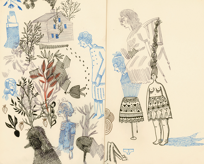
In this issue of Varoom our writers and illustrators grab the idea of Experiment in various visual genres, turn it round in their hands, poke it, sink their teeth into it, throw it away, see if it comes back. In her feature “Seven Thoughts on the Cult of the Sketchbook”, Jane Stanton unpacks the surge of interest in recent years around designers’, illustrators’ and now animators’ sketchbooks. Stanton acknowledges that in the digital age there may be a nostalgia for this physical symbol of unprocessed mark-making, but her argument suggests the sketchbook is a much more multi-facted tool.
1.4 Sketchbook as Interface
Stanton cites the sketchbook drawings of illustrator and animator Florence Miailhe, “who uses drawing as a method of kickstarting all her film projects, she uses pre-thought mark-making and experimentation in her work, ‘I like to go back and forth between the documentary and the oneiric, the quotidian and the fantastic.’” In Miailhe’s terms, the sketchbook is an experimental interface between different realities, between dreams and documentary, between the everyday stuff sketched at meetings or in cafes, and the wildest imaginings.
2.1 Freedom from Conclusions
Her account highlights the difference between experiment in science and experiment in the world of illustrators, animators and designers of all kinds. Scientists experiment to prove or disprove an hypothesis, some vision already worked out, while visual creatives experiment to discover. As Jane Stanton writes, “The premise of a sketchbook is essentially permission not to come to conclusions. Laura Heit says her sketchbook is like “…a book of starting places”. It’s a natural habitat for illustrators, animators and designers, indeed a lot of the examples in Heit’s book are essentially storyboards within sketchbooks – the beginnings of the process of editing of a short film.”
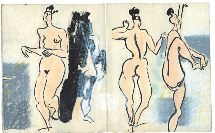
Florence Miailhe, Animation Sketchbooks, published by Thames & Hudson 2013
2.2 Visual Argument
Adrian Holme and Bryony Quinn examine the status and use of the visual in the world of science. Holme writes of the demise of the image as a tool for enquiry from the 16th to the 18th Century, as science superseded the tradition of alchemy, and the written word became the legitimate tool of argumentation. But Holme argues that we might want to reconsider the visual as a methodological tool, “perhaps visual image and visual argument, within science and wider serious discourse, might usefully assume a more significant role and could help counteract an excessively reductionist scientific approach.”
2.3 Anatomical Diagrams vs Gore
Bryony Quinn argues in her feature The New Wave Sci-Vi, that even when imagery is used in science as a representation of reality, things are not quite as clear-cut as they seem. “Anatomical diagrams in particular have a significant duality by being both a simplification and a complexity of the reality they depict. If you hold a fine line drawing of an exposed muscle, its covering skin flaps pinned back, and compare it against the cadaver, to the untrained eye it would be difficult to see flesh for the gore, the wood for the trees, the model for the reality.”
2.4 Understanding not Destination
More significantly, as science has firmly lodged itself in mainstream discourse and debate in vital public discussions around for example, new gene therapies and the science of climate change, a new kind of imagery is emerging as an essential tool in the public communication of science. “The effects of the scientific image,” writes Quinn, “are particularly resonating and behave as a passage for greater understanding – rather than understanding’s final destination.”
3.1 Realist Surrealism
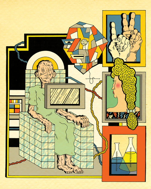
Illustrator Katie Scott who works with Jiggling Atoms, a project that brings together scientists and image-makers, believes the role of images in explaining science is vital, and the visual form illustration requires to communicate difficult science needs to go beyond the naturalistic, “some areas of science now are so distant from our personal relationship with the world, and images of it. I think this is the perfect time for scientific imagery to take a turn for the surreal and interpretive.”
3.2 Decontextualized Illustration
Laurie Britton Newell and Ligaya Salazar have re-created the traditional exhibition format as a visual experiment in Memory Palace, their major V&A show in London. Illustration in gallery spaces can be a deeply unsatisfying experience as the images produced by the illustrator neglect a core element of illustration – it’s a commissioned collaboration with client created with skilful sensitivity for the context of its display, whether on a newspaper page, or on a billboard, or on fabrics for clothes or interior design…In a gallery it becomes ‘art’, deprived of communicative context.
3.3 The Static Image
“One of our challenges,” write Britton Newell and Salazar, “was the complexities inherent in curating exhibitions of graphic design and illustration. Printed matter designed for everyday use, to be handled and flicked through, has suddenly become static and precious once moved into the gallery space. Works are taken out of their original context, isolated, framed and put on a wall or inside a case.”
4.1 Experimental Narration
So they asked author Hari Kunzru to write a story (Memory Palace), and then commissioned 20 graphic designers and illustrators to create a Walk-In book for the exhibition space. The image-makers pushed the narrative forward, and in their curation of the space, Britton Newell and Salazar pose questions about the relationship between text and image. It’s an experiment in reading and storytelling in an age where we are familiar with dipping in and out of different formats and media.
4.2 Story Fragments
The idea of the Walk-In book suggests a different kind of reading experience, a more mobile one that offers opportunity to illustrators. What kind of work could I make that generates different but connected kinds of imagery for people at different moments in time? What kinds of fragmented visual storytelling could I create for a smartphone for example that is triggered by different locales or places? And brands should look to illustrators to narrate city spaces in more interesting ways than billboards. Just as Blackberry sponsors Mad Men on UK TV with ‘bumpers’, commercial clients might want to think of engaging Paul Davis or Rachel Gannon, or cover artist Stuart Kolakovic to create entry-points for visual stories as people wander through a city.
4.3 Non-Linear
Experiment means opening up a given way of doing things, like the shimmering, backlit, technological forms of Energy Flow by studio FIELD, an interactive story for smartphones and tablets. “Energy Flow,” writes our new Motion Contributing Editor Shane RJ Walter of onedotzero, “is a very modern ‘film’ masquerading as an app: a pure experiment in graphic animation, non-linear narrative storytelling with generative software and a startling multi-layered aesthetic at its core.”
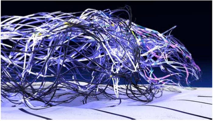
4.4 Storytelling Software
To navigate the story you touch a screen and by ‘spinning a top’ you are led to a different animation. It’s a subtle shift for visual storytellers where narration of the authorial voice is replaced by the navigation delivered by the software and the users’ spinning of the top. “Our big research task was to design our film composer software,” explain FIELD’s Marcus Wendt and Vera Maria-Glahn, “basically finding rules for composing films and soundtracks in an automatic system. After various attempts we based our approach on the classical Greek drama structure and the 8 basic story plots. Besides the traditional structure (exposition, development, climax, falling action, resolution) we’ve also identified a select number of meaningful re-arrangements of these phases.”
4.5 Pushing Pictorial Boundaries
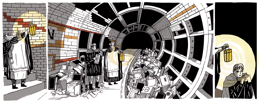
At points it is literally a riot of colour alluding to the London Riots, then gives way to biomorphic forms, then late 1990s pixelated displays, then the web servers visualised in shiny, shadowy, ‘corporate blue’. It’s formally and visually fluid. Just like future illustrators need to become, as they not only make pictures and tell stories, but make the software that makes pictures and tells stories. Andrew Hall unpacks the experimental code-writing project at CSM that encouraged students to think of creating software as creative opportunity for image-making. “It introduced coding as a way to experiment with and push the boundaries of the pictorial,” writes Hall, generating “critical thinking about developing a pro-active relationship with technology.”
5.1 Zig-Zag
Creative experiment is never about the end-result, it’s about being attentive to the making – in other words casting a cold eye on our habits of mind, habits of making, which at worst can become habits of dreaming (the history of psychoanalysis for example was about dealing people who were locked into the same dream, see Slawa Harasymowicz’s The Wolf Man, Varoom 18). Anne Howeson and Catherine Anyango take us through the steps of their Visual Research project at the RCA. Less a series of steps and more like a zig-zag, their exercises are designed to shift image-makers out of their familiar linear paths of image-making.
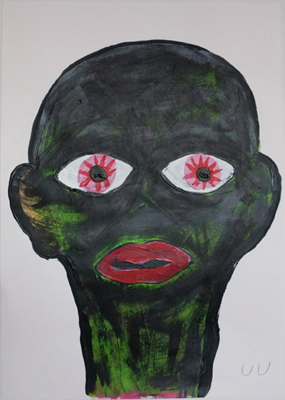
Yu Yu
5.2 Embracing the Random
Visual Research for Howeson and Anyango is about shaking up someone’s existing visual vocabulary to give students access to a different visual language. Anyango describes how photographer and filmmaker, Jacob Robinson used his established brief but took it somewhere different, “his response to the ‘Object’ brief was to ‘clinically document random objects that I found in my room …and an unintentional intimacy came out of that.’ Working laterally within his photography practice allowed him to create work that he immediately recognised as ‘new’ – but the key word is ‘unintentional’. By asking them to use new and different versions of their languages, they are able to come up with unexpected work that they were unaware was accessible to them.”
5.3 De-naturalizing
Experiment is always about shifting, unmooring, our sense of self. As Anne Howeson says of the briefs in Visual Research, “when approached playfully, not literally, new ways of thinking emerge – but it’s hard to find a solution that feels natural. Which is the point.” Experiment should de-naturalise. In this way useful creative experiments are about trying for a moment to erase the inward-looking aspect of making pictures, where illustrators refer to their familiar ideas of how to make an image, or their understanding what an image is, or what a story is. Or an unchanging self-image of what an illustrator is.
5.4 Experiment as Play
Experiment is about ‘playing’. As education researcher Brian Sutton-Smith argues in the Ambiguity of Play, play is how we introduce the accidental, the random into our lives, it’s a means of evolutionary adaptation, a controlled space in which we respond to a changing environment. By trying things out, by opening ourselves up to uncertainty, we establish new, fresh, creative and psychological connections. In a world of change, illustrators need to play and experiment in order to adapt and survive. Play and experiment has a biological, psychological, and for illustrators, a professional function. And it just makes life more interesting.
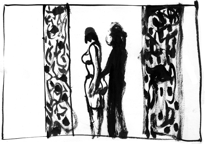
Sandra de Matos
5.5 Becoming Different
Jane Stanton’s quote from Picasso at the beginning of her sketchbook feature outlines the necessity of letting go, of letting your experimental image-making lead you to different creative and psychological places. We don’t need to be locked into a rigid, monolithic sense of what it is to be an illustrator, and we need to let go of that seductive but unhealthy idea of finding some deep, unchanging, inner self. “Know Thyself” said Socrates in a neat little motto, and with that one phrase he unknowingly launched the self-help publishing industry and a genre of daytime TV. For an image-maker the motto is “Unknow Thyself”. As Stanton quotes Picasso, “…I picked up my sketchbooks daily, saying to myself: ‘What will I learn of myself that I didn’t know?’ And when it isn’t me anymore who is talking but the drawings I made, and when they escape and mock me, then I know I have achieved my goal.”
Back to News Page

