Paul Bowman
It is with sadness that we let you know that Paul Bowman has died after a short battle with cancer. A former Board Director at the Association of Illustrators Paul helped to establish Varoom magazine in 2006 and sat on its first editorial board, being further involved up to 2014.
An artist and illustrator, Paul worked across print, animation and interactivity for various international clients including the Science Museum, Atlantic Records, Nickelodeon, London Zoo, and United Airlines. He was formerly the Course Director: Illustration and Visual Media at London College of Communication UAL, and later a Visiting Lecturer at University for the Creative Arts Epsom.

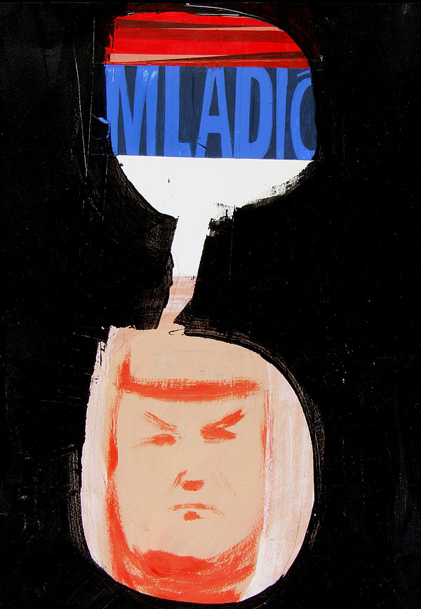
An Illustration of General Ratko Mladic, the Bosnian Serb Commander responsible for the Srebrenica massacre, Paul Bowman
AOI Deputy Chairman, Roderick Mills says, ‘I had the privilege to work with him over the past three years as the External Examiner for the BA(Hons) Illustration course at the University of Brighton. We had a mutual desire to support both traditional forms of illustration whilst imagining what illustration could be. Not just what it was. Paul certainly had strong opinions which he wasn’t afraid to express in the truest sense of a critical friend to illustration.’

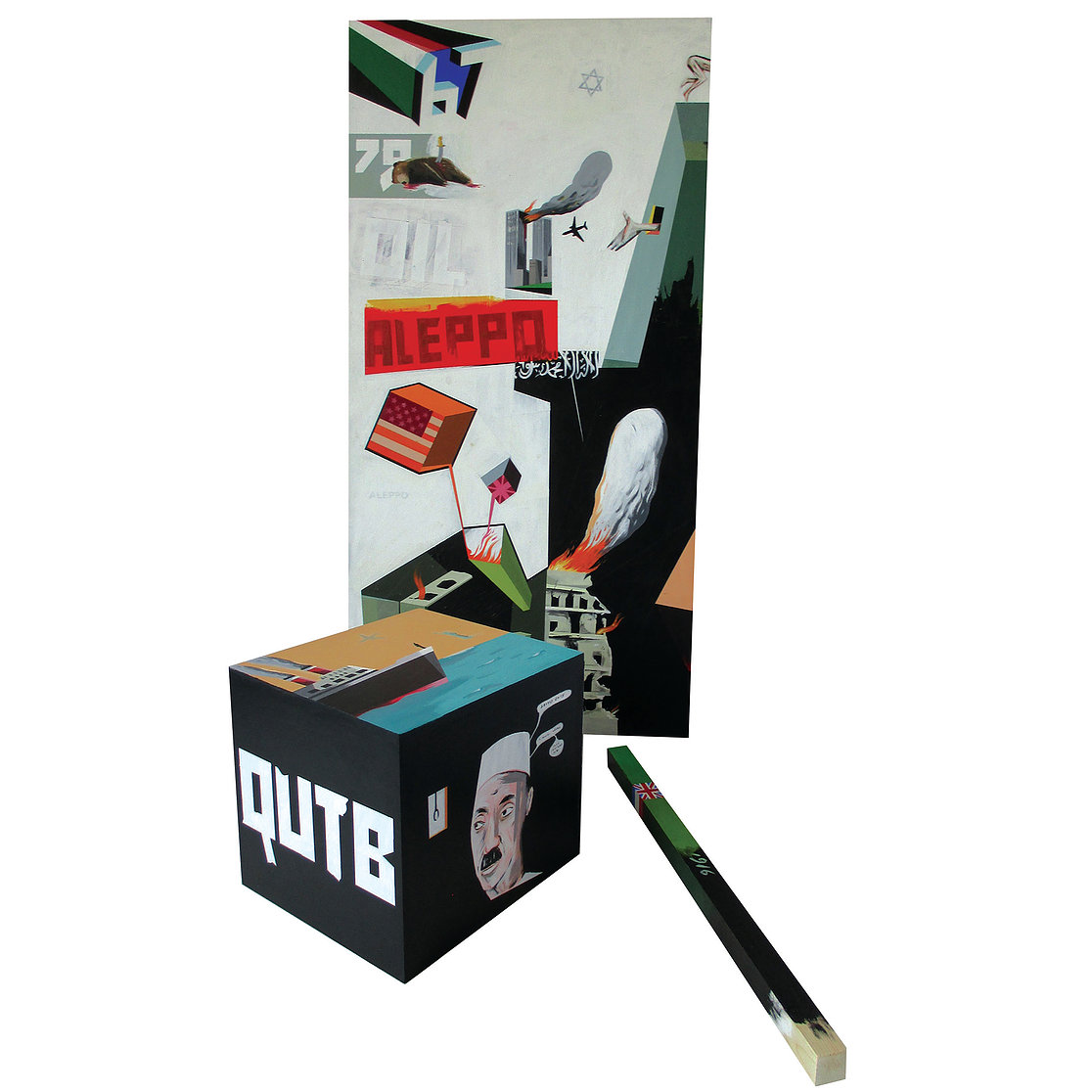
Der Kessel. Shortlisted for the World Illustration Awards. A three piece sculpture examining the dominant issues around the destruction of the Middle East, Paul Bowman
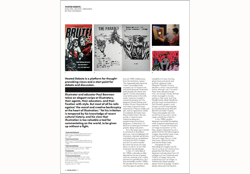
Paul published a Manifesto in November 2017 which built on his thought that ‘one of the key purposes of the illustrator is to bridge the gaps between the elitist, opulent academic culture of large areas of fine art practice, the historically manacled, fetishistic practices of sections of within graphic design and commercial plagiarism and moral bankruptcy of swathes of advertising’. This linked to when Paul contributed to Heated Debate, a platform for thought-provoking views and a start point for debate and discussion in issue 08 of Varoom, published November 2008.
He took an elegant swipe at illustrators, their agents, their educators, and their obsession with style in EDUCATE, AGITATE, ORGANISE. Although his irritation was tempered by his knowledge of recent cultural history, and his deeply held view that illustration is too valuable a tool for commentating on the world, to be given up without a fight. Paul’s piece is reproduced in full below.
HEATED DEBATE: EDUCATE, AGITATE, ORGANISE (Varoom 08 2008)
BY PAUL BOWMAN
Around 1998 I drifted away from the illustration ‘scene.’ This happened partly because I wasn’t as professionally successful as I’d hoped to be, and partly because I’d become disillusioned with clients and agents. I’d also discovered a more fertile scene in the U.S.A., where I became involved in interactive projects with the designers Durrell Bishop and Andrew Hirniak. My paintbrush and tubes of gouache were replaced by a Wacom tablet and pen, and an application called FutureSplash Animator (now Macromedia Flash). My new guides in creativity were interactive designers, programmers and product designers. Furthermore, I’d become increasingly involved in graphic design education.
But a few years ago I started to contribute to illustration seminars, met and debated with illustrators, attended exhibitions, submitted work to competitions including the AOI’s Images, and lent my work to books. But what has struck me most about my return, is how little illustration has developed.
In fact, I’m reminded of the 1980s: a decade so often depicted as the era of greed, cocaine, pinstripe suits, mobile phones and gentrification. But I also remember another 1980s: the decade of the miners’ strike, marches against apartheid, rockabilly turf wars, hip hop, ghost towns and social and political upheaval under Margaret Thatcher. It was a decade in which I was politically active, although not in my work – there never seemed enough time, nor enough money. And yet others managed to include politics in their work: Sue Coe, Gerald Scarfe, Ralph Steadman, and the visual commentators in Paul Gravett’s graphic novel Escape, and the long forgotten but excellent Brute by Malcolm Bennett and Aidan Hughes. These were people who had something to say, and in some cases, something to fight for.
In the 1990s, graphic designers reinvented themselves while illustrators stood back and watched. Through the discovery of image manipulation on the Mac, graphic designers found a perfect tool for the hallucinogenic imagery required by house music and the ecstasy generation. Text and image, like our minds and music, became blurred; and Neville Brody fused.
Alongside this new technological imagery was the rise of a critical commentary from people like Rick Poynor, and designers and educators from US colleges such as Cranbrook and CalArts, all eager, along with publications such as ‘Émigré, to intellectually dissect graphic design and its language. Graphic design advanced and became ‘serious’ by building a theoretical and contextual base through the fertile investigation of ‘authorship.’ Graphic designers crossed boundaries and moved into a range of ‘territories’ not traditionally theirs.
Illustrators wondered how they could involve themselves in this new computer-driven, creative gold rush. Most decided the answer was in the application of filters, layers and style. Then as now, most illustrators only understood visual dexterity, the demands of their clients, monetary gain and fame. Illustrators did what illustrators always do, they metaphorically went back to the drawing board, seeking solace in the familiar, the known, the safe. They looked inward when everyone else was looking outward.

DICHOTOMY
In 2008, I’m still witnessing similarities with the 1980s: an abundance of commercial opportunities; an advancing economic downturn; a style-over-content-ethos. But unlike the 1980s, I don’t see illustrators doing one of the things we do best: commentating. I only see conformity and replication.
For me, there is a moral and creative bankruptcy amongst practitioners, from the trendy to the established. I don’t worry that illustration is about to enter into a recession; it has been in a creative one since the 1970s. Even if one embraces style and media as an end in itself, why is there so little in the way of sound, movement, light, sculpture, programming, politics and cultural commentary coming from illustration? Some of the things that are enhancing, illuminating and advancing creativity elsewhere, are ignored by us.
My contention is that good creative work sheds light on something not seen, something not known. It causes us to re-evaluate our lives, our society and ourselves. Good creative work challenges the viewer to question things. The subject matter is served by the style not the other way round, and the first question asked should be – is the subject matter any good?
As I look at illustration and illustrators, especially those over 30, I have to ask – where is such work? Where are such people? Inevitably there is a dichotomy here, professional work does not allow for personal indulgence, and of course there is the mortgage to be paid, the kids to be clothed, the car to be maintained. Perhaps some of us older illustrators have become greedy, settled, complacent. Perhaps we have stopped investigating, looking and caring. Is it really impossible to be active and successful commercially whilst occasionally producing work that has nothing to do with supply and demand? Work that comments, provokes and changes; work that says something other than look at my skill.
COMMODIFICATION
The problem lies not purely with illustrators, part of the blame can be attributed to agents. There is an intensive farming of illustration by agents (don’t be fooled by false anarchy and the stylistic progressiveness of some) with their wallpaper books and their manuals of best breeds and stables of style. I accept their fiscal necessity and the protection they provide to illustrators, but where are the counterbalances? Where is our Fluxus? Our Situationists? Our Andy Warhol and Tony Wilson Factories? Where are the agents of change?
And what about the increased output of superficial journalism largely produced by academics seeking to fulfill their research quotas? Academia is the one place where we should see real enlightenment, yet mostly we are faced with an MTV approach to illustration, leaving out any real historical and contemporary contextualization, or any global or cultural meaning.
How many more books showing us another fashion parade of illustrators with their lists of clients and working structures, do we need? Why do we suffer the ‘how to be an illustrator’ books that advise us on areas of operation, equipment and style? Is this not just further commodification of an art form already packaged and stylized into ineffectuality?
Our structures are outdated, our approaches parochial, our heroes irrelevant. We are painters and decorators and when theorists turn to me and ask, what is the point of illustration? I’m unable to show them enough examples of contemporary, thought-provoking work to answer them. We illustrators will probably be forced to politicize now, as economics curtail our earnings, commission cannibalism takes hold, and we finally realize that the refuge which is higher education is close to bankruptcy. The last two decades in illustration look as if nothing has shifted in the world – politically, culturally, socially or creatively.
Over the next year or more, like a large percentage of the world, we will understand that injustice has a sharper edge than image banks, aesthetically challenged art editors, and not getting that Nokia billboard. Look around you, and if you don’t like what you see, comment. Embrace other media and have the guts to still call yourself an illustrator. Find something to believe in other than style and fashion. ‘Wake up, wake up, don’t nothing come to a sleeper but a dream.’
Back to News Page
