Nostalgia – GWR’s Five Go On A Great Western Adventure
Taking Enid Blyton’s Famous Five as the backbone of the ongoing campaign for GWR, the instant nostalgic hit of the stories and Eileen Soper’s distinctive illustrative style have become a success for GWR and Electric Theatre.
You’ll have seen the campign on TV, cinema and in print, and as the Nostalgia issue of Varoom launches, here James Sindle, Co-founder and Creative Director of ElectricTheatre Collective, takes us through the project and its process, while later we ask Mike Bell, Executive Producer of Friends Electric, ‘how effective is utilising nostalgia in business terms?’
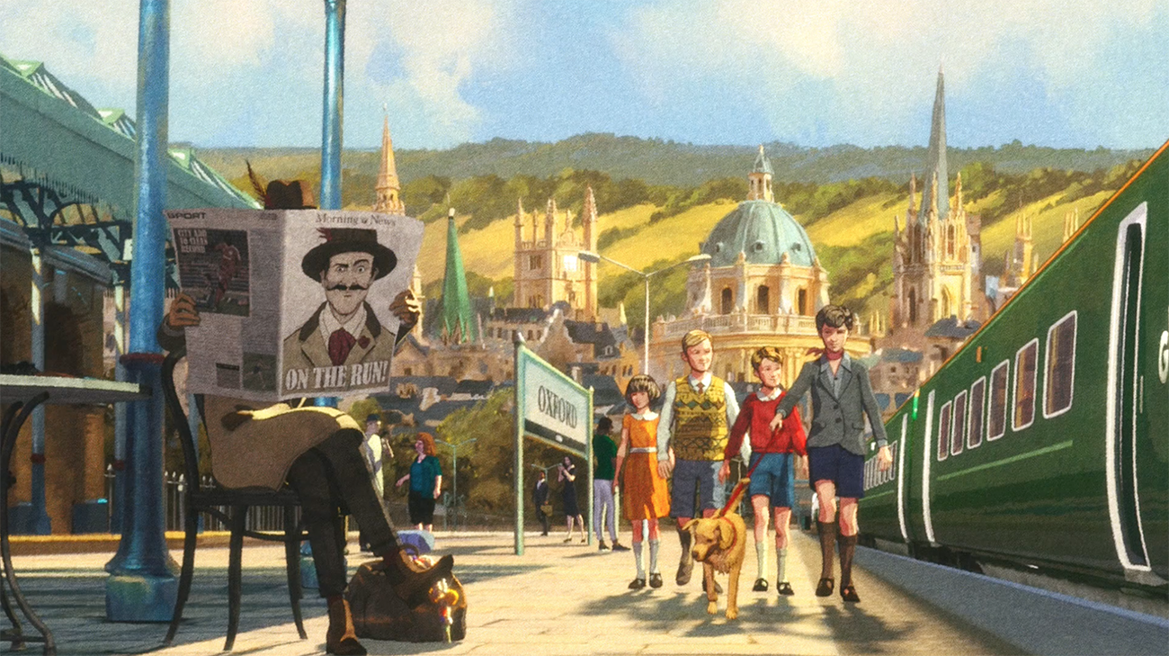
Still from Five and Missing Jewels GWR campaign
Paddington Station stands as the nostalgic hub of GWR’s brand, with its original offices still towering above the station on its east side. Whether it’s the start of your journey or you are coming to the end destination, travelling to or from this iconic station has emotional connotations. It could be that day out in London, or travelling to a holiday in the West Country, but for Londoners, or people from the West counties, GWR means something. Regardless of the destinations, the motion of train travel evokes a nostalgic feeling. From the creative conception, all aspects such as the storytelling and illustrative execution needed to work in harmony to touch the hearts of its audience.
Enid Blyton’s Famous Five was chosen to be the backbone of the campaign. The stories are written with adventure as the main theme, something GWR wanted to emphasise. Whether heading East or West, you were in for an adventure when you stepped on to a GWR train. Not only did the stories of Famous Five help drive the story behind the commercials, the distinctive illustrative style of Eileen Soper became the inspiration for the modern, animated version we produced for the campaign.
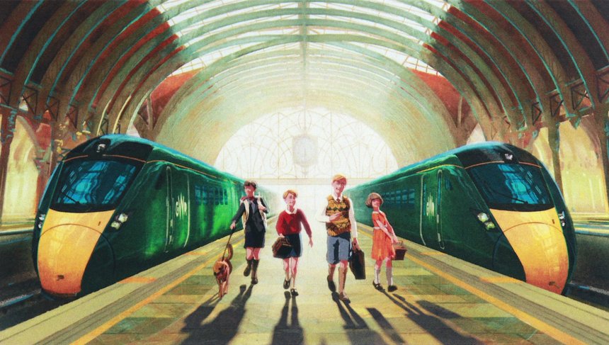
Still from GWR Five Go On A Great Western Adventure
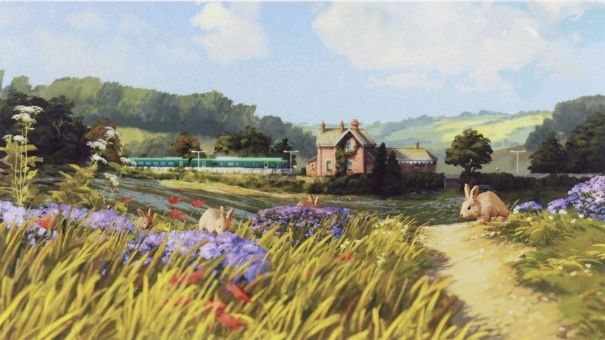
Our first task was to scrutinise the illustrations in the books. We didn’t want to replicate the style completely, but create one that lent itself to moving image but had all the nostalgic characteristics of the original illustrations. It was in picking apart those original drawings that we found the basis of our design, from the line work to its weight and colour. We could delineate where line work was used, and in some ways more importantly where is was not used. We could see how block colours could sometimes spill over the boundaries of the line work, and take inspiration from the choice of colors, facial expressions, poses and compositions. We then started the process of trying to create a style that could be animated digitally, but have a final look that felt hand drawn, or illustrated. There are so many animations in the world of digital animation that fail to succeed in their intentions to look 2D, and this gave us the motivation to succeed.
We focused on the line work, textures, rendering style and the heavy post processes applied in the compositing stage. It took no less than 25 rendered passes to get the characters looking as they did. Once the animation was approved and rendered, we decided to draw all the line work for the faces by hand. It was this touch that really made the characters feel appealing, and helped give the nod to Eileen’s original styles.
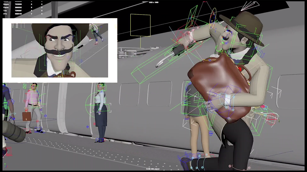
Process from Five and Missing Jewels GWR campaign
Aside from the characters, all the environments were generally illustrated matte paintings, projected onto multiple cards in 3D. The art direction of the environments went through lots of iterations, with close attention to colours and compositions. The choices of landmarks that people had emotional ties too in each scene was important also, as it was this that kept things nostalgic.
These environments were then composited with the characters, but there was still one final touch to go to create the right look. After scrutinising the printed illustrations in the old books, it was clear there was a very strong aesthetic that ran through all the drawings ‐ the artifacts created from its mass produced printing style. A distinctive rosetta pattern was visible from the CMYK printing process. These days, the resolution of printing makes it invisible to the naked eye, but 40 to 50 years ago this pattern was very apparent and became part of the illustrations visual style. We printed every single finished frame of the advert, 25 per second. We printed them at 11 cm wide, and then we rescanned each individual frame back to 2k thus enlarging the small prints we made, which in turn enlarged the grain of the rosetta pattern of the CMYK colours. This gave the final image a very unique feel. Not only did the grain become apparent, but the process of printing gave us so many more unintentional details. The way the colours bleed into each other on edges, and the way the intensities flickered frame to frame.
We are extremely pleased with the end result. A perfect mix of digital and analogue.
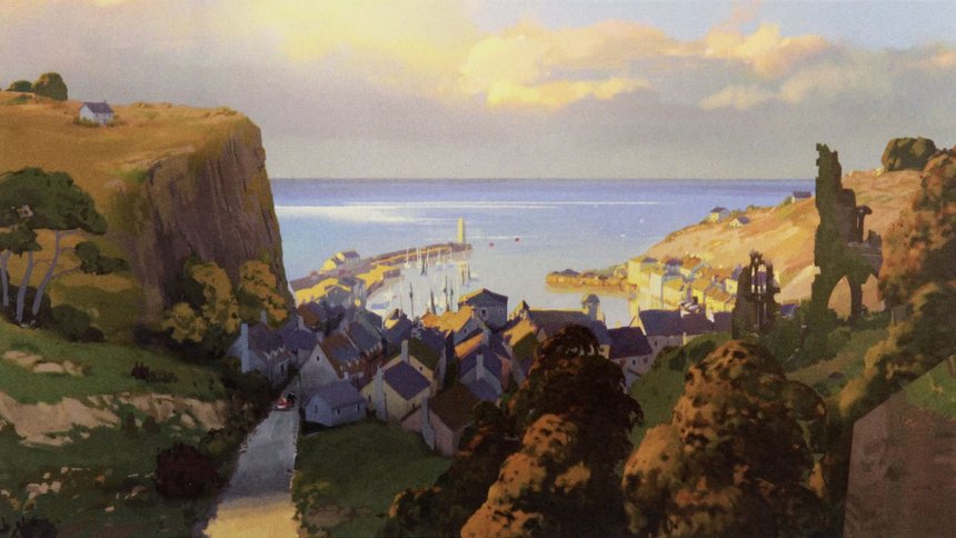
Still from GWR Five Go On A Great Western Adventure
Mike Bell, Executive Producer of Friends Electric, responds to our questions on the campaign, the use of nostalgia and potential ctiticism of it.
How effective is utilising nostalgia in business terms?
For me, nostalgia is a kind of unconscious ‘director’s cut’ of our past, a personal selection of memories that carry positive associations, and some of our most powerful nostalgic memories involve the characters we loved in childhood. Friends Electric is in the business of helping our clients engage audiences through beautifully produced animation, often using character based storytelling, so nostalgia is a really useful element for our directors to use.
Still from GWR Five Go On A Great Western Adventure
Were you conscious of avoiding any criticism of nostalgia when creating the GWR campaign?
Bringing nostalgic characters to life in a modern context is challenging because you’re tapping into the collective nostalgic memories of a wide audience, so this must be handled carefully. Our brief was to create a version of the Famous Five that carried the appeal of the original illustrations while making them feel truly contemporary. Our director Pete Candeland and the Friends Electric team approached this by undertaking detailed research and design exploration in order to remain faithful to the original illustration, while also introducing technological innovation to deliver the contemporary feel. For me, the results have a lightness of touch that feels both authentic and new.
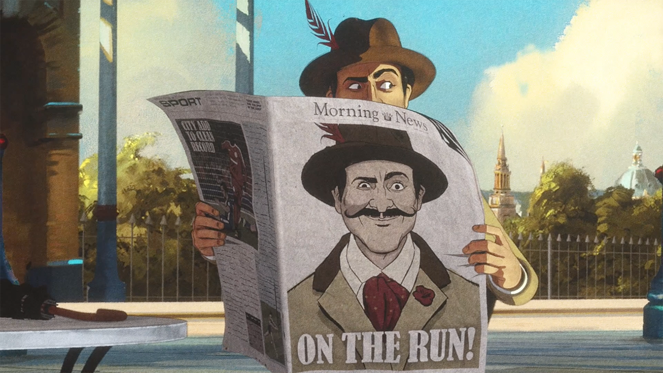
Still from Five and Missing Jewels GWR campaign
Would you use nostalgic elements for a campaign again?
In our collaboration with adam&eveDDB, we had the privilege of working with an agency who had a strong sense of how the Famous Five characters should be brought to life in relation to the GWR brand. They approached the entire campaign with amazing sensitivity and fun. We would absolutely work with nostalgic characters again providing we have the opportunity to collaborate at that level.
Thanks to Nathalie Rubin at ElectricTheatre Collective
Varoom Nostalgia issue
Back to News Page
