Illustrator of the Month – February
Alongside welcoming a collection of very awesome new members this month, we feel it is important to celebrate those that have supported us the longest! First to appear in our minds, Illustrator and artist Toby Leigh who has been a well respected and consistent member for just over TWO decades!
When looking through his extensive catalogue of works its immediate to recognise Toby’s quick wit and satirical language which we have all grown to know and admire. He has won countless awards including receiving a WIA research category award for illustration of Barbarba Lisicki, and shortlisted for his genius slapstick ABC for Adults picture book. Toby is represented by Member Agents CIA and with a studio in Hackney, based not too far from us in the big smoke!
We want you to discover more about why we find Toby so remarkable, and you can read about this below:
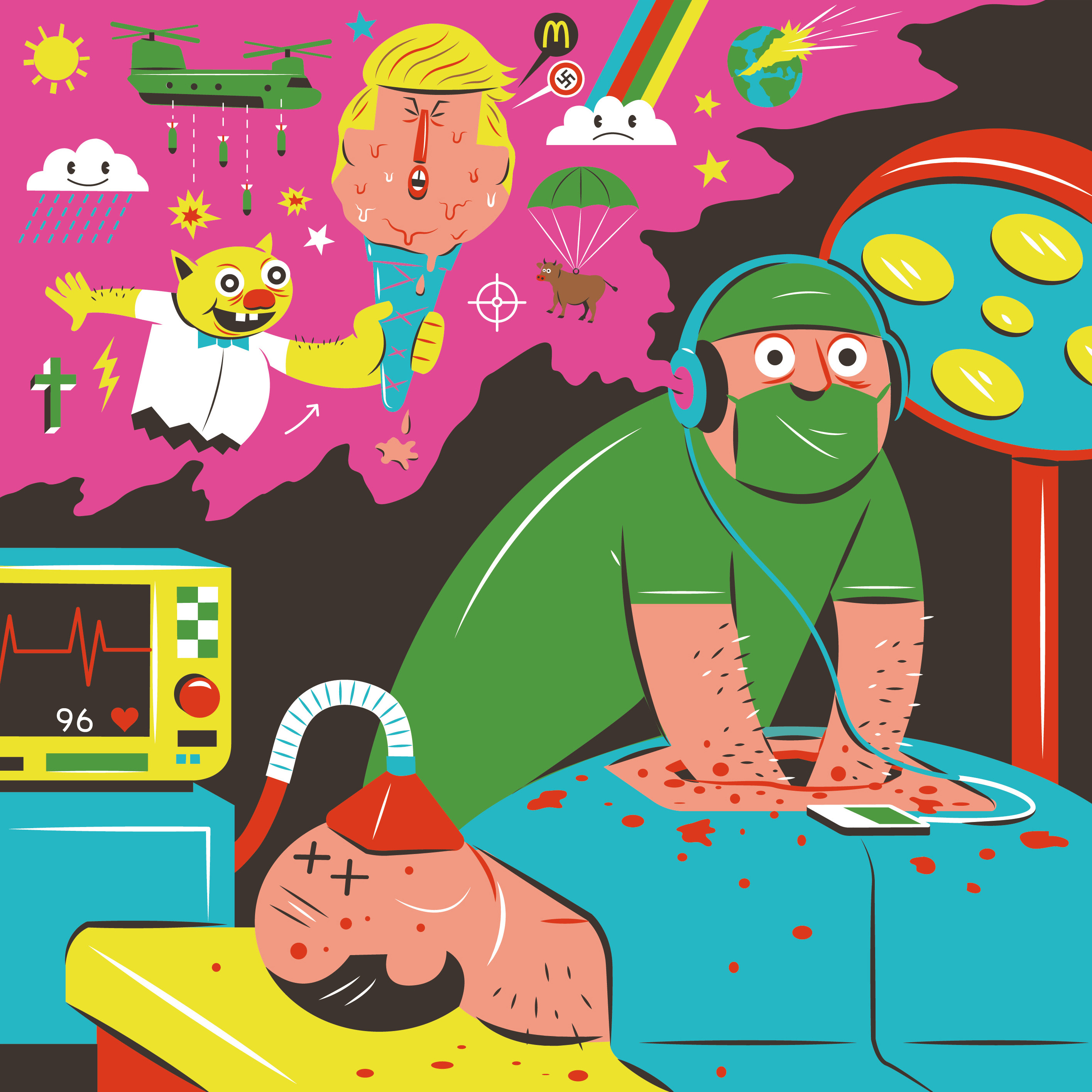
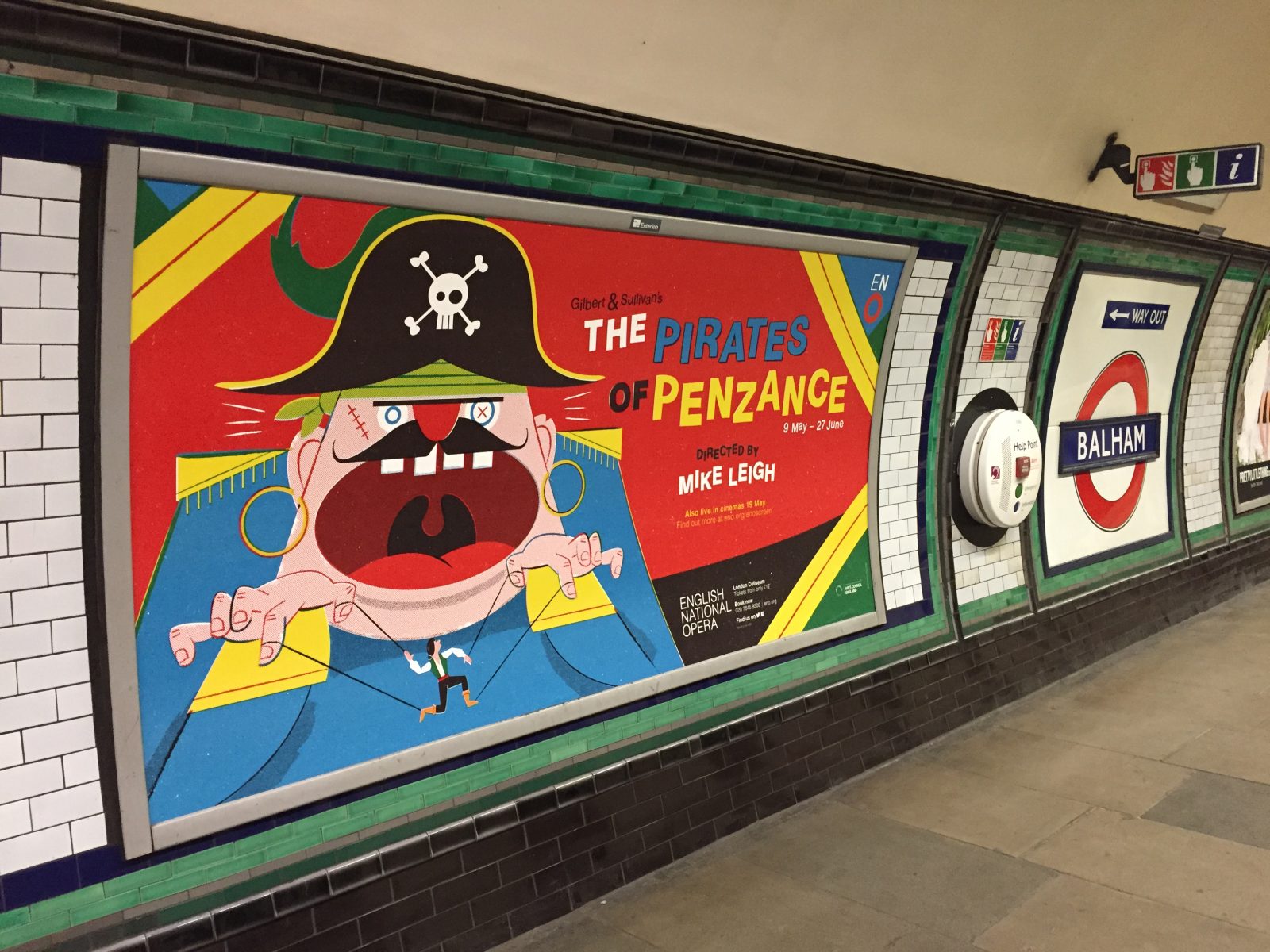
Buzzfeed
From first look at your site you divide your illustration three-fold: in two commercial illustration groups Toby Leigh Illustration and Tobratron and the separate Toby Leigh Art, which contains a collection of self-driven projects and products. How would you define your style and visual language?
Some illustrators can happily work in one style for years, but I’m easily bored, so relentlessly regurgitating the same thing over and over again would feel too much like a ‘proper’ job. I try to work across a range of approaches and some of my personal work doesn’t even involve drawing. Designating specific areas on my website seems to make it simpler, and also helps art directors find what they are looking for.
The personal Toby Leigh illustration style is a mish-mash of 30 odd years of ideas and influences. Viz, Robert Crumb, George Grosz, Robocop, Garbage Pail Kids, Ronald Searle, Ralph Steadman, Saul Bass, Seinfeld, The Simpsons, Art Spiegelman and even my local shopkeepers are in there in some way. In all of my work, I try to inject a seediness and humour that is ever present in our lives and the thing that really makes people laugh. Observing real people and what makes them tick interests me, so I try to bring this into what I do. Maybe it’s an item of clothing, or how someone stands that can make a character feel like they exist in the real world.
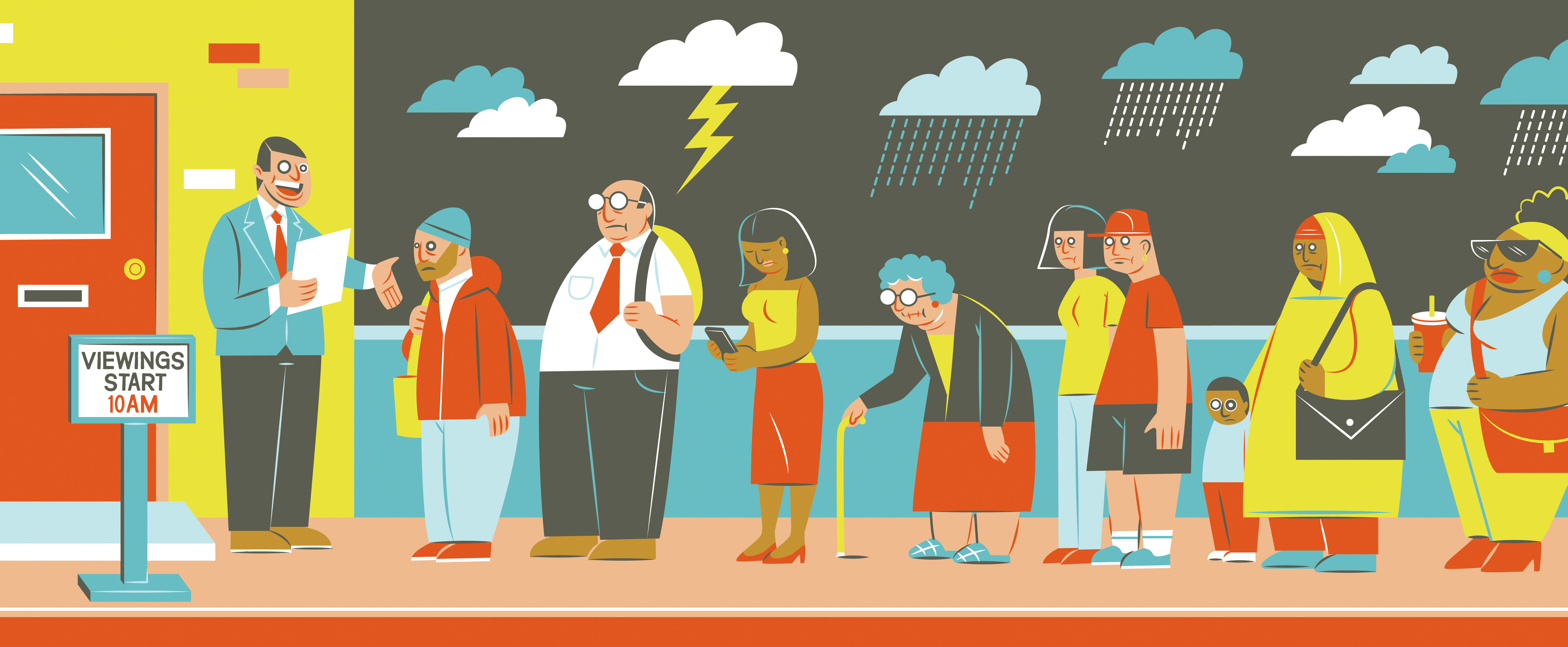
Spotlight Verlag
Very interesting! When did you decide to branch out to Tobatron and focus on infographics as a substantial area of your trade? (and why)
As I have said, I like to be working on a diverse range of different things at any one time. The Tobatron style began when I was at university as a funny way of communicating something surreal or satirical using a mundane and functional aesthetic. I love parodying a recognisable visual language and really trying to work out what makes it tick/ seem authentic. There’s a beautiful naivety about instruction manuals and infographics, and over the years I’ve spent hundreds of hours trying to replicate this.
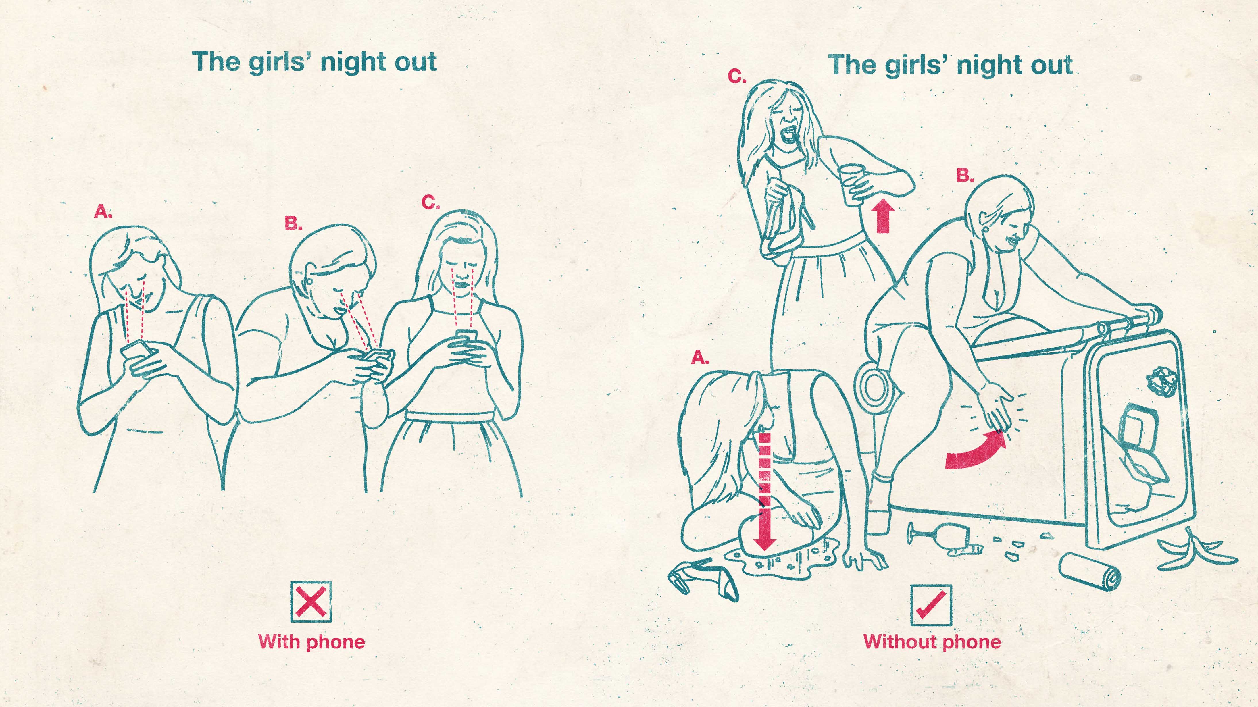
Penguin
There reached a point- a few years into my career, that clients were getting confused, because ‘Toby Leigh’ was doing two very different styles of illustration. So my agent at the time Folio suggested that I create a pseudonym to house one of them and Tobatron was born. It was a stroke of genius, as it’s allowed me to effectively be two illustrators, and so get twice the amount of work!
Looking back from the last two decades what made you enter into the world of illustration? How has your relationship with illustration changed and developed?
Two decades?! Shit!! How did that happen? I studied illustration in Manchester and so kind of just went from there. In the beginning, it was so exciting simply seeing your work in print, and it really didn’t matter where. I’d do work for an obscure healthcare magazine or some boring publication about hotel decor, and I’d rush off to WH Smith to see it finished. Then over the years, the buzz kind of wore off, and I began compartmentalising what I do into things that pay the rent and things I really care about. That’s not to say that I’m unprofessional in my commercial work, but I’ve stopped trying to push for every job to meet my criteria of what I think is good or amusing. Clients often commission me because they want humour and some kind of anarchic twist in what they are producing. But when it comes to the crunch they invariably get cold feet and dilute my ideas into a sort of pedestrian/ mainstream incarnation. For years I would fight tooth and nail in futile arguments with clients “I swear it will be 10,000x funnier like this!”. Then one day I realised that this energy could be better spent invested in my personal projects where I could be as outrageous as I liked.
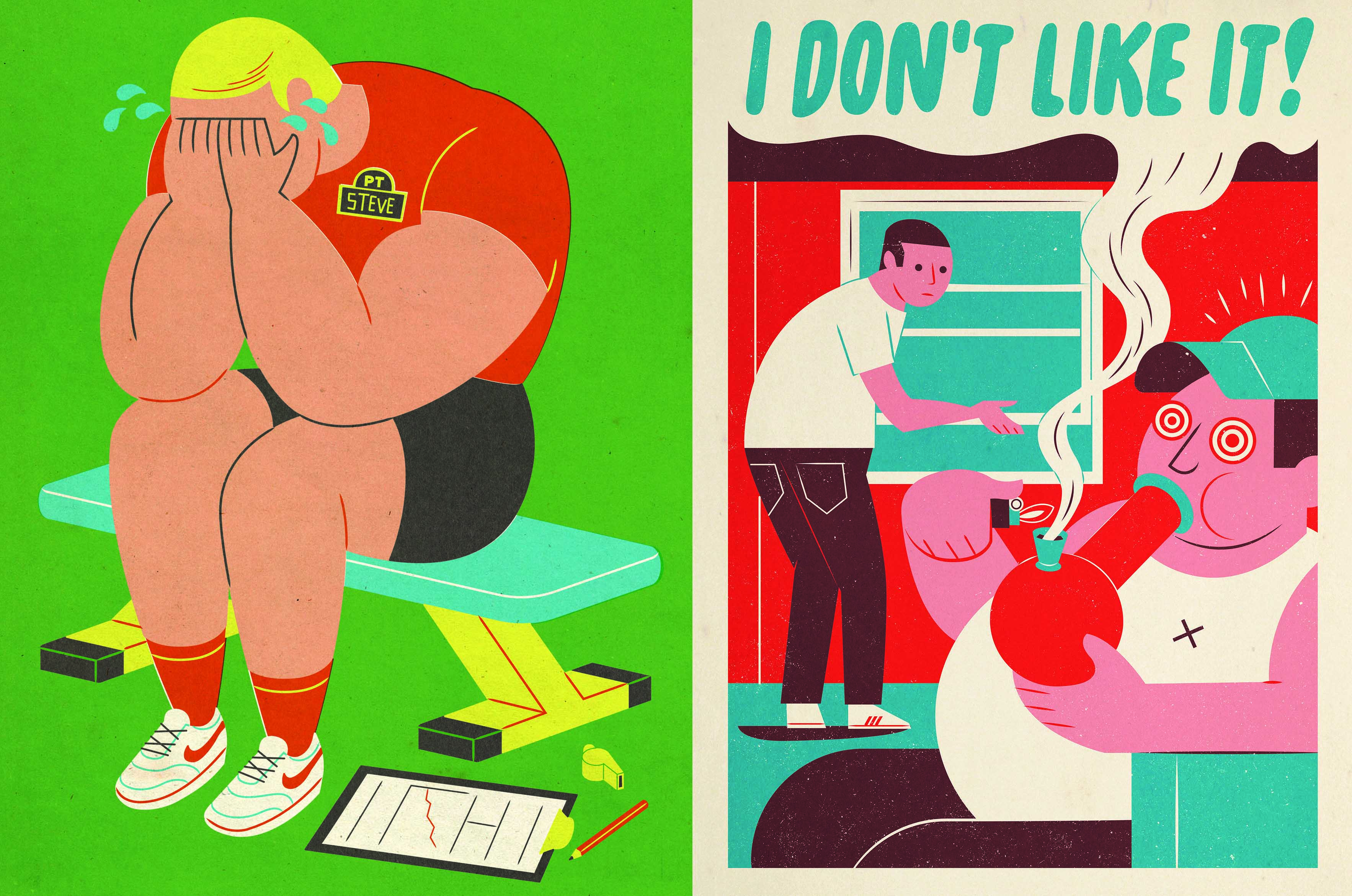
Men’s Health Magazine
That being said, I have worked on some great commercial projects over the years with some very clever and sophisticated art directors. There is a real discipline to fulfilling someone else’s vision, and I’m always pleasantly surprised when an art director makes a good call on changing something. But nothing beats the feeling of total ownership of an idea and seeing it through to completion. I’ve self-published two books, both of which are examples of projects that would freak out a commercial client. In fact, my most recent book – ABC for Adults was picked up by two publishers on the proviso that I amend some of the illustrations to appeal to a more mainstream audience. I politely turned them down.
In 2016 I published a book called Berberry, a collection of photographs I’d taken over a ten year period chronicling our obsession with fake Burberry items. I collected images of mass-produced clothes, birthday cakes, cars, tattoos, wheelchairs, iPhone covers, toilet seats and even whole apartment blocks hilariously clad in the famous tartan. The immediacy of snapping on an iphone was so refreshing when so much of my time is spent painstakingly drawing an image. I was warned by a lot of people that Burberry would sue me if I released the book. In fact, quite the opposite happened. The book launch was full of Burberry designers who had cheekily come down to buy a copy. “Don’t tell my boss I’m here” 🙂
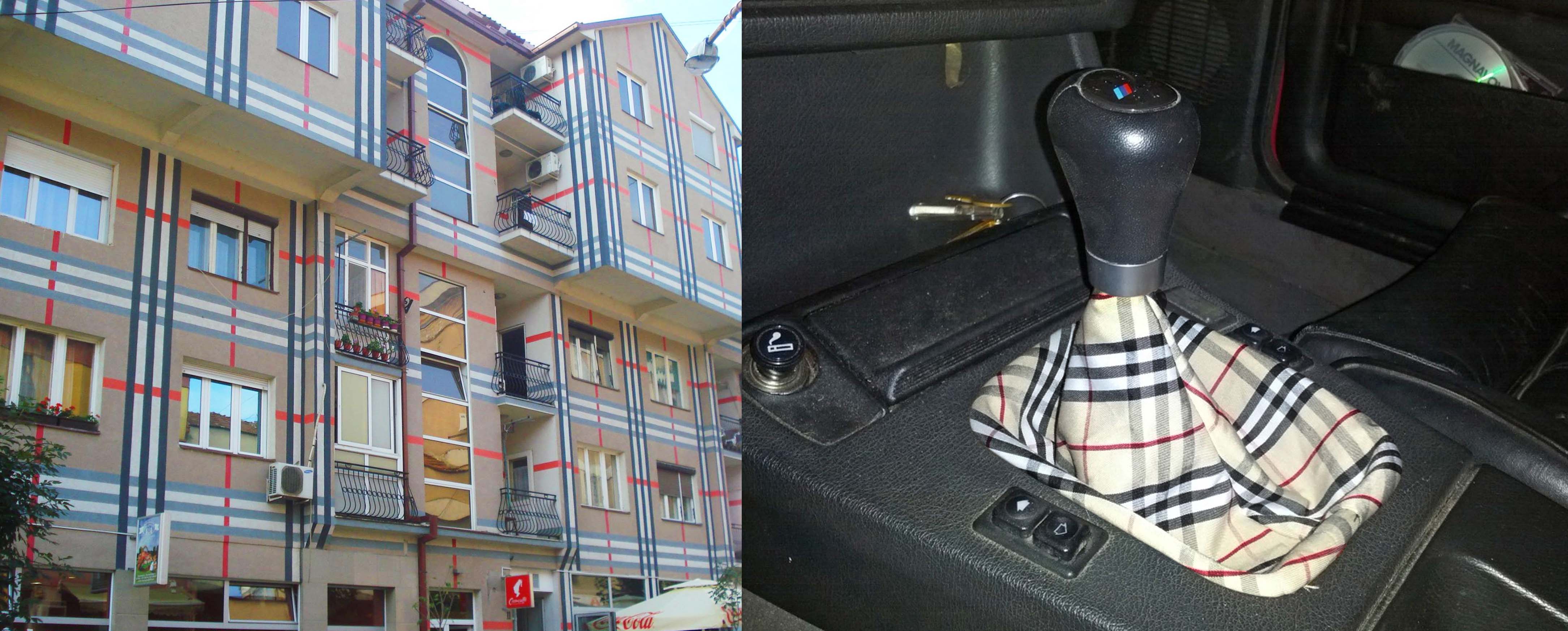
Berberry Art Project
Can you tell us about a favourite commission of yours. How it came into fruition and what the outcome was?
I did a collaboration with a Twitter feed run anonymously by a group called DJs Complaining a few years back, which was a lot of fun. They simply retweet DJs whinging about things: the champagne not being cold enough in the VIP room or beds not being comfy enough in the presidential suites of hotels. I did a monthly column with them for Mixmag, which was one of the few times when total creative freedom was allowed to roam free. It was basically one big exercise in taking the piss out of people (DJs) who think they are cool. Quite often – in the aftermath of an article going live, an online spat would break out with the DJ in question. It was wonderful.
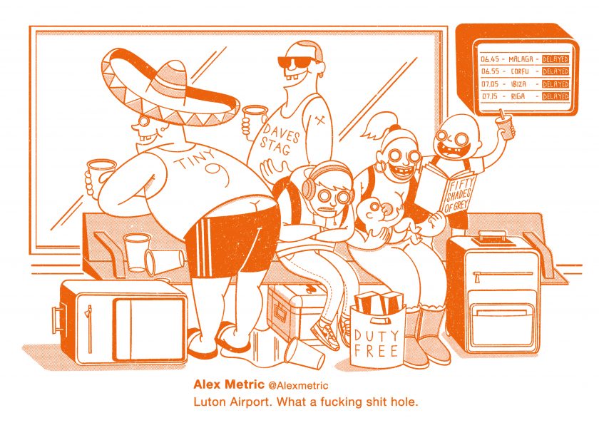
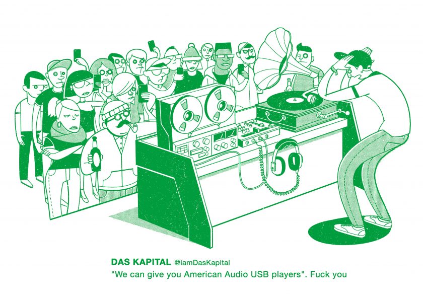
DJs Complaining
That’s hilarious! Following onto the theme of achievements, you took home an award in the WIA research category in 2017 for your illustration ‘Rights not Charity’ for Graeae Theatre which can be seen here. How did you find your experience with the award?
It was a great honour to win the award and especially for an illustration that was so enjoyable to create. Barbara, the subject of the piece is a great character and gave me a fascinating insight into the world of a disability rights campaigner. She also let me have a race around her house in her electric wheelchair. Unfortunately, I couldn’t receive the award in person as my son was being born that night, so Barbara collected on my behalf, which was good fun. Although, I still need to get the award itself off her!
Wrapping up, what are your plans for the future year. Have you got any more exciting projects on the cards?
I’m in the process of developing quite a few personal projects with an eye to also publishing another book or two. I also have various creative outlets that I run anonymously allowing me total freedom. But can’t say more than that.
Commercially, I might be working on a pop-up children’s book with a paper engineer called Matthew Reinhart, who is an actual bonafide genius. So fingers crossed that happens!
We’re grateful for the time Toby put aside to answer our questions and will all be keeping a keen eye out for the release of his next projects, art and commercial! Be sure to follow him on Twitter and Instagram
Also don’t miss last Illustrator of the Month: Cinyee Chiu
Back to News Page
