Varoom 37: Folio Society Illustrators Victo Ngai & Paul Scheruebel
The Folio Society Illustrators Victo Ngai & Paul Scheruebel
Issue 37 of Varoom profiles one of the publishing world’s most sophisticated book makers. The Folio Society has been producing illustrated version of classic titles since 1947, and their contemporary selection of illustrators have created outstanding visual companions to the text.
As a compliment to the magazine profile in issue 37, here we talk to Victo Ngai & Paul Scheruebel whose artwork is featured and ask them about the experience of working with The Folio Society, helping the publisher fulfil its stated intent on launch ‘to produce editions of the world’s great literature in a format worthy of the contents, at a price within the reach of everyman’.
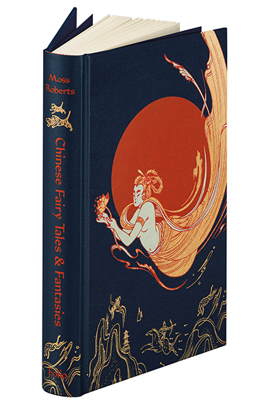
Illustration © Victo Ngai, 2014 from The Folio Society edition of Chinese Fairy Tales & Fantasies edited and translated by Moss Roberts
Victo Ngai illustrated Chinese Fairytales & Fantasies edited and translated by Moss Roberts
“Since Folio society craft their books artisanally, we have to work in certain ways to ensure the fine quality of the final object.”
Why were you chosen to illustrate this specific book?
I believe it’s partly due to my Chinese heritage, and partly due to my fascination for mythologies and images that are surreal and whimsical.
How did the process work with the Art Director? What were the biggest challenges?
Sheri Gee has been such a treat to work with. As you can imagine, there are a lot of work and details which goes into the planning, creating, and production of a book such as the Chinese Fantasies and Fairy Tales. I think Gandalf from The Lord of the Rings would be an apt comparison to Sheri, not so much the long flowy beard, but more her composure and guidance. She gets all the ducks in a row, helping me envision and plan out the whole book, making sure we are going in the right direction and keeping on track with the schedule, making suggestions on the best papers and print techniques, all while respecting my visions and creative freedom.
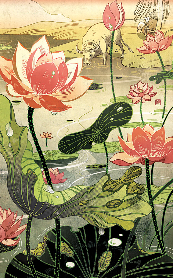
‘Every day after tethering the buffalo, he would sit and read beneath the willows’ Illustration © Victo Ngai, 2014 from The Folio Society edition of Chinese Fairy Tales & Fantasies edited and translated by Moss Roberts
For me, the biggest challenges are the technical aspects. Chinese Fantasies and Fairy Tales is the first project of its kind I have endeavoured. For other projects, I seldom have to worry about the production specificities, but since The Folio Society craft their book artisanally, we had to work in certain ways to ensure the fine quality of the final object. For example, blocking requires a file with1200dpi resolution and solid lines. These requirements are new to me and needed a change in my usual workflow – so it took some figuring out how to achieve the image I had in mind.
How did you conceive of the relationship between image and text? What was your illustrative approach? What was the most challenging aspect of the brief?
I think it’s important that the image compliments the text, entices people to read the text, but also add something extra to it, rather than just be a literal translation. While being viewed independently, I think the image should still have a life of its own and be appreciated out of context. The most challenging aspect of the brief is finding the ‘spark’ – something that interests me and gets my imagination flowing, as it’s important for me to feel engaged at a personal level in order to produce good, authentic work.
What did you love most about the final result?
I love that it’s a beautiful tactile 3-D object that I can hold in my hands.
Paul Scheruebel illustrated Fear and Trembling by Søren Kierkegaard
“Towards the end of ‘Fear and Trembling’ the images disintegrate to the extent that you might not even recognize the content had you not first seen the earlier versions. How often do you get a chance to make illustrations like that?”
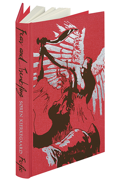
Illustration © Paul Scheruebel 2014 from The Folio Society edition of Fear and Trembling by Søren Kierkegaard
Why were you chosen to illustrate this specific book?
I think it had to do with my portfolio being somewhat heterogeneous. The whole project was about going back to the same theme over and over again, approaching it in different ways. I have always been interested in working that way and I don’t have a strict recipe for arriving at a final image. I love it when a project is a journey of discovery and I believe that Sheri Gee (The Folio Society’s Art Director) felt that this kind of play with the medium would go well with what she had in mind for the book.
How did the process work with the Art Director? What were the biggest challenges?
The biggest challenge was getting the first image of the series right. Sheri told me from the very beginning that we had to establish a solid point of departure and then let the project unfold from there, since the subject matter would always be the same for each image in the book. Every illustration is a variation on the theme of the binding of Isaac. It was a lot of trial and error for me at that point but Sheri was very helpful (and patient) and laying that initial foundation stone with her was a very inspiring process.
Once the first image was approved she sent me on my merry way and we wouldn’t be in touch for a couple of months. Imagine that! During that time I produced a great number of versions of the piece – like a mad scientist locked away in his laboratory. That long period of time without any exchange or feedback was a challenge as well, but in retrospect I think it was the perfect way to go about it. In the end I edited together what I thought was a series that had a certain natural progression in it.
Sheri and I then discussed the final outcome and tweaked a bit here and there. She also made some changes to the order in which the images would appear in the book and in doing so really improved the effect. Overall it was a very unusual and joyful process.
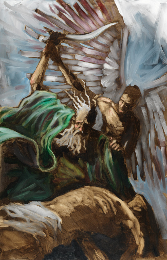
Illustration © Paul Scheruebel 2014 from The Folio Society edition of Fear and Trembling by Søren Kierkegaard
How does it compare to your previous book illustration?
Working on Fear and Trembling was certainly much more fluid and open than what I am used to. I was very impressed by the risk that the Folio Society was willing to take in choosing a process where they could exert so little control over such a substantial period of time. Towards the end of Fear and Trembling the images disintegrate to the extent that you might not even recognize the content had you not first seen the earlier versions. How often do you get a chance to make illustrations like that?
How did you conceive of the relationship between image and text? What was your illustrative approach? What was the most challenging aspect of the brief?
The relationship between the text and the images had already been established before I even came on board. Sheri and the editor Mandy Kirkby had decided that the images should mirror on a visual level what Kierkegaard did in his writing. In the text he keeps coming back to the binding of Isaac from the Old Testament where Abraham agrees to sacrifice his son. Kierkegaard discusses the scene throughout the book, building his argument and the notion of the ‘knight of faith’ upon it. The illustrations should do the same and, like the text, visit the scene again and again, take it apart and fragment it. Perhaps it was the clarity of the concept that gave them the confidence to give me that much free reign.
In a way my role was less that of an illustrator but rather that of a pure painter, obsessively banging his head against a theme. In the early stages Sheri compared the concept to the series Las Meninas by Picasso, in which he used a painting by Velazquez as a reference and painted it repeatedly, always uncovering new aspects and facets of the motive. What a beautiful example to follow! Not that I could claim Picasso’s artistic prowess for myself of course but within my limitations I was allowed to set sail for a similar adventure.
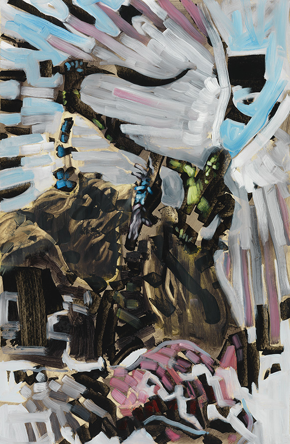
Illustration © Paul Scheruebel 2014 from The Folio Society edition of Fear and Trembling by Søren Kierkegaard
The most challenging aspect of the brief was at the same time the most beautiful aspect of it. It was the freedom of it and the trust they placed in me. I must admit that in the beginning I was a bit daunted by it and I fell into the trap of trying to predict what the Art Director wanted to see instead of just doing my best work. So my very first attempts looked a bit laboured and not very exciting at all, but Sheri did a great job at putting me back on track. She’s really a great Art Director to work with. A teacher of mine once said that if you don’t find your work exciting nobody will. And even though everybody knows that to be true I think it can’t be said often enough. I still need to remind myself of it frequently.
What did you love most about the final result?
The immediacy of it. The images look spontaneous and honest and that is a direct result of the organic process. The book as a whole is a beautiful object and it is exciting for me to see how the paintings come to life when you encounter them while reading the book. I am very grateful to Sheri Gee and The Folio Society for letting me play a part in this beautiful project.
Go here for interviews with Folio illustrators, Chris Skinner and Andrew Archer
And here for interviews with Shotopop and Keith Hau
Purchase Varoom 37 here
Back to News Page