Varoom 37 – Folio illustrators Shotopop and Keith Hau
Online Exclusive: The Folio Society Illustrators
Shotopop & Keith Hau
The new issue of Varoom profiles one of the publishing world’s most sophisticated book makers. The Folio Society has been producing illustrated version of classic titles since 1947, and their contemporary selection of illustrators have created outstanding visual companions to the text.
Here we talk to some of the illustrators commissioned by The Folio Society and ask them about the experience of working with the publisher and helping it fulfil its stated intent on launch ‘to produce editions of the world’s great literature in a format worthy of the contents, at a price within the reach of everyman’.
Shan Jiang / Shotopop.
“This project was more like a completely unknown journey which needed to be explored”
Why were you chosen to illustrate this specific book?
I didn’t choose the book, I was contacted by the art director Sheri Gee from The Folio Society as she thought that my style might be suitable to the content, so contacted me through our agency.
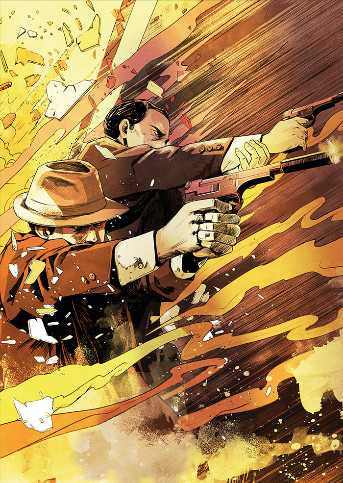
Illustration © Shotopop 2015 from The Folio Society edition of The Man in the High Castle by Philip K. Dick
How did the process work with the Art Director? What were the biggest challenges?
Sheri sent me a book (a Penguin version) and let me have a good read then select the sections that I wanted to illustrate. I read the whole book twice during the project. The first time I read at a normal pace, following the storyline. Once I got the idea I started to work on the cover.
At first I didn’t really have a clear direction in mind. After having a discussion with the Sheri, I started to build a picture bit-by-bit of the atmosphere I wanted to create and the best style for the book. I feel the cover is an ‘outline’ or ’syllabus’ rather than a specific scene. Although the art style was a slightly different — a bit more graphic than inside pages — the right atmosphere was there for me to carry through to the rest of the illustrations.
How does it compare to your previous book illustration?
The major difference is that the editor will tell you the content that you want to illustrate.
But this project was more like a completely unknown journey which needed to be explored.
I got a chance to represent the story in visuals based on my own understanding. I feel it was more like doing style frames for a movie or an animation.
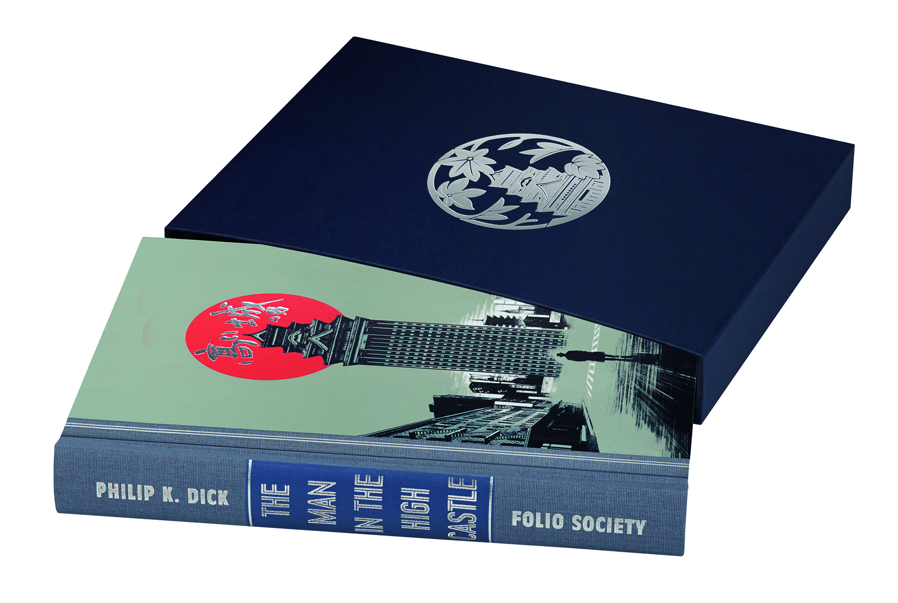
Cover binding and slip case © Shotopop 2015 from The Folio Society edition of The Man in the High Castle by Philip K. Dick
How did you conceive of the relationship of image and text? What was your illustrative approach? What was the most challenging aspect of the brief?
Instead of illustration a sentence or a paragraph, I wanted to illustrate a ‘moment’.
My approach was starting with the cover first, then the frontispiece. After setting down the ideas for these two illustrations, the following ones came out quite smoothly. The cover was quite a task, at first I didn’t really have a clear direction in mind. After having a discussion with the Folio Society Art Director Sheri Gee, I started to build a picture bit-by-bit of the atmosphere I wanted to create and the best style for the book. I feel the cover is an ‘outline’ or ’syllabus’ rather than a specific scene. Although the art style was a slightly different — a bit more graphic than inside pages — the right atmosphere was there for me to carry through to the rest of the illustrations.
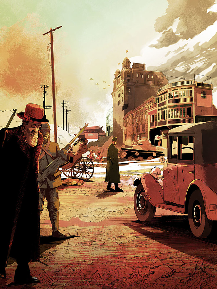
Illustration © Shotopop 2015 from The Folio Society edition of The Man in the High Castle by Philip K. Dick
The most challenging aspect of the brief?
Actually the project didn’t have a “normal” brief as other illustration jobs.
I received a book that’s it. So I think the most challenging aspect was that the art director expected the illustrator to offer his understanding and then create the artworks.
What did you love most about the final result?
I like the cover and jacket design. I think it giving you a preview of what you will see as a trailer but it purposely done in a bit different style so it didn’t leak ‘plot’ before reading the book. I also like the first illustration. It showed a daily morning scene. but I could use the details, objects to create a set and lead the read to enter the world created by the author.
Keith Hau
“The technique that goes into the cover art was something new to me and it was an interesting creative challenge to learn about the colour blocking and print process.”
Why were you chosen to illustrate this specific book?
My illustrations are inspired by folktales and nature, and are often created with a mixture of silhouette, shapes and patterns. I tend to find I’m able to illustrate the recognisable aspects with silhouette imagery whilst the ‘unknown’ can be represented through abstract shapes and patterns. These components helped me to illustrate and convey the remarkable tales and creations of myths found in the African folktales.
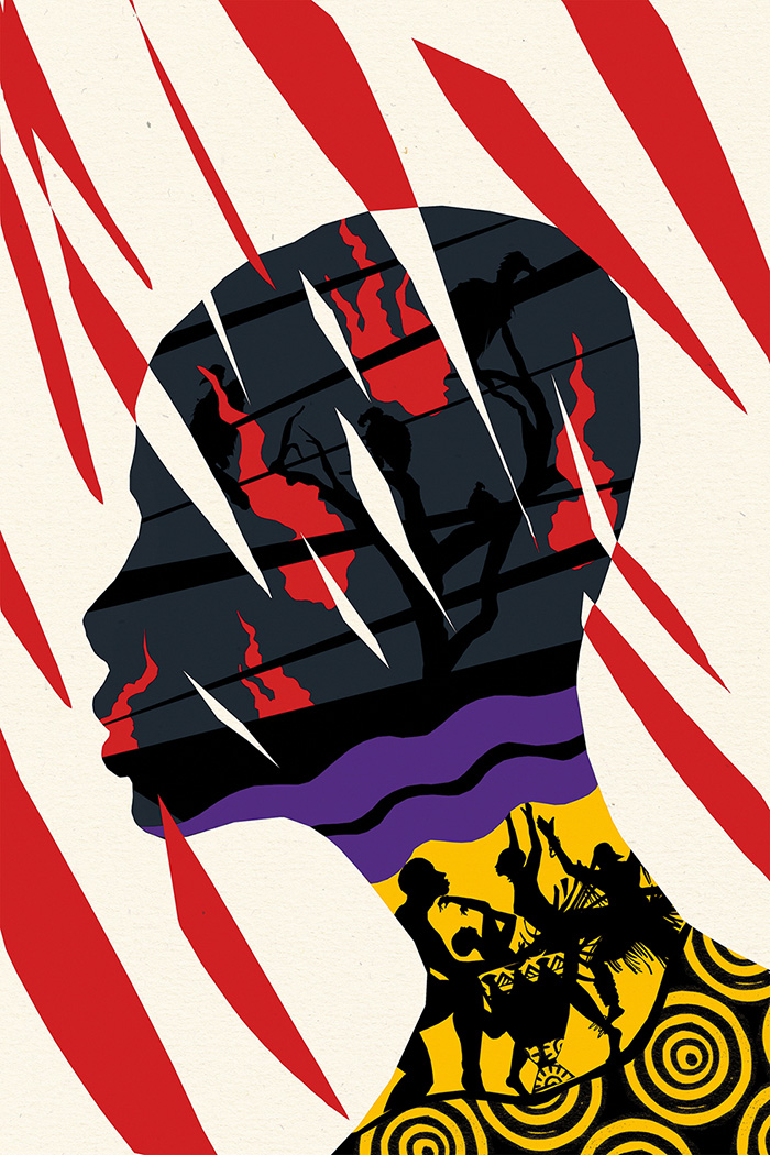
Illustration © Keith Hau 2016 from The Folio Society edition of African Folktales selected and retold by Roger D. Abrahams
How did the process work with the Art Director? What were the biggest challenges?
The African folktales feature 90 stories and the initial challenge was to work alongside the art director and editor to piece together a selection of tales to illustrate. After the selection, the next biggest challenge was to then sketch out ideas to simplify the content whilst trying to retain the level of depth found in the stories. The collaboration went back and forth so we could really try and pin down the visual artwork to reflect the narrative. As the stories are so vivid, it was interesting to hear the varied response and interpretations from different people. Even little nuances could be perceived in completely different voices. It was always a welcome inspiration and helped towards the creative process.
How does it compare to your previous book illustration?
My first self-initiated book illustrated the life and writings of essayist and naturalist Henry David Thoreau. It explored the adventures of the natural realms as well as human spirit and it was illustrated in a simplistic style with a limited colour palette. In comparison, for the African folktales I wanted to introduce additional colours as well as a multi-layered approach in the compositions in order to convey the frenetic energy depicted within the tales.
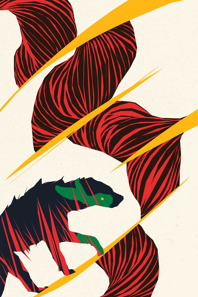
Illustration © Keith Hau 2016 from The Folio Society edition of African Folktales selected and retold by Roger D. Abrahams
How did you conceive of the relationship of image and text? What was your illustrative approach? What was the most challenging aspect of the brief?
One of the most challenging aspects of the brief was trying to manage the dynamics contained within the stories. Unlike traditional storytelling, these tales were not told via words or images – but rather through the spoken word. They are often filled with a range of emotions and themes ranging from comedy, romance, tragedy, fantasy, mythology (sometimes within the same tale!) so it was important to carefully pick out what to reveal – much like how the narrator would have originally told the folktales through slow revelation of the narrative. This made me think not only about the visuals and words, but also the art of storytelling through performance and whether I could project some of that energy through illustrations.
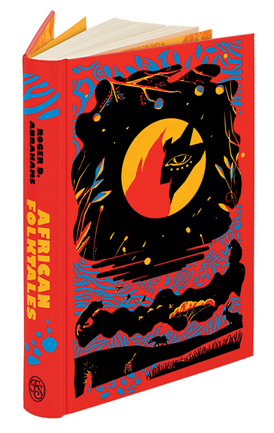
Binding © Keith Hau 2016 from The Folio Society edition of African Folktales selected and retold by Roger D. Abrahams
What did you love most about the final result?
I was excited to have been also able to work on the binding design for the book cover. The technique that goes into the cover art was something new to me and it was an interesting creative challenge to learn about the colour blocking and print process. There’s a certain charm to the craft of an illustrated Folio book, and seeing the transition from screen to print is what I loved the most about the final result – it’s a joy to hold.
Go here for interviews with other Folio illustrators, Chris Skinner and Andrew Archer
Purchase Varoom 37 here
Back to News Page