In each issue of the magazine, Varoom features a selection of work chosen by experts in a variety of fields. In issue 18, Jeremy Leslie of Magculture, highlighted The Ride Journal. You could call it just a magazine about cycling, in the same way that would say The New Yorker is just a magazine about New York!
As the Olympics arrives, here is a celebration of illustrators inspired by the creative vision of a great Art Director. So dip into the ideas and work, as Jeremy Leslie explains his selection, Art Director, Andrew Diprose, gives some context, and illustrators ilovedust and Joe McLaren explain the process of creating their image.
Jeremy Leslie
The Ride Journal is one of a number of magazines that take a fanzine-like enthusiasm for a subject and then use modern production techniques to make a far more finished magazine than a fanzine. There’s been a cycling press for a long time, this is a very traditional genre of magazine, but Ride reinvents it and approaches it from a cultural aspect rather than a lifestyle aspect, sharing the joy and the passion that its creators have for the subject of cycling in the widest sense. It’s not just about testing new bikes and the content you get in the usual cycling press. It’s about the world of cycling. It really spreads the passion, you can get into the world of cycling without ever being on a bike, seeing historical aspects of cycling, different types of cycling and hearing from different individuals about why they love it. It’s beautifully made, the attention to detail, the photography and illustration inside the magazine and the covers alone make a beautiful set. It’s a lovely thing.
Andrew Diprose, Art Director, The Ride Journal
Did Illustration feature in your vision or concept of The Ride Journal? Or did it happen as you were making it?
When we set up the journal, the idea was to do something different to other cycling publications. No reviews, how to get fitter guides or where to ride… Just to tell stories of riders and the riding experience through words and pictures. There was no real plan as to what was going to be photography or what would be illustration, we were led by what was possible with limited time… And limited favours from our contacts. The initial idea of doing something Lo-Fi and ‘Zine’ disappeared and we realised we wanted to do something with higher production values, real show of the beauty of the artwork.
Are there any kinds of stories that you would only use photography for?
If we get a great suggestion of a photographer or a shot from the writer and it’s appropriate we might use a photograph. Also if we’ve seen a great photographer and wanted to ask them to shoot something for us, or we’d like to publish an existing photo essay we’d go that route. It think it’s important to have both disciplines in there, the beauty of both the illustration and the photography is enhanced by the mix.
At the journal we don’t have a budget for commissioning anything, photography or illustration. We don’t make anything ourselves as we donate all profits from to charity, we thought it was simpler and fairer that way.
Do you get any feedback from readers specifically on the illustrations?
The readers and the writers LOVE the illustration, and although we didn’t set up the journal to be a portfolio of illustration talent, as word has spread in the illustration community I’d like to think we’ve become that. We probably have as many art and design readers and supporters as we do bike fanatics, we certainly sell more copies of The Ride though art and design shops than bike stores. I’m really excited that whether you’re a ‘creative’ or rider you’ll be drawn in by the journal, it’s nice it can bridge both passions.
How do you select your illustrators? By story? To keep a diverse visual mix?
There are some artists that we contact directly to see if they’re interested in contributing, but now mainly we are now contacted by interested illustrators.
We edit to those who’s style is most in keeping with our attitude and aesthetic. With a simple uncomplicated layout and no text or captions running on the illustrations we hope to show off work as best we can, the artists obviously really appreciate that. We have favourite illustrators and ‘friends of the journal’ who pop up quite regularly but it’s really important that we have that diverse mix and keep styles fresh for the reader. This happens naturally now as more people approach us. Regarding commissioning pieces, If we know a illustrator has a particular interest, style or enthusiasm we’d sent a piece to match, sometimes however I like to throw in an uncomfortable pairing and see what happens. Some of favourite creative moments are the pleasant surprises I get when looking at the illustrations for the first time.
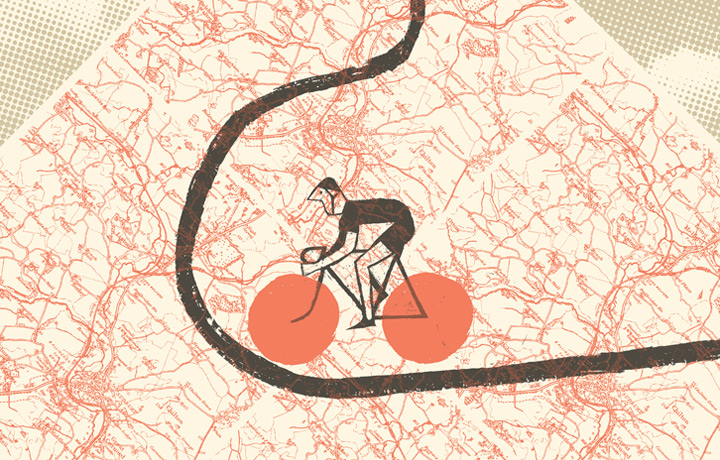
Joe Mclaren, illustrator
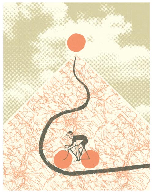
Brief: Almost none at all. Andrew Diprose gave me the article and the page size – a dream job!
Idea: The article was about gruelling climbs while cycling, and I wanted to reflect the singularity of purpose for a ‘grimpeur’, and also something of the almost ritual simplicity of it. So the image is very simple, and the triangular hill recalls a pyramid or a ziggurat, set directly below an ominous red sun- almost as though the climb itself were a primitive act of heathen worship!
Materials: The ‘handmade’ elements (the cyclist, the road and the sun) were all drawn using scraperboard, which is my medium of choice for most jobs. It gives an unbeatable texture and roughness, without the time and complication of woodcut. The rest of the picture is found imagery and Photoshop.
Research: The article mentions the famous cols of the Tour de France, and my stylised rider and his bike are based on a period in the sixties when helmets were beginning to be seen on the Tour. The geometry of the bike is an approximation of bikes from that era too. I thought that would fit the visual language of the illustration, while remaining timeless enough that the rider could just as easily be a modern day grimpeur.
Process: I roughed out the artwork with pencil and paper. I can’t compose in Photoshop as quickly as I think, even with a Wacom pad, and it’s nice to turn the Mac off for a bit sometimes. Once the composition was in place I drew the rider, his bike, the road and the sun with scraperboard. Once these were scanned in I composed the background in Photoshop. The map I used was an old one of the area around Sudbury in Suffolk which I happened to have. Some distance from the parts the author speaks of in the article, but I like the way it looked.
Resistances: Colour is always the hardest decision for me – I think in black and white a lot of the time. I struggled with a lot of different colour schemes, and settled eventually on one which was actually black, white and red with a transparent layer of yellow. It’s bold, simple and has an ‘antiqued’ look, so I thought it fitted the bill.
Insight: My early roughs for this were too complex. The article has a lovely simplicity to it, so when I realised I could use a simpler layout, everything else fell into place.
Distractions: The internet, as always! Researching the geometry of 1960s Tour de France bikes inevitably means you find yourself an hour later, watching YouTube documentaries about Eddy Merckx’s 1972 hour record in Mexico City. It’s always difficult having your basic tool of the trade connected to the most amazing instrument for distraction ever devised…
Numbers: This picture is all about threes. Lots of triangles!
Entertainment Value: I couldn’t resist giving the cyclist the nose of legendary cyclist Fausto Coppi. I imagine he must have won a few stages by getting his enormous conk over the line before the other chap. I’ve just noticed it forms yet another triangle as well!
Joe McLaren
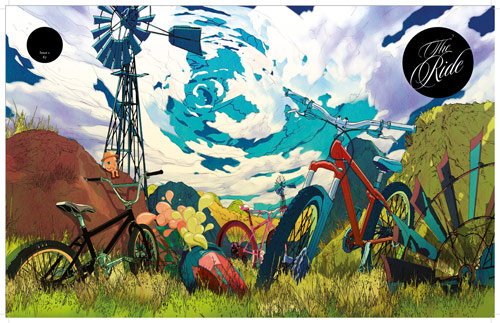
ilovedust
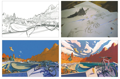
Brief: The briefs for this series of jobs has always been quite open. We have worked with the editors or ‘The Ride Journal” from the very first issue, so the standard, style, and set up of the illustrations were discussed and understood from the very beginning of the partnership.
Of course there are specific requests from editors: whether colours should be bold or saturated, whether the cover illustration should reflect summer, autumn, or winter; whether key words or specific bike components should feature. Then the rest is up to us! For example, one of our designers is originally from Shanghai so one cover design featured the landmarks of this great city partially covered in snow. The briefs allow room for interpretation and exploration, so we draw on our influences, experiences, and creativity; and most importantly – have some fun!
Idea: We draw on many different influences and styles here at ilovedust and this particular cover illustration draws inspiration from the work of Moebius.
Materials: Pen, Pencil, Adobe Photoshop for colouring.
Research: A number of key words and a little info is given by the editor and any research will be built around this. Obviously, being a bike journal – the information we give and the illustration we execute must be accurate, and often must be identifiable as a certain model or type. We research the features, functions, and forms of any given bike before beginning the artistic process. Being bike lovers ourselves – we don’t mind to much!
Process: Any rough ideas and first stage designs will be sketched out coloured. These will then be sent on to the editor for approval. Once approved the designs are once again drawn out accurately and neatly in pen or pencil. These hand drawn illustration are then scanned and all colours are added in Photoshop.
Resistances: There is often a difficulty when working on a series of jobs, between maintaining the style created for the job whilst keeping the ideas and illustrations fresh. Obviously the designers want to create something a bit different from the last: the key concept, the drawing technique, the colour, the scene – but at the same time they need to tie this back in with the pre-existing theme and the general style of previous illustrations.
Insight: Obviously a great deal of research on bike makes, models, races, uses, and styles have been necessary for this project, and working on this job has made us all recall our own personal memories also. Most of us learned to ride bikes from a very early age…. some more successfully than others, and all of us have stories to tell. We all still remain bike lovers and so all love to have a bit of input and say on this project. The bike is not only a vehicle for practical purposes, but is a character in itself. It was with this in mind that all the bicycle illustrations for Ride Journal magazine covers were created.
Distractions: Biscuits…. and the terrible music that sometimes gets played in the studio.
Number: We have created nine works in total for this project: six for cover illustrations, one for an inside spread, and a couple that are yet to feature.
ilovedust
Buy The Ride Journal here. You can also download some previous issues