Becoming An Illustrator In 2012
By John O’Reilly
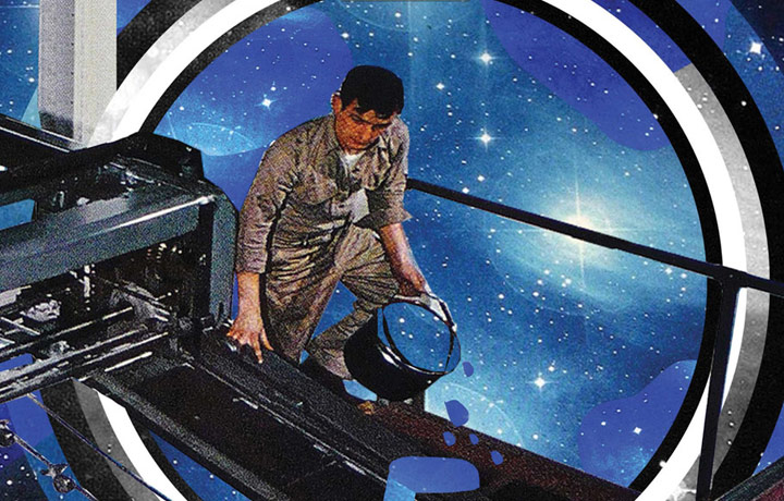
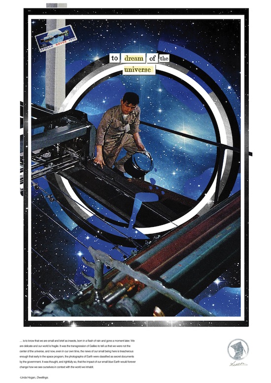
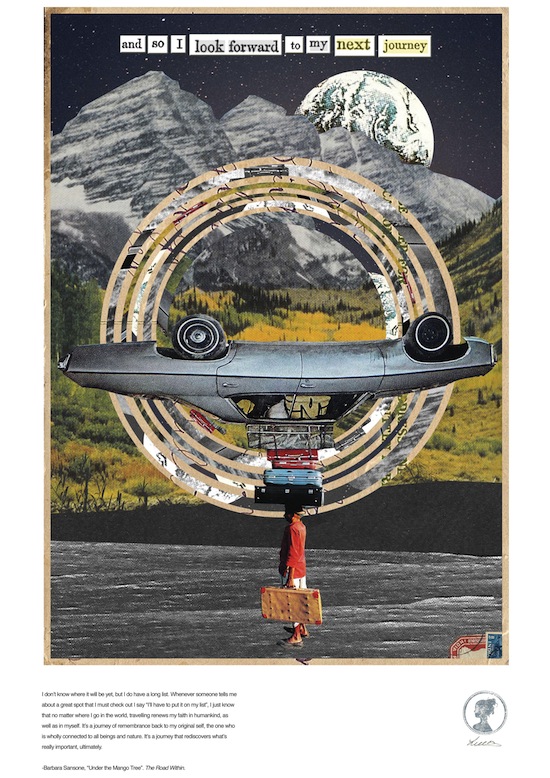
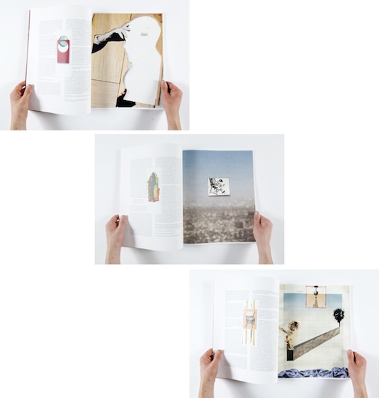
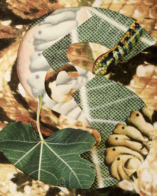
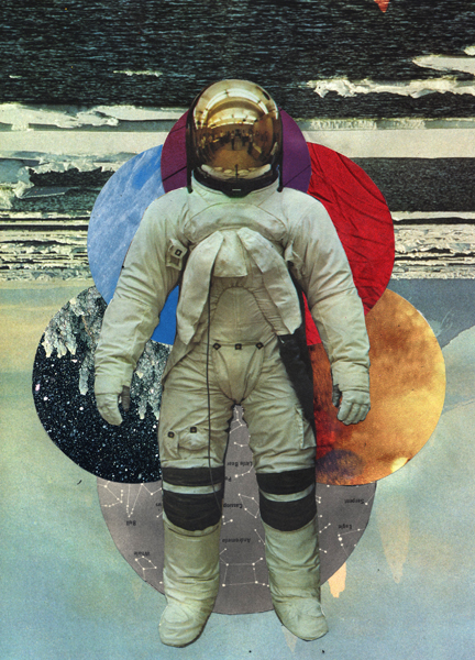
Image by Lucy Dodds
Alongside last-minute installation terror, the end-of-year giddiness, the swollen liver, the annual Graduate shows generates a rich vein of new work and brings in its wake a set of familiar questions for those of us passing judgement, from lecturers to trade magazines to the creative industries talent-spotting.
There’s expectation and benchmarking – “Is this year’s class as good as/better than previous years’?” There’s opportunity for some “zeitgeist-divining”, for licking the finger, sticking it in the air and declaring, “Yaaah, 2012…it’s definitely…maroon”. In other words, what themes, concerns, practices animate and drive this group of students? Where are we heading?
Then there’s the language we use to smooth-over the transition of students into hopefully gainful employment, the phrases such as “New Blood” with which the industry gently mocks its own need for fresh ideas (have you ever seen a Creative Director’s reflection in a mirror?) and graduates themselves increasingly have fun with perceptions of youth in defining themselves (“Feral” Bournemouth).
And then, deep down, all illustration graduate shows are about becoming an illustrator, because that’s what you’re doing, and the best graduate work reconfigures the idea of what an illustrator is. What follows is a sample of three shows seen on the same evening, Mixed Special, Now What, Rare (the collages above are by Lucy Dodds, from Havering College, at the Free Range show). We will follow-up with a response to more graduate work.
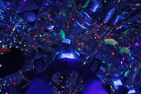
Every year tells a different story, but this year felt different, at least that’s what I felt as I lay on my back in Acktarr Khedoo’s ‘cosmic pod’ at the Mixed Special show, surrounded by wall-to-wall mirrors staring at the stars and planets hanging from the ceiling, illustration as an endlessly reflective space shaping how we see. The pod itself is a illustration-device, take a photo and it becomes a splashy canvas of colour.
At Kingston’s show, Rare, James Jessiman went to the chemical and biological source of the visual in his architectural treatment of Aldous Huxley’s 1954 book The Doors of Perception, where Huxley catalogues his experience of taking mescalin. Jessiman’s work took this ‘Head Bible’, a paean to psychedelics and mysticism and reframed it as a book about vision, an insight which seemed entirely sensible and creatively productive.
11 illustrations are designed around a central door, the beginning and end of visual forms in Jessiman’s generative collage flow into each other. As Huxley wrote, “At ordinary times the eye concerns itself with such problems as where? — how far? — how situated in relation to what? In the mescaline experience the implied questions to which the eye responds are of another order.”
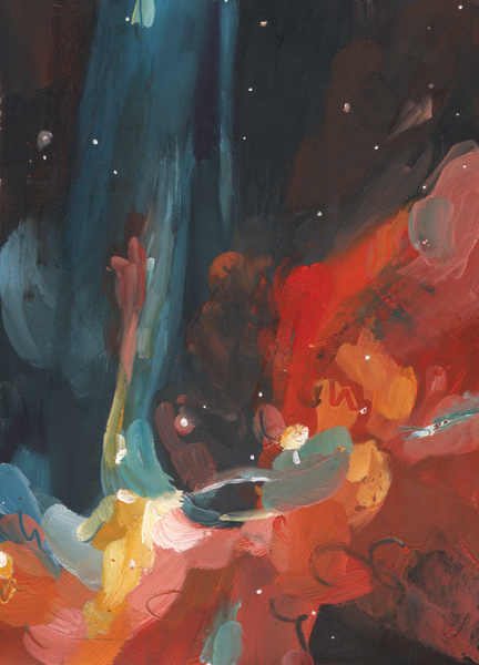
Drawing attention to perception and seeing is conventionally a consideration in art practice, but there was a lot of graduate illustration probing the viewer’s relationship to what we were looking at. Grace Helmer’s illustrations of author Primo Levi’s work, play with our sense of narrative simply through the intensity of the layer and wash of oil, each panel absorbing the eye in a superabundant intensity of colour.
As Huxley alluded to in his account of how mescalin rearranges learned hierarchies of vision, Helmer’s illustration plays with the narrative sense of scale and how visual forms connect in sequence.
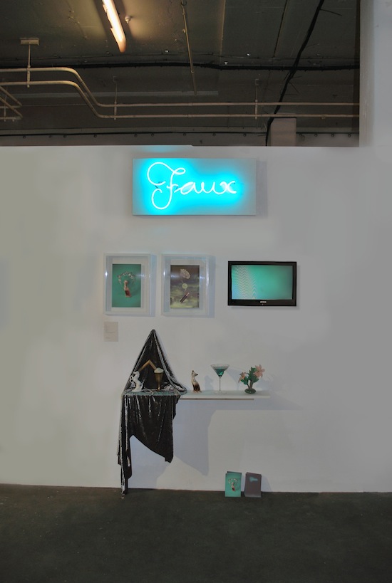
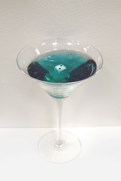
And then there was endlessly baroque imitation of Faux, whose work broke the Zeitgeist-ometer in its hot-button themes around authenticity, 80s styling and signifiers of taste: a cocktail glass filed with turquoise-tinted resin suspending a dice; a porcelain cat and horse (found objects she explains) on draped velvet fabric.
Her video Neo-Paganism, with its soundtrack of Aquarius from the musical Hair, “explores a fantastical journey energised the computer, a central hub for magickal activity. A device in which modern pagans can cast spells, using the symbols represented on the keys…”
Neo-Paganism from Faux on Vimeo.
“…USBs flow energy into crystals and batteries charge salt & herbs”, according to Faux’s Vimeo entry. Strangely, the work as a whole made me realize that Jeff Koons would have made immediate sense at the the time had he been from Brighton, with his exploration of ideas around simulation, belief, and a love for specific kind of ‘camp that dare not speak its name’ in the world of contemporary art thinking – “Beauty”.
Faux’s work is conceptually and visually rich, but most of all it expressed something that this year’s graduate shows highlighted to a greater or lesser extent – illustration practice is changing faster than a large hadron collider. Assumptions around illustration are being challenged that are making the debates we hold onto feel a little dated.
This generation of students, ‘digital natives’ as the sociologists describe them (a youtube/ fffound /tumblr generation) are absorbing imagery and work at an accelerated rate. People are uploading 250 million images each month to Facebook alone.
These students grew up with a unprecedented volume of imagery, imagery on tap, imagery distributed, shared and posted freely across social networks. And increasingly a lot of it is moving imagery, so it seemed obvious that even beyond animation, there was so much moving-image work such as Mark Prendergast’s whose Not In That Order Necessarily, cut up film, scanned, painstakingly shot and re-arranged film which process he again shot, spurred by Jean Luc Godard’s (and Eric Morecambe’s) dictum.
Aside from the obsessional craft (who says this isn’t illustration?!) this film replicated our current non-linear form of storytelling on blogs, Pinterest and social network sites where there is a beginning, middle and end, but not necessarily in that order.
Equally there was a lot of work that hit a spectrum somewhere between depressive and angry. It’s pure speculation, but perhaps it reflects a generation of students managing full-time coursework with more than part-time jobs and still coming out with mini-mortgage levels of debt.
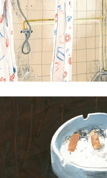
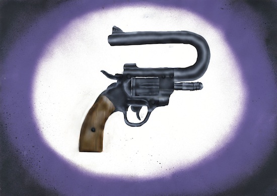
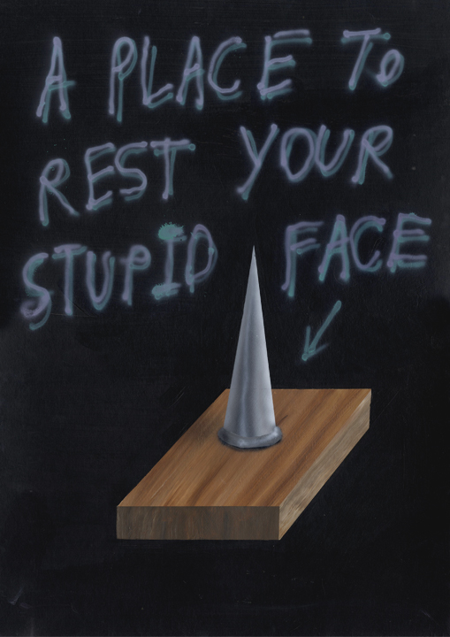
What leavens the idea-based spraycan misanthropy of Brighton’s Jack Felgate is that the target is sometimes himself.
He writes in the Now What ? magazine, “My work is largely about pessimism, exploring the idea of misanthropy through juxtaposing cartoon-like painting.” Felgate’s spray-can imagery is often blurred, woozily defined, a failure of representation.
And a lot of work that sits on the edge of beauty and grotesque (a theme we will return to in Varoom) most especially Eun Kyoung Ju whose ornate detail delays your attention from the delicate and grisly payoff, heightening the impact.
Described as “Grotesque with a touch of Art Nouveau”, her ostensibly quiet black and white drawing is about generating sensation – wonder, horror, delight. Forgive the cheesy transition, but these are feelings any graduate might have in 2012 heading out into the world of employment, or otherwise.
The most striking 2012 shows registered the unprecedented scale of change everyone in the creative industries are dealing with. The best students took a sense of what it is to create illustration, executing ideas across different formats, surfaces and objects. Which is where the new opportunities are for illustrators, for brands and companies looking to tell stories in new ways, creating ‘experiences’ that can be shared online, spreading the brand message in subtle, more engaging ways.
One college lecturer related a story to me of an industry insider a few years back who remarked on seeing some experimental “sculptural” illustration at a graduate show, that this is not the kind of work that will get commissioned. Perhaps he was right then, but times have changed. That’s not to say we don’t need brilliant graphic novelists, or children’s books, and there was some very strong examples of this in the shows which we will return to. It’s just that in the midst of the creative industry there are new, very real, openings, for illustrators. Anyone who saw Tristan Eaton’s Thierry Henry-Red Bull project had a window on the visibility and share-ability of great illustration. Illustration going social, gaining currency.
On the one hand students need to be supported in thinking more daringly about illustration, on the other illustrators need to think about how they position themselves in the wider world.
The most on-the-money idea in Lawrence Zeegan’s much-talked about Creative Review essay was his reflection on successful models of illustrator companies such as Javier Mariscal’s and Pushpin. There is a livable, money-earning, career developing future in being able to offer to clients the range of skill-sets from an illustrators’ company, from graphics to packaging to web and mobile work.
But also what illustrators can offer is the creative wit to imagine images being played out in a variety of spaces, places, and surfaces. When ‘Social Storytelling’ is the currency of Advertising and Marketing in 2012, being able to create highly imaginative, visually dramatic and shareable content makes you a valuable commodity. If Content is King, illustrators are the Kingmakers (or Queenmakers!).
Graduates unfolded the question of becoming an illustrator in some really surprising and absorbing ways. Despite the increased fees, the rapid changes in technology which has unsettled familiar certainties in business and education, these are potentially exciting times for young illustrators who have the imagination and self-belief to create visual experiences in spaces and media beyond what we once comfortably accepted as illustration. It’s not easy starting-up in 2012, but then again, it never was.
My favorite visual metaphor of what becoming an illustrator might be is a collage by Steven Marsden called Distorted Reality (which is what all good illustration should aim at, distorting our assumptions about stuff). The illustrator as astronaut, tooled up with a collage of planetary systems, with the courage to explore brave new worlds. The class of 2012…?…”Houston, we have lift-off!”

