COOP POSTER
RESEARCH AND KNOWLEDGE COMMUNICATION
PROFESSIONAL
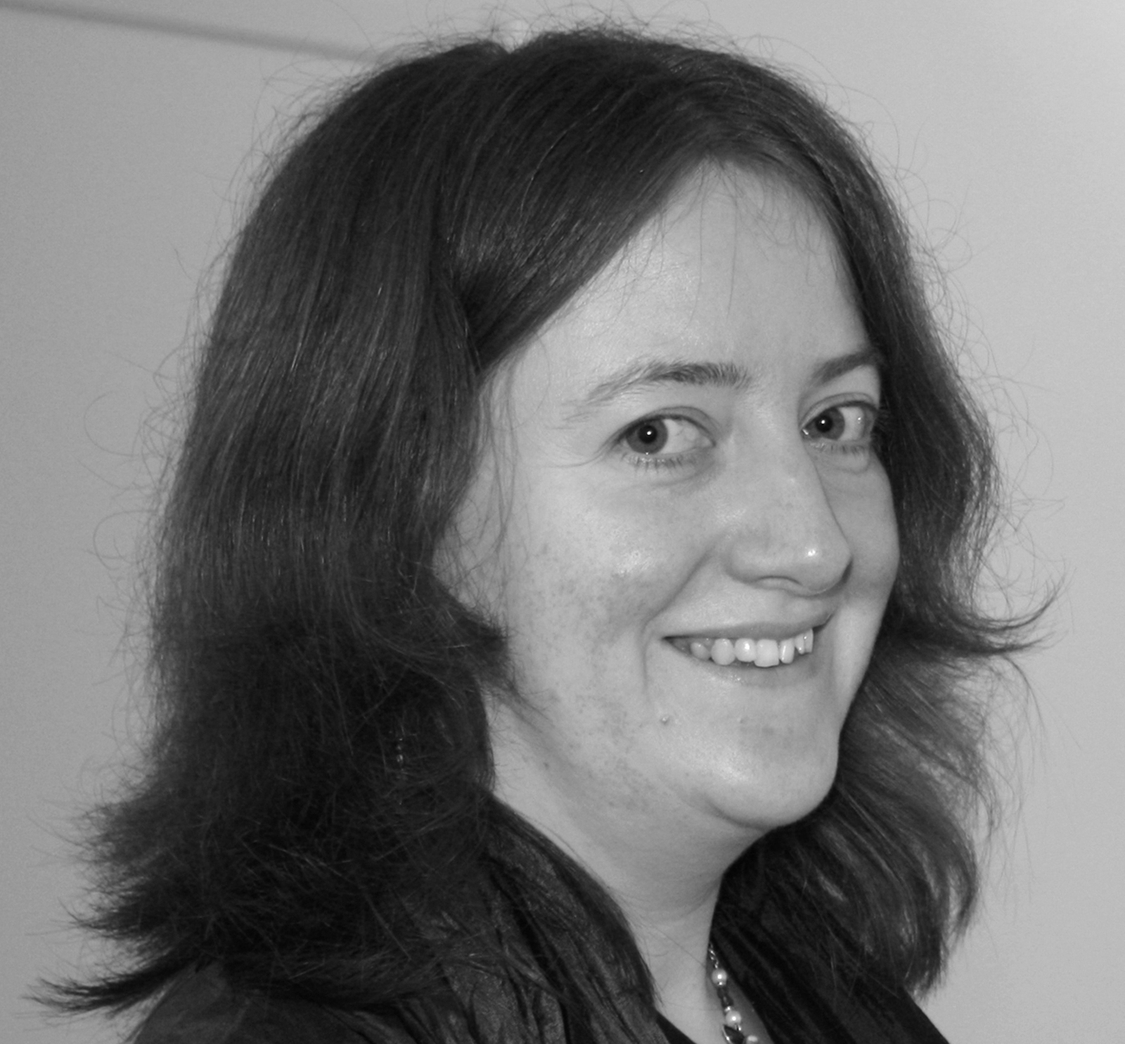
Harriet Russell was born in London, but grew up in the Sussex countryside in the small village of Lynchmere. She has always loved drawing and created little stories and books from a young age. She studied illustration at Glasgow School of Art and Central Saint Martins in London where she completed her MA in 2001. She has worked for many clients in the UK, US and across Europe, mainly on publishing and editorial projects.
The poster for COOP, Italy aims to present ideas about sustainable living in a simple and clear way. It was a collaboration with Italian publisher Corraini Edizioni who Harriet works with regularly, and the second part of a larger project about education in schools, called Sapere COOP. The poster will be used as part of EXPO 2015 in Milan, with the general theme 'Feed the Planet, Energy for life'.
"I was very happy to receive this award and I am glad that the poster is successful in communicating important ideas on sustainable living, something that is essential for our environment and continuing life on earth."
BRIEF: Design and illustrate a poster on the subject of sustainability.
MATERIALS: Pen, paper and Photoshop.
RESEARCH: I did lots of research on ways to live sustainably. I grew up in the countryside and lots of the things were already familiar to our way of life - keeping hens who we would feed scraps to, boiling up left over bones to make into stock or soup, growing our own vegetables and line drying clothes. My Mum in particular is determined never to waste anything, so a lot of the things I could include from my own experiences! An important part of this brief was also to include information on how to shop responsibly. Therefore I have included information on buying fair trade and organic products, buying re-fills and re-using shopping bags.
PROCESS: I started off with some rough ideas and sketches. I settled on the house idea fairly quickly, as it is something so familiar to everyone. Everything else is shown in relation to it, with arrows coming in and going out, showing the relationships between things and how they can be used, re-used and recycled. I began by showing the idea to the client as a rough sketch on paper. We discussed exactly what should and shouldn't be included, the main point being that it all had to be positive - what you should do, rather than what you shouldn't. I made a few adjustments and then began the final drawings, which I then scanned, put together and coloured in Photoshop.
RESISTANCES: The main challenge with this was to find a way to include lots of detailed information in a simple and easy to understand way, yet for it still to work as an overall image. Also the large size of the file, which at times my outdated computer had difficulty dealing with! Many drawings were scanned in several different bits which were then pieced together on screen.
INSIGHT: I learnt a lot about the COOP, it's importance in Italian communities and also it's responsibility to educate and provide people with information about how to make good choices for our environment and a sustainable future.
DISTRACTIONS: Just life in general I think! Also I was in the process of planning my wedding at the time so there were plenty of other things to think about as well as other projects etc.
NUMBERS: I think I had around a month to do the whole poster and it took much longer than I thought to do the final work as it is quite detailed. 17 black and white scans for the final drawing. Around 84 Photoshop layers I think. And copious cups of tea...
AFTERWORDS: This is a big subject with so many important issues involved and things to think about. I hope by bringing it down to an individual level with simple graphics this poster can educate and help people towards a sustainable future.


