AOI Members Award Cross-Category Shortlist
Meet the eight illustrators shortlisted for the WIA2023 AOI Members Cross Category Award! These projects have been selected by the AOI Membership team.
The winner of this award will win a year-long AOI Membership plus Folio, a copy of the Guide to Law and the current Directories, and a profile feature on the AOI website.
The winner will be announced at the WIA Awards Ceremony on 12th September 2023!
Lynn Bremner
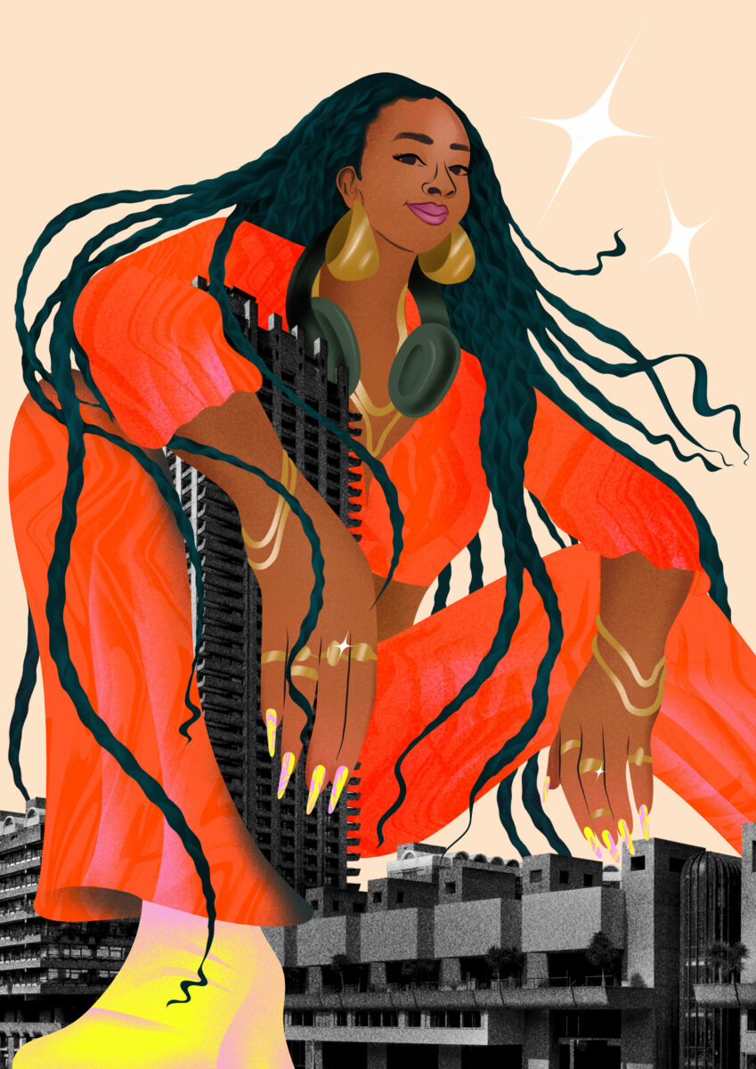
At the Barbs Portrait Illustration
This digital illustration was made for The Barbican Centre to promote their six-part podcast series ‘At The Barbs’.
Lynn was commissioned to create series of engaging and realistic portraits with eye catching details like grain, texture and movement.
Linda Baritski aka SEASONOFVICTORY
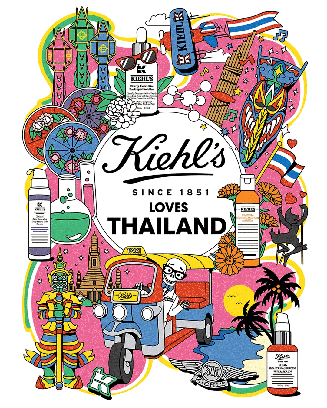
“Kiehl’s Loves” Global Campaign 2022-23
Working closely with the Kiehl’s team, the artist illustrated 48 mini kits specific to each location.
All are crafted to depict the distinctive style of local culture and landmarks. The artwork was used on limited edition packaging, POS, events, digital assets and more in each nation.
Olivia Boutrou
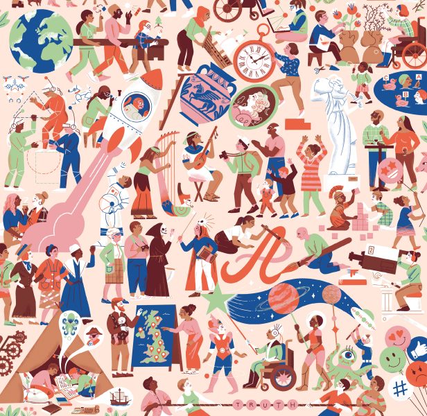
Being Human festival 2022 – Master Illustration
This project was the perfect opportunity to break the stereotypes around research and make learning a place of fun.
Olivia took a playful approach and made the illustrations inclusive and accessible to all. They created a crowd/melting pot of all sorts of subjects, reflecting the energy and the effervescence of the research field and the spirit of the festival.
Ollie Hirst
The Lancet Diabetes and Endocrinology 2022
This series pairs idea-led illustration with leading endo research.
Ollie was inspired by ideas based on monthly summaries of scientific papers, aiming for a human touch on incredibly complex topics, dismantling barriers to research and increasing accessibility.

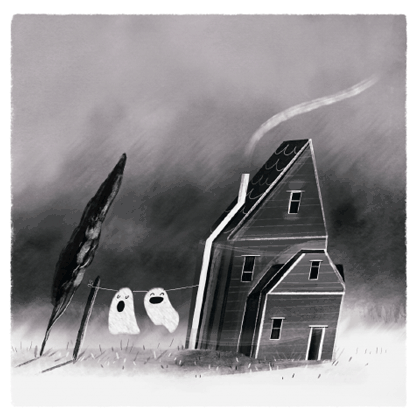
Sarah Walsh
Púca/Ghost
Púca/Ghost is an animated gif designed as a development piece for a personal project about haunted locations.
It was animated in Adobe Animate and brought into Photoshop where the colour and textures were added. Sarah wanted to use a minimal colour palette and soft blurs to create a hand-drawn and haunting feel while still being playful.
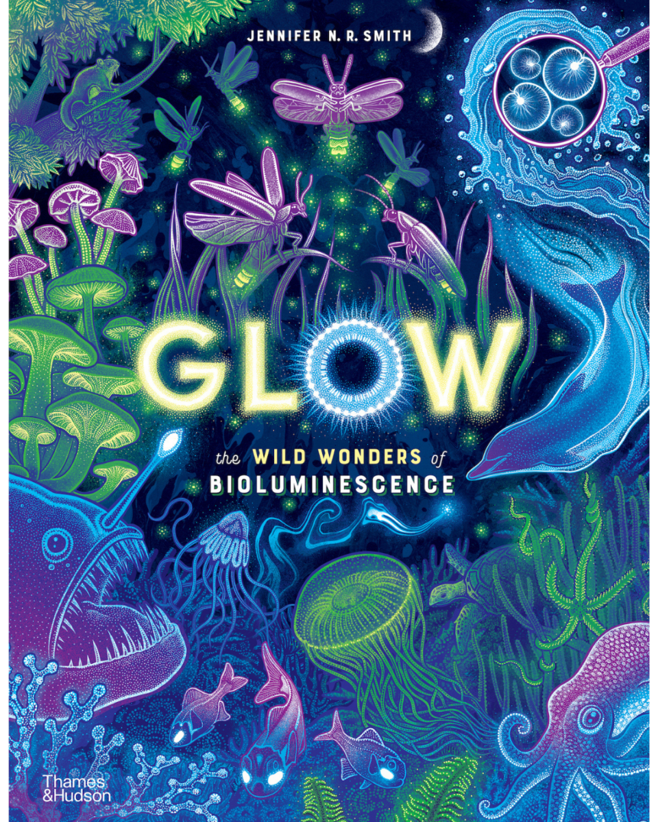
Jennifer N. R. Smith | WonderTheory
Glow
This children’s book was developed after the artist unexpectedly witnessed bioluminescence in the sea for the first time.
Working with designer Kate Haynes, they explored different printing techniques, deciding on selectively using fluorescent spot printing with expanded gamut, so the illustrations seem to really glow.
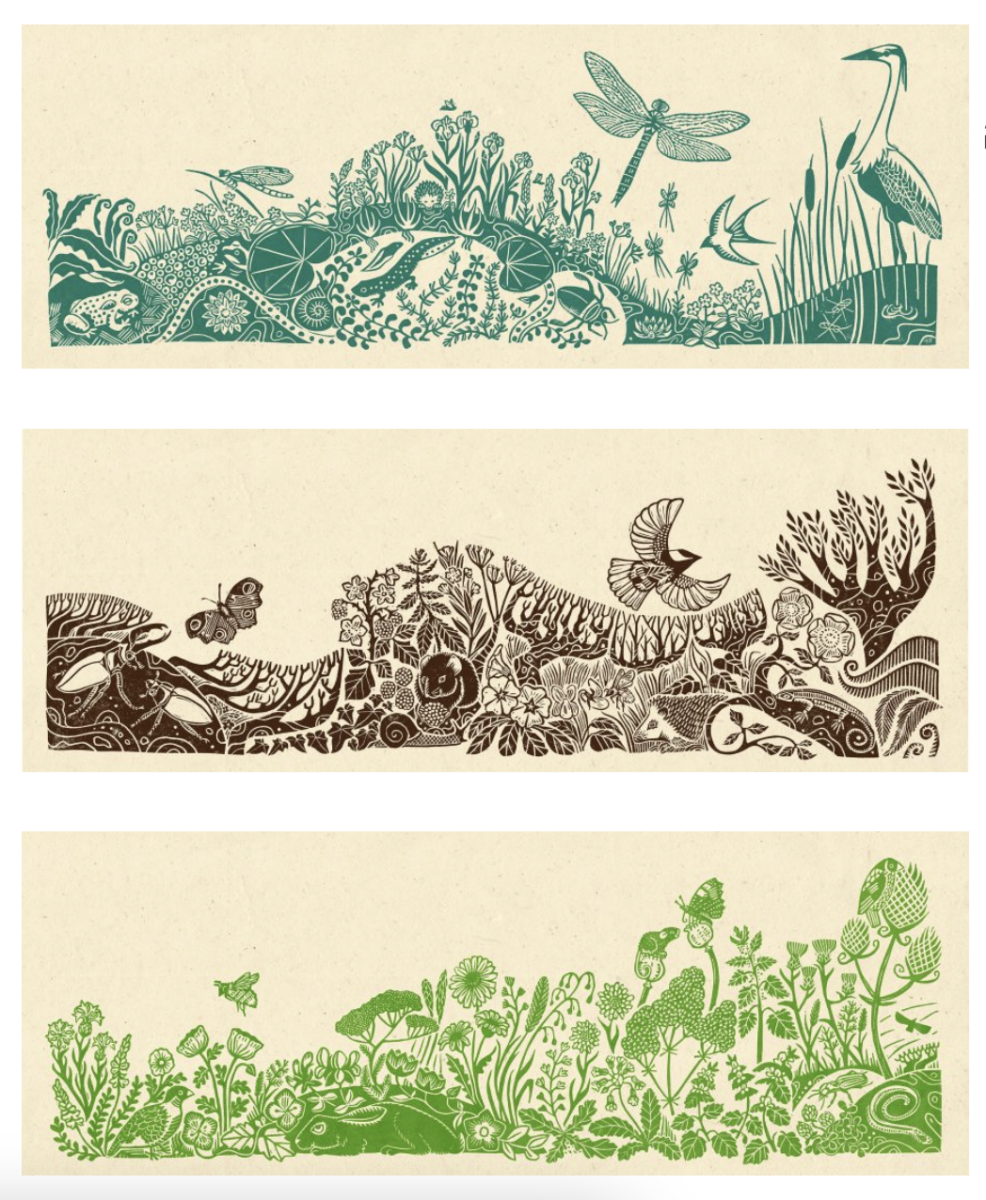
Becca Thorne
Marginal Habitats: The Hedgerow/Field Margin/Pond
Becca designed these prints as narrow landscapes to create a visual journey, so the viewer experiences them as they might in real life.
First we see large or dramatic animals, but a closer look shows the huge diversity of other wildlife. The series was meticulously researched via local Wildlife Trust courses & the UK Biodiversity Framework.
Anna Nicolò
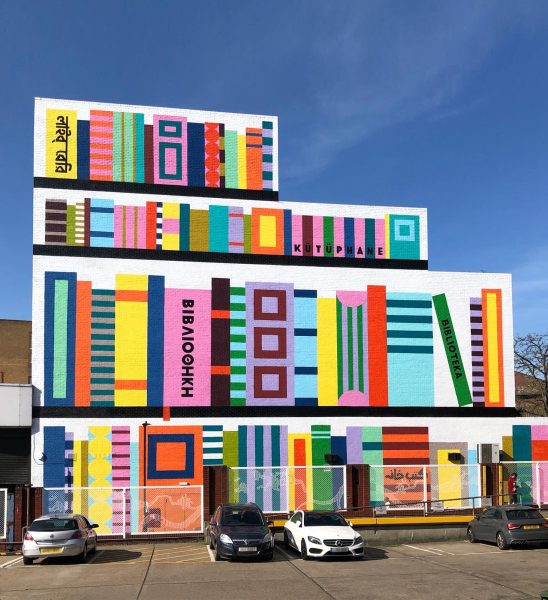
Wood Green Library Mural
The artwork was commissioned by Haringey Council as part of (RE)Imagine Wood Green, a project aimed at making civic spaces feel safer and more approachable.
The rows of books envelop the side of the library building from street level to the top. Some of the book spines display the word “library” in different languages to reflect and celebrate the cultural diversity of the community of Wood Green.