What does illustration mean to Weapons of Reason magazine?
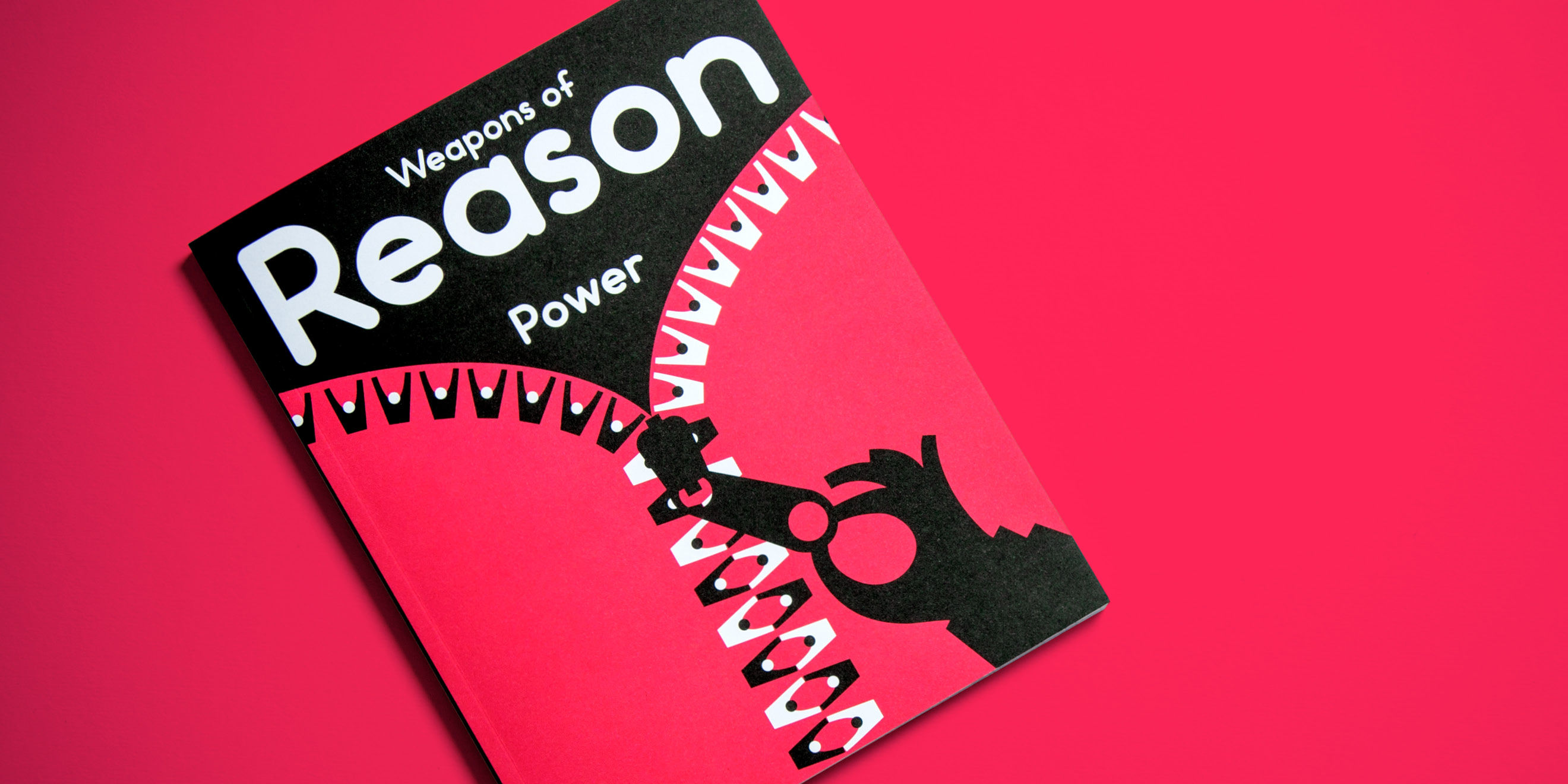
Weapons of Reason magazine recently deservedly won the Stack Award for ‘Best Use of Illustration’ for the Power issue.
Stack‘s is the world’s only awards scheme dedicated entirely to independent magazines, and this year’s Illustration section was judged by House of Illustration curator, Olivia Ahmad, and Simon Armstrong, book buyer for Tate museums.
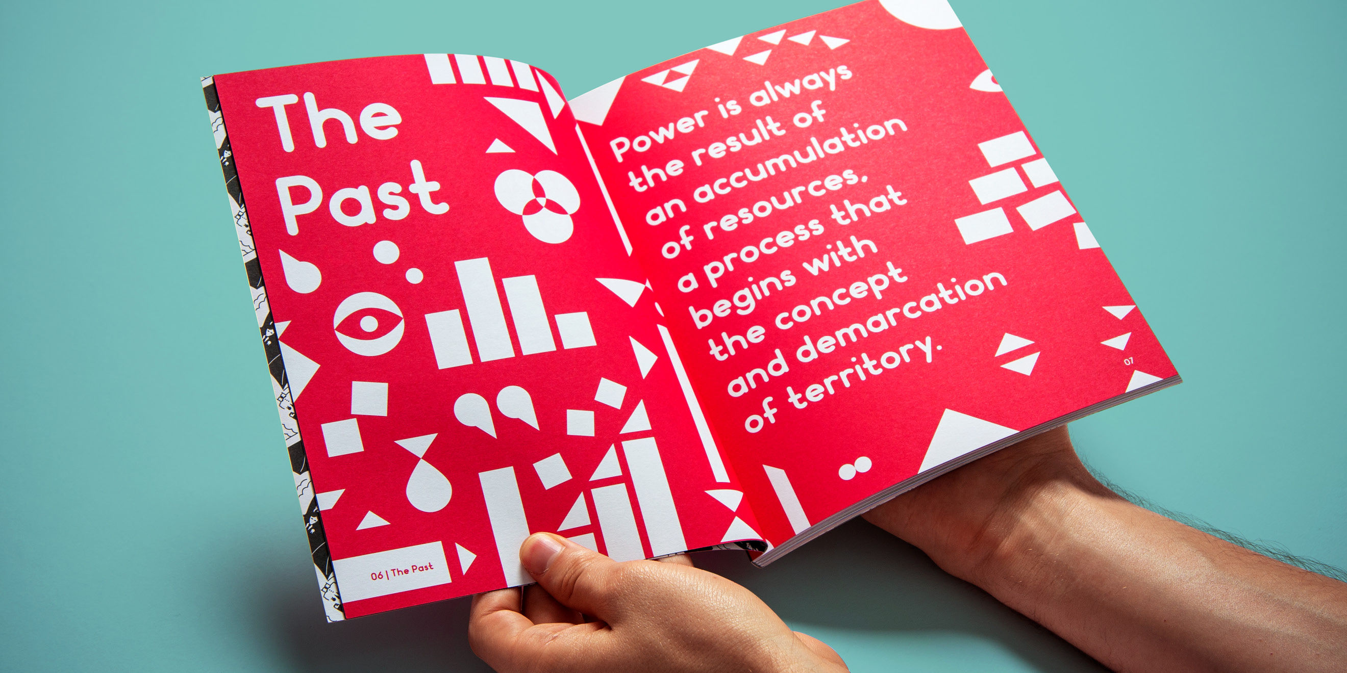
Weapons of Reason is chunky magzine dedicated to tackling issues that don’t usually get a visually impactful approach applied to them, using illustration to clarify, shine a new light and emphasise the ‘human’ element of the story. Their favoured style is very graphic illustration which can have an immediate impact without any distracting extraneous clutter.
We asked Paul Willoughby, Executive Creative Director of Human After All to explain some of the thinking behind the use of illustration in Weapons of Reason:
The magazine is described as ‘A project to understand the interconnected challenges shaping our world’. Did you see a consistently illustrated approach as an essential part of making these challenges clear to the reader?
Yes, illustration has the ability to clarify the complex in an artful and impactful way. It illuminates difficult to understand subjects and imbues the story with a sense of humanity. It also conveys visual thinking and helps to create ‘penny drop’ moments where a someone can suddenly see a concept or idea in a new light.

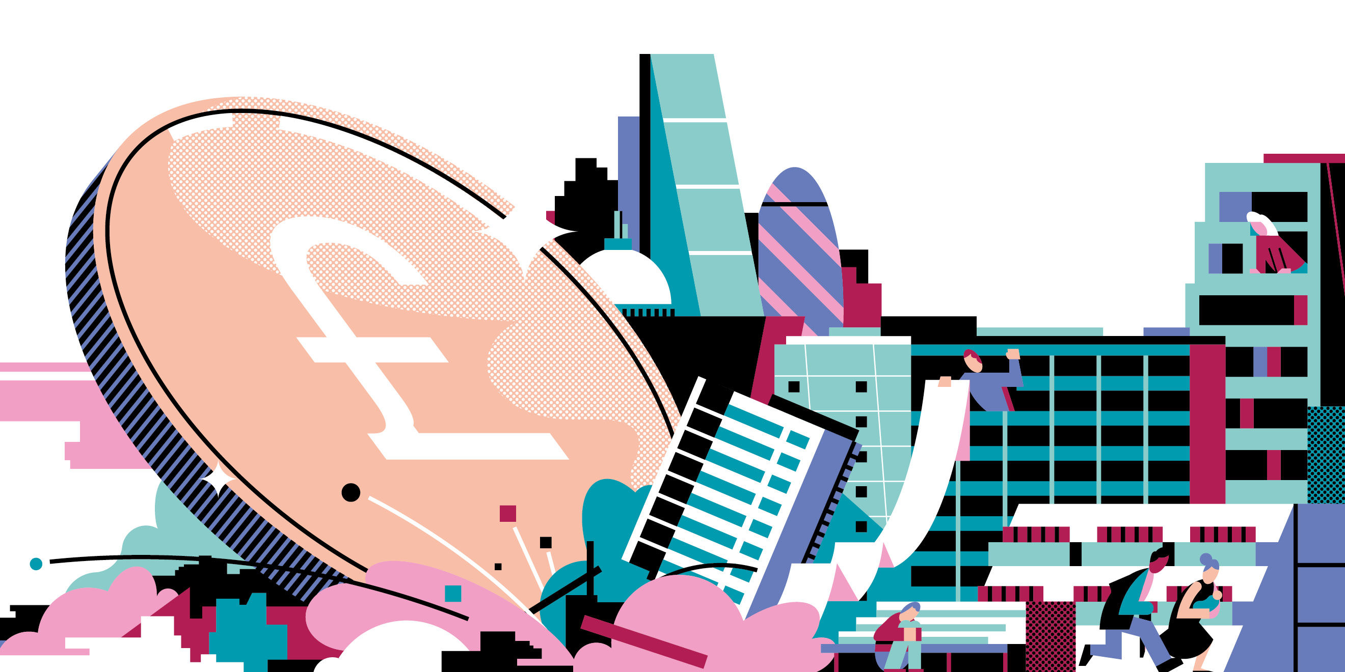
Illustration: Aleksandar Savic
The illustration has a graphic emphasis – what was the thinking behind using this style of illustration? And were there any challenges finding graphic illustrators with a conceptual bent to their work for commissioning?
We aim to produce, lean, powerful images that travel fast to the brain, but contain enough craft and sophistication to delight the mind of the viewer – that’s the balance. One of our biggest challenges is simplicity – crafting concepts and data visuals to achieve the leanest message possible. Simplicity isn’t as easy as it seems, it requires many revisions and constant alertness to embellishments creeping in, and we tend to avoid illustrators that sprinkle excess decoration over their work.

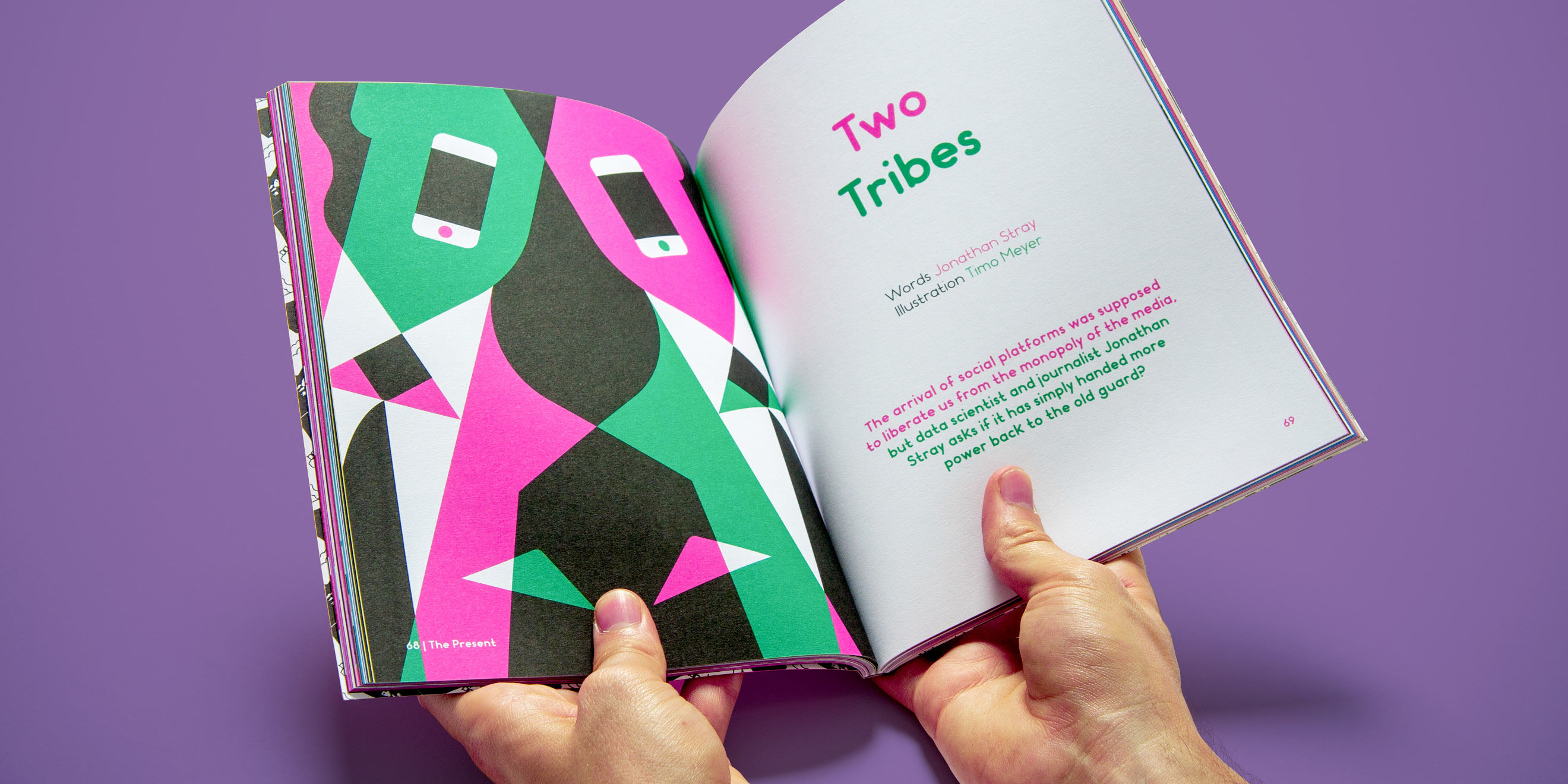
Illustration: Timo Meyer
What does winning the Stack Award for ‘Best Use of Illustration’ mean to Weapons of Reason?
It makes us incredibly happy to be recognised for sticking our neck out and pursuing an overtly illustration-led path in the expression of the magazine. To us, illustration is magic – it can be both visual poetry, and incredibly informative. Winning the award will only encourage us to carry on developing our visual language and brand.
Has the magazine had the impact you’d hoped for on it’s readers?
Yes, we love seeing readers Instagrams and getting feedback via Twitter and our reader surveys. We aim to serve our audience well and welcome any feedback that leads to a better, more useful product.

Back to News Page


