Varoom 41: The Cover
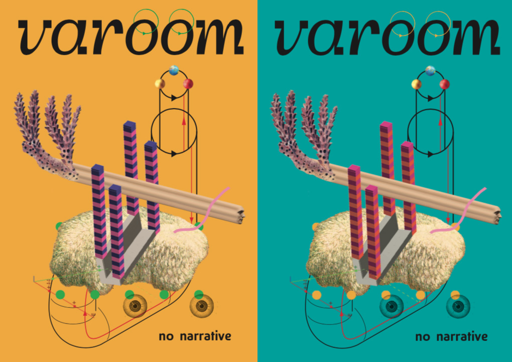
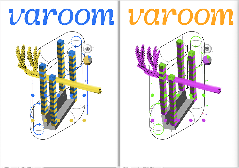
Matthew Richardson created the artwork for the cover of the No Narrative issue of Varoom in four varied colourways. We asked him about his concept and process.

Varoom: Could you talk us through the concept for your Varoom cover? How does it express the theme of No Narrative?
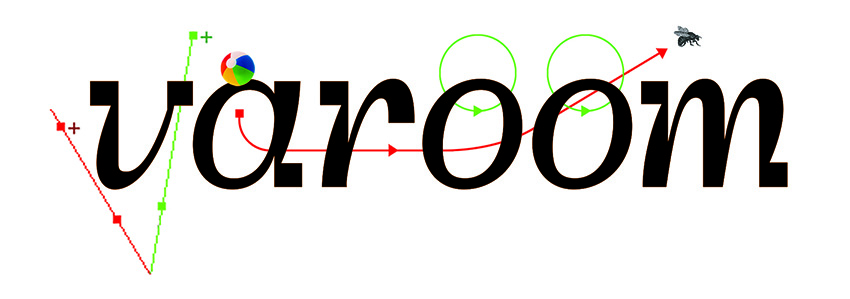
Matthew Richardson: I like playing with very different forms of visual language and clashing them together. At the heart of my approach is the use of collage to create an uneasy connection – something that doesn’t quite ‘fit’. At the moment I’m really interested in diagrams and how they work as a hybrid somewhere between words and image, so working on this cover was perfect.
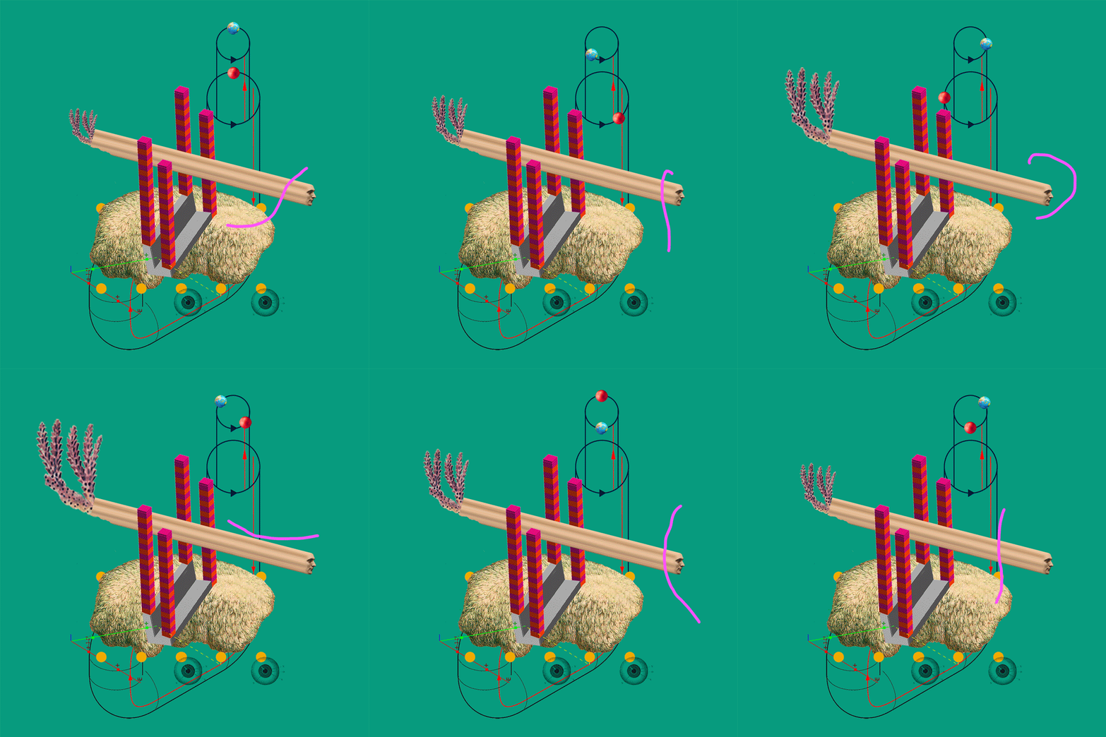
I wanted to show that even in illustration fields such as medical illustration, botanical illustration, statistical and information illustration, ‘non-narrative’ still relies on a sense of visual storytelling. Often it is a process that is depicted – a way to show time , movement and transformation. In the cover illustration I made for Varoom, the ‘space’ and place’ is ambiguous, a scientific rendition of the surreal – maybe it’s a sort of illustrated diagram of the ‘thinking process’ itself?

What was your working process? Do you piece the image together digitally straight away?
I’m a magpie of images and I am always collecting objects, images, books and postcards. The beginning point of most of my illustrations are the bringing together of images to see what might spark an idea. The process is quite drawn out, playing with many and varied objects, scales, colours and combinations. I like to find and use aspects of chance in compositions to keep them alive, so that the images don’t become too planned, refined and over-determined, which can be a tendency in digital working. Sometimes this might be about leaving something in that is ‘jarring’ or about the way drawn lines are used to connect elements in unexpected ways. I want the images to be visibly ‘crafted’, whether that is through a drawn line, a 3-D shape or a found engraved image.

How do you feel about the final artworks and the different colourways?
I’m really pleased with the outcomes and it felt like a great collaboration between all involved. It was really exciting to work on the different colourways and this aspect of the brief was a good test of the image – keeping the work fresh. Working with alternative colourways felt sort of appropriate too for the theme of ‘non-narrative’– that the content of image needed to work regardless of colour – colour used objectively rather than subjectively – not as ‘mood’ or ‘atmosphere’ but something else.

Back to News Page
