Varoom 39: Gucci’s Daydream Nation
Daydream Nation
Rome-based illustrator Ignasi Monreal’s digital paintings mix art historical and pop culture references to sublime effect. In Varoom 39 Zoë Taylor explores his work for Gucci’s Utopian Fantasy campaign and asks whether fashion illustration can break from its past?
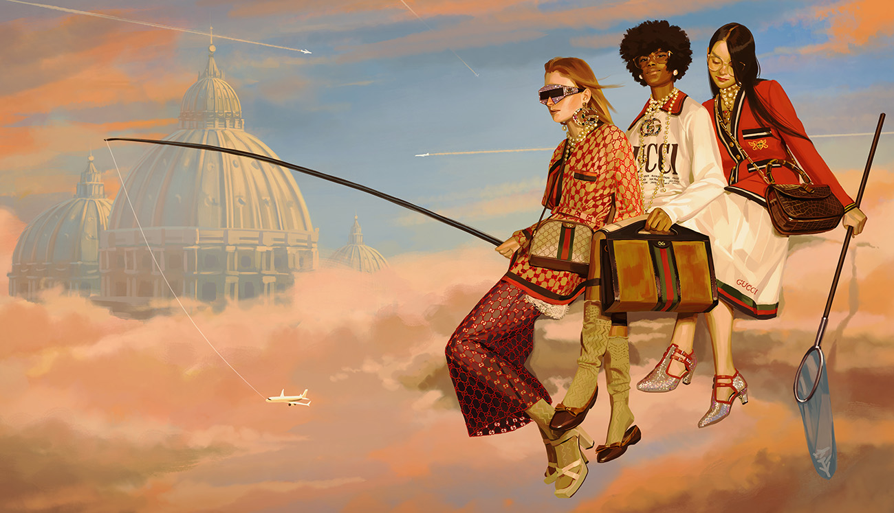
Utopian Fantasy, Ignasi Monreal, Gucci, 2018
‘It’s the first painted campaign that I know of, and a big leap of faith from Gucci,’ says Ignasi Monreal, the artist behind the 32 digital paintings that the luxury Italian brand used to advertise its spring/summer 2018 collection. From glossy double spreads in magazines – many of which reveal augmented reality effects when scanned with the Gucci app – to billboards, animated window displays, interactive sticker art, giant murals and 360-degree panoramas accessible via in-store VR devices, every image in the campaign was made by Monreal. It featured no photography.
While fashion brands have increasingly capitalised on illustration’s popularity online, Gucci’s ‘Utopian Fantasy’ (#GucciHallucination) has made the most extensive use of it. ‘Gucci is about making fashion extremely cool,’ says the tech blogger Dimitri Makris, who also notes that the brand enjoyed a 44.5% increase in revenues in the months following the campaign’s launch, dispelling long-held myths that illustration can’t be effective in fashion advertising. The campaign has also been a critical success: its innovation in the digital sector was acknowledged by Beazley Designs of the Year last autumn.
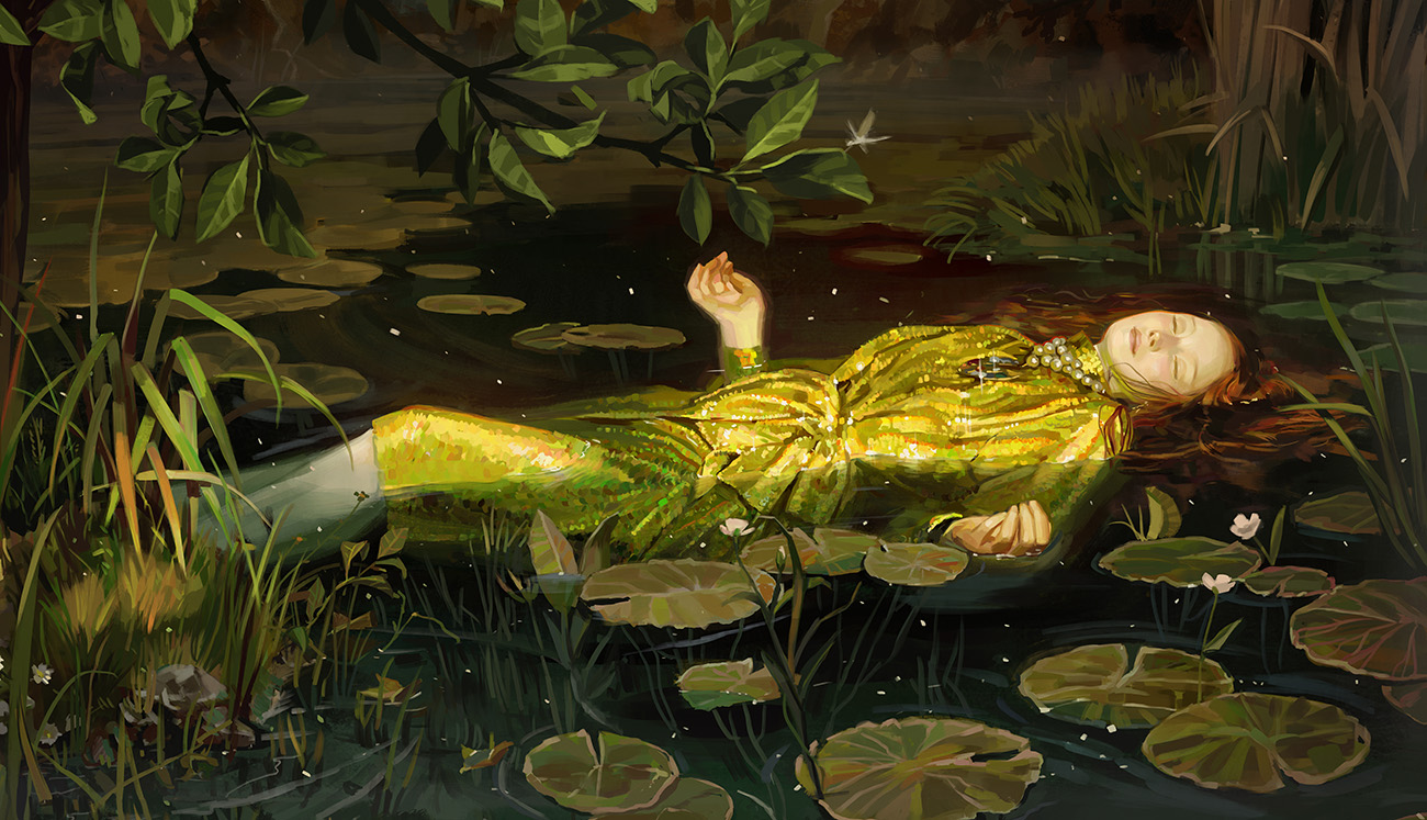
Utopian Fantasy, Ignasi Monreal, Gucci, 2018
The ‘Utopian Fantasy’ series mashes up imagery from Old Master paintings with pop-cultural, alchemical and post-internet references to create striking, slightly ironic scenes – from mermaids on iPhones and cherubs plucking Post-It notes to fashionista Fates, casually sitting on top of a Google Maps Earth. This ‘internet-friendly weirdness’ – as Dazed Digital’s Dominic Cardogan puts it – is clearly directed at an Instagram audience. But the series also conveys a romanticism that transcends the wry humour. In its press release, Gucci describes Monreal’s ‘haunting characters’ who inhabit a ‘mythical universe’; from sunsets to thunderstorms, sublime skies pervade the series. Meanwhile, the references to classical painting offer a colour palette and an approach to lighting and composition that give these whimsical images drama and impact.
The paintings are designed to grab your attention, but also to be read. It takes time to discover their details. Take, for example, the image below, which merges elements from all three panels of Bosch’s The Garden of Earthly Delights with those from van Eyck’s Arnolfini Portrait – echoed in the pose of the central couple – alongside double-headed swans, arrows, disembodied hands and Disney-esque bluebirds. There’s even a tiny portrait of Alessandro Michele, Gucci’s creative director, pensively sitting by a stream in a pink suit, with a halo and a Jesus beard.
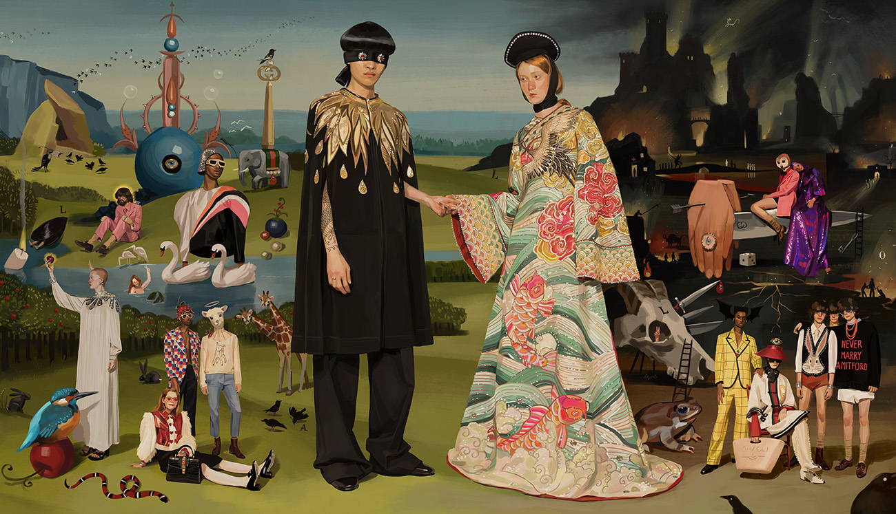
Utopian Fantasy, Ignasi Monreal, Gucci, 2018
Of course, these images are striking partly because of the extraordinary garments they represent – the cape adorned with a golden feathers motif and the fully embroidered 14th-century-style dress that take centre stage here, for example. But equally important is the skill with which they’ve been rendered: the shadows that delineate the crisp pleats of a skirt, the regularity of the classic Double-G print on a transparent dress and the glistening of sequined Snow Whites, bejewelled shell suits and patent leather handbags. Despite its evocations of old paintings, the heightened detail and accuracy have led many to describe the series as photorealist, or even hyper-real.
The appearance and gestures of the characters in these paintings resemble those in a fashion shoot. ‘I used a lot of reference photos because… it’s a campaign with an agenda and the product needs to be visible, and the images can’t be misleading – they have to be faithful to what’s being sold,’ says Monreal. He photographed the models himself in a low-key shoot ‘with no make-up or hair’, which he added later as he built up the images.
At first glance, you might assume that the images had been painted traditionally, but they’re all digitally made. Using a Wacom tablet and PhotoShop, Monreal effectively captures the feel of European painting from the Renaissance to the 19th century. Although he references iconic paintings such as Millais’s Ophelia, others are harder to pin down – maybe the flooring of a Dutch vanitas painting here, or a baroque sky there. ‘This was like my love letter to painting, and I enjoyed merging the realism with all of these different references from art history,’ he told Vogue.
From conception to the finishing touches, each painting took about two days to complete and Monreal worked in intense 14-hour stretches to achieve the level of detail he wanted. Over several months, he produced nearly 200 paintings for Gucci to select from. ‘It’s digital painting, so it’s all in my computer or tablet… Since I’ve been doing this since I was 14, I’ve really had time to refine and create my own specific technique,’ he told W magazine. Although he has had traditional artistic training, as a teenager Monreal developed a preference for the digital – which he discovered through video games – ‘because you don’t have to have any materials and it’s cleaner’.
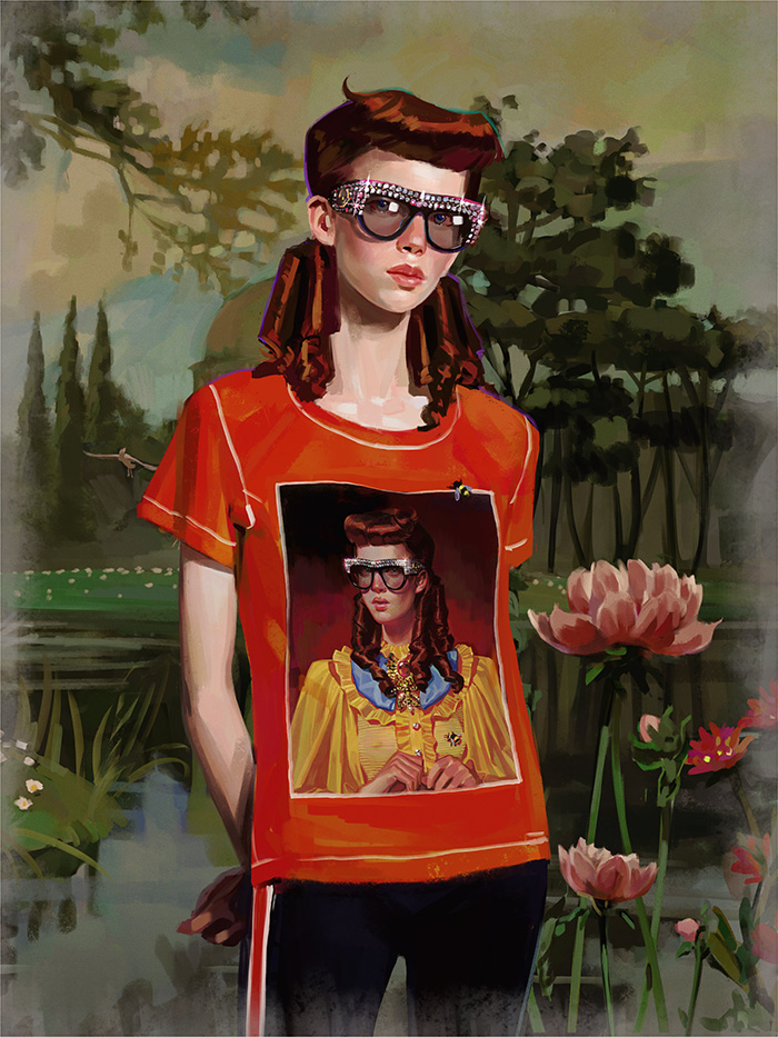
Gift Giving, Ignasi Monreal, Gucci, 2017
The Spanish-born 27-year-old studied comics and illustration in Barcelona and then fashion creative direction in Madrid, before moving to London to work as an art director for brands like Swarovski. By night, he worked on his illustrations, which soon took off with commissions for W magazine and various musicians, including an on-going partnership with FKA Twigs.
Gucci first approached Monreal in 2015 for #GucciGram, a series of 15 illustrations by 15 artists, published on Instagram, which launched just after Michele’s arrival. His contribution of eerily blinking weather girls and TV psychics led to further collaborations with Gucci, as well as animated commissions for Dior, JW Anderson and Louis Vuitton.
Monreal’s playfulness and interest in myth make him an ideal partner for Michele’s vision. Like Michele, he also juxtaposes the historic and the contemporary – evoked partly through the medium of digital painting. His imagery echoes and complements the overload of references that epitomises Michele’s work, which, in this collection, ranged from Elton John’s glam rock wardrobe to Queen Elizabeth I, Disney and Marlboro packaging.
Vanity Fair Italia editor Simone Marchetti has described Michele’s work as ‘a spirited archaeology of the past’, yet, as critic Sarah Mower points out, ‘He’s also one of the fashion masters of the digital universe, communicating his visions brilliantly through Instagram campaigns.’ Mower goes on to say, ‘It’s perhaps no wonder that this omni-connected man channels the sensibility that everything, past and present, is going on at the same time.’ As Michele told Vogue, ‘To feel the contemporary, I need to know that something was there before. I want to touch it.’
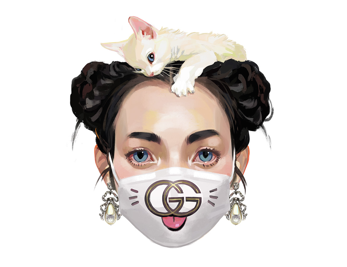
Gift Giving, Ignasi Monreal, Gucci, 2017
In the past few years, Gucci has teamed up with more illustrators than any other luxury brand, working with Jayde Fish, Angelica Hicks, Lebanese illustrator Nour Flayhan and Unskilled Worker, among many others. Michele has said he wants to transform Gucci from a brand into an immersive experience, and his collaborations with artists and innovative use of social media have played a major role in this. ‘Today, creativity is often born and finds its voice in digital media, a vital source of visual culture,’ he once said. Illustration suits Gucci’s new association with free imagination, fantasy and eccentricity, and although it gets great engagement on Instagram – where the fashion house has more than 32 million followers, and where Michele discovers his illustrators – these artists’ work is used not only for online advertising but also as giant store façade murals, on clothing and in Gucci-curated art exhibitions.
Towards the end of 2017, Vogue cited Gucci’s use of illustration and its emergence ‘as a tool for cutting through the visual noise of social media’ as evidence that fashion illustration was ‘having ‘a moment’. It has certainly had more visibility with the rise of Instagram, with its categories and hashtags. But proclamations that ‘It’s back!’ have become something of a trope in fashion, where illustration seems to be continuously dying and being reborn, often simultaneously – even its so called ‘golden age’ during the first 60 years of the 20th century was also seen as an extended swan song, according to historian Colin McDowell.
Fashion illustration – like illustration in general – continues to evolve and diversify as culture and technology change, yet somehow the perception remains that it’s a fleeting, diminishing form, forever overshadowed by its former glory as the dominant medium in style magazines. But Vogue’s assertion that David Downton ‘has almost singlehandedly kept illustration in the limelight over the last 20 years’ is simply not true. With strong, inky lines (reminiscent of Rene Gruau’s work of the late 1940s) and a knack for capturing an elegant portrait with minimal detail, Downton works in the tradition of classic fashion illustration. He’s a master of his craft and has had a long career working with both luxury and high street brands; in 2009, his portrait of Cate Blanchett for the cover of Australian Vogue made it a sell-out edition.
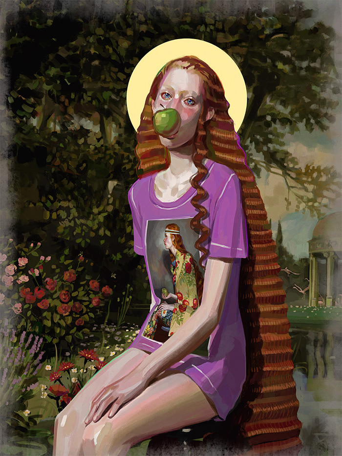
Gift Giving, Ignasi Monreal, Gucci, 2017
However, there have been a lot of developments in fashion illustration since the early 2000s – a time when it was also claimed to be having a renaissance, as fashion houses started to realise the power of the internet. Take, for example, the rainbow-coloured, tits-and-bums drawings of the ubiquitous Julie Verhoeven; Nike’s various collaborations, such as with James Jarvis; and Prada’s major campaign with Jean James in 2007, whose sinister fairies featured on massive murals, painted sets and prints on clothing, and which culminated in an animated film, ‘Trembled Blossom’. Alongside all of this have been the rise of animated fashion films and the emergence of virtual models.
Yet perceptions of fashion illustration tend to remain fixed on that which echoes its history. Vogue even wonders if it might be making a return because of a current craze for nostalgia. It seems hard for fashion illustration to shake off the view that it is fundamentally of the past.
Monreal wants to challenge this. ‘I want to try to help put illustration on the same level as photography and video,’ he has said. Speaking to Plastik magazine, he attributes his success to ‘working hard and having a painting style that is different from what we are used to in fashion illustration’.
Like Michelle, Monreal enjoys creating characters, which he puts down to his love of comics. His work, which is dense, detailed and narrative-based, contrasts with fashion illustration’s conventions of gestural line work, watery shapes and playfully exaggerated or semi-abstracted bodies on stark backgrounds.
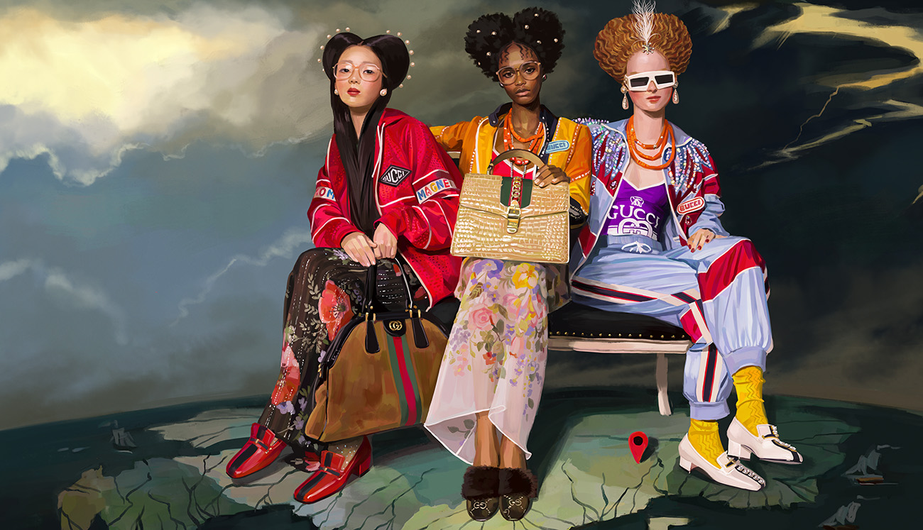
Utopian Fantasy, Ignasi Monreal, Gucci, 2018
Since the perfection of colour photography in the late 1930s, fashion illustration has largely sought to stake out its place by doing ‘what photography can’t’. Writer Holly Brubach explains that fashion illustration and photography were ‘twin forms that grew up together over course of 20th century’, and each came ‘to specialise in what the other was incapable of doing as well’. Over the years, much of it became less detailed, more abstracted; and it has explored, in a myriad playful ways, gestural or exaggerated methods of representing the fashioned body. Although there might be suggestions of character, the mise en scène required to tell a story has largely disappeared.
This approach arguably originates in the 1930s with Gruau and can be traced through the work of Mats Gustafson and François Berthoud in the 1980s. It can be seen today in the illustration promoted by the website ShowStudio, among others. While it continues to produce interesting work, it seems a shame that fashion illustration has largely left unexplored its potential to tell stories. Despite the exceptions (some of Antonio Lopez’s work, the ‘Trembled Blossoms’ animation mentioned above, Marie Jacotey’s recent work for McQ, for example), there’s an enduring perception that fashion illustration has little to do with this terrain.
The telling of stories in fashion has developed an acknowledged sophistication in photography, film and theatrical fashion shows. But in striving to do what photography can’t, fashion illustration has perhaps been slower to match what fashion photography does at its most interesting – setting up scenes loaded with drama, tension or mystery, which enables the images to go beyond representing products and explore other themes or issues. Take, for example, the work of photographer Guy Bourdin, who in the 1970s was among the first to introduce dark and complex narratives into fashion advertising; Miles Aldridge’s acidic takes on the dark side of glamour; or Philip-Lorca diCorcia’s psychologically charged work for W magazine.
The images in Monreal’s ‘Utopian Fantasy’ series likewise set up dramatic scenes, which suggest stories and invite questions. Perhaps it’s the allusions to history and myth that make them seem so loaded and mysterious. The way they situate fashion in a web of conflated references encourages interpretation, although what their meaning might be exactly is far from clear. Does this hi-tech recreation of old paintings bring into focus the new significance of digital media, or ask what it means to be contemporary now? What do we make of the juxtapositions of historic symbols of status and beauty with those of today? Or the mash-ups of fashion-shoot poses with icons from Western cultural mythology, from Ophelia to Snow White?
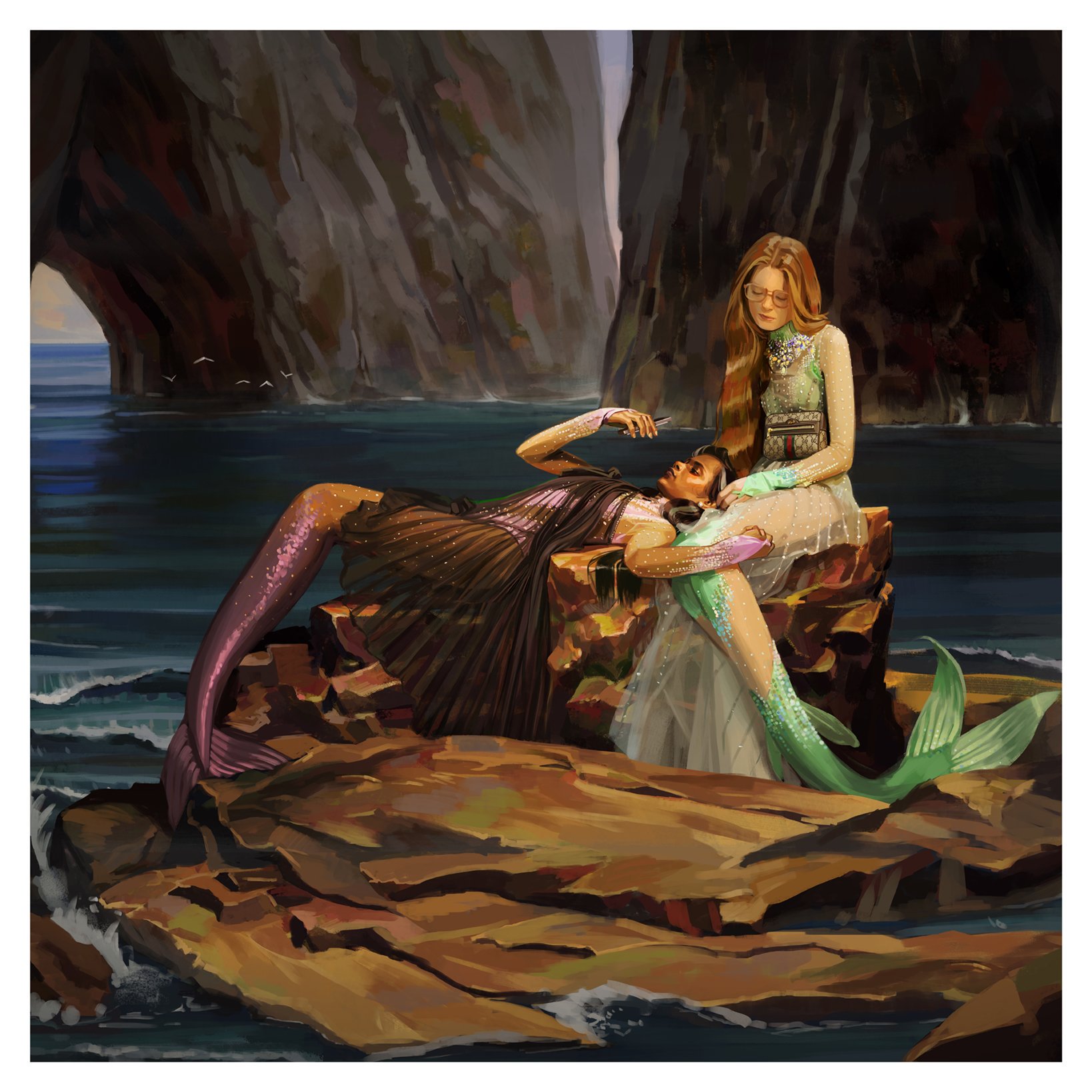
Utopian Fantasy, Ignasi Monreal, Gucci, 2018
In AnOther, Susannah Frankel writes that Michele’s work as a designer ‘appropriates and re-appropriates references to the point where, though there’s a certain familiarity to anyone looking on, the overriding sense is one of disorientation… There is certainly storytelling at work here but that story may be all the more engaging for remaining a mystery.’ Taken as a whole, the same could be said of Monreal’s ‘Utopian Fantasy’ series. It invites interpretation but remains ambiguous, and this seems to be the key to its power.
Resembling an artwork in a gallery, the new window display presents a bench facing the screen on which colored velvet-covered mannequins sit, as if looking at the #GucciHallucination campaign by #IgnasiMonreal hung on a gallery wall. #AlessandroMichele #GucciSS18 pic.twitter.com/VTtneL3mYJ
— gucci (@gucci) February 27, 2018
Fashion theorist Caroline Evans, writing about historical referencing in the work of late 1990s fashion designers, uses the ideas of Walter Benjamin to explain what she describes as the ‘emblematic nature of fashion’ and how ‘fashion images, like emblems or metaphors, are by their very nature densely packed with meanings which may be both complex and contradictory… Yet because they also function in the modern period… one can begin to see connections, re-seeing the past through the filter of present concerns.’ These ideas are most likely familiar to Michele, who, in his show notes for Gucci’s autumn/winter 2016-17 collection, referenced Benjamin’s ideas about what happens as the past collides with ‘the now’.
Fashion illustration is capable of such complexity. It needn’t be restrained by preconceptions of what it should be and now, more than ever, the possibilities for it seem unbound by technology. The boundary between the ‘made’ and photographic image hasn’t always been clear, even in fashion – but the rise of digital media has blurred the lines even further. Photographs can be seamlessly altered, blended and mixed together to fantastic effect (see photographer Nick Knight’s pioneering fashion images of the 1990s, for example); likewise, the illusion of photographic realness can be created through digital rendering. While there is much still to explore within traditional media, this has opened a whole new range of trajectories for fashion illustration. So, what can fashion illustration contribute today, alongside photography? As Dolly Jones (Vogue) says, it ‘allows for a different daydream’. Monreal’s work does just that.
Envisioned by #IgnasiMonreal for #GucciHallucination, leather ballet flats with a layered bow and GG mirrored detail at the center—an archival reprisal of the House's signature emblem—appear underwater. #GucciSS18 #AlessandroMichele pic.twitter.com/bXt41tPsOL
— gucci (@gucci) March 1, 2018
References
Images – Artwork: Ignasi Monreal
Art direction: Christopher Simmonds
Creative direction: Alessandro Michele
Drawing Fashion by Colin McDowell and Holly Brubach, 2010
The Impossible Image by Robin Derrick (intro), 2000
‘Yesterday’s emblems and tomorrow’s commodities: the return of the repressed in fashion imagery today’ by Caroline Evans in Fashion Cultures, 2000
Dolly Jones https://www.vogue.co.uk/gallery/fashion-illustration
https://www.vogue.com/fashion-shows/spring-2018-menswear/gucci
Sarah Mower
http://www.anothermag.com/fashion-beauty/10576/people-need-reality-alessandro-michele-on-his-gucci
Susannah Frankel
https://www.vogue.com/article/gucci-gram-instagram-project
Back to News Page
