Varoom 37 – Folio Society illustrators Andrew Archer and Chris Skinner
Online Exclusive: The Folio Society Illustrators
Andrew Archer and Chris Skinner
Issue 37 of Varoom profiles one of the publishing world’s most sophisticated book makers. The Folio Society has been producing illustrated version of classic titles since 1947, and their contemporary selection of illustrators have created outstanding visual companions to the text.
Here, in an online exclusive, we talk to some of the illustrators whose artwork is featured in the magazine profile in issue 37, and ask them about the experience of working with The Folio Society and helping the publisher fulfil its stated intent on launch ‘to produce editions of the world’s great literature in a format worthy of the contents, at a price within the reach of everyman’.
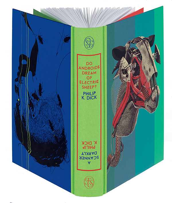
AOI members Chris Skinner and Andrew Archer were both commisisoned to illustrate a single volume containing two novels by Philip K. Dick.

‘Joint’ cover of Do Androids Dream of Electric Sheep? and A Scanner Darkly by Philip K. Dick Illustrations © Chris Skinner (right) and Andrew Archer
Chris Skinner illustrated Do Androids Dream of Electric Sheep by Philip K. Dick
“One of the key advantages with this project was Folio’s trust in allowing illustrators to create freely”
Why were you chosen to illustrate this specific book (which was filmed as Bladerunner)?
The Folio Society thought my cinematic approach to compositions and lighting in my illustrations would be a great fit with Do Androids Dream of Electric Sheep.
How did the process work with the Art Director? What were the biggest challenges? Did the fact it was two books in a single volume effect your decision-making?
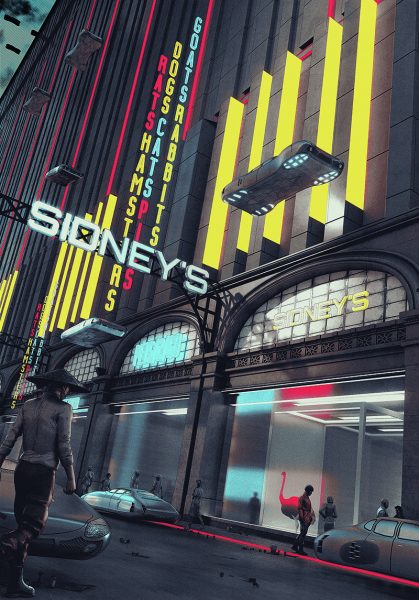
The process ran very smoothly and everyone involved was great to work with. The Folio Society gave me a lot of freedom and let me choose which scenes from the book to illustrate. Each stage of the process was approved by Philip K Dick’s estate which adds a nice seal of approval. The biggest challenge was choosing which scenes to illustrate, PKD’s writing evokes so much imagery which needed to be narrowed down and evenly spread throughout the novel.
How does it compare to your previous book illustration?
I approached the illustrations as I would most projects, with plenty of research and communication with the client. One of the key advantages with this project was Folio’s trust in allowing illustrators to create freely. I think this freedom shows in all of Folio’s editions, as the artists and illustrators are given a great sense of ownership.

Interior illustration by © Chris Skinner 2017 – Do Androids Dream of Electric Sheep?
How did you conceive of the relationship of image and text? What was your illustrative approach? What was the most challenging aspect of the brief?
I started by reading the book a few times and making notes on what might make for an interesting illustration, then sketches were sent in for approval before taking them to final illustration. I wanted my work to sit somewhere between the imagery I got from PKD’s writing with a little hint of the film Blade Runner (which is based on Do Androids Dream of Electric Sheep). I think the closest I got to similar imagery from the film is the illustration of Rachael Rosen taking the Voight-Kampff test, but this is how I saw it when reading.
What did you love most about the final result?
The way Folio Society have combined Andrew’s and my own work into one edition. We have very different art styles but they have been packaged together beautifully.
Andrew Archer – illustrated A Scanner Darkly by Philip K. Dick
“The work is like nothing I’ve done before”
Why were you chosen to illustrate this specific book?
The Folio Society approached me for my surreal and suggestive approach to my work. We both felt that the work and style would fit perfectly with Philip K. Dick’s writing style and A Scanner Darkly.
How did the process work with the Art Director? What were the biggest challenges? Did the fact it was two books in a single volume effect your decision-making?
It was very smooth. I had over 60 ideas for visuals which needed to be cut down to 7, which was the hardest part of the project! The books merging didn’t effect my process at all and only really came into play when I got the final illustration which merged with Chris, and even then we managed to work up the joint image with ease. It was a pleasure working with everyone involved.

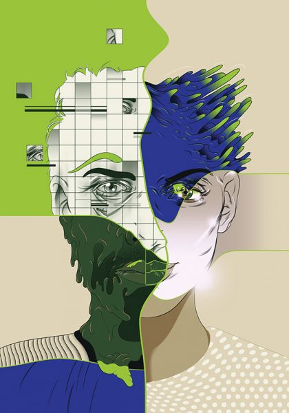
Frontis illustration © Andrew Archer 2017 – A Scanner Darkly
How does it compare to your previous book illustration?
The work is like nothing I’ve done before. Usually you put forward your most out-there ideas and you know they will be shut down or toned down. This was a rare brief and the team had so much trust in my work and input on the visuals, and I think it showed in the visuals which were published.
How did you conceive of the relationship of image and text? What was your illustrative approach? What was the most challenging aspect of the brief?
The toughest and most challenging part was deciding how to interrupt each scene, Philip K. Dick really pushes your imagination and leaves every element of his books up to you from a visual standpoint. The area I paid close attention to throughout was the mood of the images, I wanted to bring that raw, grimy and disturbing feel of the effects of ‘substance D’.

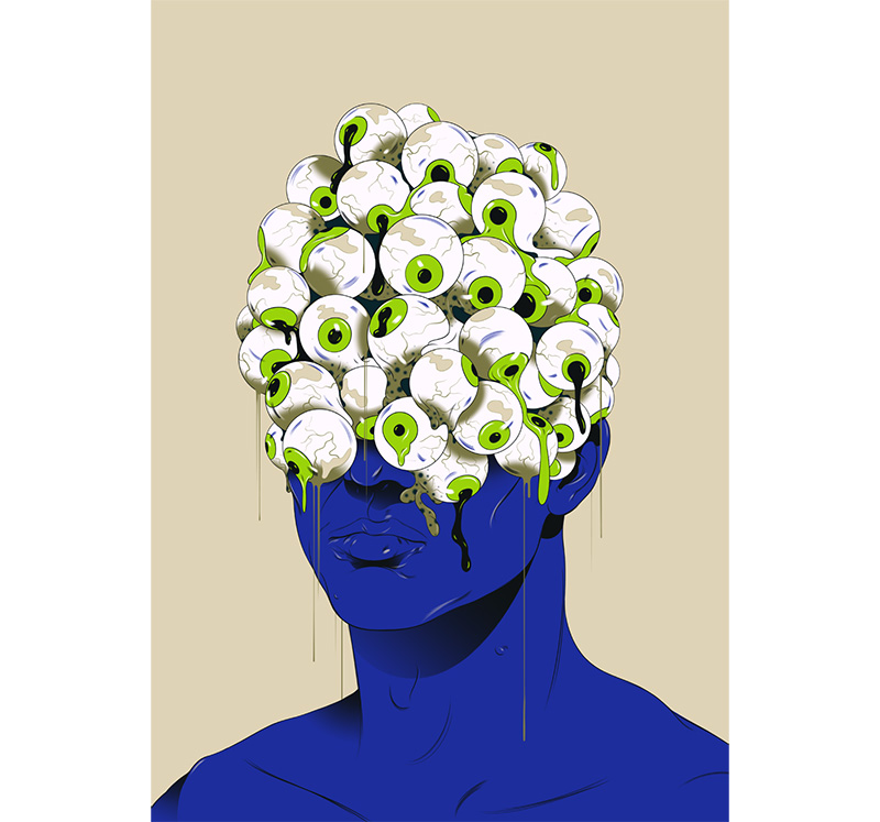
Interior illustration by Andrew Archer 2017 from The Folio Society edition of A Scanner Darkly by Philip K. Dick
What did you love most about the final result?
The cover and the opportunity to work with such a great group of people. The cover had one sketch in a few variations and was pretty out there but somehow made its way to the final version of the book with no changes or revisions.
Purchase Varoom 37 here
Back to News Page
