Varoom 34 – Wellbeing Approaches
Framing the visual language of health and wellness can be tricky. Get it wrong and you’re doing the equivalent of ‘woman laughing alone with salad’. In 10 Visual Approaches to Well Being inVaroom 34 Sharon Bowes looks at work by illustrators who get it right and extracts some nutritious advice. Below are a couple of the images she selected, and before that we feature another successful visual approach from Kallo.
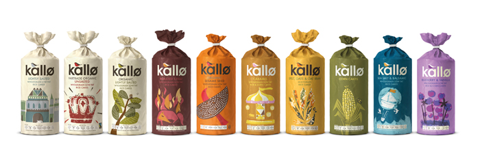
Feel the health crunch
Rice cakes and other natural health foods with a bit of an image problem are given a colourful, illustrated repackage, successfully appealing to consumers. Branding agency, Big Fish were commissioned to redesign the Kallo range, “We carried out some extensive research and discovered that Kallo consumers were intelligent people who like to be in control of what they eat. However, the old packaging made them feel like they were people who had “special needs” rather than foodies who are free to enjoy natural nibbles.”
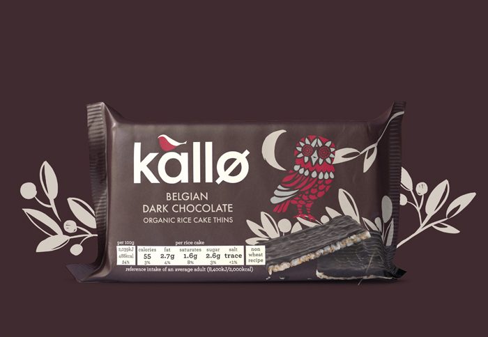
Taking away the feeling for purchasers that they were “functional foodies”, the new packaging feeds into a more expansive appeal by using illustrations which don’t always even reflect the contents of the pack. A hand printed feel crown for Fairtrade unsalted organic Rice Cakes, or the displaying peacock-like bird for Spelt Oats and Oat Bran Rice Cakes are saying ‘pick me up’, I’m not a boring product’.
Creativity nutrients: How do you reflect flavour? By using inviting, playful imagery.
Two of the 10 Approaches to Wellbeing from Varoom 34:
Compassion and possession
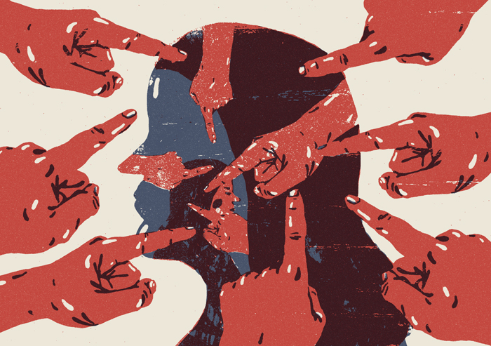
Harry Tennant’s illustration was for Libération newspaper in France accompanied the court case report of Fabienne Kaboue. Harry said he wanted to depict, “a sense of blame being formed by society that’s also present within the accused. She believed she had to commit the crime, not by choice, citing “Witchcraft” as the justification for her actions.” It was a very short deadline from Libération via his agency (Central Illustration). It was commissioned at 2pm and the deadline was 6pm that day! So he kept concept and layout simple.
Creative nutrients: How do we embody the ineffable? Recrimination in colour, repetition, and simplicity.
Harry Tennant
Natural bodies
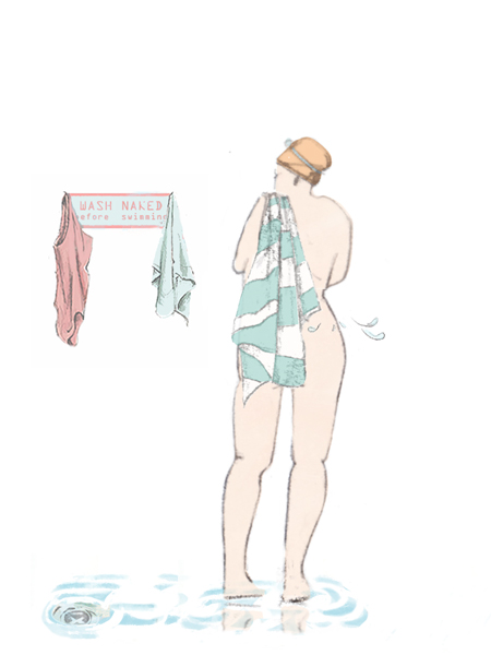
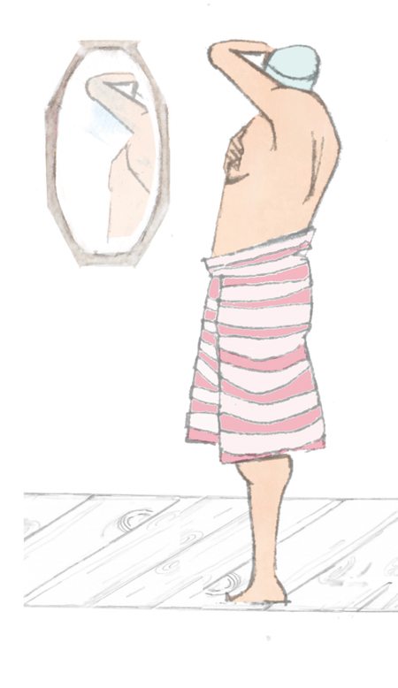
Lido enthusiast, Saran Corbett has been a fan of the outdoor pool since she was young, and had created a small product range based on lido swimmers which she approached the Lido Bristol with. They then commissioned further illustrations and the range developed from there. Corbett sketches at the Lido, so the figures are an honest reflection of the Lido characters. “The feedback I get is that people like the depicted bodies types because they are real – all sorts of shapes and sizes. They can identify with the images and often say ‘Oh look that’s me or… you!’ So there’s a personal connection to something recognisable, people can identify with it.” Designer, Mel Bond, worked closely with the Lido and Corbett to ensure the illustrations worked with the packaging whilst telling the story.
The Lido is not about body image, it’s an urban escape for all, where the focus is on relaxation. They offer relaxing massages, not beauty treatments, and food that does not compromise on taste and flavour. The illustrations reflect the Lido’s approach and its users, and they are already looking at adding new products to their current range using the same style of illustration.
Creativity nutrients: Reflecting the world back honestly
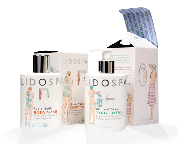 Artwork by Sarah Corbett, design by Mel Bond
Back to News Page

