Varoom 24: Five Things We Learned About Obsession
With the release of the new issue of Varoom on the theme of Obsession, Varoom Editor John O’Reilly, reveals five things we learned about images, image-makers and Obsession
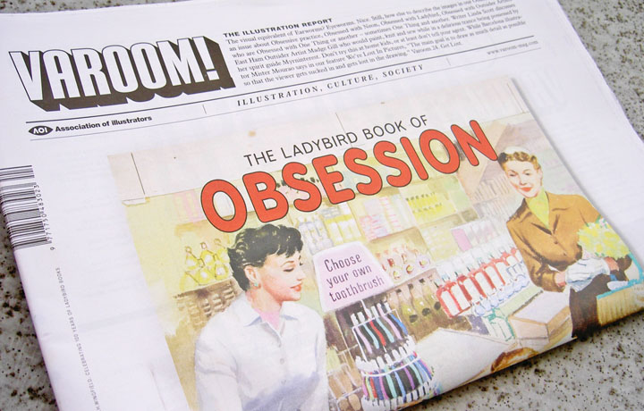
Mention Obsession to illustrators, writers and they just get it. Everyone knows Obsession: love; the micro-rituals of everyday life; the sports fan; obsessed by a band, by fashion. In Varoom 24 onedotzero‘s Shane RJ Walter talks through the work of the late Run Wrake, an image-maker whose obsession with music became a rich creative journey exploring the relationship between sound and images. And our cover feature on Ladybird by Laurence Zeegen, who revisits many illustrators first engagement with the obsessional experience of collecting. And of course there’s our regular double-page image form Marian Bantjes, who toys with Obsession in her work, in her ornamentation and pattern-making, but whose singular wit makes obsession echo with laughter. Craft is obsessive by its nature, the making, the edit, the re-making. Knowing when to stop? Giving up is hard to do.
1. Precision
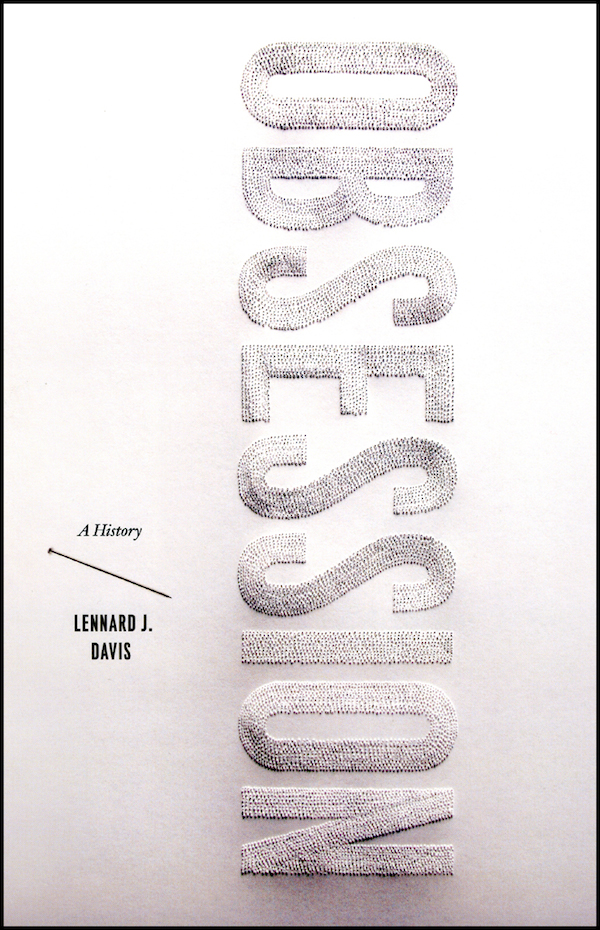
We didn’t learn two things, or seven things. We learned 5 things. Obsession is precise. Or perhaps it’s just the surface of obsession that’s precise, the image of Obsession, perhaps Obsession is really smoke and mirrors, that Obsession is a psychological name we give to creating illusion. I’m thinking of the world of magic and the technique of misdirection, how a magician shows us something to take our attention away from what’s really happening. Which is what Obsession does. Take for example the extravagant image by illustrator Lauren Nassef which we show in our Varoom Report. A book cover for Obsession: A History by Lennard J. Davis, (which was clearly made to be seen in its full obsessive glory across our A3 double-page spread) creates the lettering of the word “Obsession” through hundreds of tiny pinpricks. It’s a beautiful, conceptual image, making me think about how Obsession’s image of organization, order and perfection, harnesses disorder, and even barely suppressed violence in those hundreds of pinpricks that are created with enough force to leave a bump in the surface of the card, but with enough care, with enough loving precision not to break the surface.
2. Mesmerized By Obsession
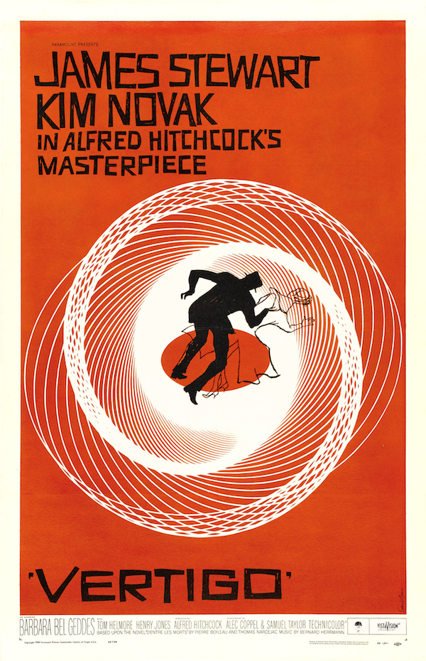
It’s easy to be seduced, mesmerized by Obsession itself, by the Obsessive quality of images. It’s only mentioned in passing in this issue, but Cinema and Illustration visualized the modern idea of Obsession in Alfred Hitchcock’s Vertigo whose theme was Obsession, and in Saul Bass’ image of the Vortex in the poster of the movie. The Vertigo poster is not just an illustration of a Vortex, the illustrated lines pull you into the Vortex – the illustration is a Vortex.
Like the imagery of vortices by illustrator Catherine Anyango which we don’t show in print in this issue, but we do show one of Anyango’s obsessively constructed images that picture Anyango’s elaboration of Obsession, Domesticity and Repetition.
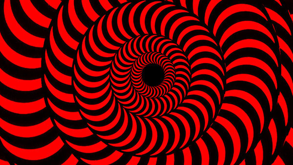
Or this still from Run Wrake’s live visuals for U2’s Popmart tour.
3. Repetition
If Hitchcock’s film is a defining vision of modern Obsession maybe it’s because Modernity itself, the Modern age was the age of Obsession, of being surrounded by images to be Obsessed by – which is the driving theme of Hitchcock’s work. And maybe (it’s the nature of Obsessives to find conspiracies, to live by the leap of logic implied in ‘maybe’) that’s the key to Cyriak Harris’ obsessive, repetitive loops in his music promo Cirrus for Bonobo. Selected by onedotzero’s Shane RJ Walter, Harris writes about his research for this piece, that he found a short film, “about the joys of consumerism in 1960s America. This immediately gave me the idea to create the whole video as a vast repeating mechanism that the camera slowly scrolls across. It is a machine whose purpose is to create itself, much like the western capitalist society glorified in the original footage.” Be careful when watching, viewers have been known to become frozen, mesmerized. Or alternatively (watch the promo) viewers can turn into Transformers.
4. Nostalgia
Obsession is best mates with Nostalgia. When they go out drinking, Obsession will insist on single-malt Scotch while Nostalgia invariably ends up teary with sentiment after 5 pints of Guinness. Obsession is Nostalgia without History. For Nostalgia, the past has a Halo, for Obsession the past is just a tool for its own kind of extreme creativity.
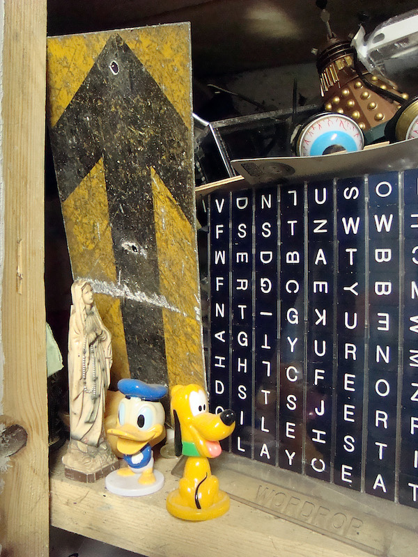
In our feature around Obsession and practice We’re Lost In Pictures, illustrator Peter Quinnell discusses the materials he collects for his collages and assemblages. “I came to use collage/assemblage through a love of the objects. I have always made collections and arrangements of stuff that I’ve found, even as a young child. Objects and images that have had a previous use hold a richness and subtlety of meanings and significance that I really like, and that can be used well in commercial illustration.”
5. The Labyrinth
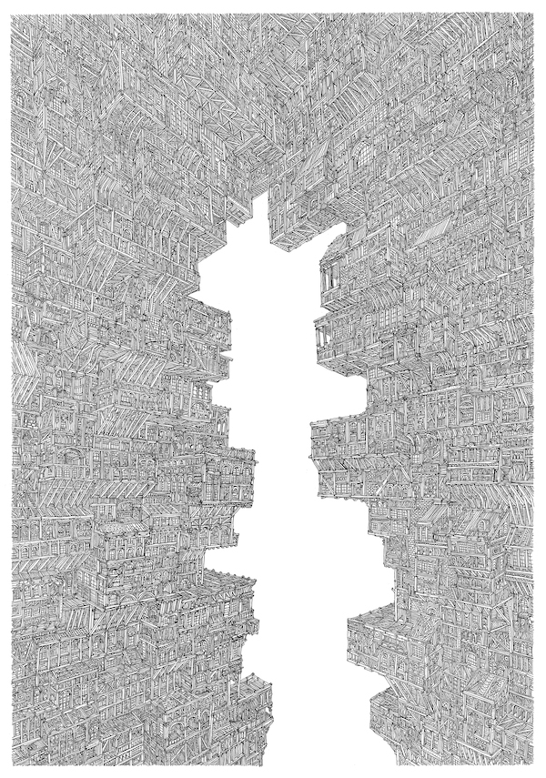
Obsession is how we create something to lose ourselves in. Our feature, We’re Lost In Pictures, also highlights the work of Barcelona-based illustrator Mister Mourao, whose obsessively-detailed images are created by getting lost in the process, “For personal work, I usually just grab a good piece of paper, a pen and start drawing, while listening on my headphones to a good mix of podcasts and music (the Radiolab podcast and Steve Reich will do quite nicely) and just get lost in the process.” Steve Reich’s repetitive minimalist patterming is the Obsessive’s choice for getting lost in music.
But the notion of ‘getting lost’ is also an effect of the images Mister Mourao is trying to create. “The main goal,” Mister Mourao tells Varoom, “is to draw as much detail possible so that the viewer gets sucked in and get lost in the drawing.”
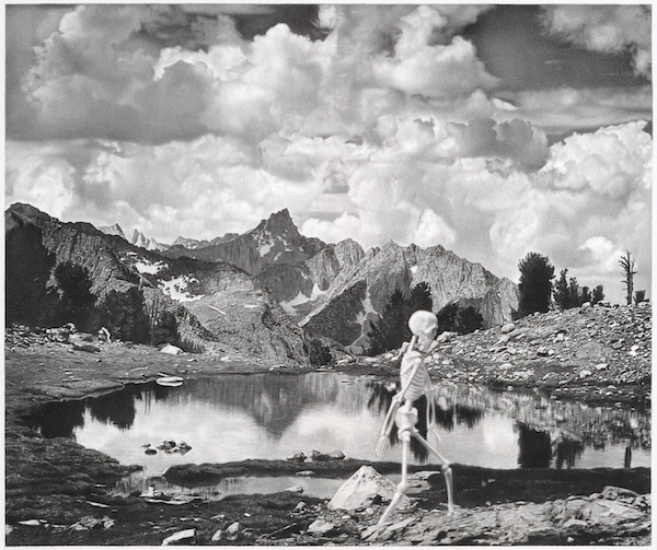
The one image, that became a bit of an Obsession in this issue, as a way of picturing Obsession, is an image by Ed Loftus. His images are often mistaken for photo-collages, but Loftus draws these moody, atmospheric spaces and objects in pencil. It takes up to five months for Ed Loftus to finish one of his images. There’s one image of a skeleton walking across a landscape (the landscape is one that was pictured in an Ansel Adams photo), that feels like the image of the obsessive. Stripped down and driven by a single-minded thought, there’s a strange kind of freedom that comes with Obsession, free of the need for flesh, fuelled by the painstaking, unfolding of a creative process that provides you with the image of the only sustenance you need.
It’s mad, I know. But seeing image-makers’ Obsession is soothing. In the world of the illustrator, Obsession is a kind of legitimate madness. It’s a valve for your own occasional madnesses. The madnesses of practice, and the madness of the commitment and effort it takes to keep going when the commissions are slow, when the uncertainty kicks in. The Obsession of craft is the escape route that helps us understand why we do what we do. It helps us think through both personal stuff and commercial projects.
So, Obsession is craft, the craft of honing, editing, making, re-making, refining, nailing the image down, stripping away anything that blurs the expression. But Obsession is also an art, the art of making connections that others don’t see, pulling different diverse elements together to show us something new, generating patterns. Like Run Wrake’s animation Down With The Dawn (music by Howie B.) created after he was diagnosed with cancer. Obsession as Art and Craft, blending biology and cosmology, having the richness of imagination and an obsessional belief in the redemptive power of your creativity to share something that’s almost beyond communication. That’s the imaginative gift of the image-maker’s Obsession.
Down With The Dawn, album by Howie B. released March 3 2014.
John O’Reilly, Editor Varoom, Spring 2014
Varoom 24 Obsession is available here
Back to News Page

