V28 Fashion – Illustrating Prada

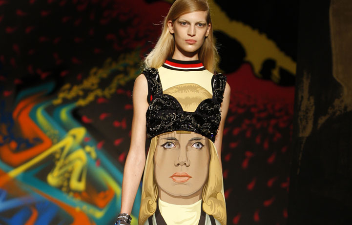
Garment illustration Jeanne Detallante. Image courtesy Prada
“I’m kind of famous for introducing ugliness in fashion,” says Miuccia Prada. “But it’s not that I introduced ugliness in fashion, I want to introduce normal life and pure life, and what is around. I want to really try to understand what is beauty and what is a possible beauty today.” In 2014 Forbes magazine listed Prada number 69 in its list of the world’s most valuable brands ahead of Chanel, Adidas and many other household names. And while Prada fashion has been known for its austere utilitarian style, Prada suggests it may have been her personal shyness that played out in fashion design as minimalism, which makes Ann Field’s account of Prada’s forays into illustration and collaboration with illustrators even more intriguing.
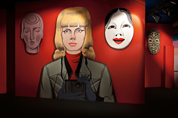
In Varoom 28, Ann Field explores how the Prada brand uses illustration and gets the thoughts of French illustrator Jeanne Detallante, whose work featured across multiple elements of the Prada S/S 2014 show and collection. An extract from the article is below.

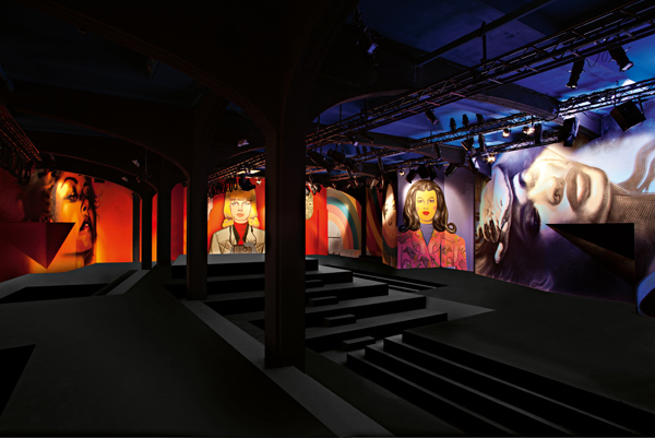
Prada S/S 2014 showspace. Jeanne Detallante illustration. Image courtesy Prada
Ann Field: How did the collaboration with Prada happen for the spring/summer 2014 collection? Please explain the working process for you from initial commission through to deadline.
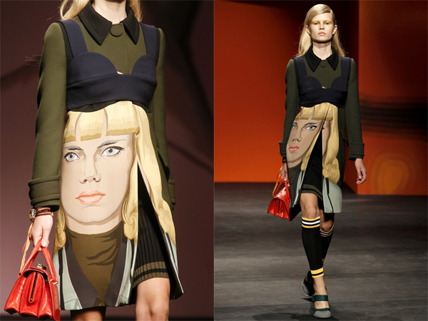
Jeanne Detallante: At first I was part of a group of chosen “street artists” – I’m not a street artist at all but I was chosen for large scale work I did in a bar: it was actually applied as wall paper on the walls. For this project they wanted as a priority to have the murals actually painted on the walls. So we decided to have a professional murals painter to do the project on site. That pretty much shaped the style of my design. I decided to have very clear lines and zones of colours to leave the least possible room for interpretation. I submitted my two “walls” and they ended up using them on the dresses and garments. Which was a total and very exciting surprise when I watched the show.

Garment illustration Jeanne Detallante. Image courtesy Prada
AF: Your illustrations were used on dresses and on the wall of the catwalk, how did these materials affect how your illustrations looked? Did it work for or against the artwork?
JD: I think it worked very much in favour of my work, the multiplication of it, the changes of scale were very meaningful, and a powerful statement.

Artwork left to right El Mac, Jeanne Detallante, Gabriel Specter. Image courtesy Prada.
You can read the full article in Varoom 28: The Fashion issue, available to purchase here.
Back to News Page
