The Varoom Report: Emerging Nations Issue V17
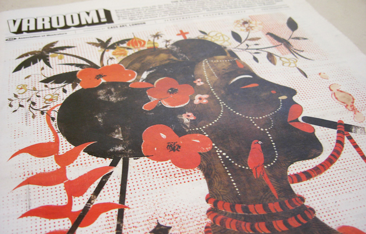
Emerging Nations Issue
THE ILLUSTRATION REPORT
Introduction to ISSUE 17 Winter 2011/2012
by John O’Reilly
In the emergent BRIC nations (Brazil, Russia, India, China) where illustrators are exploring local visual traditions and new international styles, where they find themselves in brash new economies run by old-school establishments, Irony is often a form of self-preservation for the illustrator.
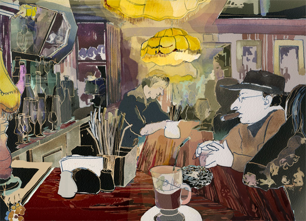
Russian illustrator Victor Melamed plays with classic Soviet era styles in his work for Rolling Stone, and it’s a survival tool in a country that still retains some Soviet era instincts.
“Irony is the only vaccine against propaganda,” says Melamed, “without it we all would have our brains fried long ago.” Irony is no laughing matter.
1.0 New Economic Powers
Varoom 17 features work from Brazil, Russia, India and China, the new economic powers of the 20th Century. While economic power and dominance is shifting from the West to the East, it’s clear from our survey of Illustration culture that the cultural power of western visual forms hasn’t been exhausted. Alan Male in his report from China, discovers the creative, commercial and cultural issues that explain illustration’s current place in the public life of Chinese culture. These issues are fascinating because they are so familiar. While we in the West – illustrators, journalists, art directors who commission illustration – pride ourselves on our maturity and sophistication, the aesthetic issues in illustration among the emerging BRIC powerhouses reflect back defining creative practices, philosophies of illustration and entrepreneurial lessons.
1.1 Local vs Global
In Brazil, Russia, India and China the question that hangs over illustration, and visual culture in general, is the relationships between local kinds of image-making and the images that arrive hand-in-hand with economic globalisation. Alan Male observes that while the Chinese government is keen to assert its cultural independence, with initiatives, for example, encouraging traditional imagery in Computer Games, brands seem to be mostly employing Disneyesque and Manga Style illustration because this globalised style appeals to the public. Indeed one could see why in China such imagery is a signifier of modernity, an image of the internationalisation of the country.
1.2 Russian Illustration
In Russia, illustrators such as Victor Melamed and his Tzeh collective, are finding an audience for a uniquely Russian kind of illustration drawing on its Soviet his- tory with design and illustration that defined modernity, but also on its tradition of Folk Art. Constructivism is a native style but so are the ‘local’ forms of illustration encompassed in the countries of the old Soviet Union. Contemporary Russian illustration is built on modernity and folk.

Victor Melamed: The Polictics of Pluralism (pg 36)
2.0 Tradition vs Modernity
We planned this issue of Varoom with a view to discovering how illustration was faring in the BRIC nations, looking at the local aesthetic, the market for illustration, legal issues around copyright, how illustrators were getting organised. As our writers reported back it became clear that creatively, culturally and socially, the themes that illustration is dealing with in Brazil, Russia, India and China highlights issues central to our own – tradition versus modernity, folk versus the modern/the graphic, the vernacular versus the universal, how we make use of the past and why particular styles of illustration are valued.
2.1 Postmodernism
An appropriate moment then for the Postmodernism exhibition at London’s Victoria & Albert museum where the illustration, architecture and design on show demonstrated how creative professionals dealt with history, tradition and ‘folk’ culture in Western societies at a moment of economic and social transition – from the post-war economic industrial consensus to information based global economies, the world of computerisation and international finance. Subtitled “Style and Subversion 1970-1990”, the show highlights the extent to which historical styles were raided, often de-contextualised, and quoted in architecture, design and culture (the soundtrack of Blade Runner, a film pairing Futurism and Film Noir, resonated throughout the first few rooms).
2.2 Historicism
Among covers of The Face, i-D and Émigré magazine, the curators showed sleeve design from the period, from the Manchester Modernism of Peter Saville’s work for Joy Division, to Malcolm Garret and Linder Sterling’s Orgasm Addict sleeve for The Buzzcocks, to Paula Scher’s Best of Jazz and Swatch watch posters, highlighting how designers and illustrators played with legacy. Paula Scher’s Best of Jazz poster was created from the names of Jazz covers with pre-existing typography, pushing a Constructivist styling off the grid, and her Swatch poster used Herbert Matter’s original 1930s poster for Swiss tourism for a Swatch campaign.
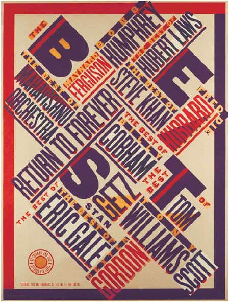
Best of Jazz poster, Paula Scher, 1979
3.0 Irony
While Scher’s poster has been the subject of discussion, critics arguing it simply appropriated a past style without comment, its punkish humour in the brash branding slapped in the middle of the new collage, (the arm is wearing two Swatch watches) and the cheeky piggybacking of classic Swiss heritage for this young brand established in 1983, highlights another visual attitude of postmodernism – ‘irony’ (this was a watch company that launched a range of ‘Irony’ watches in the 1990s by making watches that were more traditionally designed).
3.1 Collage
Collage, as craft and as philosophy, became the default way of creating work and evaluating the past. You can see echoes of this in illustration in BRIC nations whose economies have grown rapidly, and the imagery which is either trying to join the present to the past in the work of Victor Melamed’s sculptural portraits for Rolling Stone which nod ironically to the epic iconography of Soviet realism, and to the Leo Burnett ads we feature in our piece on Chinese illustration, where the images play with the pre-revolutionary images of genteel Chinese women.
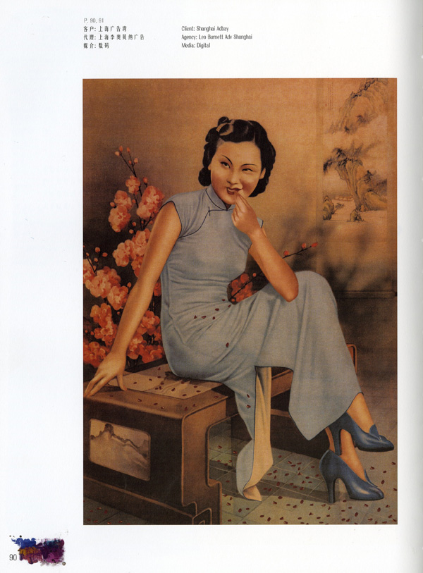
Shanghai Adbay, Chow Lee, Agency: Leo Burnett Shanghai
3.2 Handmade
The most interesting illustration from brands in the BRIC nations reflects back to consumers a take on their visual heritage. It’s been happening here over the last decade, the folk revival has gone hand in hand with craft, ironically fuelled by new technology with web platforms such as Etsy, allowing illustrators and designers to sell work directly to consumers as a little earner on the side. At the very moment newspapers and magazines look in jeopardy as consumers and advertising moves online there’s never been more interested in print, with people like NoBrow and Landfill Editions, turning out illustration with a sense of visual texture. And companies such as SORT (the Society Of Revisionist Typographers) who blend hand set lettering, and turn of the 19th-20th Century print techniques set alongside modernist influences from El Lissitzky and Jan Tschichold.
4.0 Gambiarra
Though we think of collage as a specific type of illustration practice, it’s much more than that. It’s a way of thinking, and doing, not just a word describing a genre of work. In the Postmodernism show the curators use a French word, Bricolage, with its source in the work of Claude Levi-Strauss, whose Structuralist Anthropology became a staple in Humanities courses. The Bricoleur as illustrator improvises from surrounding materials, assembles new work from old, recycles materials, plays with images and ‘signs’. Illustrators in these new economies are often creating a new national narrative from images of the past. Brazilian illustration is a case in point, much of it is influenced from Street Art, and Street Art itself is a communication channel for those without access to media to tell different kinds of vernacular narratives to the official stories, on a canvas that is improvised. Illustrator Eduardo Recife highlights the Brazilian word for this process, Gambiarra, meaning “improvisation.” New money in an economy changes not just the value of commodities but also how creatives and consumers value a culture’s signs and images.
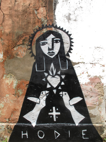
Derlon Almeida
4.1 Rubbish Theory
The creative process of Danish duo Hvass & Hannibal in their recent Chinese project was a kind Gambiarra. Jo Davies explains that the duo used the ripped foil from discarded cigarette boxes to create a layered 3D image, with a nod to more ancient arts. The collage artist (any illustrator in the broad sense) is an expert in creating value from material that is considered rubbish or waste. Ian Noble and Russell Bestley in the new edition of their book, Visual Research, explore this idea in the work of Anthropologist Michael Thompson, a cult thinker in the world of artists and academics.
4.2 Revaluing Old Techniques
Reading Thompson’s book, Rubbish Theory, in the late 80s immediately echoed the new economic activities such as Gentrification, where derelict neighbourhoods popular with impoverished artists and students became popular with ‘Yuppies’ seeking lifestyle kudos. Thompson’s book explored how objects seen as ‘Rubbish’ at one point in their life-cycle, became valuable. Some- times because of scarcity, sometimes due to how an individual values an object, but it’s also part of the current wave of illustration. Think of the Folk-Art trend, and how an art form seen as a kind of Olde English Corn, has been revalued and reworked by illustrators exploring old styles and techniques (see Des McCannon’s Folk Art article in issue 11).
5.0 Recycling Images
Or think of Vaughan Oliver’s sleeve art for the band Colourbox (the album was called Colourbox), shown in the Postmodernism exhibition. The artwork was created from a found image from graphics teacher David Jones in the 1960s. Rick Poynor tells the story in his book Vaughan Oliver Visceral Pleasures, that Jones had saved a bunch of run-on sheets from a Japanese printer, and then gave some to Oliver. The image was of Japanese catalogue models, overprinted with peach labels when set- ting up the press. Oliver told Arrow, a Sheffield student magazine around the time that, “It seemed to me an apt visual parallel to Colourbox’s eclectic cut-up approach in making music and Colourbox themselves relished the idea of taking something destined for the waste bin and printing it 50,000 times to package their record.” Instant collage recycling rubbish turning it into Art.
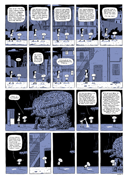
My Latest Work, Luke Pearson, Nobrow 6, 2011
5.1 Cooking Up
Or consider Luke Pearson’s piece for NoBrow 6 exploring the artist as recycler, who collects the leftovers of his life, the waste, such as leftover food, bric-a-brac, keep- sakes, all held together with a stomach-churning “spit, jizz, and plasticine.” Recycling, Bricolage, collage is a crucial component of illustrators in the BRIC economies who are improvising a new tradition from old practices, crafts, styles, with new visual genres and technologies. In Postproduction: Culture as Screenplay art critic Nicolas Bourriaud writes of the practice of borrowing and sampling the past, “If the downloading of forms (these samplings and remakes) represents important concerns today, it is because these forms urge us to consider global culture as a toolbox, an open narrative space rather than a univocal narrative and a product line.” Global culture is toolbox culture. In straitened economic times it might not feel like a golden age of illustration, but creatively illustrators, in a unique position between fine art and commercial culture are fostering new thinking in recycling histories, traditions and visual forms from the visual offcuts of culture.
To purchase Varoom 17 go here
Back to News Page

