The Varoom Report: Afterwords – The Awards Issue 23
Afterwords: The Awards Issue
THE ILLUSTRATION REPORT Autumn 2013
Varoom 23: AfterWords: the Awards Issue spotlights a dramatic shift in our society and culture. In a world of Instagram, Tumblr, Facebook and YouTube our communication and interaction is shifting from words to images.
This issue reveals the best international award winning images you’ll need to see in 2013. Celebrating the Webbys, Angoulême Prix Revelation, V&A Illustration awards, the BAFTA short animation Winner, the Caldecott Medal winner and the AOI Illustration Awards – the world’s most comprehensive award for illustrators highlighting image-making in areas from Children’s Books to Knowledge and Research to Public Realm. We also offer up the Varoom Magazine Cover of the Year.
Editor, John O’Reilly introduces this issue in his Report:
1.1 “Awards for The Most Telling Insights Into Imagery”
Ladies and Gentlemen these two awards are given for moments that reveal how we think about pictures. These richly revealing moments disclose deeply engrained assumptions in our culture about the value of pictures. They hold up a mirror to the social, cultural and commercial value we attach to images and image-making. Firstly…

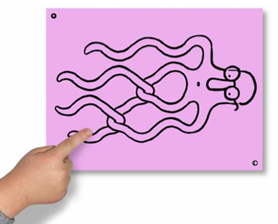
Nate Kitch, AOI award Winner for The Man Who Mistook His Wife For a Hat, The lost Mariner
1.2 Two Cultures!
Charles Percy Snow’s Two Cultures, since the anniversary of his Rede Lecture at Cambridge University in 1959, there has been a renewal of interest and steady drip-feed of articles exploring Snow’s lecture and book, which highlights the rift between the two most fundamental aspects of human culture, the chasm between the sciences and the humanities, between “Literary intellectuals at one pole – at the other scientists, and as the most representative, the physical scientists.” (The Rede Lecture, 1959)
1.2 The Literary Vs. The Scientific
Snow notes the mutual incomprehension of these two fundamental ways of seeing the world, the literary and the scientific, noting that while the scientific community is not widely read in literature, “this culture contains a great deal of argument, usually much more rigorous, and almost always at a higher conceptual level, than literary persons’ arguments.” Secondly…The Apprentice…
2.1 Rhomboid Eyebrows
Amidst all the schoolyard posturing, the high-camp-pantomime version of what it is to run a business and be a business person, and the remarkably free-flowing wielding of the word ‘creativity’, the defining moment of this year’s Apprentice on the BBC was Alex Mills, the competitor described by The Times of London as the man with the “rhomboid eyebrows”. Among all the contestants in this wonderful theatre of cruelty, only Alex could have been described in the language of shapes.
2.2 Guru
It was the third episode, in which the two teams were tasked with creating a credible piece of flat-pack furniture, resulting in an oddly revealing insight into our culture. One team paraded the language of multi-functional design, The Daily Telegraph in London commenting, “candidate Uzma Yakoob multifunctioned as a design guru, commercial genius, Thunderbirds puppet…”
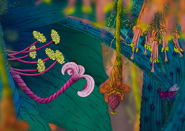
Cheri Williams, Morphoplis
2.3 Flip chart Epiphany
But if anyone wants to understand the under-appreciated value of images, how they help focus attention, energy, and imagination, look up this Apprentice episode online. In a TV series whose guilty pleasure is seeing and recognising the hapless unraveling of a business project, the moment when Alex Miles took centre stage was a revelation. Amidst the babble of voices (known in business as ‘brainstorms’ and in the bible as demonic possession/speaking in tongues) of the team meeting, there was the moment when Alex stood up and drew a picture on a flip-chart. It wasn’t a drawing of a prototype, or a design, or a schematically detailed plan, it was a simple childlike picture. And suddenly everyone understood.
2.4 Visual Spark
No surprise that Alex and his team nailed the task. We shouldn’t confuse Alex’s drawing with a plan. It was a visual anchor for a project and a team ethos that generally involved collapsing into noisy, verbal chaos. The drawing acted as both a point to gather thoughts and as a platform for other possibilities. Not just a visual aid, Alex’s simple drawing was the spark for a whole ethos of involvement, collaboration and thinking.
3.1 Two Cultures?
Which brings us back to CP Snow and his Two Cultures – the literary and the scientific. There is a small part of me that feels stupid to say what I am going to say, but I remind myself that that’s how ‘ideology’ or ‘discourse’ works – it makes the invisible cultural and social rules that serve an agenda, or serve a particular set of interests, seem normal, everyday, not so much ‘common sense’ as the stark bleedin’ obvious. Seeing the world differently isn’t unthinkable, it’s just that when you do think it, it makes you feel out of step, out of sync, it makes you feel awkward. Anyway, here goes… Two Cultures – the literary and the scientific. Umm…What about pictures?
3.2 Literary Muscle
Maybe it’s because drawing and picture-making in our culture is too deeply associated with early childhood that image-making isn’t regarded as a fundamental culture, that it’s ornamental, that image-making, and using images to think simply doesn’t have the same cultural weight as the literary.
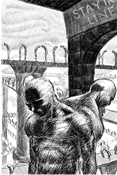
copyright (c) Nick Sousanis spinweaveandcut.com. nick sousanis’ thesis ‘Unflattening’ Published April 2015
3.3 Flatlands
For someone such as Nick Sousanis, this is the world of the Flatlands. Sousanis is currently doing his PhD in Education at Columbia University – presenting it in the form of a graphic novel. The idea of Flatlands is a nod to the 1884 novel by Edwin Abott Abott, Flatland: A Romance of Many Dimensions a piece of 19th century sci-fi delivered as an exploration into mathematics and the limitations of two-dimensional world.
3.4 Sharp Edges, Soft Thoughts
“Imagine a vast sheet of paper”, writes Abott, “on which straight Lines, Triangles, Squares, Pentagons, Hexagons, and other figures, instead of remaining fixed in their places, move freely about, on or in the surface, but without the power of rising above or sinking below it, very much like shadows – only hard and with luminous edges – and you will then have a pretty correct notion of my country and countrymen.”
3.5 Multiple Intelligences
Sousanis pushes this idea, exploring in visual form how education systems, far from opening our eyes to possibilities, by defining what knowledge is and the literal forms in which it is transmitted, excludes different perspectives, different ways of seeing. “I am kind of using the visual as a metaphor for the other ways people make sense of the world,” says Sousanis. “This is very specifically about visual communication and comics but also about multiple intelligences. Yet when you go to take a standardised test it’s still the same old thing so I’m trying to do it through its form.”
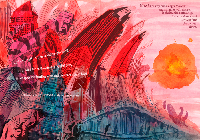
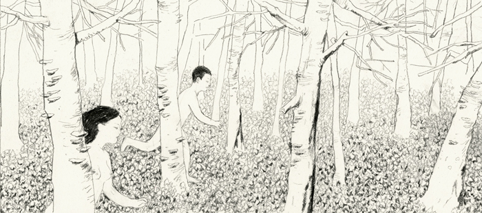
John Riordan, Capital City
4.1 Pseudo-Event
In modern times sociologist Daniel Boorstin in his book The Image: A Guide To Pseudo-Events In Modern America was the first to raise the alarm about the dangers of a modern image culture but fear of the image can be traced at least as far back as Plato’s Allegory of the Cave where prisoner’s were mesmerised by the shadows cast by a fire on the wall, mistaking the ‘pseudo-event’ for the ‘true’ reality outside the cave. And in between, literalist, religious belief systems, iconoclasts destroyed representations of the divine, most infamously in the destruction by the Taliban of the giant Buddhas of Bamyan.
4.2 880 Billion Images
But we have reached a tipping point in the culture, where imagery is no longer an extra bit of information to support the words already there, the idea of the image as a supplement to the original text that illustrators are very much aware of. Imagery is fast becoming, has become already, the default form of communication and social interaction. In a 2013 presentation by Yahoo they estimated that on current trends 880 Billion photos will be taken in 2014. 27,800 photos are uploaded to Instagram every minute, while on Facebook 208,300 photos are uploaded each minute adding up to 6 billion per month.
4.3 From Digital Natives…
Sociologists and commentators talk of ‘digital natives’, children born into the age of accessible computers and the internet. But there is a new generation following. In his feature on the evolution of illustration Lawrence Zeegen observes the interaction of three-year old Walter who had been playing the richly visual, interactive Petting Zoo by Christoph Niemann and Zeegen. Then it was storytime with a printed book.
4.4 …To Visual Natives
“What did Walter do next?”, writes Zeegen. “He listened to a story being read to him, he looked at the pictures and he absorbed. And then he placed his finger on a figure in the illustration and dragged his digit across the open page. Try telling a three-year old that running your finger across the printed page won’t produce the same results as doing the same thing across the digital screen.” In truth, new touchscreen technology just highlights what pictures have always done, it’s just now pictures will be driving interaction, pictures are alive. We are entering a new age of the Digital Picturesque.
5.1 The Picturesque
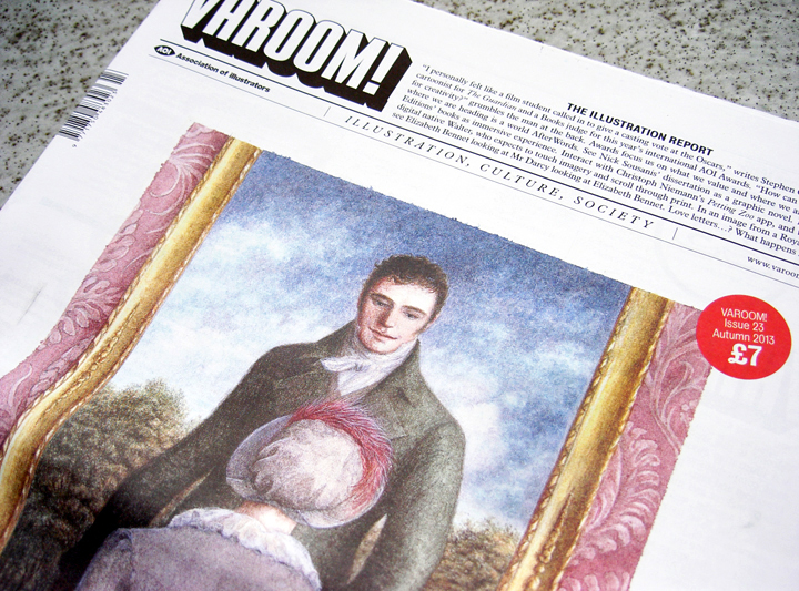
The idea of the Picturesque originates in the late 18th century, in the work of William Gilpin, who believed the gardens of Capability Brown were too smooth, arguing for a vitalistic, rugged vision of nature. Gilpin was an influential figure not least on the author Jane Austen, whose Pride and Prejudice is depicted on the cover by Angela Barrett, a stamp commission for the Royal Mail.
5.2 Sensational
Barrett visualises the moment in Pride and Prejudice when Elizabeth Bennet, walks through the gallery of Pemberley House, indifferent to the images of strangers on the walls, she only has eyes for the portrait of Mr D’Arcy. “There was certainly in this moment, in Elizabeth’s mind, a more gentle sensation towards the original than she had ever felt at the height of their acquaintance.” The sensation of the image is more than a feeling, it’s a sense that the image itself is active. “And as she stood before the canvas on which he was represented, “ writes Austen, “and fixed his eyes upon herself, she thought of his regard with a deeper sentiment of gratitude than it had been raised before.” The image fixes its eyes on the viewer.

Angela Barrett, a stamp commission for the Royal Mail
5.3 The Black Mirror
There was an 18th century technology of the picturesque, an 18th Century smartphone that enabled painters, and especially tourists to see the landscape through a filter – just like Instagram. Called variously in its different versions – the Black Mirror, the Claude Glass – this dark, convex glass condenses the image for the artist wishing to abstract something ‘essential’ from the landscape. According to Art Historian Arnaud Maillet, the Claude mirror transforms a scene into, “an ideal view, that is, one with a universal character. The Claude mirror eliminates particular details and imperfections. This removal of triviality brings forth an abstraction, that of ideal beauty.”
5.4 The Digital Picturesque
It wasn’t just artists who used this technology, it was tourists. Seeing a beautiful landscape in front of them they could enhance it, improve it, see it as ‘nature’ intended by simply turning away. Looking into the mirror the perfect picturesque landscape, highlighted, edited, with a mellow tinge – the cultural equivalent of our Digital Picturesque via Instagram/Hipstamatic filters, or simply the framed view of a concert/party/event through the camera of the smartphone. Tourists used Claude Glass to turn the world into a picture, the Picturesque was also a theory of travel, of site-seeing, which now happens virtually through images that link to other pictures, places and experiences. Even back in the mid-eighteenth century, tourism and its visual technology raised hand-wringing debates about the ‘authentic’ experience. As if the visual demeans experience.
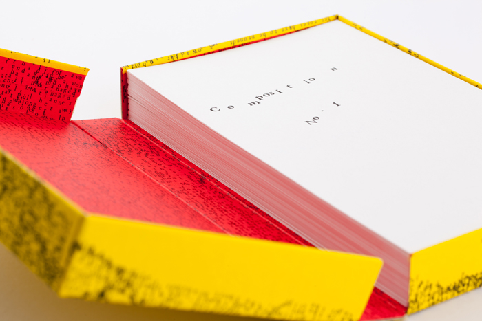
Visual Editions, Composition No. 1
6.1 Creative Satellite
In Anna Gerber and Britt Eversen’s Visual Editions the visual orders, shapes and programs the reading experience. Their books defamiliarise the experience of reading. Books such as: Marc Saporta’s Composition No. 1, the book is a sheaf of papers in a box that you must pick up and arrange; or their new work Where You Are which is a series exploring the idea of the Map and storytelling with contributors such as Geoff Dyer, artist Olafur Eliasson and Illustrator Leanne Shapton. Visual Editions is a celebration of print at the end of print, a celebration of the book at the end of the book, their work is a little experimental satellite sent out to into the discover what happens with words in the age when pictures and new technology are offering different entry points, different ways of experiencing the world around us – from Google Glass to the Touchscreen, we have only barely begun a journey in which imagery.
6.2 Becoming A Parasite
The pioneering Award-Winning imagery in this show is already pushing in this direction: from the new Research and Knowledge Communication category featuring Mitch Miller’s visual ethnography; to Jun Cen’s wordless visual novel; to Ceri Williams’ interactive app Morphopolis a visual discovery of biology and the processes of the natural world through inhabiting the beautifully alien form of a parasite; to the visual demand made by Joe Caslin’s large scale, wall-size portrait of Edinburgh’s lost young men.
6.3 Power of Pictures
“A drawing has the power to go further than words,” writes Caslin. “But a 40ft drawing has the potential to resonate and disrupt the visual landscape of a city. It has the power to pull a passer-by from the mundane, the power to trend and the power to gain real social momentum. It will re-establish respect for and showcase the capabilities of our nation’s sons.”
6.4 Unflattening
Joe’s right. Drawing, imagery, has the power to change how we see, how we understand, how we act to transform the world. In the language of Nick Sousanis, they help us escape the Flatlands. “Unflattening,” says Sousanis, “is a simultaneous engagement of multiple vantage points from which to engage a new way of seeing.” Which is why I’d want to put my hand on Plato’s shoulder and say, “Hey Plato, it’s ok, don’t be afraid, they’re pictures. Just imagine.”
More on Varoom 23 here
Back to News Page

