Miguel Valdivia, The Raw And The Cooked, #3 Graduates 2013
A mash-up of Sci-Fi, Francis Bacon and a flying saint, RCA Graduate Miguel Valdivia’s wordless book is a whole new genre in itself writes John O’Reilly
I first came across Miguel Valdivia’s work in a magazine call Le Petit Neant (The Little Nothingness), he edited in his first year the the RCA. It was a sequence of wordless images by fellow RCA students and lecturers (Andrzej Klimowski). Beautifully designed by Giulia Garbin, for those expecting a narrative it can be quite irritating. But like any inventive creativity that you can’t get your bearings with it takes a little time to retrain your eyes and mind. Just like Valdivia’s visual novel for his graduate project.
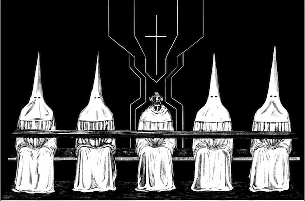
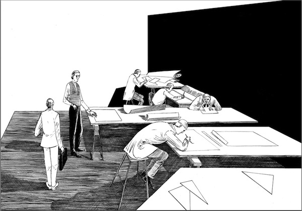
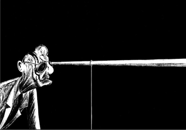
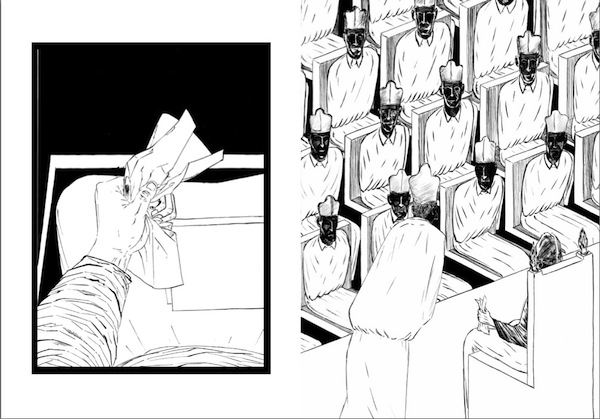
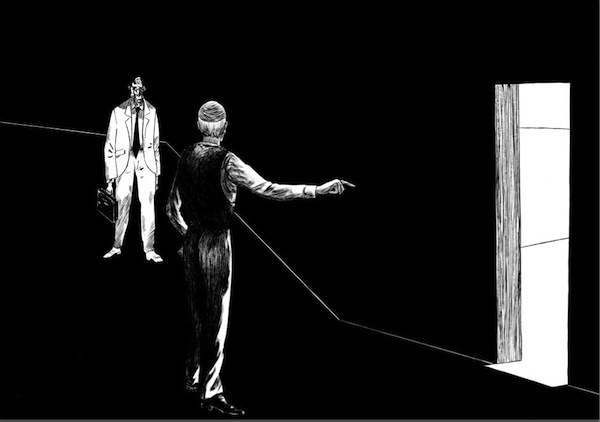
Based on an obscure, never-made film script by Italian actor and film director Carmelo Bene, it’s a piece of dark surreal, sci-fi supernaturalism. Like The Little Nothingness, it creates its own conventions of storytelling, ignoring the grid and sequencing of the graphic novel, with a visual grammar that emerges from the oddity of the story itself. In the caption for the graduate show Valdivia expains, “the book talks about a Saint who lived in 1600 in Puglia, in the Southeast of Italy. His name was San Giuseppe da Copertino. He was said to have been remarkably unclever, but prone to miraculous levitation and intense ecstatic visions that left him gaping. The only way to bring him down was recall him to Obedience.”
If Valdivia ignores lowbrow comic convention, his introduction of a character right out of the work of highbrow painter Francis Bacon is also a reminder of the marvellously lowbrow horror-schlocky, flesh-creeping feel of the Irish artist’s famous Popes.
But most of all, Valdivia’s project, is another reminder of the continuing interest in wordless ‘comics’. His work demands narrative interaction, to work out and fill out narrative elements purely from visual cues. lllustrators should take note. New media and technology makes linear narratives something we really have to work at as readers – think of how we pop-in and of mobiles, laptops, tablets at various points of the day, frenetically picking up ‘the story’ of our life from scraps of email, documents, photos, social updates, the narrative drift of everyday life… Valdivia’s imagery, sequencing and formats, Le Petit Neant included, is also an invaluable exploration of the possibility of Slow Reading, a less frenetic form of visual and tactile interaction. But until Valdivia gets a print publisher you’ll have to do with scrolling down the page.
Materials, Format and Name of Work?
It wasn’t easy to find the proper tool to draw this narrative. I tried pencils, watercolour, and brushes, gouaches, etc… I was looking for something special and by pure coincidence I found it in a shop in Paris: a small woodcock feather mounted on a brush. It is very delicate and requires some practice but I find it stunning. It makes me smile to think that I found a small feather to tell the story of a saint who flies! And then ink, a super pitch-black ink. The formats are: A3, A4, and sometimes smaller sizes. This work is freely inspired from a script for a film that has never been achieved, written by Carmelo Bene in 1976. The original title was Boccaperta and it can be translated as “Gaping”. I haven’t found a definitive title for my version.
Tell us a little about the content of your book, it’s a mash-up of Sci-Fi, Francis Bacon, Velasquez …?
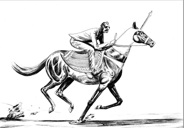
Indeed, Francis Bacon is always present. In this narrative I have tried to bring the original story into my own world. My world is clearly made of everything I’ve read, seen, heard … I do not follow a storyboard. I rather follow what comes to mind at the moment. Perhaps from a narrative point of view it does not always work, but sometimes it creates an interesting space-time displacement. For example, the character of the inquisitor,who rides a horse with a cross on his head. He seems to be straight out of a sci-fi western.
Also because from a certain point, I was totally uninterested in the temporal coherence of the original story, which took place in 1600. Another major influence has been the work of Italian photographer Mario Giacomelli, and his use of Black and White.
One of the many interesting features of your work is that it challenges genres and conventions, the story unfolds as a sequence of images without the ‘grammar’ of comics or the graphic novel – panels, changing frames, and words?
Up until a few years ago I was a passionate reader of comics. Today I can hardly read most of them, at least at this stage. My research, still in progress, was to find forms of visual narrative that would follow different rules. Or that did not follow any rules. One of the first conditions was precisely to remove the words. I try to use the frames when they are needed and not systematically. Consequently, the rhythm of reading is slower, almost static. In comics, there is a unique path, dictated by the double language text and drawing. But without the words and without a specific visual “grammar” the reader finds himself lost. At this point, the reader has to invent a new path, to give a sense to the sequence of images. At this point I would like to say that this work is to be considered a work in progress. The elements begin to take shape but they are far from being definitive. In the end, it remains essential to communicate with the reader. To do something illegible or too confusing would not make sense. So I must find the right balance.
You use, and fill the landscape page, sometimes breaking up the space, but you are largely working with that format, in effect a DPS. Any reasons for that?
It is for the pleasure. And it is a way to dedicate as much space as possible to the drawing. It is also a cinematic format, which I find very engaging.
How does the decision to work in Black and White effect the decisions around your storytelling?
If we talk about drawing, including the comics, my favorite artists work in Black and White. Colour is important, but more from the point of view of sensory pleasure or from a dramatic point of view. From a narrative point of view, it does not add much. Quite often I find the original drawings in Black and White more beautiful than the color version (often colored digitally). Recently I was surprised when looking a cover for the The New Yorker by Scott McCloud. The original drawing was, from my point of view, much better than its final colored version. The issue is different for artists who work directly with color, such as Mattotti. Personally I love Black and White because I consider it a challenge. A challenge of spaces, balances. Even if the white is already on the page drawing in Black and White is also drawing with the white and not just with the black. I don’t use the gray which I find disturbing. Obviously these choices affect your drawing from the root and consequently your way of telling.
What did you learn from your book project “Le Petit Néant” and how did it feed into this?
Le Petit Néant is a fabulous experience because it involves many interesting people and leads me to discover new artworks from around the world. My project and the Le Petit Néant are clearly linked by the desire to explore the visual narrative without the use of words.
What next for your book and for Miguel Valdvia?
This is a great mystery to me too. What I can say is that the next issue of The Little Nothingness will be released in mid-October.
Back to News Page

