The New Wave Old Wave pt. 1
In an era obsessed with the Next Big Thing, the Flavour of the Month or whatever happens to be this week’s New Black, Varoom thought our readers would appreciate a longer-term view of the world of illustration. Though the illustrators in this two-part article originally published in Varoom 11 would blush at being described as ‘legendary’, having produced canonical work, they are still turning out Hot New Work. We wanted to find out what early work proved significant in their art or career? What one piece captures something essential about their work? How has their point of view developed in new work? Their responses showed just how they maintain the creative fire. We also wanted to know which illustrators of a more recent generation they keep an eye on, which revealed a fascinating selection of contemporary illustrators, and a few older ones.
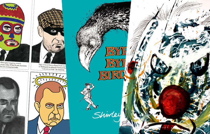
Seymour Chwast
Interviewed by Steven Heller
The co-founder with Milton Glaser of Push Pin Studio in the mid-fifties, Seymour Chwast brought passé art styles – Victorian, Art Nouveau, and Art Deco – together in a totally contemporary way. The consummate illustrator, he has authored/illustrated over 30 children’s books and scores of adult volumes. He was the editor of the Push Pin Graphic and now the publisher/designer of The Nose.
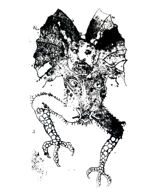
Devil, Seymour Chwast (1968)
The most significant early work in terms of your development as an artist
My first job after graduating from The Cooper Union School of Art was for the promotion department of The New York Times. I was in the fortunate position of being able to design (low budget) sales pieces and creating art to fit. The style of my art varied from Speedball pen technique to woodcut where my print became the finished art.
My work then and now uses the conceits of cartooning so that much of my illustration has humour. Since my mentors included Cassandre and Francisco Goya, my work can reflect a serious message. Much of my early work required decorative and/or cute renditions perhaps as part of the illustration revolution: reaction to the realistic and sentimental work in magazines before the fifties. Since my early work was all over the place it’s difficult for me to say what work was most important to my development.

The Faces of Nixon, Seymour Chwast, The Nose #16 (2008)
Recent work that demonstrates how your point of view has developed
I always thought that in my commercial work it was the art director, editor and publisher who had points of views. The illustrator is picked to reflect that. Recently I did a series of portraits of our most notorious president, Richard Nixon; Inside each head is a different part of his political life. Treating a subject from different aspects is typical for me. Often deadpan humour with a social message. I love to draw fat-cats and other types in position of power so I can mock them and otherwise have some fun.
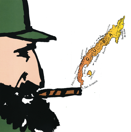
Castro, Seymour Chwast, 1998
The single piece that is the quintessence of your illustration
I found four pieces in my book, “Seymour”, one of which might answer your question. The first is the Kama Sutra of Reading, taking a familiar erotic theme and apply it to something totally asexual. It might be the Korean Calendar page for December. I drew a man wearing the attire of a business man. He was also wearing a colourful ski mask. Incongruity may be the word to describe a large portion of my work. Another piece was a portrait of Fidel Castro, not great work but it was a brush drawing, unusual for me. What is interesting is that he is smoking his famous Havana cigar while the smoke is a found map of Cuba in visual harmony. The last may make a stronger point. It is the cover of the Push Pin Graphic on the subject of couples. It is an example of combining ideas in one image. A cigar (man) and a cigarette with lipstick (woman) in an ashtray. The smoke (again) intertwines representing a relationship. Telling a story using concise symbols. A little like a poem.
The most “significant” contemporary illustrators
I can’t say who is “significant”, since I’m not an historian and I don’t have oversight. I don’t even know if illustration as we know it has a future. I do know that this period in visual history is a vast improvement over the past when we all had the same limited tools at our disposal. Currently the work is so eclectic that we can’t name it while I’m fairly secure in the notion that there is always the same proportion of good and bad work. Here is a partial is of accomplished illustrators whose work I admire: Yuko Shimizu, Vivian Flescher, Christoph Niemann, Steve Brodner, Philip Burke, Floc’h, Chris Ware, Brian Cronin, Gary Taxali [see also Aimee And The Illustrators]
Seymour is celebrating his 85th year with a book about war. His upcoming release At War With War visualizes humanity’s 5,000-year-long state of conflict, chaos, and violence on a continuous timeline.Shirley Hughes
Interviewed by Derek Brazell
Shirley Hughes, born in the late 1920s, has been a strong presence in the picture book world for decades, selling millions of copies of her numerous titles across the world. She was made an OBE in 2000, and awarded the Greenway Medal for Dogger.
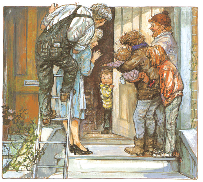
Alfie Gets In First, Shirley Hughes, Red Fox (1981)
Significant illustration I learned an important lesson from
Alfie Gets In First, published in 1981, was the start of one of my best known creations in picture books. He’s an established character now, but the first time I drew him he was running up the street, in just a felt tip drawing, but I knew he was pink in the face with determination to get into this story.
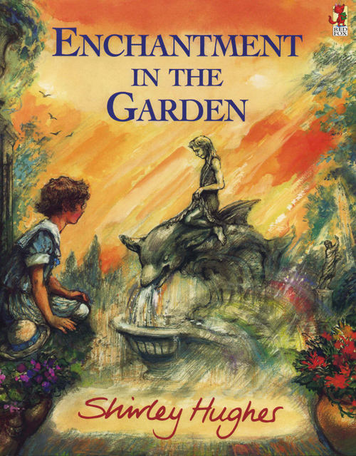
Enchantment In The Garden, Shirley Hughes, Red Fox (1998)
This publication shows the way the form of a book can almost dictate what is drawn. Alfie has dashed up the street and into the house. His mother goes back out to get the pushchair and the door slams shut. Her keys are in the inside lock, but he can’t reach them. A drama builds up outside as Mum and neighbours try and get in.
I realised I could make the gutter of the book part of the story, even though that section of a spread is usually an area the illustrator is trying to flow across. All I had to do was draw a line for the door by the gutter, so the left hand page is the exterior of the house and the right hand page is Alfie alone in the hall. Every child can recognise this is outside and this is inside. It’s a filmic split screen trick. The gutter became part of the story. This was a crucial breakthrough for me in the sense that realising every book has its own design, its own feel.
Work that demonstrates development
Ways of telling a story on the page continued to interest me, and Enchanted in the Garden from 1998 reveals another way of presenting text with images. The story is set in an Italian garden, and is about a statue that comes to life. Format is very important to this book, it’s a longer text than you’d get for a very young child, and I didn’t want to make it like a conventional picture book. The designer suggested a text panel down the side, which I felt was a good solution, and I added small line drawings to the panel which capture another angle to the story.
New work showing different approaches
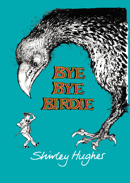
Bye Bye Birdie, Shirley Hughes, Jonathan Cape (2009)
Two new books published in 2009 are quite a contrast; children’s picture book Jonadab and Rita featuring a stuffed toy elephant and mouse, and Bye Bye Birdie, an adult graphic novel of a man being pursued at every turn by sinister birds. Jonadab and Rita’s story line of a neglected toy escaping his owner to cavort with fairies gave me the choice of less literal depiction and use of materials. The artwork is very different from Alfie artwork where you have to have clarity for the child. Here it is wet paper and brushed-on paints – it’s right for this particular story. Some images reference A Midsummer’s Nights Dream, following my wish to give parents or teachers the opportunity to discuss and expand on the reference, making a contribution to the storytelling.
Bye Bye Birdie comes from an altogether different angle. If you ask me where the inspiration comes from for the wordless line-drawn tale of a man wooing a lady, only to discover she’s a scary bird creature, I have no idea – you have to live dangerously, don’t you? Turned down by my regular publishers, and quite rightly too, ‘what on earth are you doing?’ they’d say, I then took it to Dan Franklin at Jonathan Cape, whom I admire for putting graphic novels on the map. I decided on just line to differentiate it from my other publications, as it’s an adult book, not meant for children. I like to stretch myself, and with a character such as Alfie, I wouldn’t want to be on the treadmill of producing another and another, just because it’s a popular book, so I vary myself in between by doing something like Bye Bye Birdie.
Most admired illustrator
A great many illustrators catch my eye, including Chris Riddell, James Mayhew and Charlotte Voake, but my favourite is Clara Vulliamy, author-illustrator of The Bear With Sticky Paws series. Clara does lovely children’s books. She doesn’t make them too cartoony. She can draw children, and animals, and makes them move, working with line and a cool watercolour palette. Clara, who’s my daughter, was originally a portrait painter, and she came to illustration later. But I knew it was only a matter of time – it’s in the genes – and the only advice I ever offered was ‘Do some life drawing.’
Shirley continues to write and illustrate her children’s book series Alfie, with the recently released Alfie Outdoors and the upcoming title Alfie and His Very Best Friend.
Ralph Steadman
Interviewed by Derek Brazell
Ralph Steadman was born in 1936, and over a long career has been celebrated for his sharp ink-splattered imagery, illustrating the lives of Leonardo da Vinci and Sigmund Freud as well as work for many other books and newspapers. He created Gonzo journalism with Hunter S. Thompson, best revealed in Fear and Loathing in Las Vegas.
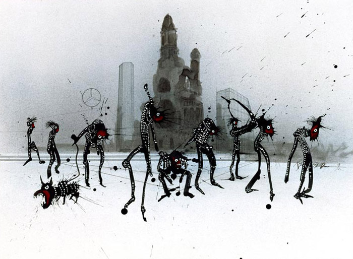
Berlin Punks, Ralph Steadman, DU magazine (1990)
Significant early work
The illustrations for Hunter S. Thompson’s texts were an important turning point. My drawings changed as soon as I started the American pieces, and became far wilder and more incisive in a way. I’d been doing gentler stuff in the sixties, it was idiosyncratic. The drawings I did for Fear and Loathing in Las Vegas ‘made my name’ in America, and we worked together a lot, including this image illustrating a piece Hunter wrote in 2004 during the trial of Lisl Auman, convicted for a crime she didn’t commit. He just wrote what he did on the print, but couldn’t quite pay me the full compliment…!
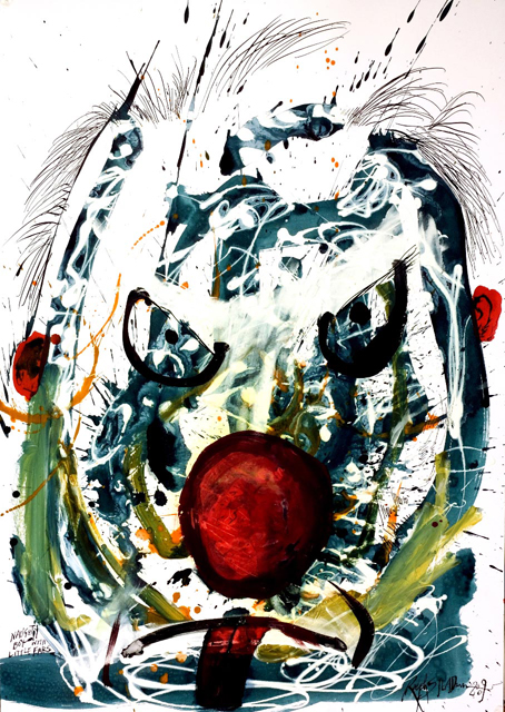
Filthy Bastard!! Don’t Bother Me!!, Ralph Steadman (2009)
The single piece that is the quintessence of your illustration
I was there when the Berlin wall came down, and was struck by the punks in the city. I produced this image for the German magazine DU in 1990.
New work
I’m currently working on some mask faces, and I just let them happen – thinking what will happen when that dries? As for commissions, I’m not very interested in doing the cover of someone’s book anymore. I’ve become more contrary and less interested in the idea of being a jobbing illustrator. If something stimulating came along then I might. For instance, I don’t want to draw politicians anymore. I’ve drawn Gordon Brown, Tony Blair and all those people. I’m sick of politicians – can’t be bothered.
A current illustrator you admire?
If anyone is carrying on my tradition in some way, it’s Steve Brodner. He’s pretty good. Very political, caricatures, interesting collected works.
Charlie Paul’s feature length documenary on the life and work of Ralph Steadman For No Good Reason was released in 2013, with last year seeing Ralph’s second collaboration with Ceri Levy with the release of Nextinction.
This article concludes in Part two, featuring Marshall Arisman, R.O. Blechman and Judith Kerr.
Back to News Page
