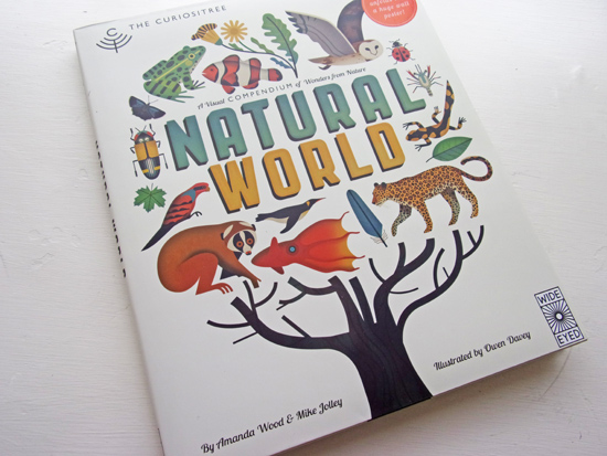
The Curiositree: Natural World – Book Review
Written by Amanda Wood & Mike Jolley
Illustrated by Owen Davey
Published by Wide Eyed Editions (Quarto) ISBN 978-1-84780-751-9
Review by Rachel Morris
What sort of museum visitor are you? Do you work your way from the front door, methodically following the arrows and examining each exhibit in turn? Does flitting between different areas as something new catches your eye appeal to you? Or are you more of a have-a-quick-whizz-around-and-head-to-the-gift-shop sort of person?
Whatever your style this book will probably suit you. It’s a ‘choose your own adventure’ treasure trove of beautifully presented information. And if you’re the third sort of museum visitor, you will be pleased to know that the dust jacket unfolds to reveal a bonus visual feast of a wall poster.
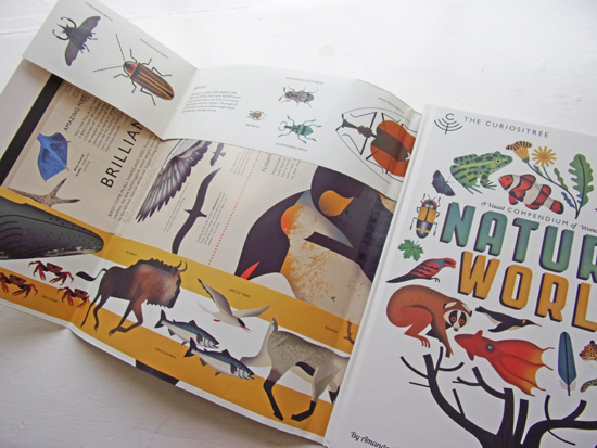
The colour-coded arrow markers on the edge of each page direct you to charts on related topics, so you may decide to dive in towards the back of the book and find that ‘All Kinds of Nests’ leads you the ‘Life in the Honeybee Hive’ which, in turn takes you to the ‘Interesting Insects’ chart. The charts themselves (some landscape, some portrait, some across the double page spread) are colour-coded according to subject matter. This, combined with the three different coloured ribbons to mark your pages, makes you the master of your own journey through the book. I imagine the planning of this book involved the kind of wall of Post-its linked with bits of string that you see in crime films.
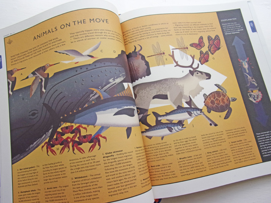
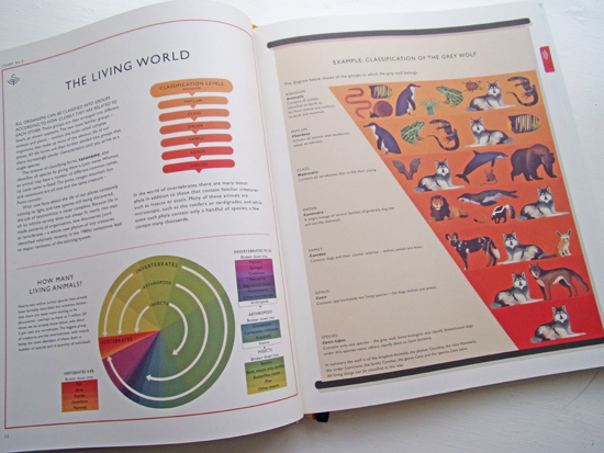
The charts inside the book (there are more than 65 of them) made up of cut-aways, diagrams and illustrated scenes are frankly beautiful. More than that, when coupled with the concise and fact-packed writing style and clear, logical book design, there’s a real flow to this book. The amount of information contained could make it dense and difficult to navigate but the way it’s presented makes it easy to take in.
I asked Owen Davey, AOI member and the illustrator of this mammoth book, a few things about the project; starting with an insight into how long it took.
OD: “The process of illustrating the book took a little over the year. And yes it was a huge task. There were ups and downs in it. I’ve never worked on something so massive before and I had to contend with the occasional drop in confidence or enthusiasm, but mostly it was great. From start to finish it was about taking it one page at a time and trying not to get intimidated by the sheer scale of the workload.”
How did the working relationship with the authors work?
“This book mainly worked like a series of editorials, strangely. Mike and Amanda would come up with the content together, send through a suggested page layout and recommend what animals or scenes might be in certain spaces. Sometimes I altered this because I had an idea of how the illustration could fit in a different direction or something, but mostly I then just got sketching. The hardest part was the fact that you couldn’t simplify anything that much because it more often than not appeared in the book later on so would need to look similar.”
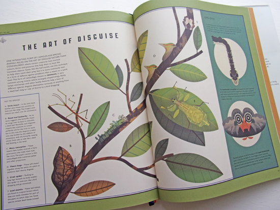
How involved in things like paper choice and the over all design did you get?
“As much as I wanted really, but to be honest I didn’t get that involved with that stuff very much because I’ve worked with Mike and Amanda several times when they were at Templar and I was doing my picture books with them, so both sides already knew what the other side liked and we were on the same page pretty much with everything.”
Do you have a favourite spread or element in the book and is there any part that was a particular challenge?
“Not sure which is my favourite page. There are a few I suppose but I reckon the Journey of a River spread (below) encapsulates the vibe of the book really well and I like how that one turned out visually. The most challenging pages were always the scenes. Trying to get everything fairly accurate but working together and still trying to use my sense of stylisation and simplification was all a bit of a juggling act on those pieces.”
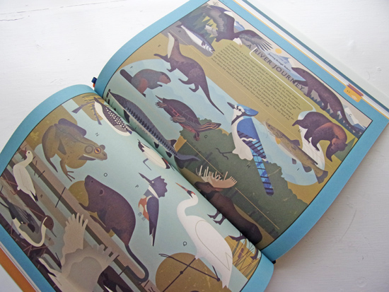
There is an elegance and rhythm to the illustrations in Natural World that reminded me of Charley Harper’s work. Where did you look for your inspiration on this project?
“Yeah I love the work of Charley Harper. A long time ago I was inspired by his approach of trying to simplify stuff down to geometry. That’s how I create my work. I think in shapes. Then it’s just about sketching an animal from various references until you find the right way to convey the awesomeness of each animal with a fine balance of accuracy and artistic license. That’s often one of my favourite things to play with in illustration.”
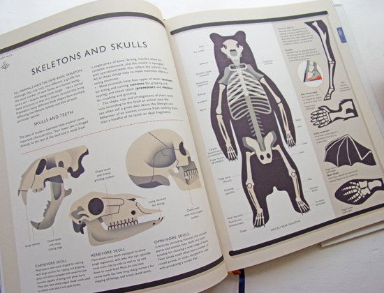
Each spread; the colours (slightly muted by the off-white, matt paper) and the over all aesthetic harks back to much coveted, mid-century wall charts. If ever you find yourself face-to-face with anything in the book, from a Shrike to a Leaf Mantis, the illustrations could be used as a field-guide for identification, but they are also pared back and downright stylish in their own right in their simplification.
There are surprises on every page, so I won’t spoil them for you here. Dive in and you will find out which creature is the only one, apart from a bird, to have zygodactylous feet, which cacti can live for 150 years, and which creature holds the record for the longest insect migration.
It’s perfect for the “passionately curious”; which is how Albert Einstein described himself in the quote that opens the Editor’s Note at the start of this book. Over all, Natural World is a triumph in the way the visual and written content have been brought together.
You may be interested in this book review:
Drawing People – The Human Figure in Contemporary Art
Back to News Page

