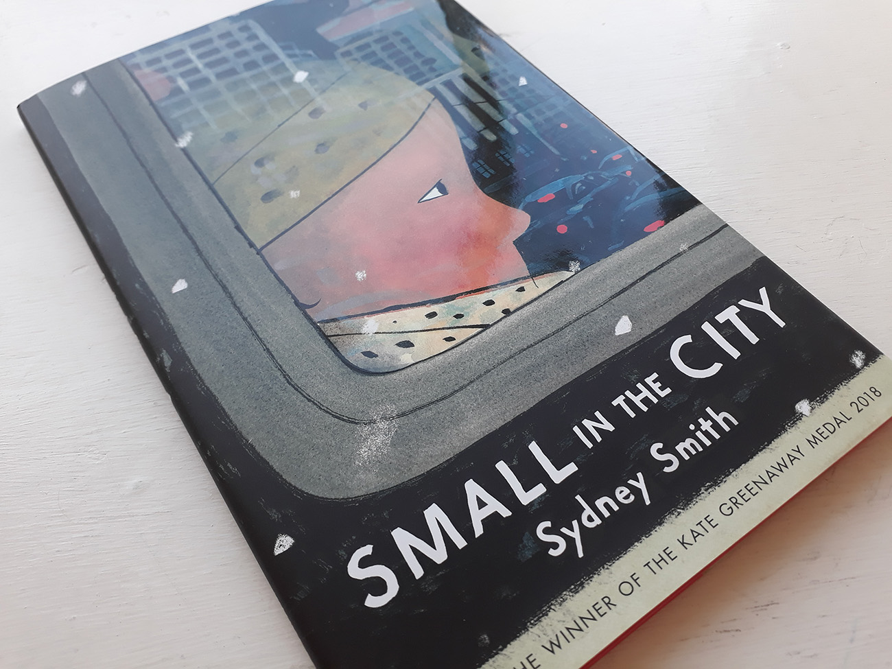
Sydney Smith talks about Small In The City + our Book Review
Written & Illustrated by Sydney Smith
Published by Walker Books ISBN: 978-1-4063-8840-4
Reviewed by Karl Andy Foster
This is something special. Sydney Smith’s narrative power is his ability to immerse the reader into the world and concerns of a small child. His spare economical prose and exquisite artwork propels you towards a startling destination – it’s an honest and credible story that after drawing you in, leaves you satisfied, perhaps with one or two tears in your eyes.
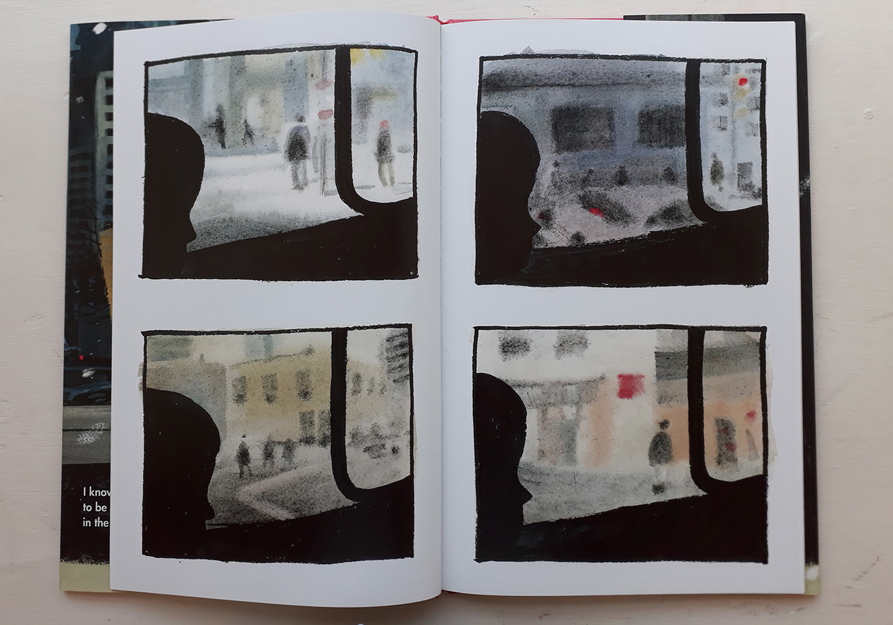
The content of this hard cover picture book offer some lovely observations – visual and textual. The initial four panels with silhouettes and blurred streets convey the sense of unease. A child roams around the city, encountering a range of scenarios and offers advice that may, or may not, be of comfort to a stranger in the town.
Sydney Smith’s carefully constructed pages are a mixture of full spreads and panels. Of note is a double page spread when the child leaves the bus and makes their way into the throng of the crowds. In addition, the words “I know what it’s like to be small in the city”, or “The streets are always busy. It can make your brain feel like there’s too much stuff in it”. I particularly enjoyed “Alleys can be good shortcuts. But don’t go down this alley, it’s too dark.” We are completely involved with the concerns of our young protagonist.
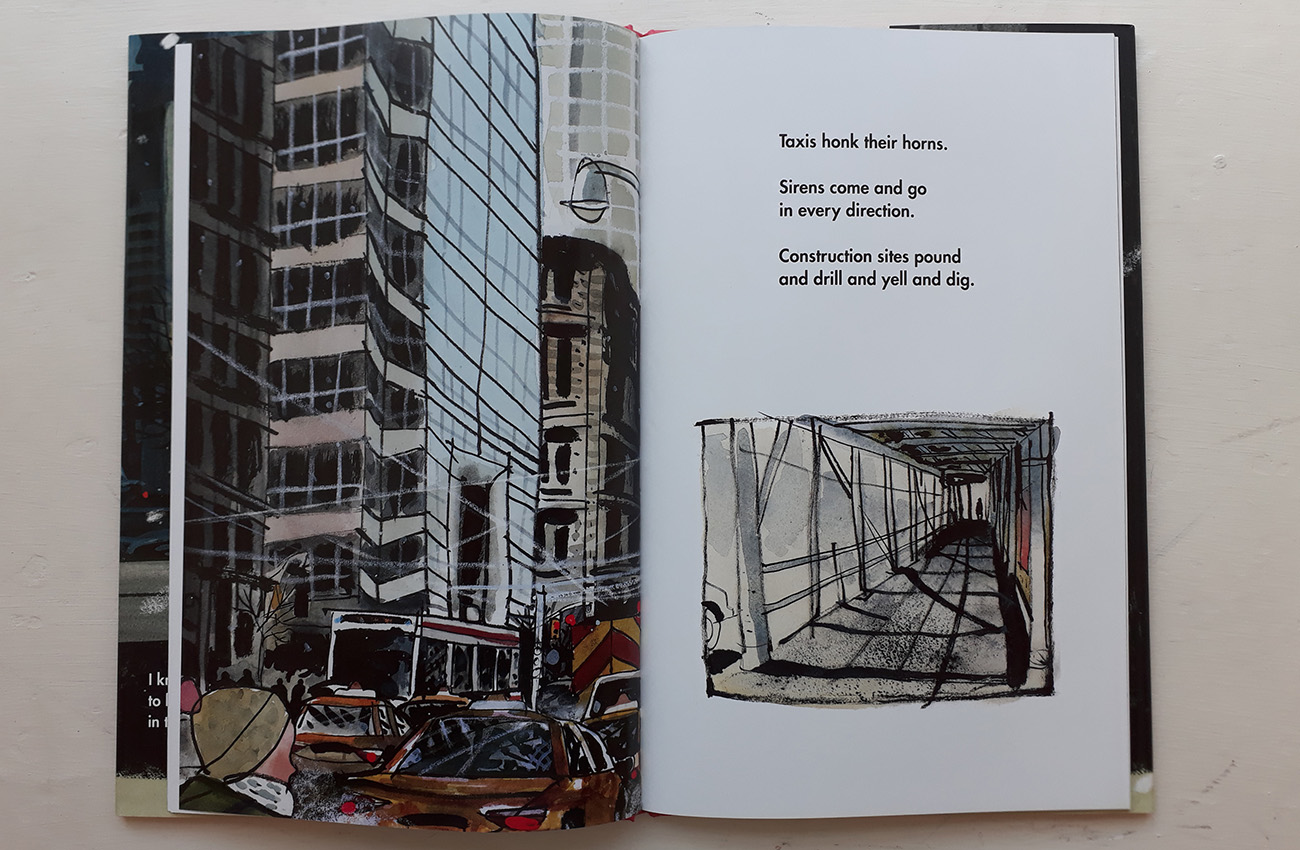
The grid lines of buildings, walk ways and street furniture create a web suggesting a trap for the uninitiated. There is a stunning picture of the child’s reflection fractured by the arrangements of the mirror tiles on a building façade. We soon realise that this advice is not aimed at the reader but at something far more important. The revelation at the end of the picture book came as a surprise for me but I did start to get an inkling of what was to come.
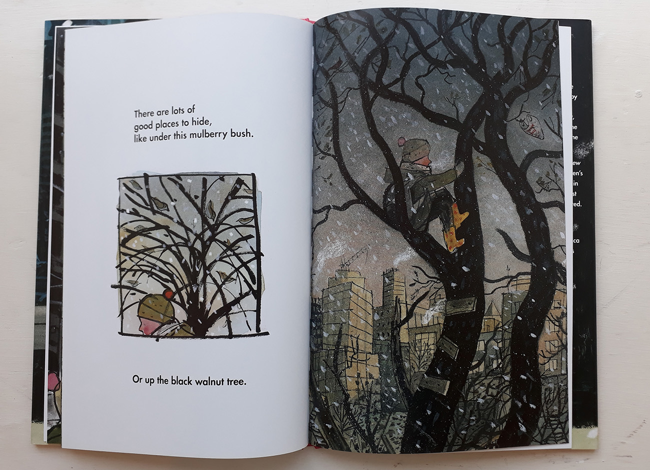
Sydney Smith has created a classic that will make a big impression on readers with a story that though simple is imbued with a graphic fluidity combined with a visual dexterity that few can match. This for me is reminiscent of Ezra Jack Keats’ atmospheric The Snowy Day when I read it for the first time. The artwork nods in a knowing direction towards Dave McKean’s ‘Cages’ and ‘The Savage.’ The use of a subtle and sophisticated palette suffused with interpretive impressionistic inky marks and charcoal lines is thrilling.
If this picture book and his 2017 Kate Greenaway Medal winning collaboration ‘Town Is by the Sea’ written by Joanne Schwartz is anything to go by Sydney Smith is on his way to great significance. When you are small in the city you can still have the biggest heart of all.
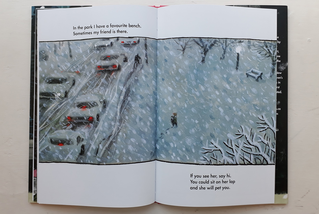
Sydney Smith tells us about Small in the City – how it developed, working on the narative and images, and how it relates to his other titles:
The goal of writing and illustrating Small in the City was to explore the devices that I had discovered in the work leading up to now. I wanted to take what excited me and see how far I could run with it. Things like counterpoint and montage, ambiguity and speaking to an audience in a way that was less about talking to kids and more about addressing everyone, including children.
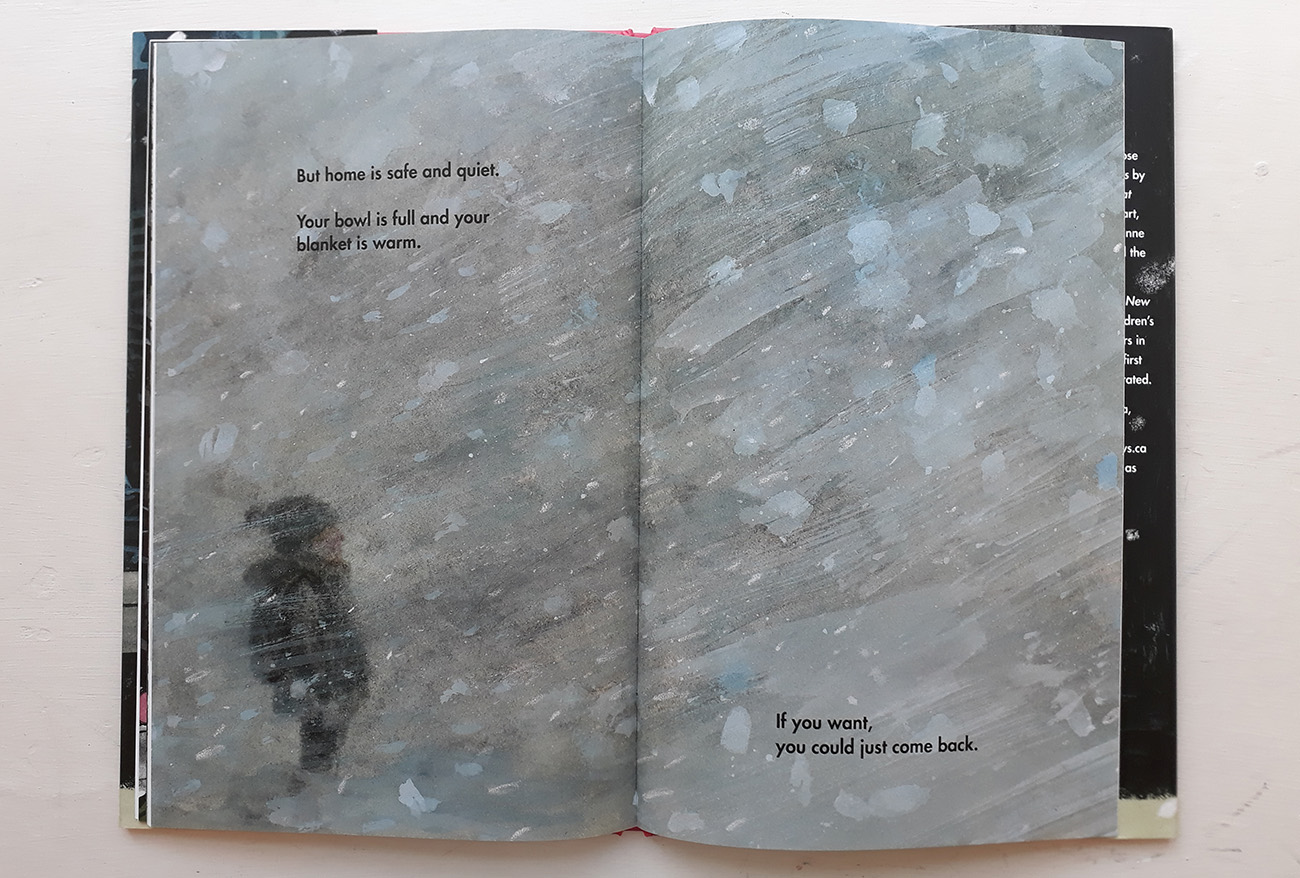
Initially, Small in the City was called Snow Fort. I had started with a story about a kid who was obsessed with tunneling in the snow and they became lost in their own labyrinthine snow fort. As the story developed and changed I saw more substance in the actual snow storm and its ability to change a city than in the fantastic narrative that had trouble finding a resolution. So, it changed. The story was now about finding solitude in a city that never stopped only to find relief in a snow storm. But that lacked a grounding narrative. There was too much atmosphere but not enough at the core. After describing the story to friends, only to receive blank stares in return, I knew that there needed to be something more substantial. Something to ground the story. Perhaps a simple narrative.
While visiting Boston I met with Neal Porter and described to him where I was at with the story. He suggested adding a dog. I quickly dismissed that but it must have stuck in my head because a month later while driving through rural Nova Scotia, I misheard the lyrics of a Martha Wainwright song and it triggered something. I thought she sang the words “Why can’t I see you again. Because I’ve done everything I can, to do the right thing.” It was such a heartbroken, desperate plea that betrayed an otherwise confident and guarded voice. I began applying that and forming a story about a child looking for a lost cat in the city. The voice of the child was the text. I could still have the snow storm. It could represent the rising feeling of solitude or helplessness. But it could also be what provides the proof of the cat at the end. The paw prints in the snow.
Finally, the story was taking shape.

I knew that before I got too carried away I needed to look at other books about snow and the city. But I was terrified that the story I was working on had been written before. Part of me was braced for that crushing discovery.
Thankfully, our libraries and our friends, the librarians, are extremely informed and helpful. Joanne Schwartz, not only an incredible author of children’s books, but also a librarian, helped me put together a stack of books that shared themes of winter and/or the city. Among them were Snow by Uri Shulevitz, Wolf in the Snow by Matthew Cordell, Snow Sounds by David Johnson, The Snowman by Raymond Briggs, Before Morning by Joyce Sidman and Beth Krommes, Owl Moon by Jane Yolen and John Schoenherr, The Snowy Day by Ezra Jack Keats, The Snow Day by Komako Sakai, First Snow by Bomi Park, and Snow by Sam Usher. After reading through this stack I felt a sense of relief. They were all so beautifully crafted but the story I wanted to see was still unwritten.
Now was the time to sketch and build up reference material. I began the search for the authors and artists that brought out the right tone and perspective from me.
I wanted to show the city honestly. The neighborhood is dirty and feels cold and definitely not a charming residential street or cul-de-sac. It was important to me because that’s where I live and raise a child of my own and we aren’t the only family in an apartment in a dodgy neighborhood, surrounded by crime and sirens. I wanted to show the reality of living in the city center.
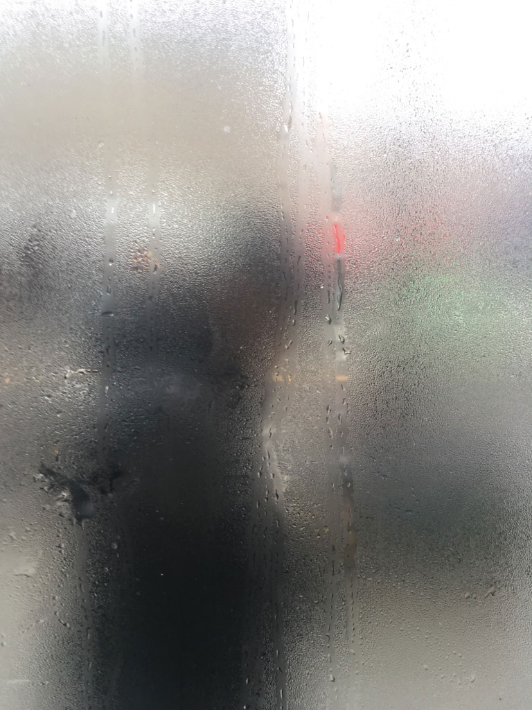
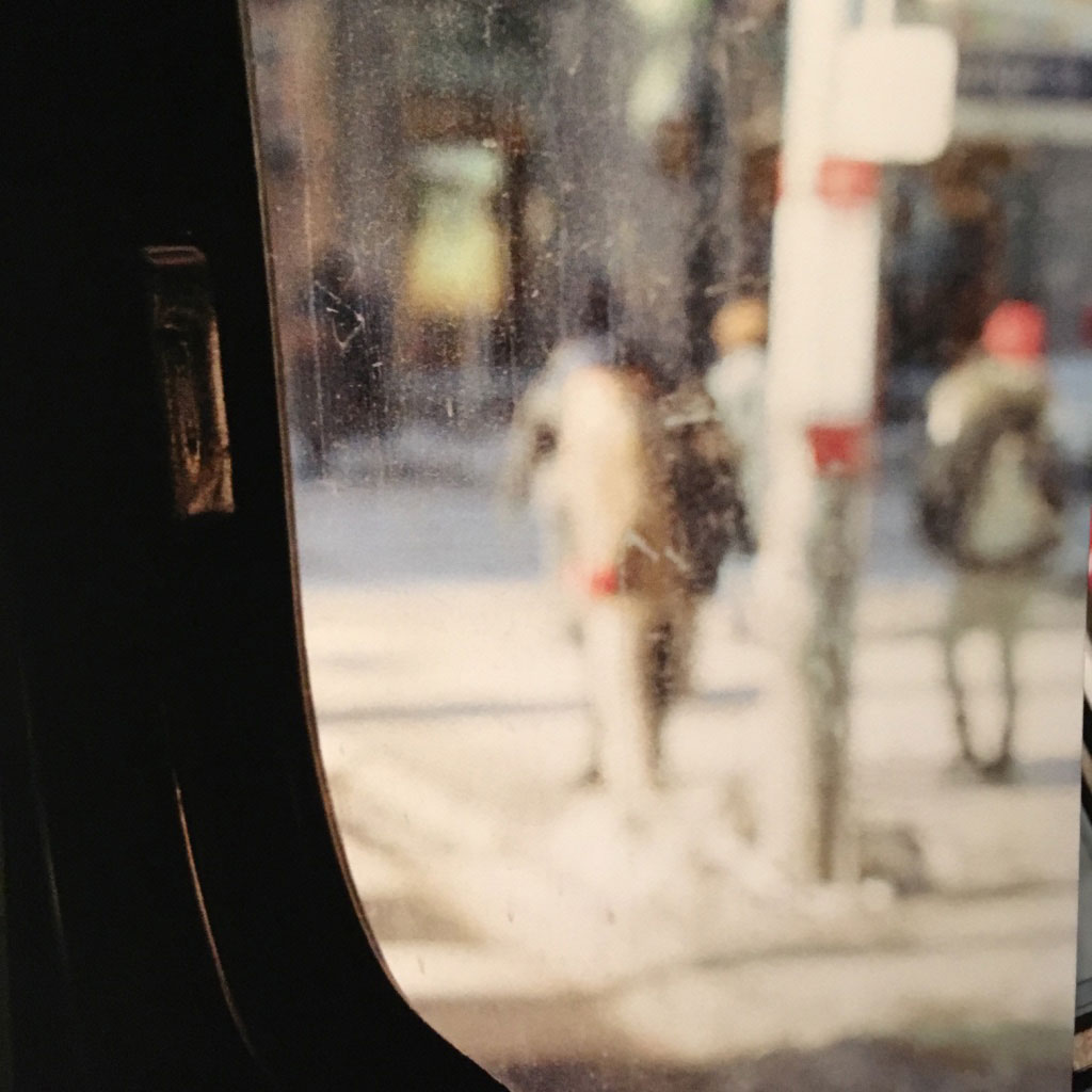
Like the projects before this one, I had been inspired by photography. For this story, Saul Leiter, Lee Friedlander and Robert Frank dominated the inspiration folder. Their city photographs, having innovative compositions, were often near-abstract in how they shot through windows, focused on reflections and cropped their subjects. What a perfect way to describe an overwhelming, and often confusing, city environment or state of mind.
I also picked up my father’s old SLR and decided to spend some time and money on capturing the neighborhood in various states of weather. The unique colors and textures of developed film feel like they translate better to a story. There is a certain magic to taking photos with the same camera that documented my own childhood. This was all well and good but it was becoming a bit excessive.
There is something that most artists value above all else and that is the spark that occurs in the act of creation. It is the harmonizing of your idea with the improvisation and experimentation, and an excitement and confidence as the work takes over, and it becomes real in front of your eyes. In many moments like this I have forgotten what time it is and where I am; hours could pass without notice as I am taken out of myself. This could be what Joseph Campbell meant by the “rapture of self-loss”.
These moments are both golden and frustratingly elusive. You could be well rested, fed, caffeinated, with a fresh haircut and new socks and it won’t happen. Other times it could happen when you are sitting on a bus with a sketchbook, with only two hours’ sleep and a hangover. You can’t plan it and all that randomness can be terrifying. So sometimes I find myself planning and sketching and preparing myself to excess because I don’t know if when I sit down, it could work. But the one thing you can count on is that it won’t happen at all if you don’t pick up your pen, pencil or brush. Some say inspiration only finds you when you are busy, but you could also look at it like singing. If you spend a week in silence the first note you sing may not be in tune.
So I sat down, with the encouragement of my writing partner, Ben, and wrote down the story, and then over a month sketched out a dummy. As it has been in the past, I went about sketches the wrong way. I was too precious with some, building them up too much. Others were meant to be place holders, left unclear and required rethinking too late in the process.
Too often I have a problem that after the sketches are approved, I compare the quality of the finals to that of the sketches. The sketches embody an impromptu quality that can’t be repeated. In some of those cases I changed the image altogether after realizing the sketches work not because of their merit as a plan for something bigger but as a complete piece on their own. Rough and loose.
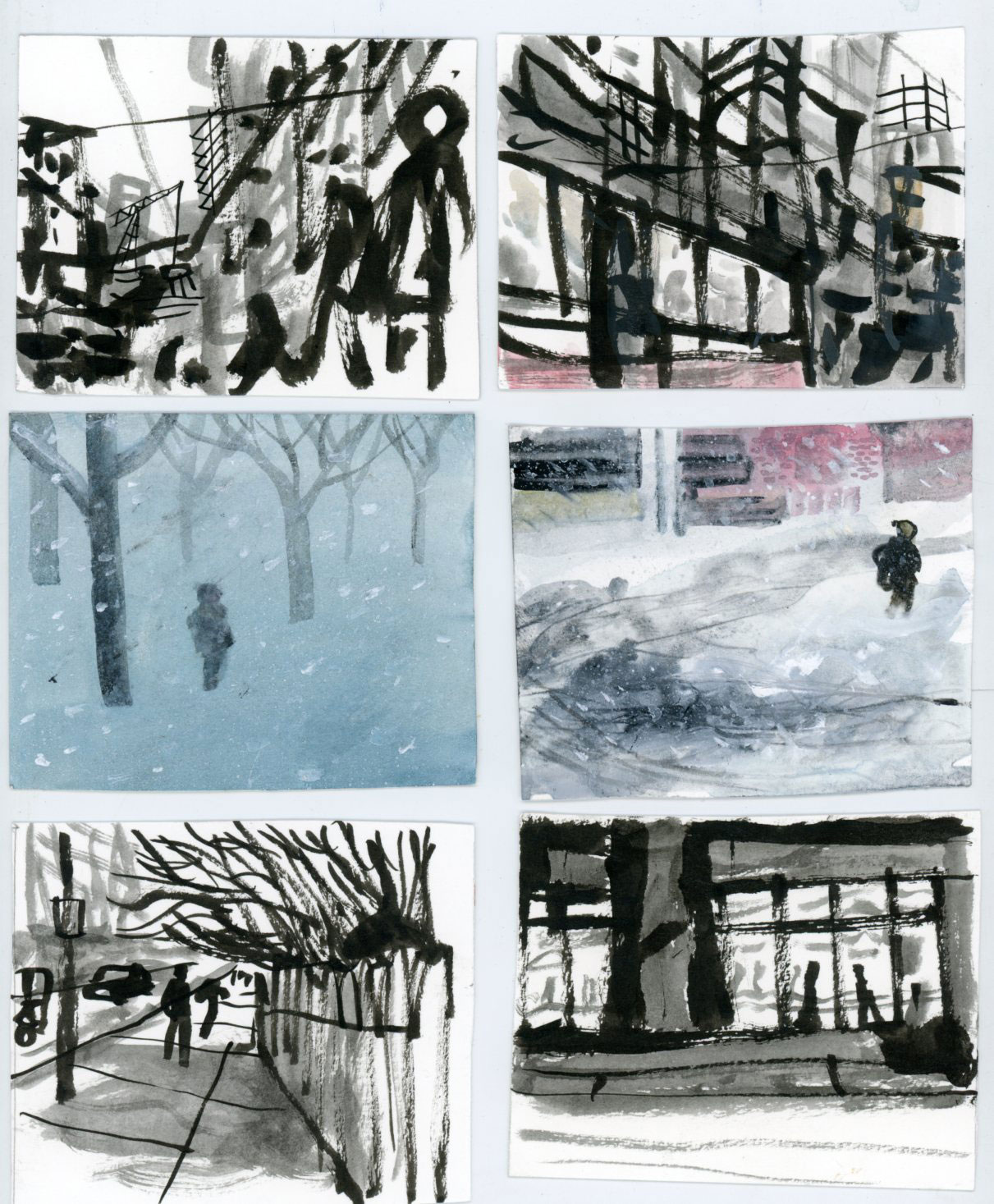
A sequential panels montage appears in Small in the City immediately. I wanted the first page to act like an opening shot to a movie. A mix between distorted city lights through a windshield in Taxi Driver or the silhouetted figure in a doorway of The Searchers. This is where credits would fade in and out. Take a chance to communicate the essence and suggest a character before we begin. There are many moments in this book where I rely on the reader to have patience with the ambiguity and work with me.
Another montage moment is the fourth spread. This is a mix of images, laid out to overwhelm. Some of the snapshots are more literal than others. I ran into trouble with this spread as I painted more and more single squares but couldn’t decide in what order to put them.
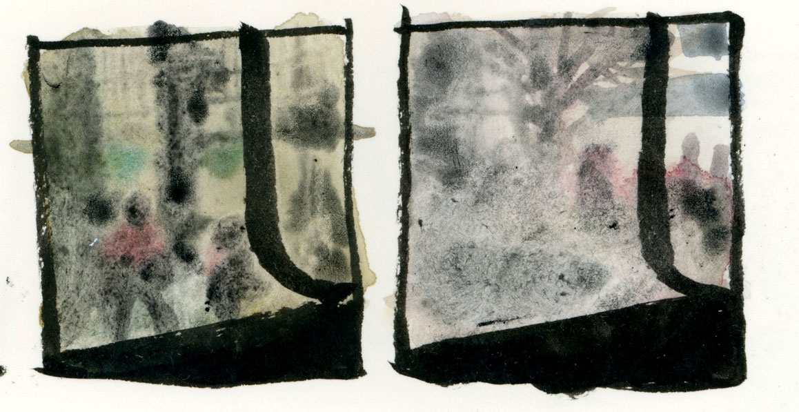
Since Sidewalk Flowers, I have been interested in how wordless moments in a book can change how the book is read. Wordless moments cause a pause in the voice of the reader. It has potential to disturb the natural rhythm and punctuate words by letting them linger in the air like a bell’s sustained ring. It is especially effective if you anticipate a moment of clarity. If the images contradict the text or there is a subtext that becomes clear, adding a wordless image can give the reader a moment to process the information given. Or it could just represent a quiet in the mind of a character. As mentioned, in Town is by the Sea I used the wordless sequence to create the tension of waiting for the father. In Small in the City the text vanishes at the same time the noises of the city would in the snow storm.
This story is a way for me to process my situation as much as Sidewalk Flowers and Town is by the Sea was.
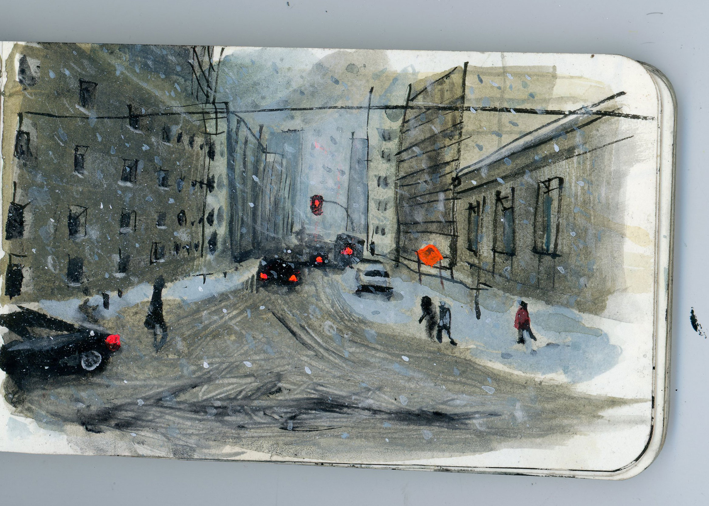
Sidewalk Flowers was about discovering beauty in the busy city and sharing it. I worked on that book when I first moved to Toronto. Town is by the Sea is about struggle, family, and legacy. My first child, my son, was born while I was working on that book. It helped me process the significance of the moment. Now it’s Small in the City. It’s about navigating the nonstop urban life while also walking the path of grief after losing a loved one. Sheila Barry, my friend and editor, passed away as I was developing this book. Through this character I am able to project and process my own emotion after losing someone that important to me.
All images courtesy of Sydney Smith
Back to News Page

