Slanted magazine: Helsinki issue – Book Review
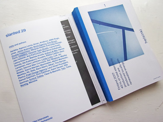
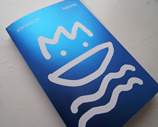
This is the most recent issue of Slanted – the Helsinki issue. With a seductively gleaming blue cover leading the reader into a wealth of content, it’s an interesting magazine to engage with.
The focus of Slanted is on typography graphic design, but when investigating a city (as they do with each issue) they bring in many more elements, talking to creators from the city about much more than type. A questionnaire directed to a designers gives multiple views and attitudes towards their city and country (‘Finns have a strong sense of national identity. What does it mean?’)

Not always expected in design magazine, there is the inclusion of short story fiction – stories which bring the reader into the Finnish experience in a way that straightforward reporting may not do so effectively.

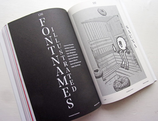
Illustration is involved, with the regular section of Font Names Illustrated covered by nine illustrators visualising Nordvest, Suomi Kuvaa and others.

An interesting, eclectic approach to a city and it’s design friendly inhabitants.
See more here
Back to News Page

