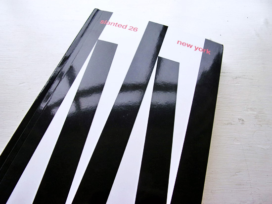
Slanted 26 – New York
Published and Designed by Slanted Publishers
Review by Laura Bilsby

Slanted have released the 26th edition of their Typography and Graphic Design magazine, dedicated to the city of New York. The issue features a timeline of works produced by designers, typographers and artists reflecting the transition of the city. The diversity of the designers within the creative community mirrors the cultural diversity of the city.

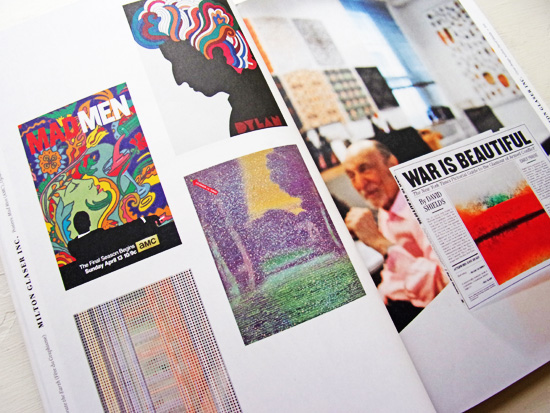
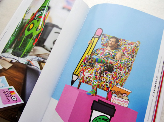
The magazine features designers who have been in the industry over 30 years, such as Milton Glaser and Lance Wydman, as well as design firms like Sagmeister and Walsh, Doyle Partners and 2×4, and also highlights freelancer designers/illustrators including AOI member, Jon Burgerman. Together all these individuals form what seems like a tight-knit community.
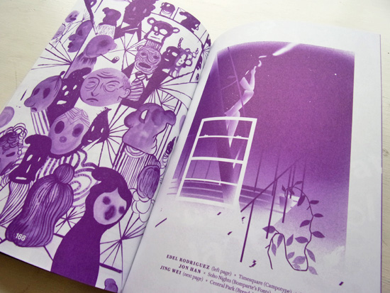
The book feels like a catalogue of New York’s aesthetic sensibility from all boroughs of the city, demonstrating the result of like-minded creative people, working together, being immersed in such a fast paced evolving city. Slanted also asked a group of Artists to illustrate a typeface for the New York issue, to give an interpretation to a well-known place in New York or visualise its historical context.

Overall, Slanted have produced a comprehensive up-to-date picture of the scene, with a great selection of works, studio portraits and interviews, showcasing an exciting array of graphic design, typography, and different styles of design, reflecting the endless possibilities for the future.
Back to News Page

