Shaun Tan on The Bird King, An Artist’s Sketchbook – Interview
One of the world’s most popular illustrators, Shaun Tan – known for a series of fascinating picture books – has just published The Bird King, An Artist’s Sketchbook. A book of sketches for upcoming books, character studies, development work for Eric and cover design ideas for Cicada, plus new oil paint landscape sketches containing ‘much fun, wit and wisdom’, according to our reviewer, Karl Foster, who spoke to Shaun about sketchbook vs tablet, the influence of his Australian location and how he pursues the use of scale in his artwork.
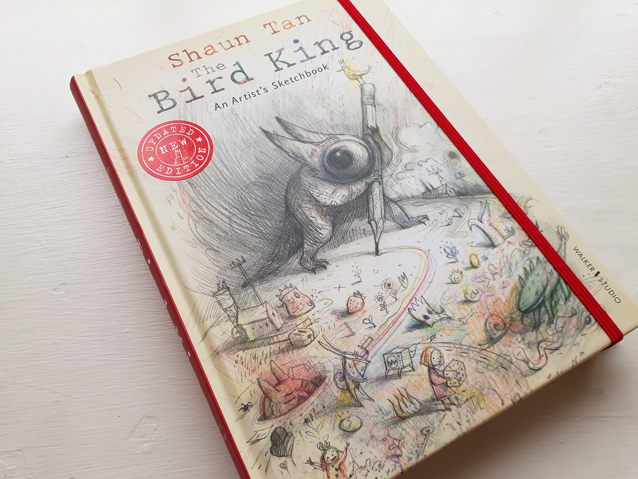
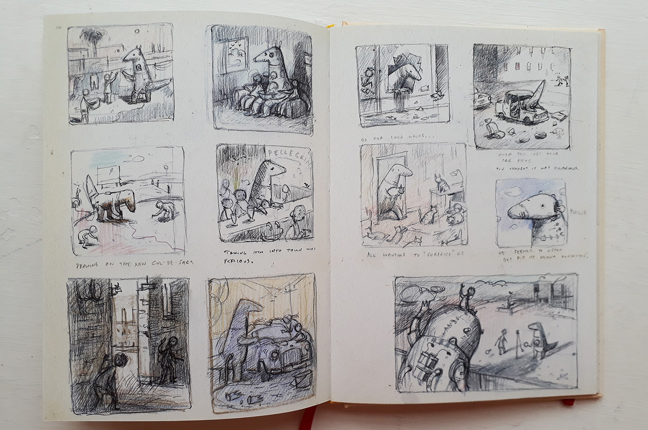
The Bird King, An Artist’s Sketchbook is a visual dairy of the influences that drive Shaun Tan to be a creator. Whether that be from direct observation or his imagination he is able to conjure up compelling images that keeps one asking questions. As a master draftsman his work commands respect and thoughtful consideration. This comprehensive and thoughtful tome from Walker Studios contains much fun, wit and wisdom.
All artists have an inner kingdom and internal energies that drive us to make artefacts. There are several ways to communicate this to the outer world but none are as intriguing as the artist sketchbook. Visual language can be heavily influenced by commercial concerns, but we also need to find ways to express our richer personal drives. Shaun Tan writes about this process with ease and great depth of feeling. Embodied at the heart of this enterprise is his assertion that it’s important to keep things fresh.
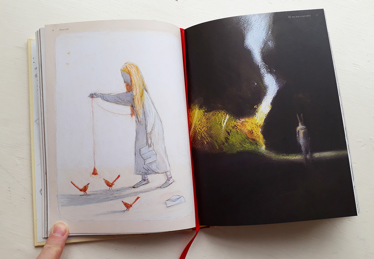
Sketchbooks are used to help you work out what you want to say and what you wish to keep personal. Your ideas live behind closed pages. That is why artist’s sketchbooks interest the public so much. It’s the chance to discover secrets or hidden passions that others may have missed in more visible works.
Tan’s drawings are delicate in tone, shade and line work. He is able to infuse his work with bold and dynamic areas of intense colour. There is a palpable impression that we are being invited into a private space that is only meant for the initiated. The printing on some pages evokes in facsimile his real notebook pages reminds me of artist James Jean’s Process Recess books. This texture adds to the authenticity.
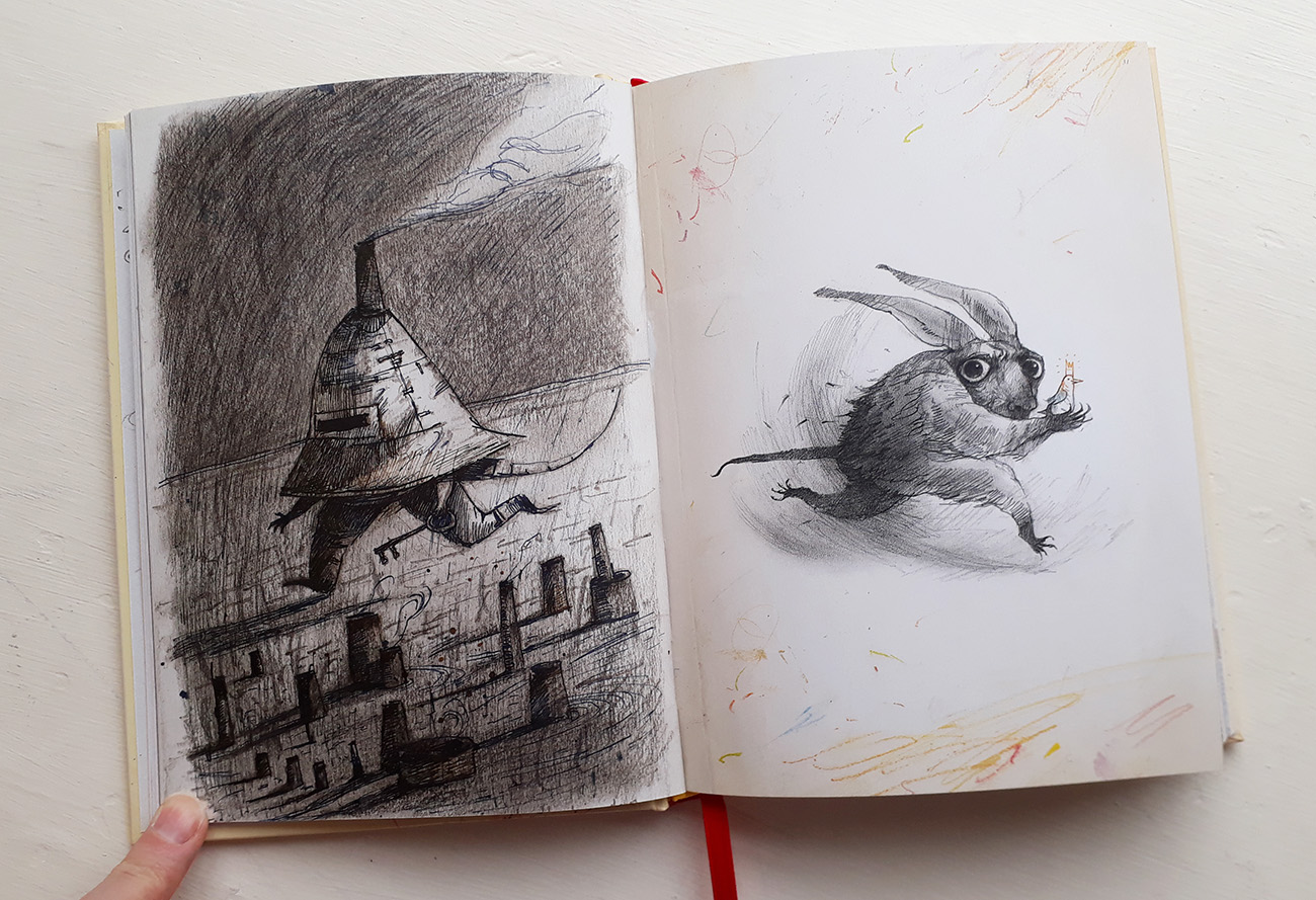
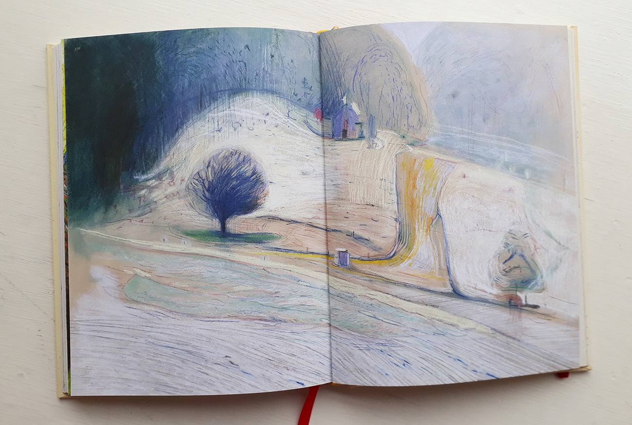
In his work there is for me a strong connection to the landscape similar to that of the artist Sidney Nolan and the hallucinatory scenes from Peter Weir’s film ‘Picnic at Hanging Rock’ (1975). These landscapes frame something that is just out of sight, that would amaze us if we dared to focus our gaze upon them. He also renders grainy, colourful, shocking and eerie townscapes that contrast perfectly with the more open spaces. Tan’s expert handling of scale and perspective is used to create worlds that are unexpected but also deeply satisfying.
The creative process is key to the formation of measurable outputs and helps one to maintain and sustain one’s ability to stay current and to produce work of relevance to oneself and a wider audience. This book will inspire students and those who need to be encouraged to find a place to store their own visual insights and secure their inner kingdom.
Karl talks to Shaun Tan:
In a world filled with electronic tablets do you think that traditional sketchbooks have had their day, and will you ever stop using a sketchbook?
Maybe I’m a bit too old to convert to electronic tablets fully: I find them very useful, but grew up with traditional materials and the odd glimpse of Corel Draw in a lesser used corner of the high school art room. Well, how things have changed! But also stayed the same. I’ve yet to find anything that beats the immediacy, or the concrete, tactile reality of a sketchbook.
One of the great virtues of traditional materials is that they are quite resistant, sometimes unforgiving. If you make a mistake, you work with it, you learn from it. My own problem with digital media is an undo-button reflex, which seems to bring an editorial aspect to drawing far too soon, and makes me far less bold or innovative in front of a screen. Too confident, safe and repetitive.
Drawing is very much about resistance, about risk, of not being able to fully control an image, in the same way that reality is resistant and beyond our control. Drawing is about coming to terms with the true nature of that concrete reality.
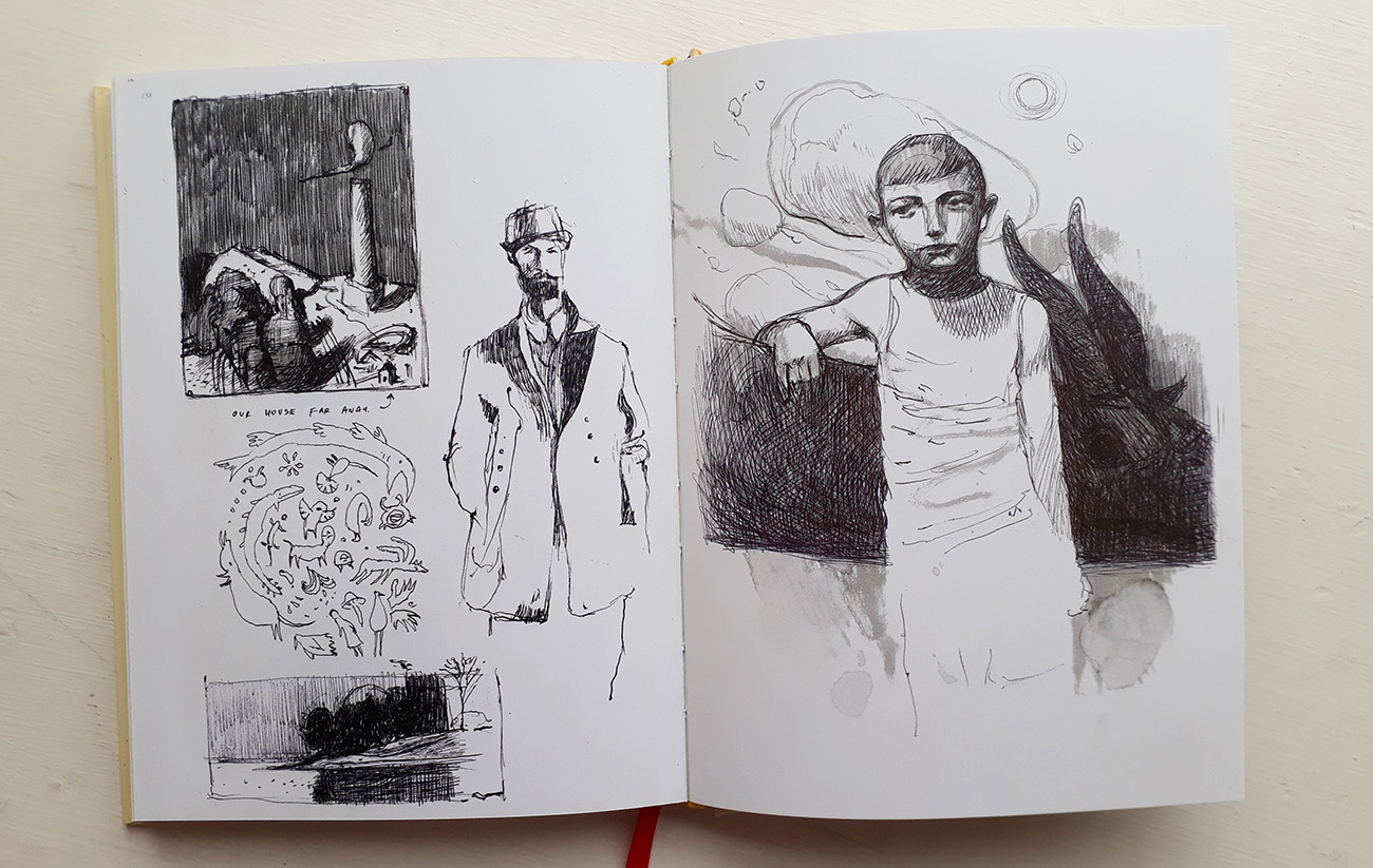
How do you keep your ideas fresh when so much of our visual world is formulated for us using ultra-sophisticated CGI?
Well, that’s an interesting question, because we are certainly saturated by over-produced imagery. I’m somewhat careful about what I expose myself to, about how my visual environment primes my subconscious. I still look at everything with great curiosity, but I try to also distance myself a little, and think about any bit of visual culture from a critical point of view, and measure my precious time accordingly. How does this stack up against other good painting, film, photography? In some cases, very well, very inspiring CGI. Mostly not though, time to move on.
The difference is core ideas and feelings, and these are not usually ultra-sophisticated at all, they only need to be authentic and clearly expressed. They are the same across all media, and as fresh or not-so-fresh regardless of paper, canvas, stone or screen. I’m always looking for depth of feeling, that continuity with other things, other artworks and real life experiences. When you find that in other people’s work, it tends to freshen up your own, it inspires and illuminates.
Do you think this revolution is stifling our imaginations?
Again, only if it is excessive, shallow or produced with commercial intentions only. I think a lot of that kind of thing is just plain boring. It’s only stifling if it somehow precludes us from seeing other things, other kinds of art and expression. The good stuff always has a way of shining through. It may not be popular, high-grossing or mainstream, but it is enduring. It will still be interesting and looked at in 10, 20, 50 years time, when all the other ill-conceived material is not even a memory.
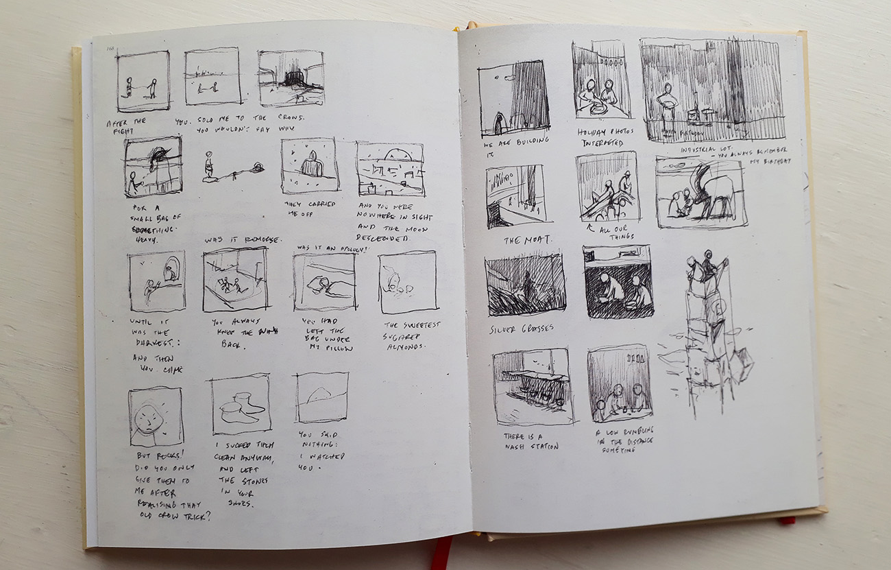
There is a powerful sense of depth in the environments within your work, do you think that your Australian location is responsible for this?
Yes, it may well be. In particular I grew up in Western Australia, and having travelled the world and returned, can see that along that coast there is certainly a specific kind of light and depth, which might be best described as vast and vivid.
The city of Perth was at the time quite small, and in any direction you could see out of it, the broader landscape forever visible between the high-rise offices, a sense of easy escape. The suburbs were peppered with untamed bush and swept by wild light, areal contrast of inside and outside spaces. But more broadly on one side you have the immense Indian Ocean, and on the other an inconceivable expanse of desert. As one of the most geographically isolated cities in the world, it did feel a little like an island, a strange sort of castaway place.
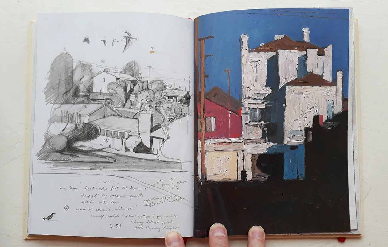
You use scale a lot to create surreal and sometimes disturbing imagery, what drives you to pursue this as a form of expression?
I suspect it’s an extension of childlike play, where scale shifts are one of the simplest ways of playing with expectations, whether for an amusing, puzzling or poetic effect. Sometimes a disturbing effect. I think that this is also a feature of dreams, irrational changes in scale, which can suggest hidden feelings and meanings. Or maybe nothing at all, just fun to look at and draw. A really huge snail, a tiny exchange student, I do think these start as playful exercises and then end up revealing new ways of looking at a very familiar things, to think about them more carefully and even philosophically, without great transformation of initial appearances. It’s a trick that never gets old.
Do you consider yourself an artist or an applied designer?
I would say both. I would call myself someone who likes to paint and write, and will find ways of doing that within the practical and cultural institutions that are available, just like any other creative.
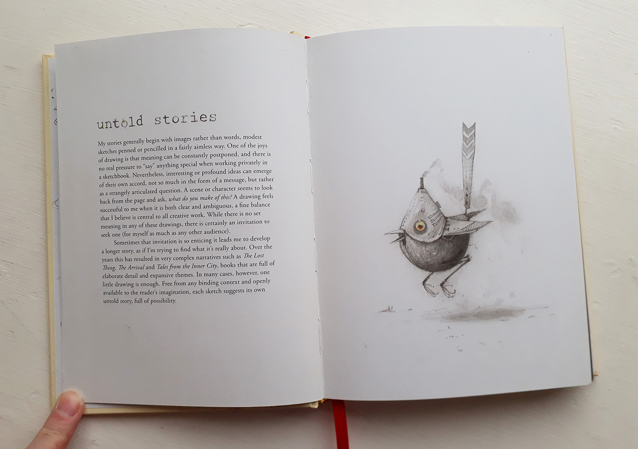
Do you know when your work is fine art or applied art?
I guess there is a kind of scale. As a general rule, a work of ‘fine art’ seems to set all of its reasons and problems internally, like a painting I’d do of a tree just because I’m primarily interested in the act of painting that tree, and may never even exhibit or show it.
An applied art might be, say, an illustration for a particular part of a story that needs to be presented for other aspects to work. It exists for itself, but also in service of a larger story, a book or film, or creative brief. This is not a discrimination of quality or integrity. Each is as equally valid or potentially self-contained. I think we generally make too much distinction between different kinds of expression, and are obsessed with categories based on form or context. I try not to think about these too much, and just do good work.
What are you working on now/ next?
We had a baby in January, so he is kind of the main creative project at the moment! But I’m always pottering away at a variety of different things, small landscape paintings, sketchbook drawings, ideas for other books, all the kind of thing that you can see in The Bird King.
That’s the great thing about sketchbooks, they are such a terrific little laboratory for thinking, remembering and resolving creative ideas, in such a way that you really never know what they will lead to. There’s always creative hope the moment you pick up a sketchbook and a pencil.
The Bird King, An Artist’s Sketchbook – Written & Illustrated by Shaun Tan
Published by Walker Studio ISBN: 978-1-4063-8924-1
Review and interview by Karl Andy Foster
Back to News Page
