Rear View Mirror – Stephanie Black
In a fast-moving media world Stephanie Black’s Peer-Reviewed paper explores how forms of illustration provides a truly engaging sense of time. Black argues that developers of New Media may want to look to older forms of navigation in media, such as books which can engage readers in much richer ways, encouraging the dialogue and conversation that newer media often only gesture to.
In the world of smartphone devices, iPads and digital billboards, our visual landscape is changing fast – from static display to moving, time-based displays. Yet traditional illustration often manipulates time with more grace than many of the slightly awkward digital examples, although the occasions where the elements of their design move over time, but do not always develop the content over time, may just be a teething problem. This essay will extract some highly relevant lessons from non-digital illustration in order to encourage a deeper understanding of how illustration negotiates time, as a significant characteristic of the field.
Therefore this piece is an exercise in tentative mapping from an illustrator’s perspective, it is an invitation to discussion, and responds to Adrian Holme’s suggestion in his 2011 Illustration Research conference paper that illustration can make use of a number of theoretical approaches. The outcome of this can be applied to the shifts in context outlined at the outset; if illustration is a time based activity, then perhaps we can argue for illustration’s place within this landscape with certainty. We can certainly ask for digital illustration to become more sensitive to its content, and to use the possibilities afforded by the technology to enhance the relationship between image and viewer.
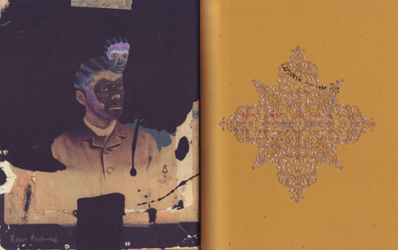
Henrik Drescher, Turbulence, Chronicle, 2001
The concept of time crops up repeatedly within writing on illustration, with illustrator Sue Coe’s comment on “slowing time down” being of notable influence, and taken up by academic Steve Braund in his paper, Slowing time down: correspondences, ambiguity and attendance. If we examine how illustration achieves such temporal manoeuvring we can identify methods and principles that may be transferable to other media, and root any theory introduced within concrete and accessible examples. Sequential illustration provides some curiously complex examples of how time can be made multi-directional within the form of the book. David Hughes’ Walking the Dog (2009) and Andrzej Klimowski’s Horace Dorlan (2007) both spring a surprise on the reader in that they each produce an experience of looped time. Hughes stratifies time by presenting simultaneous events separately and simultaneously, as uniquely navigable until sequences converge and they become constituent parts of the looped whole. Hughes also merges past and present times by employing an unsettling memory of events documented elsewhere in the book to accompany the events pictured.
Horace Dorlan alternates text and image in lengthier passages and produces a sense of déjà vu by repeating an early written passage later on as a visual sequence. Both sequences end in the central character suffering an accident on the stairs, with the visual account culminating in his crashing out of the rigid boundaries of the linocut images and, in full-bleed, falling out of the picture, in parallel to the events that occurred in writing near the start of the book. Although the events are familiar, the reader hasn’t seen it before and this introduces an element of doubt as the pages are retraced to ascertain exactly what has happened – and why it is happening in duplicate. By doing so, it raises questions of linearity and parallels in time, whilst eroding any preconceptions the viewer may have held about the veracity or otherwise of text, image, art, or science.
Both Hughes and Klimowski have produced sequential narratives that use the structure of the story on the page and the respective abilities of images and text to run time in different directions and parallels within each book. They accomplish this within the two-dimensional pages of a traditional book format, and this spatial aspect of the page is what allows sequential narratives such as comics to manipulate time so extensively. They do so by working with the principle outlined so convincingly in Will Eisner’s Comics and Sequential Art and Scott McCloud’s Understanding Comics, that space and time are the same thing in comics, and therefore more space equals a greater length of time. The overview of a portion of space can also show us an overview of different points in time.
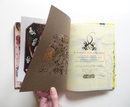
Henrik Drescher, Turbulence, Chronicle, 2001
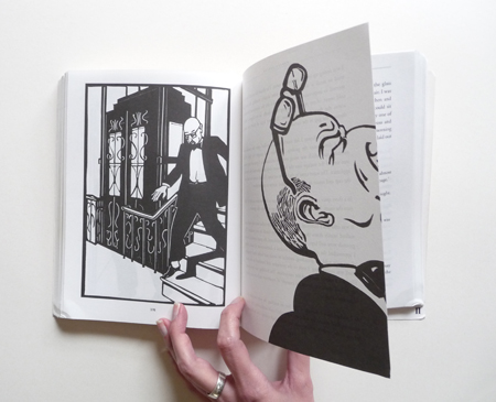
Andrzej Klimowski, spread from Horace Dorlan, Faber & Faber, 2007
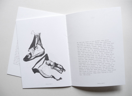
Helene Pertl,spread from The Case and detail showing the book’s disintegration. Atlantic Press, 2011
Dividing time into units such as pages and panels as Klimowski and Hughes do, complicates early 20th century French philosopher Henri Bergson’s assertion in Time and Free Will (1910) that our common sense understanding of time confuses time with space, and this quantitative approach to thought (through the strictures of language) prohibits us from experiencing time as it really is: duration. Duration is instead an inexplicable concept that can only be grasped through thought experiments, for language isn’t capable of appreciating the diverse nature of duration (with its past, present and future intermingling). Words such as ‘simultaneity’ and ‘succession’ will give a good indication of what duration is, but remain inappropriate as Bergson finds them irredeemably quantitative and spatial, in that they divide time into units placed in front of or next to other units. And yet both Hughes and Klimowski have woven together past, present and future by spatialising time. Yes, Klimowski’s division of time into separate panels mirrors the photographic sense of time quantified as discrete units (rather than the temporal flow within an image as McCloud explains and Hughes shows) but the sequencing of these in relation to the written chapters and the other visual passages is akin to duration, if we’re to pursue the thought experiment route. Therefore the division of time into units that concerned Bergson doesn’t seem to be an insurmountable barrier to the fluidity of time.
The issue of how we experience time was more than a theoretical question for Bergson, as it impacts upon our personal and psychological development. Bergson argued that real time needs to be reconciled with common sense (spatial) time to avoid the trap of our choices being pre-determined; not involving our conscious decisions in response to the world. And this “automatism” is a useful concept to hold up to digital platforms. Whilst the smoother transitions between images might offer the fluidity of duration, digital poster sites do not (yet) encourage the choices borne of free will in the same way as these two books. Hughes and Klimowski offer a lesson in communication that we as viewers navigate, which the touch screen navigation of mobile devices may be better able to replicate. The use of gesture recognition and touch screens within poster sites offers us the possibility of combining fluidity with choice, but at this stage they characterise the viewer as a consumer, which the reader of these two books isn’t limited to. The book’s limitations in this regard could be seen as more respectful; the book does not have the capacity to monetise our free will in the same way that app or web-based content can, books don’t use tracking cookies to observe our behaviour.
Acknowledging the viewer’s abilities and role in communication is a theme that reappears when examining Henrik Drescher’s book Turbulence (2001). The book is a collection of sketchbook excerpts, so the links between the majority of pages aren’t causal in the same way as those between images in Horace Dorlan. The disjuncture between the images in Turbulence corresponds to the ‘gaps’ implemented by graphic designer Tibor Kalman, who in the 1980s and 1990s used divergent text and image as a method for making communication harder won, but grasped more tightly. Kalman stated:
“…sometimes if you make things clear it’s not as penetrating as if you leave gaps. The trick is to make sure the gaps are spannable” (Farrelly, Tibor Kalman: Design and Undesign,1998)
In order to span the gaps Drescher has employed subtle links across the series, such as the written snippets introducing Hindu mythology that serve to anchor the sketchbook fragments under a unifying theme, lasercut pages acting as chapter breaks, and smoother sequences featuring a man with a boat. These elements give an identifiable structure to the book, and such rhythms within the series are comparable to the mnemonic that Peter Storkerson writes of in Communication research: Theory, Empirical Studies, and Results (2006). He argues that such patterns (as found in songs and poems) help us to remember things even if we don’t understand them at the time, such as the lateral ruminations of Drescher’s sketchbook. Not only that, but if we persevere and do draw a narrative interpretation from the collection of images and text, we remember the meaning more successfully. Storkerson suggests that “by making a learning task more difficult, learning is slower, but what is learned is better retained”. By making the images and text cryptic, Drescher gives us a lot of work to do, but if Storkerson’s findings are accepted, this approach extends the temporal experience for the viewer by exercising their cognitive functions.
Presenting a temporal experience that can meet the viewer on their terms and at a time of their choosing is in keeping with the audience-dependent role of illustration, and the examples discussed have all utilised the book as a circulating form to do so. They constitute a challenge to the deliberate avoidance of objects by similarly time-based work in other disciplines. In avoiding the problematic implications of objects described by Hal Foster in his essay Chat Rooms (2004), the artist can make work that could be missed by the viewer, leaving them bewildered. The issue is likely to become more pressing and we are likely to be seeing more of these temporal works where the process by which the work comes about is the work. In Grant Kester’s view:
“…there is a shift towards participatory, process-based experience, and away from what I’d describe as a ‘textual’ mode of production in which the artist fashions an object or event that is subsequently presented to the viewer for decoding”
(Stott & Kester, 2006)
And yet by embracing objects (such as the book form) to circulate their work, haven’t the illustrators discussed here created a “participatory, process-based experience”? The productive role of these objects might go some way to addressing the problems arising from work featured in discussions of art critic and curator Nicolas Bourriaud’s book Relational Aesthetics (Bourriaud, 2002), most notably in the exchange between Claire Bishop and Liam Gillick within the journal October. Of note was Bishop’s account of a rather disappointing and confusing experience when visiting a time-based processual piece of work (Rirkrit Tiravanija’s soup kitchen Untitled: Free) when there was no activity taking place. The relevant aspect of this was the mistaking of objects (leftover rubbish from the soup kitchen) for the social relations that constituted the work. This is curious for the fact that none of the illustration examples discussed here allow the viewer to miss the work in such a way, and it is precisely because they have presented the viewer with an object (one they have invested care and time in the production of) that the work can perform its processes directly in front of the viewer, or itself be performed by the viewer and therefore offer a temporal experience. It is not solely a record of something happening elsewhere at another time. Helene Pertl’s book The Case (2011) marries form and content in a symbiotic relationship to do just that, and by choosing an unstable binding to sew its three printed sections together Pertl has produced a form that has a lifespan to mirror its contents. It’s a quietly violent book, a catastrophe made poetic by presenting it as a collection of fragmented, hallucinatory texts and carefully observed drawings of banana skins, which are sprawled and contorted in wildly uncomfortable positions. In contrast to the previous examples, the fragments don’t add up to a coherent whole. The written passages flicker between past and present tense, but don’t flow smoothly from one to the other. They seem to be confused and conflated, which is reflected in the relationship between text and image. These paired elements remain in parallel but never fully articulated into a single message. The result of all of this is that the book takes on the character of the indecipherable trauma within, which is ably demonstrated at the same time through the disintegration of the form used to present it. The reader is complicit in the destruction by handling the book, making the experience part of their lived time.
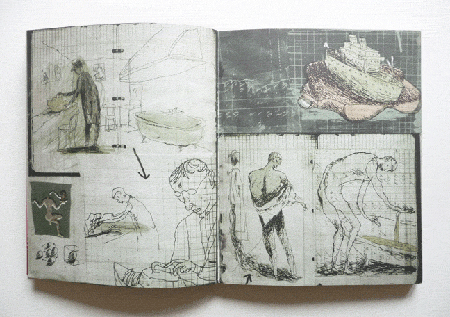
Henrik Drescher, Turbulence, Chronicle, 2001
Creativity Dialogue
The lived time of the viewer and their actions within the work are central to Container’s Evil Twins: Haunted House installation, and gives the work its sequence and duration. Here, visitors were invited to enter a labyrinthine construction containing various illustrated interludes through a portal under a desk. Container’s Luise Vormittag describes it as “a narrative environment where visitors were physically and psychologically immersed”, and used bewildering changes of scale and darkness to achieve this. The experiential aspect of this work was central to the project’s play on fiction becoming real, and grew in importance as Container realised they had facilitated dialogue amongst the disconcerted visitors. They developed this aspect of the work by building events into the exhibition that encouraged such exchanges, such as tea parties and a confessional activity. Container have pursued this interest since, with their current project in conjunction with Vital Arts hinging upon dialogue and collaboration, thus bringing the social relationships so important to Bourriaud into the making of the work, which also finds a communicative role for the object.
Digital poster sites aren’t always successful in using the form in a manner that is sensitive to, and enhances, the content, whereas Pertl’s and Container’s work uses a form that requires negotiation by the viewer as a constituent part of the content. This allows the viewer to devise their own meaning from the relationships between signs, and both The Case and Haunted House involve the embodied viewer travelling through time and space to encounter signs. And if we pause for a moment to look outwards at what other disciplines do with these elements, it becomes a rather contrary activity. In his catalogue essay for the Tate’s triennial of 2009 entitled Altermodern, its curator Nicolas Bourriaud comments on how signs are transported by artists within their work. This is of note to Bourriaud as artists moving through time and space to borrow signs differentiates altermodern time (the time we live in now) from the previous period (postmodern time), as Fredric Jameson described it in Postmodern Culture (1985). And yet the viewer is still fixed in time; they do not participate in the time travel or geographical roaming of the altermodern sign. It appears that Pertl’s book and Container’s installation offer more of a temporal experience to the viewer than the works discussed by Bourriaud, as it is the viewer moving through space and time to compile signs. Illustration has provided examples that could have complicated Bourriaud’s formulation of altermodern time. Whilst altermodernism may not have caught on, it is telling that illustration wasn’t factored into the deliberations. But we won’t be in a position to contribute to the discussion of how our understanding of time defines this period without adequate scrutiny of such work within illustration, and raising awareness of these examples amongst a wider audience. Scrutinising and articulating the methods and principles used equips illustrators for pushing the perceived boundaries of illustration and creating provocative pieces of work that extend the debate surrounding the time we live in.
Valuable Practice
The lesson we need to draw from this is that illustrators need to articulate their understanding of how illustration operates in order to be given any opportunity to contribute to broader cultural discussions. Illustration has a great deal to offer in this regard, by virtue of its close relationship with the audience. As a mirror of the society that it speaks to and on behalf of, illustration is arguably a valuable practice to consider alongside more respected disciplines. However, in order for this to become feasible, the examples that form the basis of our arguments need to be better represented. It isn’t always appropriate to judge the cover without the book, and therefore we need to develop more appropriate ways of representing temporally complex, three-dimensionally installed and dialogical aspects of illustration in order for their purpose and efficacy to be evaluated alongside the visual qualities of the work. If illustrations are to be shown out of context in order to promote a project to a wider audience, one option is to pursue the lessons championed earlier concerning the temporal accomplishments of books. There is also a need to explore the strengths of screen-based work in this regard; from stop motion films to recent developments in augmented reality there are a number of avenues to explore that are suited to representing the experiential and dialogical aspects of work such as Container’s. Whilst doing so we need to identify and bear in mind the central principles of illustration so that we are aware of and can tackle questions that arise regarding the accessibility of technology.
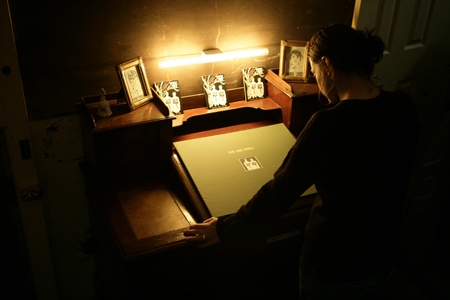
Container, photograph documenting The Evil Twins: Haunted House exhibition
Breakthroughs in technology that focus on touch, movement and the affective qualities of communication offer encouraging steps towards communication that responds to the specificity of each audience member, but ought not to overshadow illustration’s achievements to date. Illustrators are already accomplishing this using analogue forms, as demonstrated within this article. But as these developments become more widespread a number of possible outcomes are created; that the understanding and demand for this aspect of illustration increases, that illustrators have useful cross-disciplinary skills that help to expand another avenue of employment as the traditional marketplace changes beyond recognition, and that illustrators may ask the right questions in order to make technology-dependent communications accessible. Using these same skills illustrators may wish to adopt a deliberately oppositional stance. All of these options require further discussion based on examples, and all of these options show illustration to have a future broader and healthier than the confines of what recent commentary has characterised as the cul-de-sac of a craft-based cottage industry.
Stephanie Black is an illustrator and Associate Lecturer at the University of the West of England. She is working towards a practiced based PhD at the University of the West of England.
References
Bergson, H. (2001) Time and Free Will New York: Dover (trans. F.L. Pogson)
Bishop, C. (2004) ‘Antagonism and Relational Aesthetics’ October 110, 51-79
Bourriaud, N. (2002) Relational Aesthetics Les presses du reel (English translation by Simon Pleasance and Fronza Woods)
Bourriaud, N. (2009) Altermodern: Tate Triennial London: Tate Publishing
Braund, S. (2011) ‘Slowing time down: Correspondences, ambiguity and attendance’ Paper presented at the Second International Illustration Symposium, Illustration and Writing: Visual Languages, Manchester Metropolitan University, November 3 2011
Container (2008) The Evil Twins: Haunted House [exhibition] London
Drescher, H. (2001) Turbulence. San Francisco: Chronicle
Drescher, H. (2004) Postal Séance. San Francisco: Chronicle
Eisner, W. (2006) Comics and Sequential Art. Twenty-Eighth Printing. Paramus, NJ: Poorhouse Press
Farrelly, L. (1998) Tibor Kalman: Design and Undesign London: Thames & Hudson
Foster, H. (2004) Chat Rooms In: Bishop, C. (ed) Participation. London: Whitechapel, 2006, pp190-195
Gillick, L. (2006) ‘Contingent Factors: A Response to Claire Bishop’s “Antagonism and Relational Aesthetics”’ October 115, 95-107
Heller, S. (1999) Stories unfolding in time and space. Eye 31
Holme, A. (2011) ‘One theorist who said we do not need one theory. The relevance of Marshall McLuhan to illustration theorisation and pedagogy (or why illustration is a 21st century discipline).’ Paper presented at the Second International Illustration Symposium, Illustration and Writing: Visual Languages, Manchester Metropolitan University, November 4 2011
Hughes, D. (2009) Walking the Dog. London: Random House
Jameson, F. (1985) ‘Postmodernism and Consumer Society’ In: Foster, H. (ed) Postmodern Culture. London: Pluto Press
Klimowski, A. (2007) Horace Dorlan. London: Faber & Faber
Lorenz, T. (2007) ‘The Pressure to Conform’ Design Week 22(19), 19
McCloud, S. (1993) Understanding Comics: The Invisible Art. New York: HarperCollins/Kitchen Sink Press
Magee, J. Projects http://www.periphery.co.uk/projects.htm [Accessed 25 April 2012]
Magee, J. (2009) Projects [online]. Available from: http://www.periphery.co.uk/projects.htm [Accessed 25 April 2012
Mills, R. (1994) Nine Inch Nails logo [mixed media, photographed]. Available from: http://www.russellmills.com/mills/recordcovers/rc024.htm [Accessed 10 March 2012]
Pertl, H. (2011) The Case. Penryn: Atlantic Press
Poynor, R. (2012) ‘Scarcity and silence: Amc2’ Eye Blog [blog] 5 February. Available from: http://blog.eyemagazine.com/?p=10791 [Accessed 5 February 2012]
Raeburn, D. (2004) Chris Ware. London: Laurence King
Smith, K. A. (1996) Structure of the Visual Book. Keith A Smith Books: New York. (3rd Edition)
Storkerson, P. (2006) ‘Communication Research: Theory, Empirical Studies and Results’ In: Bennet, A. (ed) Design Studies. New York: Princeton Architectural Press
Stott, T. & Kester, G. (2006) ‘An Interview with Grant Kester’ Circa 117, 44-47
Vormittag, L. (2012) Email to Stephanie Black. 25 April
Ware, C. (2000) Jimmy Corrigan: the smartest kid on earth London: Random House
Back to News Page

