R/GA talks Mailchimp’s Illustrated transformation
One of the biggest talking points of 2018 was the launch of Mailchimp’s global contemporary rebrand and sister ad campaign. It involved a wealth of creative partnerships, including Collins brand consultancy and R/GA: the advertising agency responsible for the commissioning of six illustrators.
The keen-eyed readers amongst you might recognise three Illustrators involved in this project, who also happen to be awesome members of the AOI: Franz Lang, Molly Fairhurst, Amber Vittoria!
We spoke to Lucia Orlandi, a Creative Director at R/GA. She’s currently based in NYC, and has led creative for Mailchimp, Google, L’Oréal Paris USA and more. Her work has been recognised by Cannes Lions, The One Club, and Communication Arts.
Can you tell us a bit about yourselves? How long have you worked together, how has the design department grown? What is your relationship with Mailchimp?
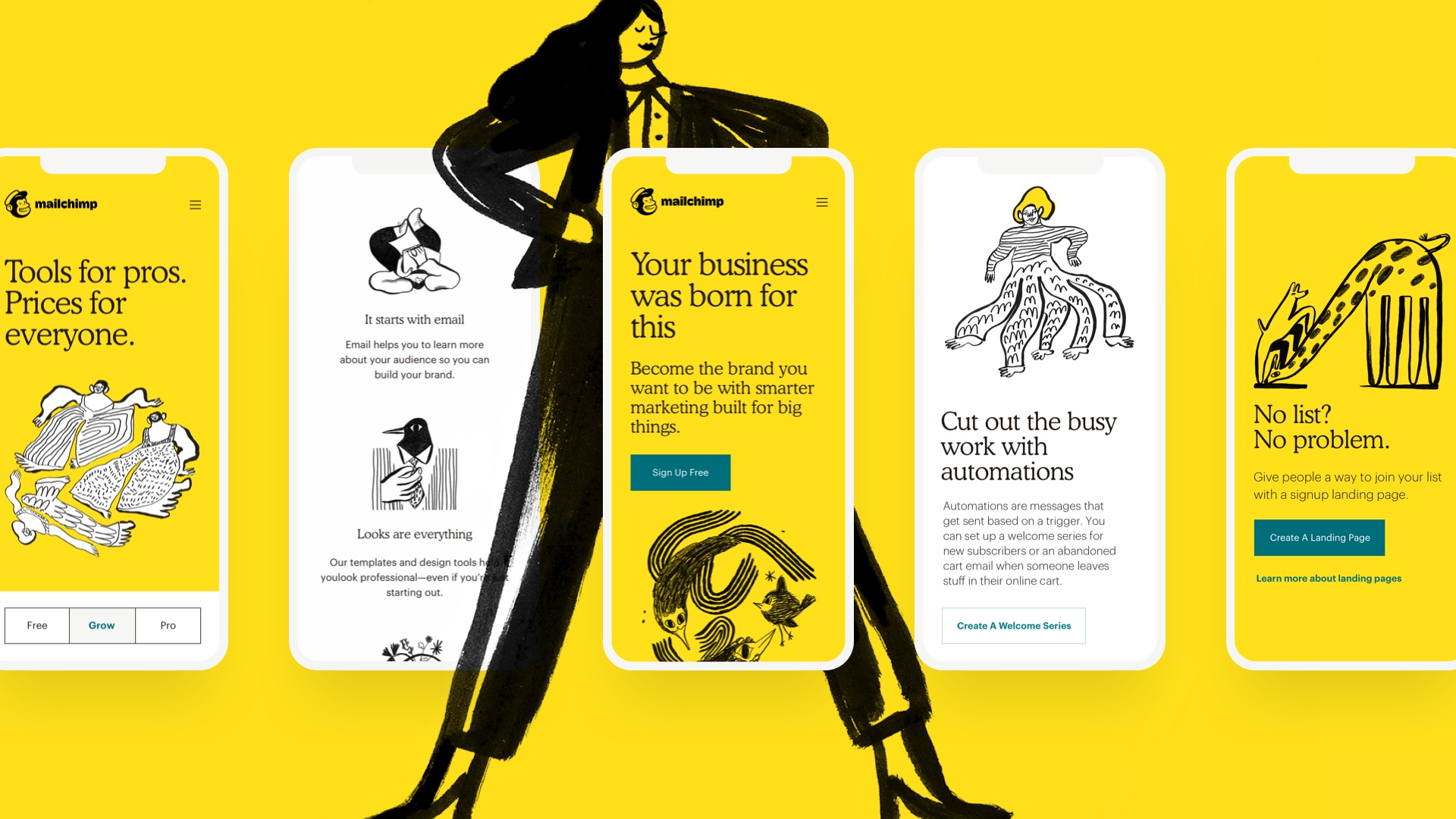
I’m a Creative Director & Designer based in New York, where I work at R/GA. My team was recently part of the Mailchimp launch, our work spanned the redesign of mailchimp.com and brand campaign. The team that worked on this included a mix of visual designers, copywriters, experience designers and art directors.
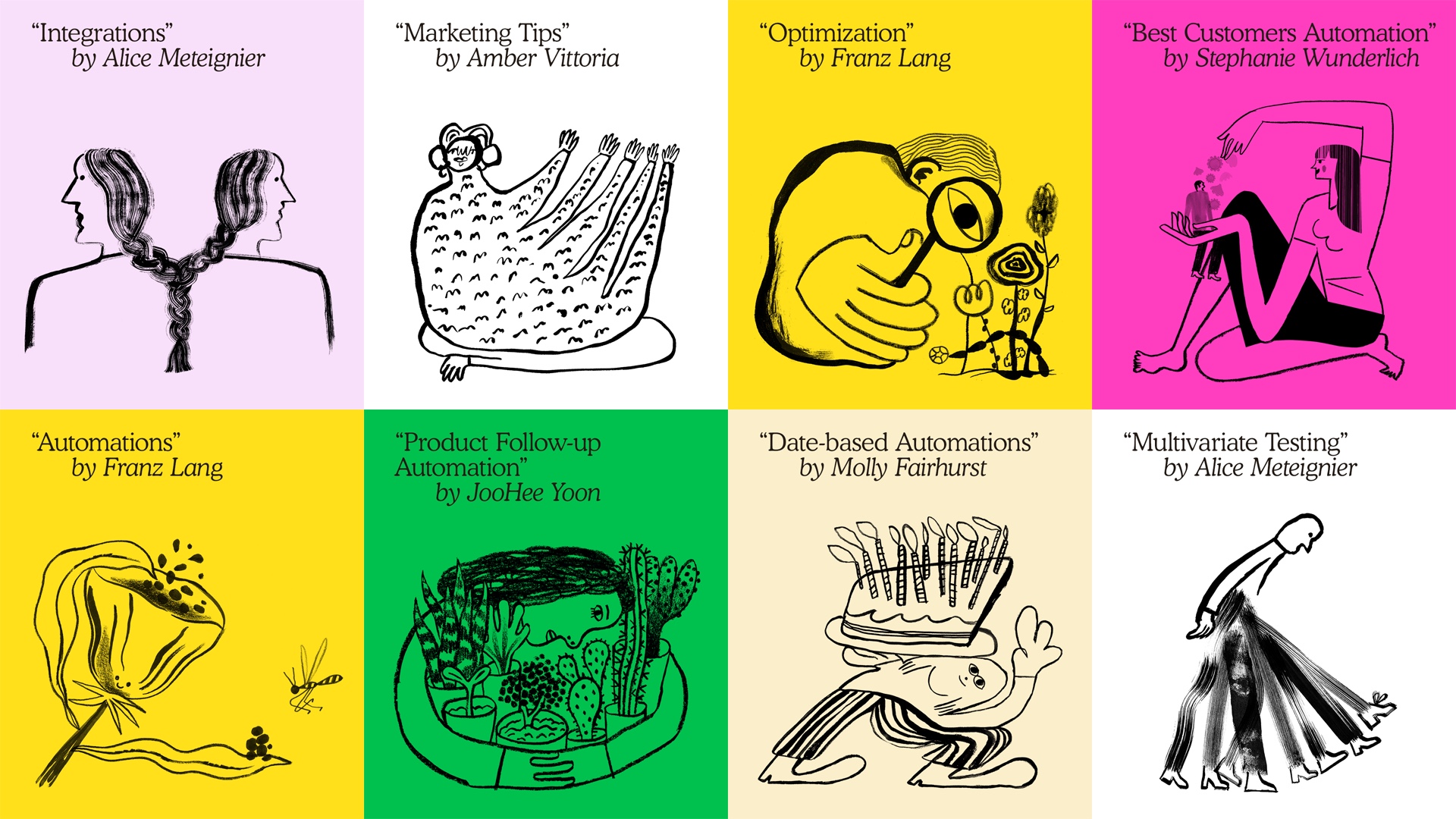
A big part of this work included building out the illustration system, brought to life by a team of illustrators from across the globe. I led the art direction for the work by Franz Lang, Molly Fairhurst, Amber Vittoria, Alice Meteignier, Stephanie Wunderlich and JooHee Yoon. All of this was in collaboration with the wonderful Mailchimp’s internal design team.
How did you discover these six Illustrators?
I obsessively keep lists for creative reference and art direction – it contains the likes of illustrators, photographers, and directors. So that was my first go to when researching artists for this, along with Instagram actually, which has become an easy place to save reference. A lot of links were then shared back and forth with the Mailchimp team, until we landed on our final group of illustrators.
What made these individuals stand out to you as a commissioner?
Collectively I was looking for elements in each illustrator’s work that I could envision living together harmoniously. There definitely is a spectrum of styles in there across line, form, texture and overall tone. Franz was the first illustrator that our team commissioned – I had been a fan of her work for some time and saw a lot of potential in her forms and characters, plus conceptually her work is really strong too. Each artist brings a different way of thinking and style that makes for an unconventional system that really can continue to flex and grow.
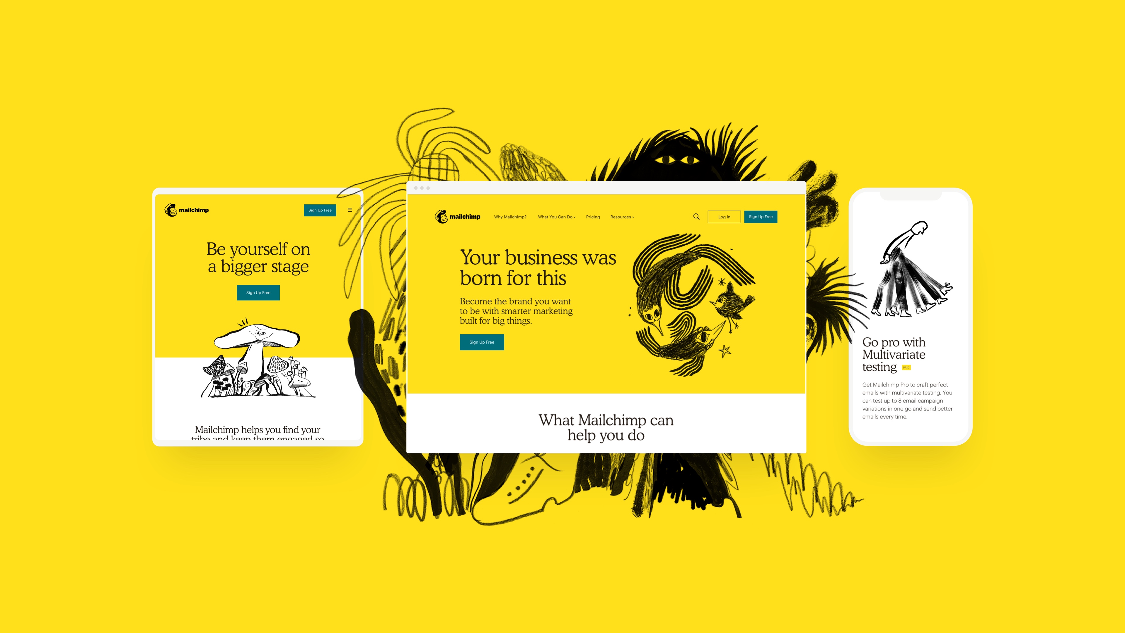
Art directing over 150 illustrations with 6 different artists, in tandem, was definitely a balancing act!
Starting with such a strong brand framework (established by Collins and the Mailchimp team) really laid the foundation for the world in which these illustrations exist – one that celebrates individual expression over perfection.
It was important for us to create an environment where the illustrators could create in a way that felt true to their artistic process, so the back and forth with each artist was slightly different.
Each illustration you see across the site and campaign has a purpose. From a creative direction stand point, ensuring that we were communicating in a way that was human and jargon free was super important. Complex topics like automations and multivariate testing were broken down into simple communication prompts, which meant the artists has a fruitful jump off point for their concepts and the resulting metaphors were perfectly offbeat yet relatable.
A simple way to think about the illustration system is like an ensemble – a collection of voices that come together in a balanced way.
The redesign is not limited to branding, but is also richly applied across the new ad campaign. How did you feel Illustration would carve out a unique space in the advertising world?
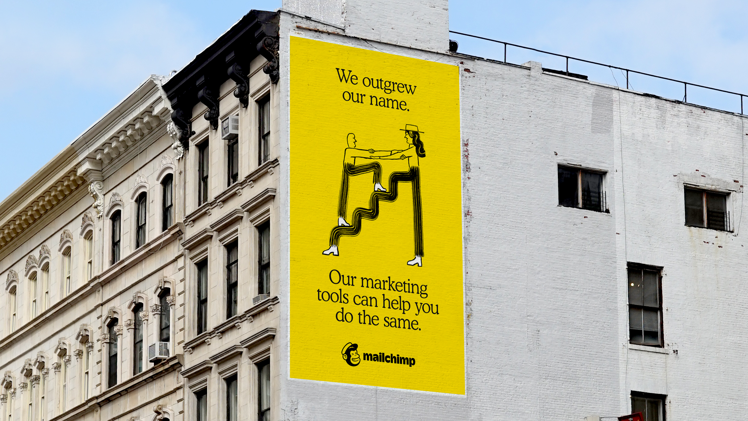
The illustrations gave us a rich visual language to work with from a storytelling perspective. The absurdist style helps to punctuate the tone of the campaign, which celebrates outgrowing your business name as the ultimate sign of success. This is something Mailchimp knows well: The word mail is in their name, but they do more than mail.
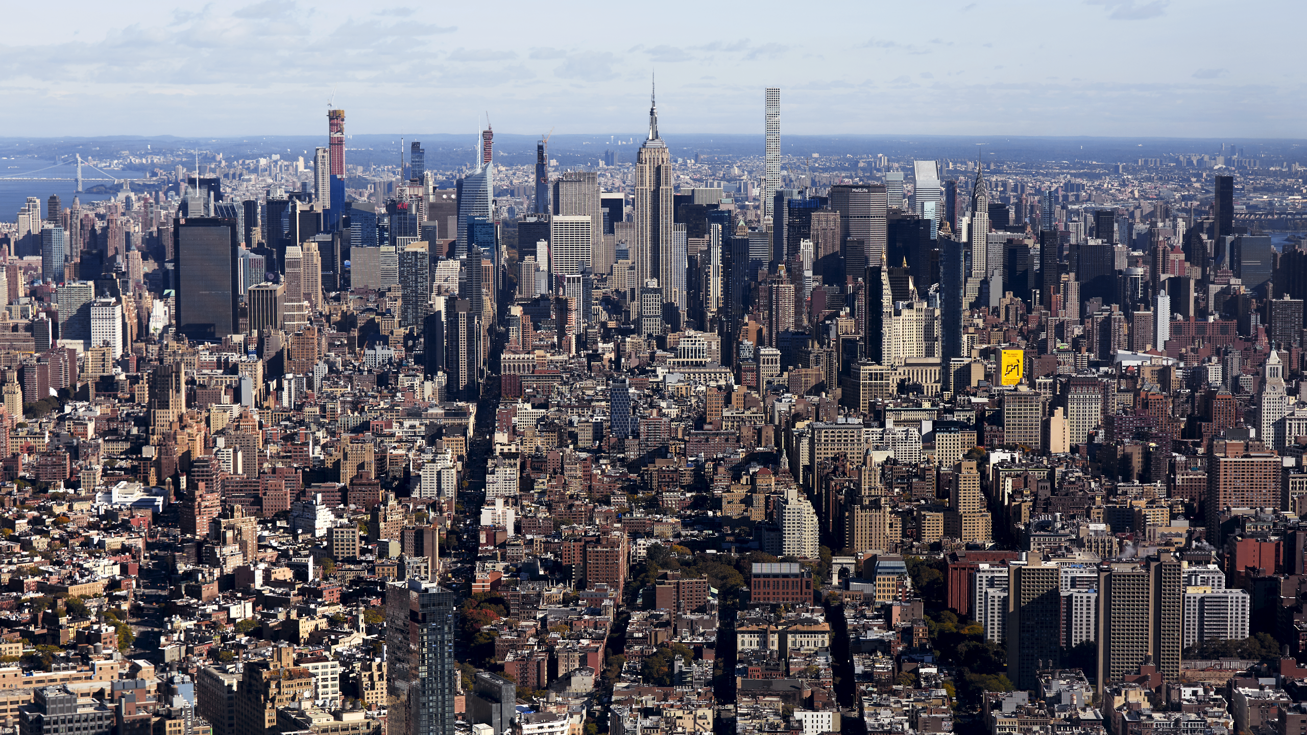
The artwork placed on the brand cavendish yellow paired with our editorial approach really breaks through in video, OOH and print. (So much so, one of the hand painted billboards is literally visible across the NY skyline from the top of the World Trade!)
That’s incredible! Are you pleased with the project?
Yes, this really was a dream project from a visual standpoint and I’m immensely proud of the work and the team. The expression that comes through in the illustration system really captures the unconventional spirit of the Mailchimp brand!
–
Thanks to Lucia R/GA for taking the time to expressively answer some of our burning questions about this project. If you haven’t seen it already, you can dive into Mailchimp’s bustling new website, features and resources to catch the full library of Illustrated assets.
Back to News Page
