Print, Paint and Pencil Illustrations
We speak to AOI members who prefer to handcraft, to find out why you still can’t go wrong with the classics.
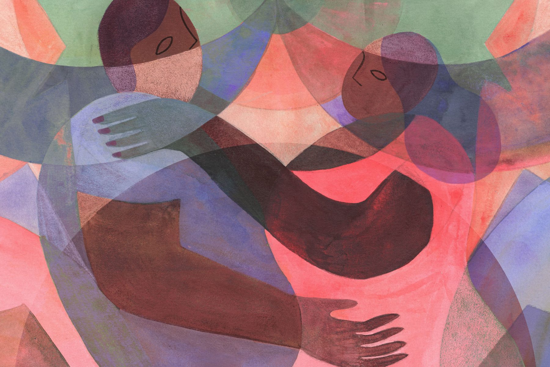
Analogue, traditional, physical – whatever term you prefer, pigment and paper are going nowhere.
For many of our illustrators, the medium is the message. Sara Rafat says – ”I think the medium you choose will influence your creative process and deeply inform your message. In fact I think there’s no essential separation between form and content in the realm of illustration.” Annabel Wright shifts the way she works to invoke different ideas. She says ”The right medium can do half the work for you. I choose different materials depending on what I’m trying to express. A watery brushstroke, with colours blending with gravity or time, can convey emotion, movement, atmosphere, noise. Flat gouache shapes could help an abstract concept. An oil pastel line is soft, friendly. No strict rules though.” Sharon Farrow agrees, “I hope the materials I use and the way I use them can convey movement, stillness, or a certain atmosphere within the piece, and help guide the eye around the image.”
To me, they symbolize what makes us human. Warm, vibrant, perfectly imperfect.
Sirin Thada
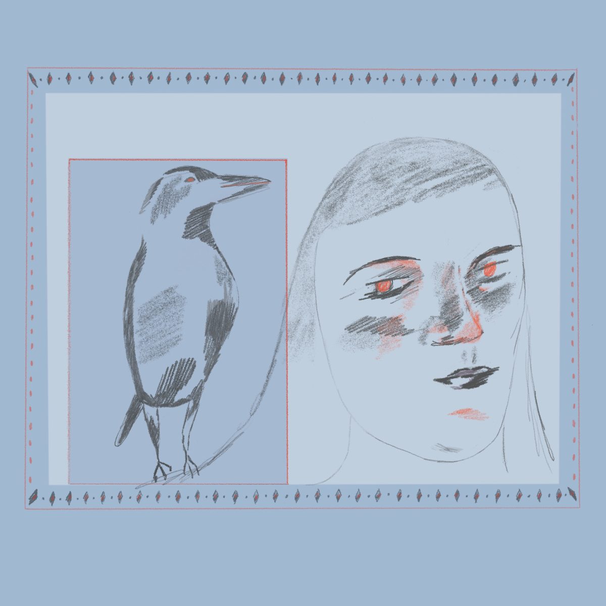
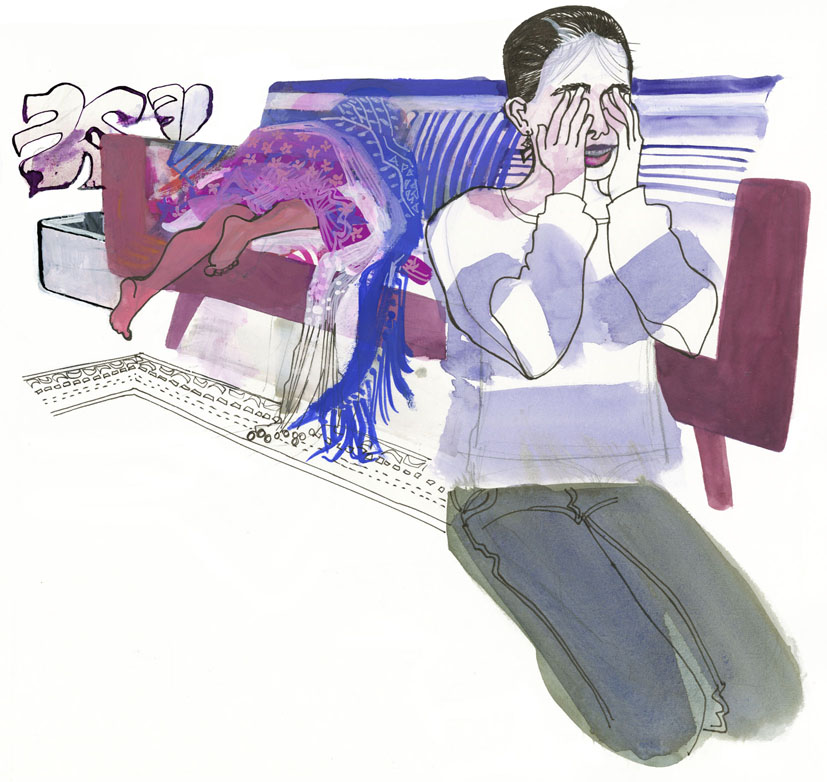
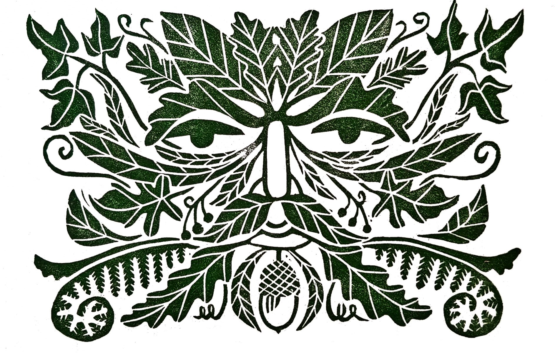
Jenny Tarr pointed to a feeling of authenticity and connection – ”I think that analogue materials connect in a very specific way. There is an inherent familiarity in real marks on paper, an honesty.” Becca Thorne spoke to us about how the history behind a medium can instill meaning. “Linocut, visually and as a process, is very similar to the woodcut used by Medieval printmakers, so when I work on a historical piece, I feel there’s a real connection to the subject matter.” In Georgia Hanna Oxley’s botanical work, the use of watercolour underpins her narratives, as it “takes control over the page, in the same way nature does on earth, moving and growing organically.”
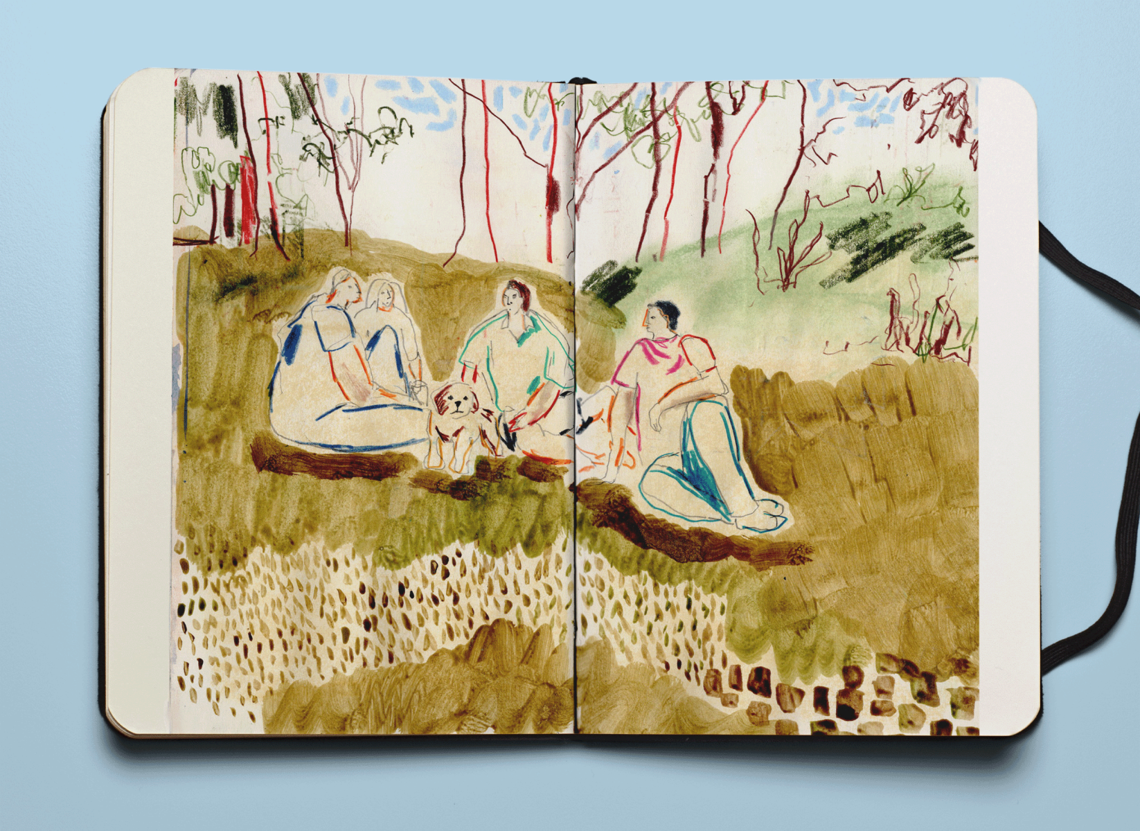
Completing his masters degree has given Johnathan Scane insight into his process. He tells us ”When I consider tangibility, I always think of John Berger’s understanding that drawing offers discovery and shared ownership through experience between the subject, artist, and viewer. I’m generalising a lot here! But in a nutshell, I want the viewer to see how I drew something, know the utensils I used, and obtain a greater sense of time, place, and emotion.” As much of his recent work has leaned towards reportage and engaging with sensitive social issues, perhaps the human hand so evident in analogue media gives the work familiarity and underpins nuance.
…getting inky fingers, hearing the clink and splash of your brush as you wash it in the jam jar, feeling the paper give as the pencil digs in to it.
Annabel Wright
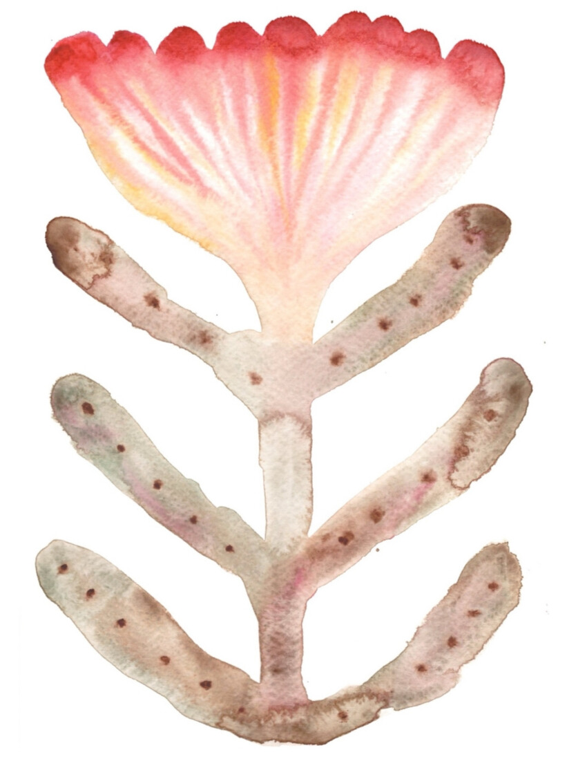
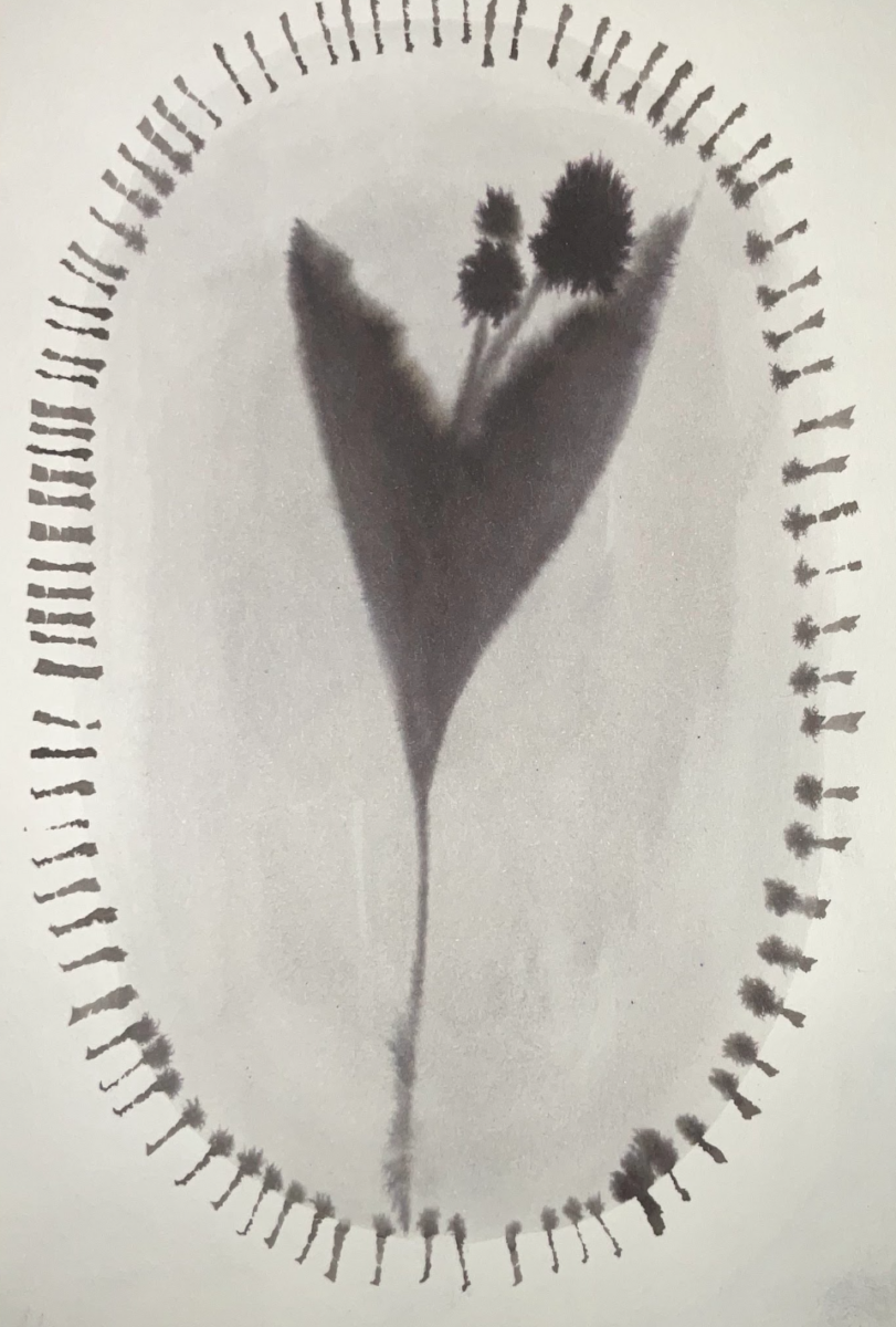
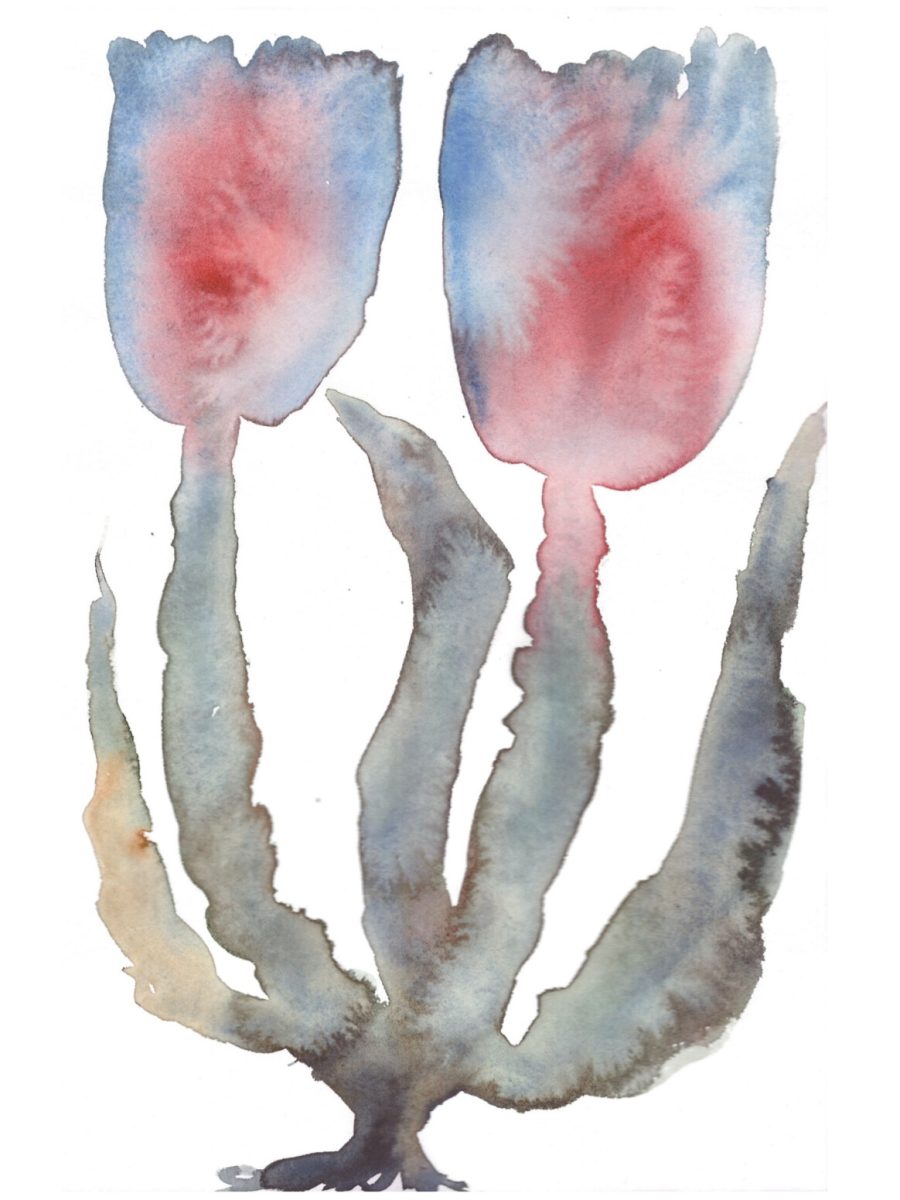
A preference for physical media doesn’t mean our illustrators ditch digital tools – and it’s easy to imply a false binary or conflict. As Anja Reponen put it, ”I’m not dogmatic or strict about techniques. I’m curious about all techniques and interested in their potential.” Particularly for our illustrators who work with commercial clients, digital tools can provide the necessary speed or room for amendments. Jenny Tarr spoke to us about her process for this, “For some commercial projects it is helpful to scan in individual elements and collage them digitally. It means I have more flexibility to adjust the image.”
Sirin Thada might vary her process depending on the work she’s doing – ”I often make entirely analog pieces for fine art clients. For illustration clients, some projects are painted by hand, with only minor fixes and details done digitally. Other projects can be drawn completely digitally, with layers and layers of handmade textures worked in after.”
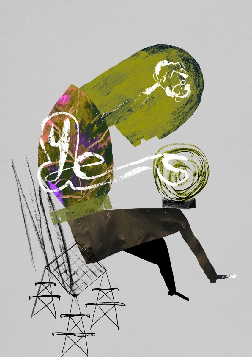
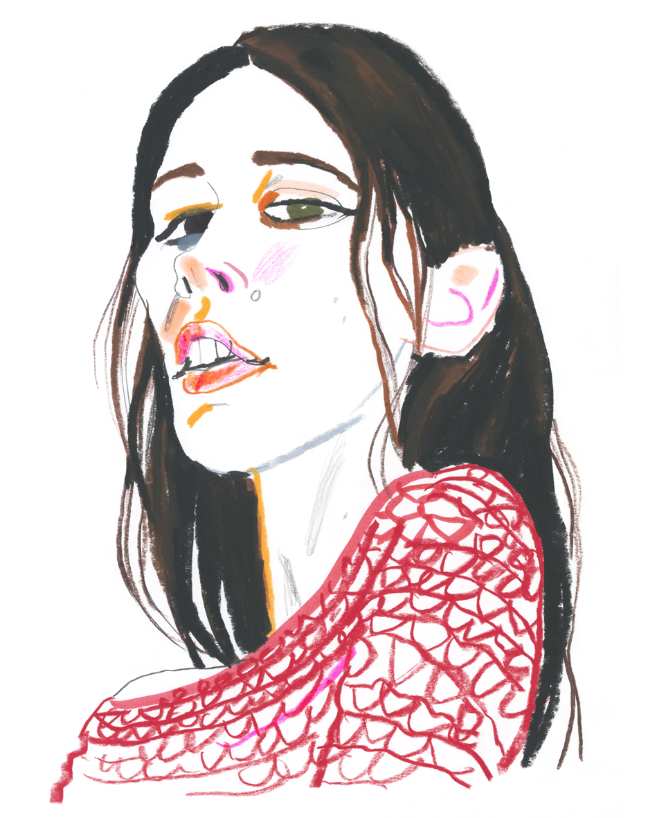
One commonality we noted is that many of our illustrators relate a connection between their chosen media and where they sit within the discipline of illustration. Perhaps because analogue media can create true ”originals”, or maybe because it can be a slower process, many of the AOI members we spoke to positioned themselves as artist-illustrators. Recent graduate Georgia Hanna Oxley has already noted this duality in her practice. She says ”I think my style and process probably does put me in a very niche box” but she is exploring that niche, both selling her work as prints and putting her touchy-feely textures to good use within childrens illustration. Becca Thorne considers how she positions herself can influence others’ perception of what she does – ”A lot of people hear ‘illustrator’ and think graphic design, or assume my work is digital. Adding the ‘printmaker’ helps convey more of my personal practice, and the traditional, hands-on nature of my work.”
I have certainly received feedback that my style is too ‘arty’ to be particularly commercial, so perhaps that rules out certain kinds of work. Overall, the kind of work I make will inevitably appeal to a certain type of client.
Jenny Tarr
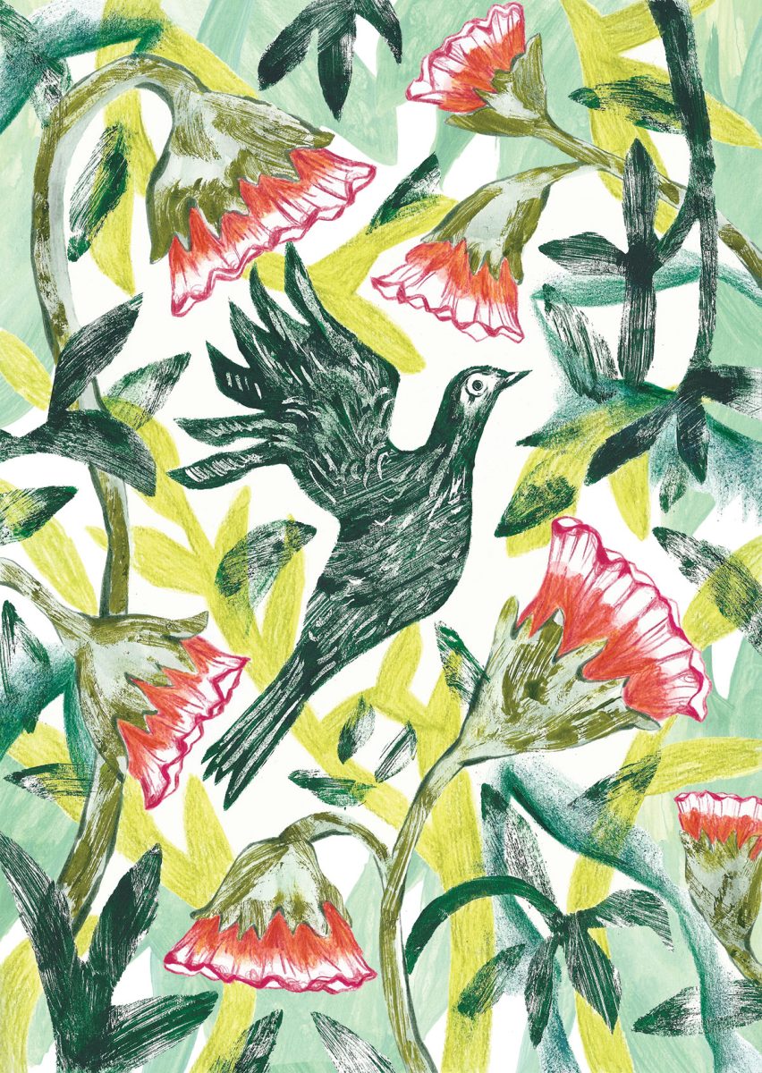
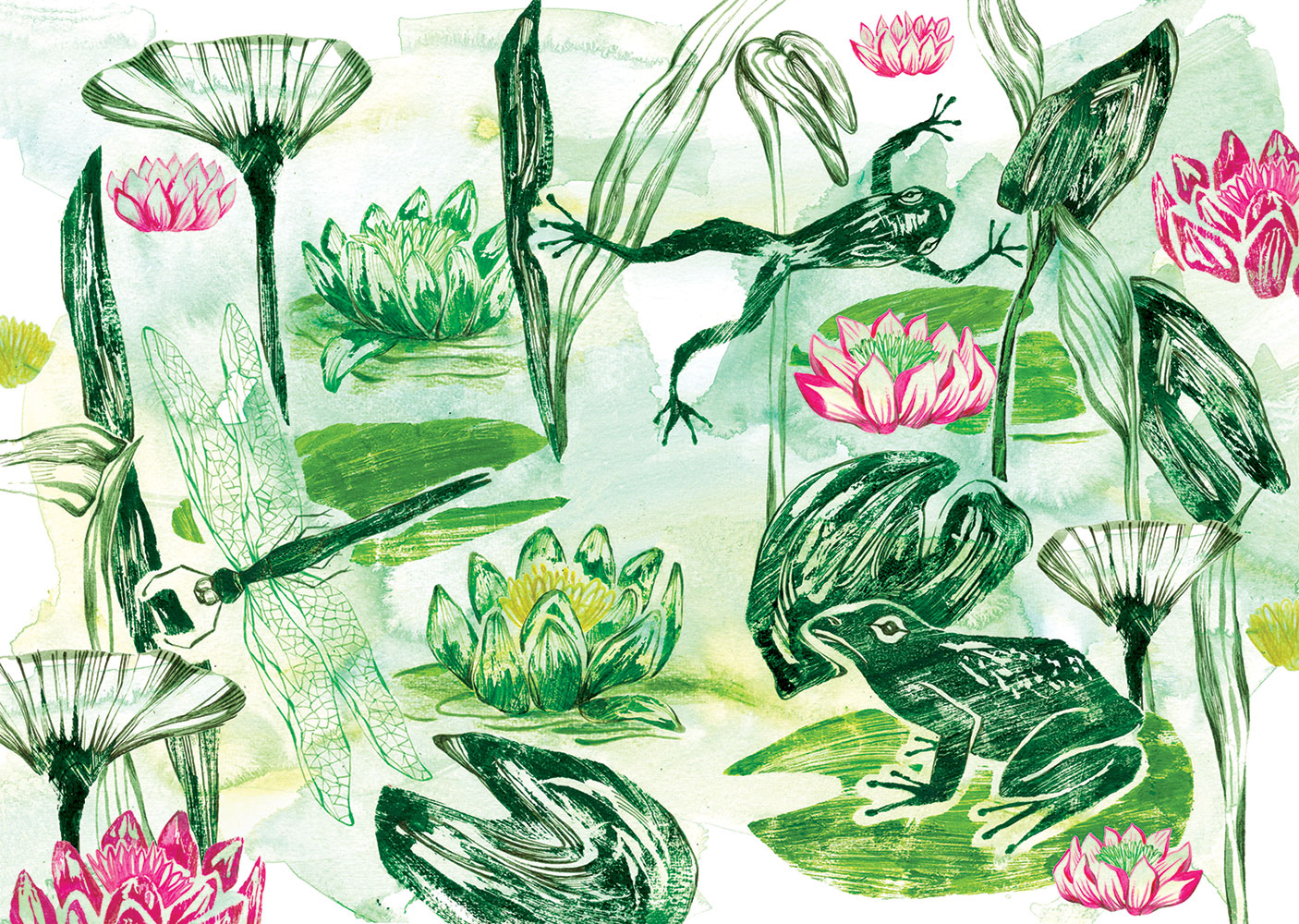
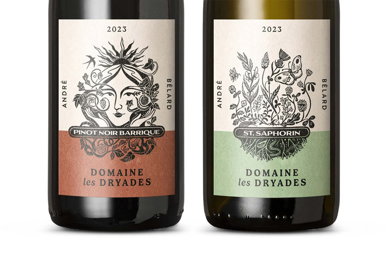
Actually for many clients, analogue work is the appeal. Annabel Wright thinks her clients ”probably identify with the look of my work – it’s not just about materials, it’s also choice of imagery and how ideas are expressed, but that expression is very much bound up in the choice of materials” And as Becca Thorne points out, even a laborious analogue process can be a selling point – ”I’ve recently worked with a traditional Devon spinning mill and an organic Swiss vineyard, and both wanted to know that there was a tangible, original print behind their visuals. They loved the fact that, even though things could be so much simpler and quicker if I did it all digitally, I was choosing to work in a slower, more physical medium.”
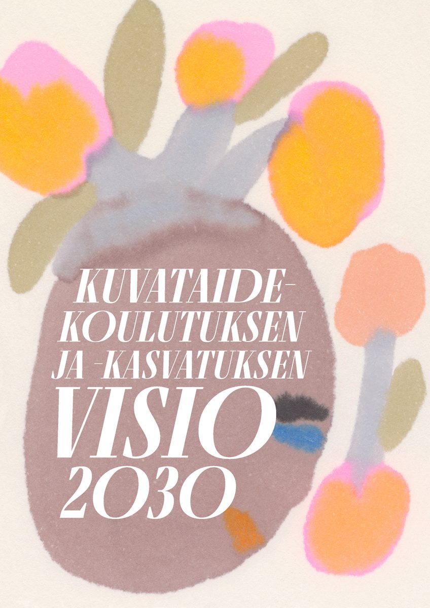
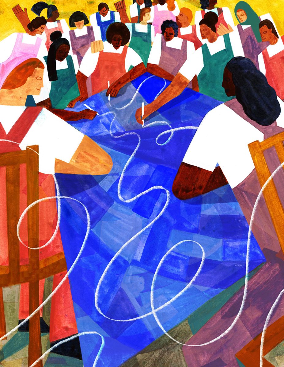
For many of our illustrators, part of the draw of analogue media is the potential for accident and surprise. For Johnathan Scane, this is an intrinstic part of his process, as he tells us ‘‘I experiment a lot, which often leads to surprising and pleasing results—from using found objects for mark-making to finding colour palettes from my surroundings, mixing various media, and juxtaposing ad hoc elements.” Sara Rafat echoes this approach – ”I like to feel that my practise is an exploration and I keep figuring out new ways of making images every time I’m working on something. When I achieve a sense of freshness, I know I’m onto something”
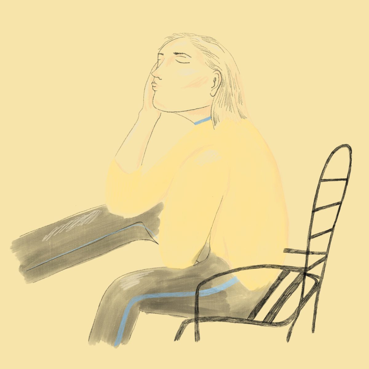
And though digital tools have their uses, one drawback is the ability to undo. Anja Reponen points out that ‘‘strict restrictions open up a clear channel for creativity to flow.” and being restricted from hitting that ctrl-z can create some seriously creative results. Mistakes are good, she says, ”Imperfections belong naturally to analog media. Correcting is much more challenging or even impossible when you draw, paint, or whatever by hand. Imperfection is surprising, fascinating, and human, and those are qualities I’d love my work to communicate. Lucky mistakes make my illustrations breathe.”
Slowing down the process of making and leaving myself more exposed to losing control and embracing accidents is part of my ‘voice’ as an illustrator.
Sarah Rafat
It seems another feeling all our illustrators share is the drive to play, and the sheer enjoyment of physical mediums. As Sharon Farrow puts it,”When it all comes together and I’m happy it’s immensely satisfying. I like the unexpected marks that happen, the things you can’t entirely plan too. I just think for me working in a traditional way is what keeps me excited to create.”
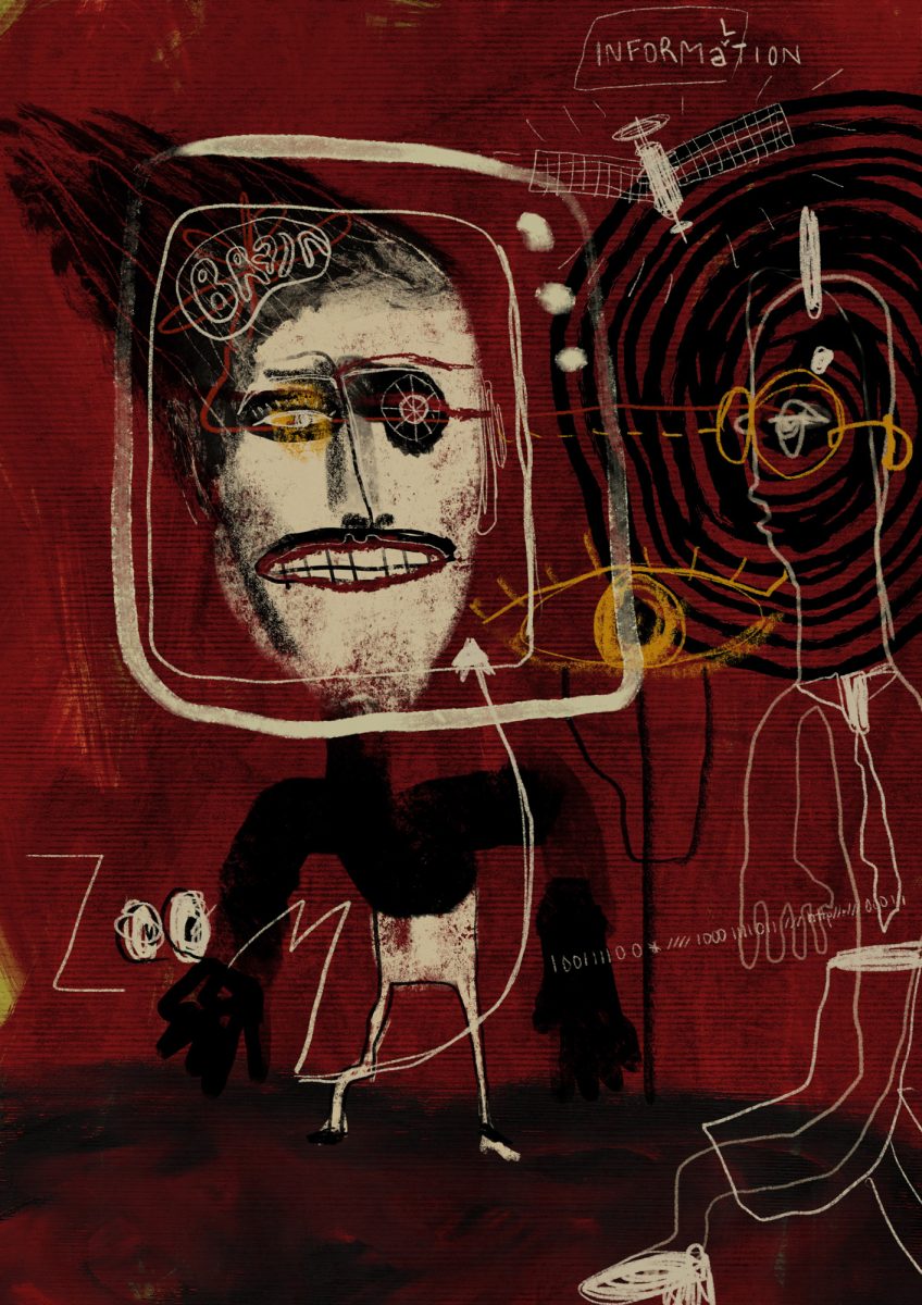
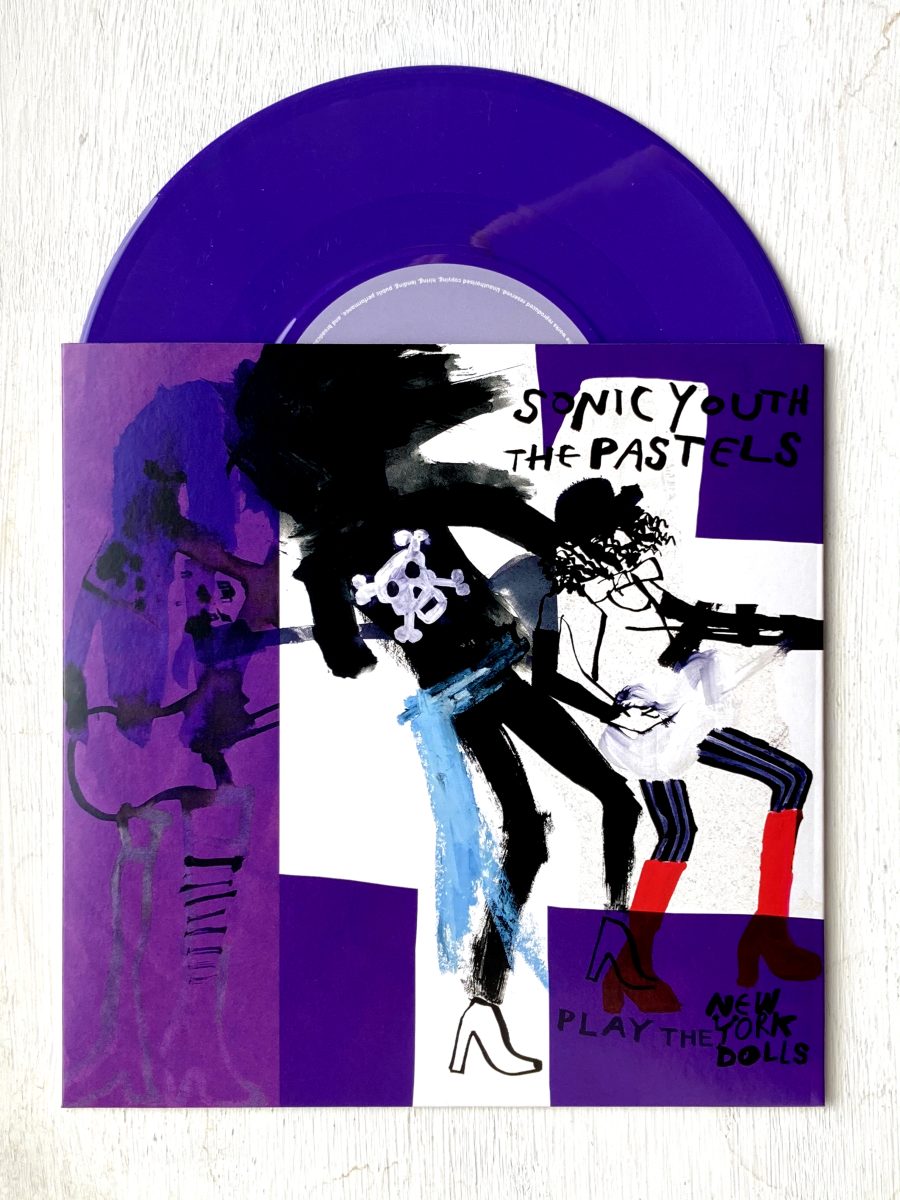
With thanks to our illustrators, artists, printmakers and those who find themselves located somewhere-inbetween. If you’re wondering how to make the most of your analogue illustration portfolio, take a look at our brand new resource: Folio Advice from Agents.
Sirin Thada
AOI Folio | Website
Annabel Wright
AOI Folio | Website
Sharon Farrow
AOI Folio | Website
Anja Reponen
AOI Folio | Website
Becca Thorne
AOI Folio | Website
Georgia Hanna Oxley
AOI Folio | Website
Johnathan Scane
AOI Folio | Website
Back to News Page
