Inside Illustration Gaming: Members’ favourite video game visuals
For this season of Inside Illustration we asked AOI members what their favourite video game is and why the visual aspect of that game is so appealing for them.
From soothing and beautifully stylised imagery to the interesting effect of contrasting styles within one game, we feature their responses.
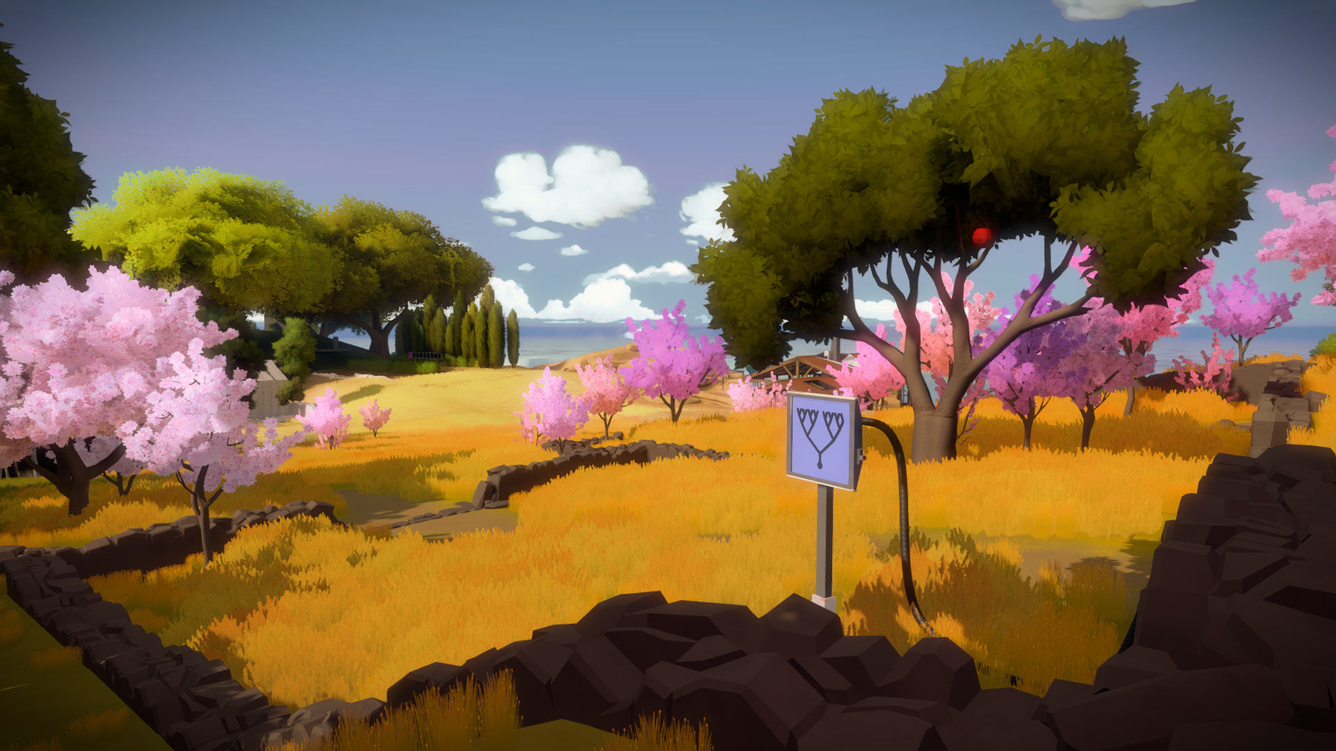
Matt Harrison Clough – The Witness
One of my favourite games is The Witness. Designed by Jonathan Blow, The Witness is a puzzle game where the core theme is ‘the joy of discovery’. You explore an uninhabited island while solving a series of maze-like puzzles, all of which have one common mechanic – you draw a single unbroken path from point A to point B.
However, there are no instructions or directions; everything is inferred through trial and error and observation (hence the title). To complete the puzzles, the player must decode visual cues, symbols, colours and hints from the environment around them. By identifying this visual language, you will soon start to view the in-game world from a new perspective (literally!)
The world is beautifully stylised and peppered with strange statues. Anything around you could form part of a puzzle or hold valuable information. The key is recognising the clues.
I like to illustrate from a conceptual viewpoint, using visual puns and metaphors, and I think that is why I connect so much with The Witness; it rewards patience and curiosity and gives me the same “epiphany” feeling I get when I land on a great idea in my sketchbook.
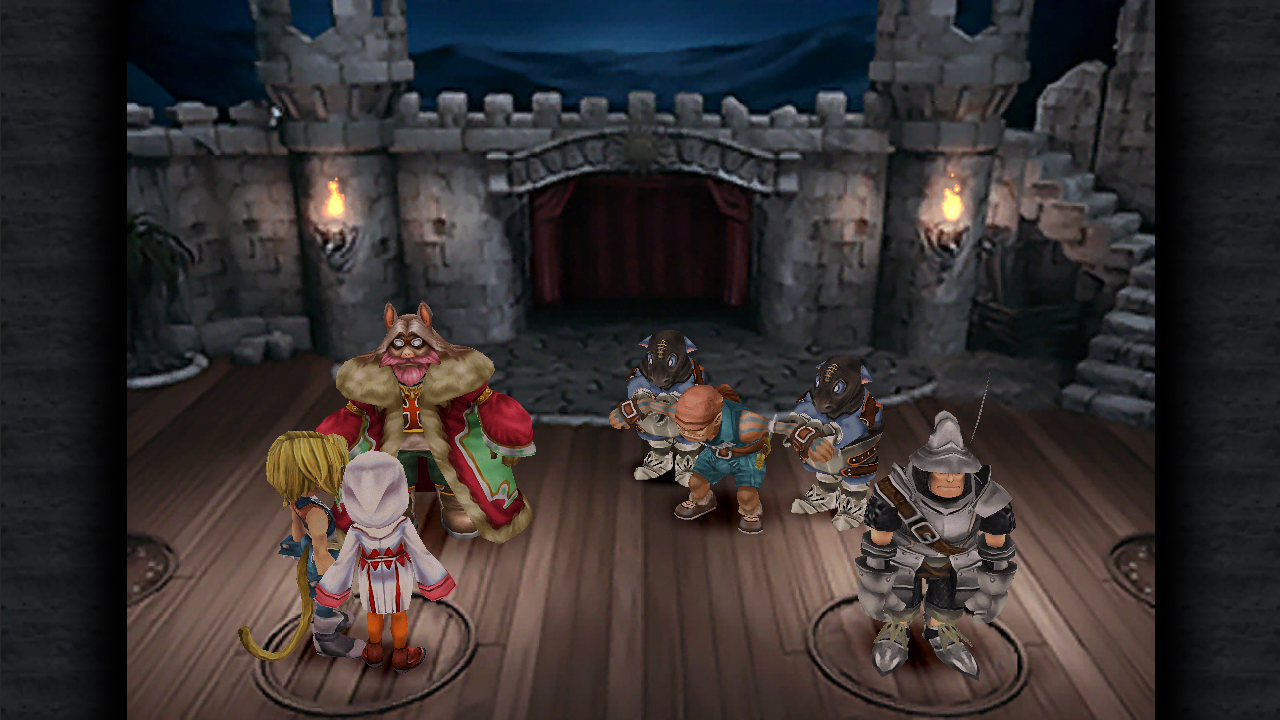
Bex Sheridan – Final Fantasy IX
Video games were an enormous entry point into the worlds of illustration and storytelling for me. Struggling to bridge the gap between picturebooks and pages filled with intimidating words, along came the PlayStation1. The first game I ever got to play from start to finish all on my own was Final Fantasy IX. To this day, it remains my favourite too.
The contrast between styles used for different purposes grabbed me most. Whilst the playable characters are polygonal realisations of interesting not-quite-humans, the backgrounds are comprised of watercolour paintings. In a time where computing power was limited, illustration was cleverly used to add a level of depth not otherwise possible.
And then there were the cut scenes. As the game progressed the player encountered stunning, differently stylised clips resembling a cinematic movie. They were the rewards that kept you hooked. When polygons revealed their true forms and paintings came to life, it was thrilling, making every aspect its own treat with purpose.
Beyond a deep-seated appreciation, what I really took from this was an urge to illustrate across formats without restriction, to explore and experiment and see every aspect of any story as its own potential work of art.
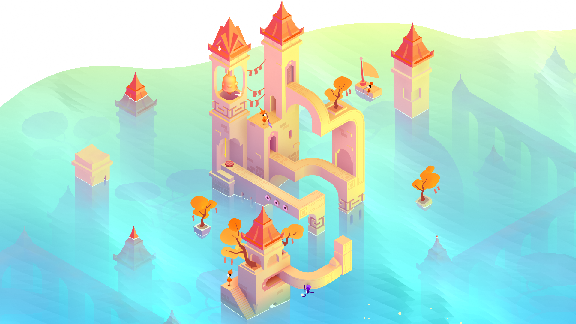
Hannah Jay Hollowed – Monument Valley
As a kid I was an avid gamer. It’s a hobby that’s taken a sideline in my busy adult life, but I love to jump into a slower, cosy vibing game every now and again to relax. My favourite game for its visuals and vibes is Monument Valley.
With its pastel hues and a tasty mental blend of minimalism and surrealism, every chapter of the game just makes my brain go ‘ahhhh’. I love the ambiance created by the blend of music, storytelling and pastel architecture.
I’ve travelled quite a lot, and the blended architecture style reminds me of many places I’ve been which is nice, and I think it’s cool how such minimalist simple design can provoke so many feelings and fond memories in my mind.
Overall, I think the developers have done an amazing job harmonising the story, visuals and music to create something the flows so nicely, and the puzzles are just hard enough to make me think, but not so tough that I want to throw my tablet out the window after a long work day.On a simpler note, maybe the colourful architecture just reminds me subconsciously of Balamory, and my inner child perks up ‘hey, I love this!’. I have always been drawn to gently colourful things!
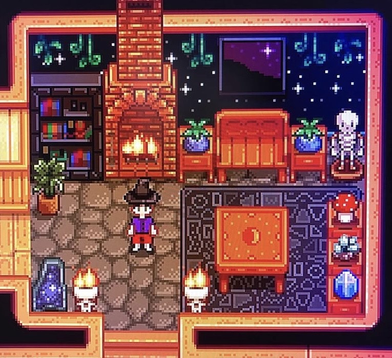
Hayley Wells – Stardew Valley
Stardew Valley is probably my all time favourite video game. As an autistic person, I find the gameplay incredibly soothing: the regular routines, comforting sound effects, and simple relationship rules all speak to different aspects of neurodivergence. But I love the game for aesthetic reasons, too. The pixel art is nostalgic yet the expansive colour palette helps the game feel fresh and contemporary, despite it being almost 10 years old. There is so much attention to detail that every object, environment and character feels convincing, even with just a few pixels.
There is an abundance of collectible items and customisation options, all brimming with creative potential, that it’s possible to build a farm that suits any manner of aesthetic. My farm, for example, includes witchy nooks, a graveyard, and a shed decorated like an apothecary. But I have seen sci-fi themed farms, aquariums, and entire museums all built from the assets the game provides. The only real limit is your creativity (and maybe a few million in-game-currency). So for an illustrator, the possibilities are endless.
Any last links for an article page, with intro line – taking care not to use double carriage returns (so use ‘shift-return’ to minimise line heights). This utilises smaller font size and always has a final spacer beneath. Once created, go back and check spacers & patterns used well in all posts!
Matt Harrison Clough, Website, Instagram
Bex Sheridan, Website, Instagram
Hannah Jay Hollowed, Website, Instagram
Hayley Wells, Website, Instagram
Back to News Page