Meet the… process behind James Davies new book series
Last year we helped AOI Member James Davies price a book project he was just about to develop. Fast forward to 2018 and this project has now been released by Big Picture Press as Meet the…: a book series exploring ancient civilisations such as the Romans and Egyptians.
The books look wonderful, and we couldn’t but help get back in touch with James to ask him a few questions about their development. If you happen to be interested in becoming an Author + Illustrator for children’s books, then this Industry Insight is just for you.
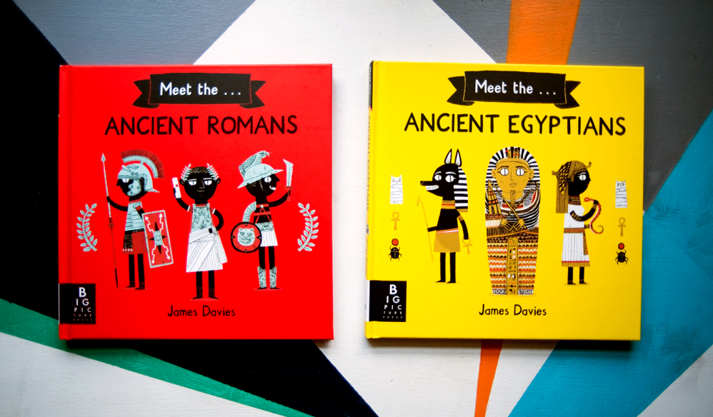
How did the commission come in place? Is this a project that you pitched to the publisher, or did they approach you with the concept?
It was a little of both. I’d taken a few years away from illustration because I wasn’t happy with my old style of working and where it was leading. When I came back to it, I suddenly had this new style that just felt natural and worked perfectly with the themes I’m most fond of drawing – monsters, folklore, anxiety, and history. In a few weeks I put together an entirely new portfolio and was lucky enough to get spotted by Big Picture Press. We had an exciting meeting where we chatted about what we could do, and quite quickly decided on a non-fiction series which I’d write, too. The dream!
Can you walk us through the commission? A step by step from the research to the final product.
Research was mostly done by sitting in the library for weeks with stacks of history books. I was learning everything from scratch, and I spent ages just writing down possible chapters, facts and spread ideas.
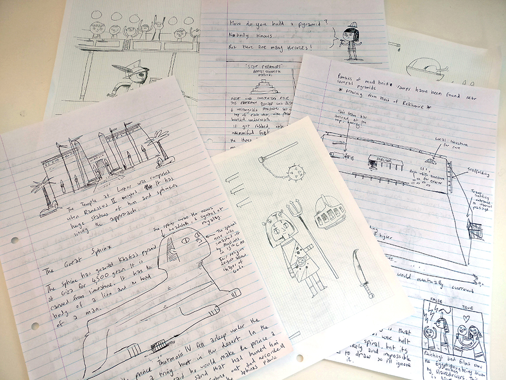
Writing took a while. The first drafts were pretty dry and had way too much information about boring things. It took a few goes to get the tone right, but I have the most wonderful editor, Jo, who helped enormously. Gradually it came together and it all became more light-hearted and fun. It had to be accurate too, of course, so everything was sent to a historian for reference, who had some really good ideas of his own!
I find I’m much, much more nervous when I send written work off to be critiqued, whereas I’m not too bad when I send illustrations (though I still sometimes run away for a bit).
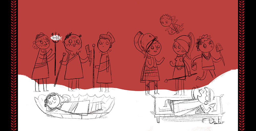
Roughs were not too bad! The books are 64 pages, so there was a lot to think about, but I got so comfortable with the way I was working that it didn’t take too long to put together, with only some hiccups. Some of the roughs are essentially a load of stickmen, but they got the idea across.
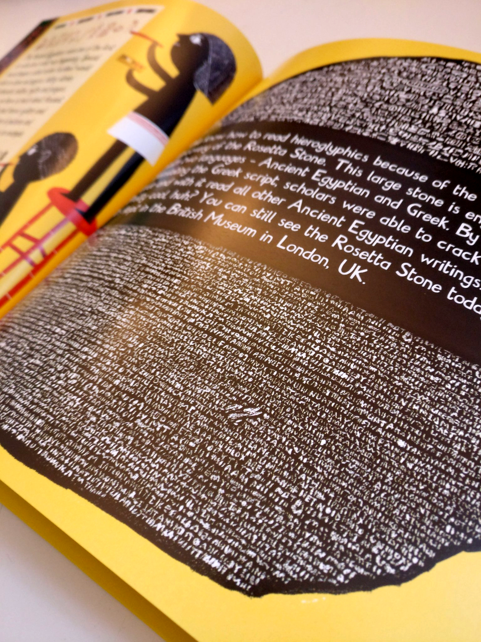
Finals came together quickly. I had the colour schemes sorted early on, and there are only 4 colours per book, so it was about filling everything out and making it look as cool as I could. My style is pretty “simple”, but at certain points (the mummies, the Rosetta Stone, the armour) I pushed the detail up a bit. The imagery from all ancient civilisations is incredible, so I wanted to get that across. A lot of time was spent on the finishing touches – the patterns on the page edges and the cats on the spines. That’s my cat, by the way. She’s worked her way into the books several times.
Proofing was amazing. After a bit of a whirlwind getting it all together I went back to the BPP office and went through every page as it was going to be printed. Though we picked out little changes to be made, it was a fantastic experience to see the books so close to being real! A few weeks later, I got the actual books in the post. That was a really cool day.
Publication day was January 25th. I still couldn’t quite believe they’d actually be in shops. On the 25th I trawled round Bristol book shops nervously looking for them, and there they were! On shelves! In actual shops! Then we had cake.
Overall, the entire project took up a lot of last year, but it flew by. It was an amazing learning experience, with more freedom than I’d had in any illustration job before.
What did you want to do differently from other non-fiction titles?
I wanted to make books that were striking to look at, but full of facts and humour. History books can sometimes feel so dry and distant that we forget about the people living back then, so with the Meet the… titles there’s a bit of a focus on daily life and how we might feel if we lived back then.
There’s also not much text, so reluctant readers (and busy parents) can get just the facts.
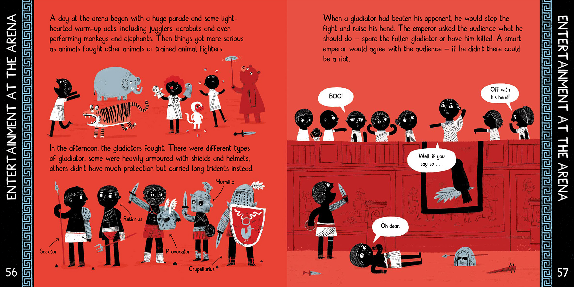
You also mention that you designed the font. What was your inspiration for it? What challenges did you face in designing it?
The font was based on handwritten text I’d been doing for years and had never bothered to turn into a font. Making it was a nightmare at times, but educational, too. I used an Adobe Illustrator plugin called Fontself which is fantastic, but it meant I had to learn Illustrator skills, and I’ve always been scared of it. It took a while to get the punctuation marks correct – it had to look handmade but still legible and follow at least some typography rules.
It’s been really cool having my own font though, and I think it suits the books and the artwork. I’ve since made a new font which I’m even happier with, based on my handwriting. This font will be in my next book.
What’s next for you?
This summer my debut picture book – Long Dog – is coming out from Templar, which I’m super excited about. I’m currently researching for the next two Meet the… books. Those keep me pretty busy, but I do smaller projects in between. Last year I illustrated and designed a lot of material for Penguin’s social media campaigns, and that’s ongoing too. I’m always doing personal projects – recently I’ve been drawing all the characters from The Lord of the Rings.
And hopefully a holiday?
We hope so James! You deserve it.
See more of James’ work on his website and follow him online:
Twitter
Instagram
Back to News Page
