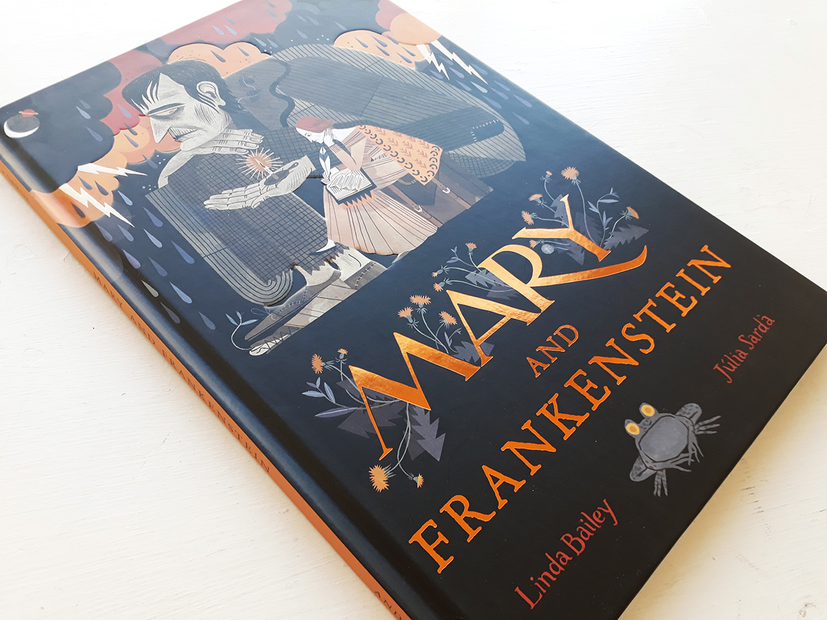
Mary and Frankenstein – Júlia Sardà Interview + Book Review
Written by Linda Bailey Illustrated by Júlia Sardà
Published by Andersen Press ISBN: 978-1-78344-679-7
Reviewed by Andy Robert Davies
This is an exciting and empowering true tale with the drama and tragedy of Gothic fiction. Bailey introduces us to a strong-willed and intelligent young woman who lived a dramatic and remarkable life. It celebrates those who delight in telling stories and the virtue of imagination.
By telling the story of Mary Shelley’s intriguing life and her creative tussle when producing her literary masterpiece, Bailey has created a text that will entice readers to discover or rediscover the book ‘Frankenstein’. We learn of Mary’s sad and motherless childhood, her rebellious youth and subsequent adventures. The text is factual, and readers may find their empathy building towards Mary as she runs away from home and her time toiling to win the infamous challenge laid down by Byron: to write the most chilling ghost story.
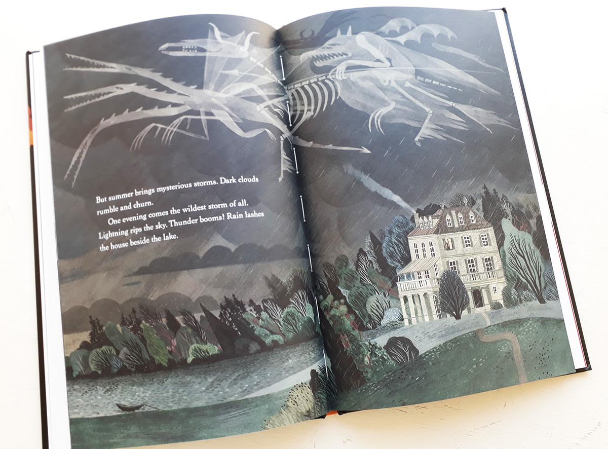
Sardà’s illustrations superbly capture the tempestuous atmosphere and environment that acted as both backdrop and catalyst to Mary Shelley’s novel. The aristocratic poet Lord Byron holds court in a house on Lake Geneva with a storm raging overhead. Through strong graphic shapes, painterly texture and delicate line, Sardà describes each character’s personality and their relationships. From observing their pose and gestures we get an idea of the chemistry developing within this group.
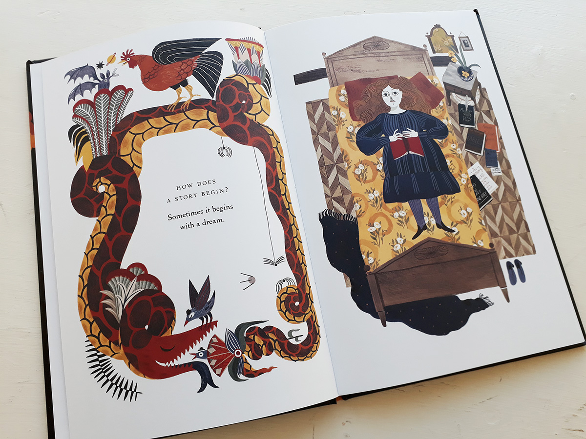
Viewpoints are varied to add more intrigue and the imagined begins to appear alongside the tangible. Byron conjures up beasts and ghouls whilst lounging in a dressing gown, reminiscent of an earlier scene where a much younger Mary listens to Samuel Taylor Coleridge reciting poems in her family home. This formula is used to introduce Mary’s protagonist, the Monster. He is suitably enormous and unnerving in appearance, but there is a tenderness to him in the way he inhabits Mary’s rooms as she writes. Can she see him? Is he real? The cat certainly thinks so!
From the dynamic cover to clever endpapers, this book has done justice to the subject matter. Sardà uses a mix of full dramatic landscapes which nod to Romanticism, coupled with close up figurative illustrations where the white page helps to emphasise the intensity of patterns and mark making. The reader finds themselves inside that draughty lakeside dwelling, with the fireplace crackling invitingly as the thunder booms and lightning flashes.
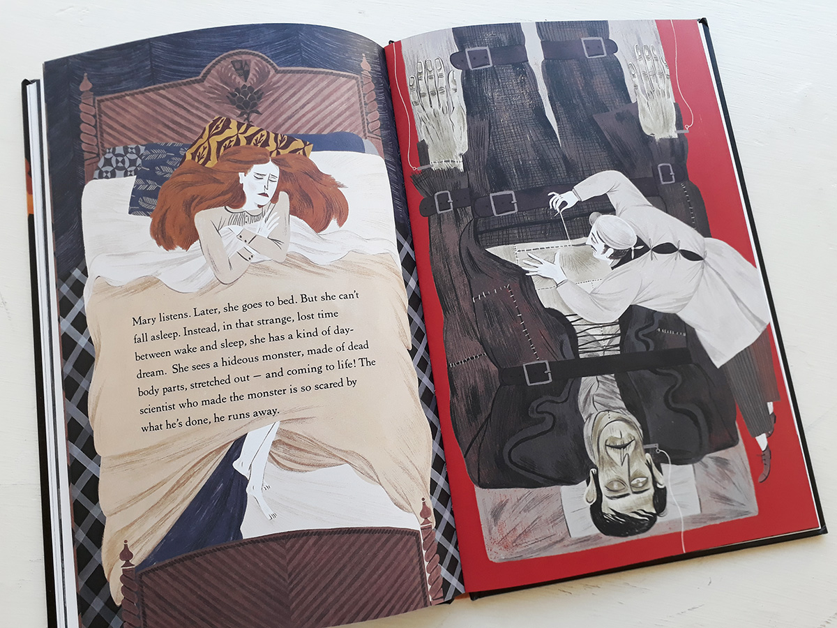
This is a picture book for older children and possibly young adults, who are yet to read Mary Shelley’s novel (as well as older adults who have). It is a very good example of how biographies for children can be a combination of fantasy and remarkable real-life events, resulting in stories that entertain and inspire.
I spoke to Júlia Sarda about her inspiration and reseach for the book, and also her use of pattern and colour.
When researching the subject, were there any films, archives, or locations that you found particularly useful and/or inspiring?
Júlia: I always try to do a good amount of research before start drawing, it helps me a lot to find inspiration. I also try to look among different artistic disciplines to widen my view. In this case I think that the biggest influence was the painter Felix Vallotton, his representations of the countryside and the interiors of the époque were very useful. But you can see hints of lots of inspirations in things such as the dancing fire and the ghosts in the storm inspired from Fantasia, “Night on Bald Mountain” the floor pattern from Twin Peaks, and there’s also inspiration from Goya’s Colossus mixed with “Fight to death with Clubs”, Medieval language from “Apocalypsis” from Beato de Liébana, etc.
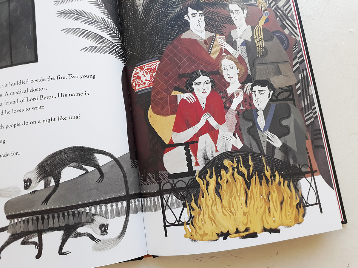
Pattern and detail feature heavily in some of the spreads; from fabric to pictures on the walls. How do you use these elements to aid the narrative?
Detail was always a plus for me as a young reader: I always have loved to spend time looking and discovering. I feel like there are thousands of parallel stories hidden in details. I tend to hide things I know or like, or that I think the character must have liked or have been interested in. I also like to repeat them along the story or make them evolve, like pictures hanging on the wall. I find that they are a great tool to hide messages or help building an atmosphere. Or the quotidian objects of the characters, the kind of books they read or the music they listen to.
I feel I can help build the story and the character by adding my contribution. And patterns are a great game, they can make the scenes vibrate in a million of ways, and can bring attention to things, or make them get lost among the colour labyrinth. In this story in particular, I’ve played quite a lot with patterns, as I’ve felt that they helped me building the confusing, stressing and a little frightening atmosphere that I wanted.
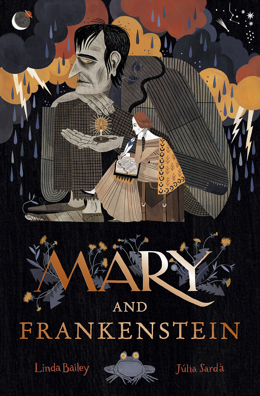
Your colour is very effective. How do you set about choosing your colour palette for a book?
When I make the reference research before start drawing, I usually come up with a spectrum of colours that I like or think that suit the story. I keep this references together in a folder to come back to every time I start an illustration. This way I don’t get lost in the long process and the book keeps unity and coherence. I try to keep it neutral with a couple of bright hints, but even though I try to keep it simple I always end up adding too much colour everywhere. I end up very tired of my own illustrations!
Back to News Page

