Make your Mark! An agent’s view of New Designers and New Blood
The Artworks Illustration Agency is a boutique wonder (as well as being an AOI member). Agents Alex and Steph work with fantastic illustrators in advertising, design, publishing and editorial. Constantly on the look out for great new talent, we talked to them about what they look for at graduate trade fairs like New Designers and New Blood, and what makes an illustrator stand out from the crowd.

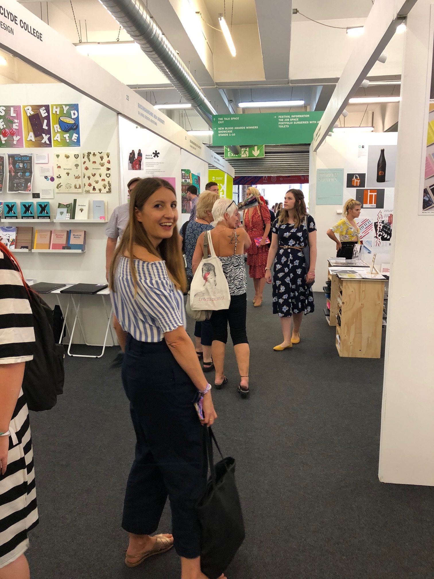
The Artworks: Every year we go on the hunt for new talent, and we choose to visit New Designers and New Blood purely because we don’t have time to go to all the individual degree shows.
We are looking to fill a place on our Startworks program, which is essentially a year’s mentoring/ representation with a view to a permanent place among our artists. A large proportion of our represented Illustrators came to us this way.
There’s a great range of talent on show, so how do you make sure your work gets noticed?
Here’s our thoughts on our experience this year at both New Designers and New Blood.
Alex on New designers.
This year I was judging the SAA New Talent in Illustration Associate Prize 2018 at New Designers. It was a great experience and I really enjoyed being part of the panel and getting to check out all the new talent from this year’s graduates!
Looking round the show there is a lot to take in, so I was looking for someone that really stood out from the crowd. I found that there was a lot of beautifully executed work, however there were only a few artists that had both striking originality as well as strong presentation, so the ones that did instantly grabbed my attention.

The winner we selected was someone that had really followed their own interests and had a completely unique style and feel to their work. What really helped her work to stand out was a strong selection of images shown on the wall, backed up by a portfolio of supporting work and other elements such as concertinas of her work dotted around as well. She had business cards and stickers for people to take away, clearly labelled and with all the information a client is looking for, including website address and contact details. It may sound obvious, but make sure that your website is fully working and with plenty more work to show. There were more sites than you would think ‘under construction’ or with only one or two pieces of work on. This is your time to showcase what you can do – If you have passed the first hurdle of grabbing a commissioner’s interest, don’t fall down at the next opportunity to confirm why they picked up your card in the first place. Show as many strong pieces of work as possible and on an easy to navigate website.

Overall, I was really impressed by the standard of work that I saw, and by the students behind it. A number of them came up to me whilst I looked at their work and spoke confidently and eloquently about what they were trying to achieve. The majority that I spoke to also had just the right balance of enthusiasm, but without pestering! It’s a valuable skill when trying to gain commissions, and something to bear in mind when sending out your work too.
Steph on New Blood
When I go to these shows I get a knot in my stomach and a flip of excitement remembering my own illustration graduate shows. I felt totally plugged into the nerves and anticipation all around me. It’s one of the things I love the most about the whole thing.
Anyway back to the show, first of all: Is it fair? Many of the displays in New Blood are only a selection from the course.
This means that only a handful of the students are shown – sometimes because of the costs, sometimes because of curation. I wish there was a way that could show all the work to give everyone a fair shot. I know some colleges charge the students and take a stand depending on the number of takers which seems to be the only fair way as it stands.

We spent two days here. On the first day we looked through the work in detail, and on the second we conducting portfolio reviews. Many of those who we saw in the reviews were excellent and not represented in the show because of the selection process, so it was a great opportunity to get to meet them.
This year I was very encouraged by the diversity and originality of the work I saw. There were some really brave moves going on by students doing their own thing and not following current trends. This made for a really exciting show! The private view was hindered by the England game but I don’t think the spirits of the students was dampened by this. Talking to them as we walked around there was an air of confidence that I haven’t seen in a long time. The illustration industry is very good at the moment and I feel that the surge of graduates from 2018 will only make this even better.
If you are lucky enough to be on a stand, how do you stand out from the rest?
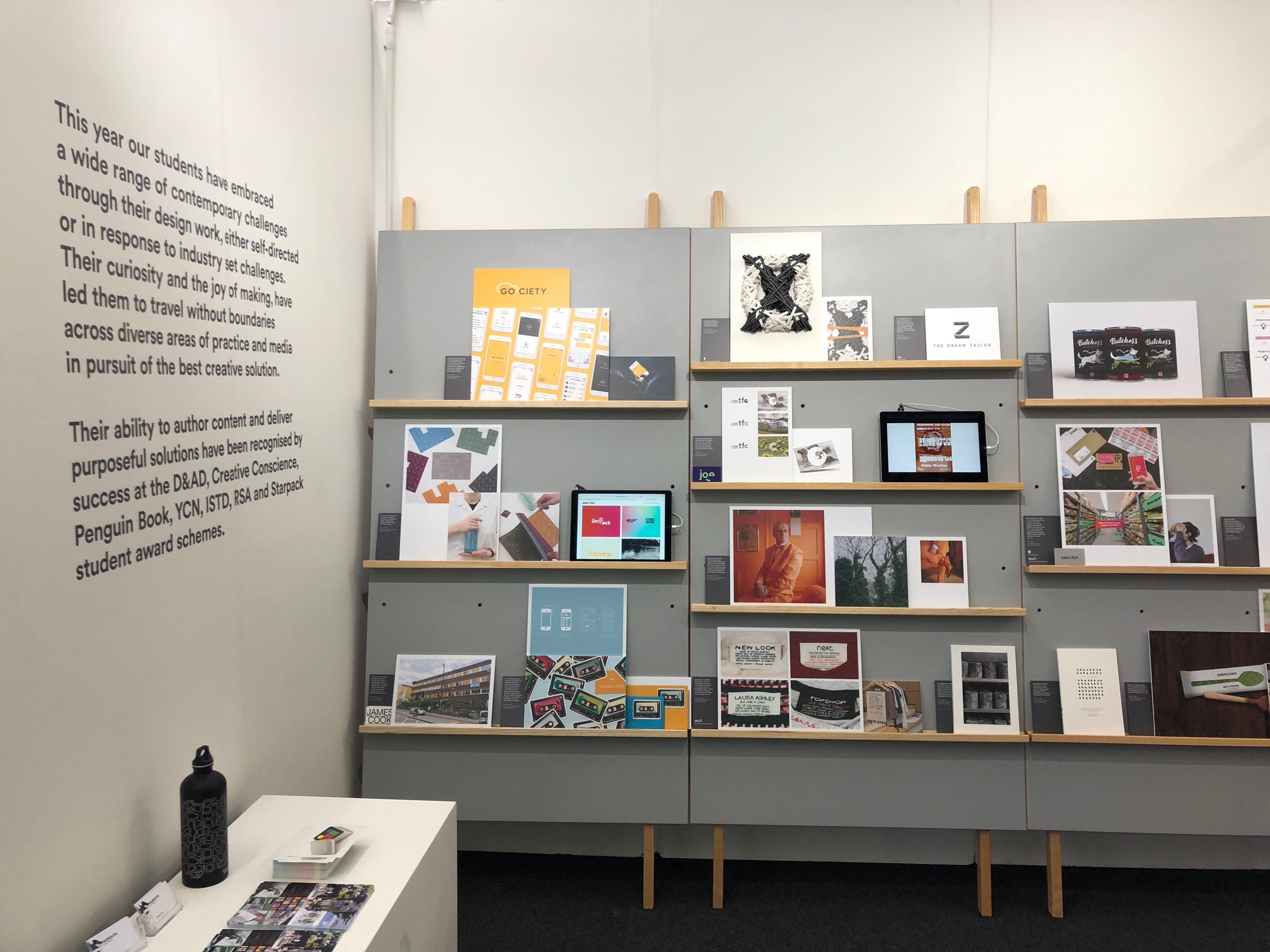
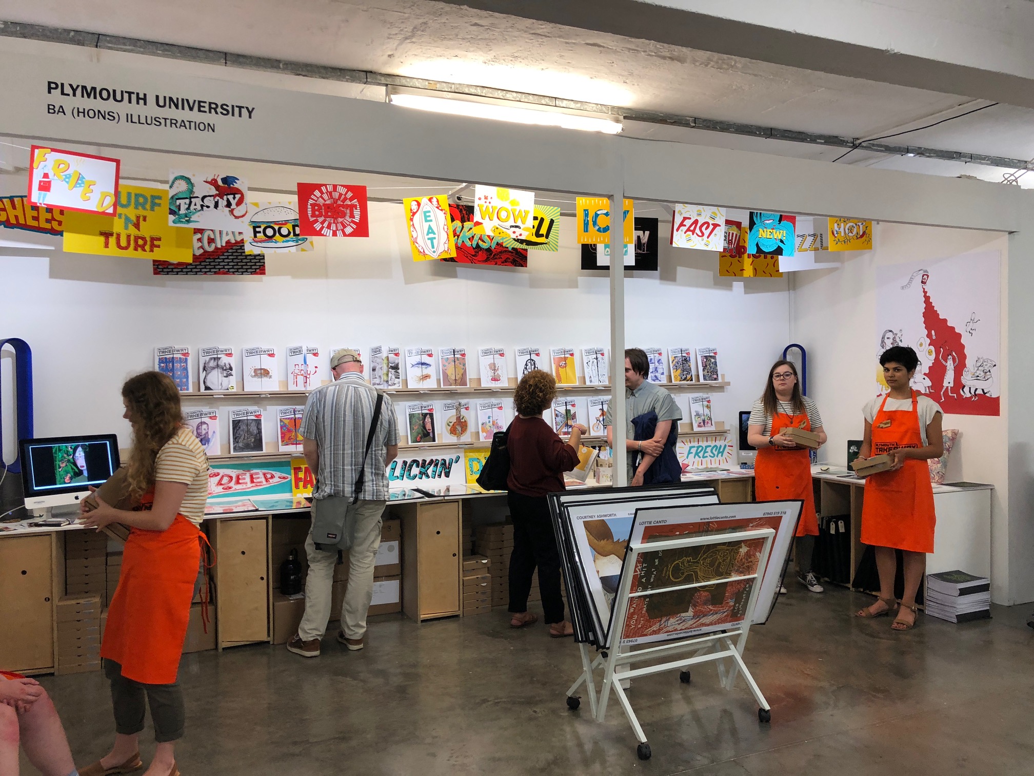
I think the showcases that work are the ones that have a good visual idea to draw you in, but they also need to be clear and easy to navigate. There was one that had lots on the walls but then just clear portfolios all on a central table: Simple but effective. I looked at more work on this stand than any of the others as it was easy to dip in and see more of the images I liked from the walls. Everything was accessible, but it lacked imagination. There was another one where I was immediately drawn in by the striking layout which was a bit like a like a magazine news agency. Each work was branded heavily – maybe a little too heavily, and it was hard to see the work for what it was. I feel if these two stands had combined it would have been the perfect formula!

Sometimes gimmick took over and skewed the work and I couldn’t connect or digest it. So while you want to get noticed, remember to think very carefully about the functionality of the exhibition. These two things need equal consideration and time. If one thing outbalances the other, then the work won’t get its deserved attention.
A tip for the sometimes awkward approach when talking to people visiting the stand (I experienced a lot of this) if you don’t know what to say – explain the stand! If there is anything interactive show them what’s there, tell them what’s there. It’s hard and I can feel the hesitation so this is a good thing to focus on – after all it’s the thing we have come to find out.
As a general point, if I hear another person say that they have run out of business cards I might have to scream a tiny bit. Always print more cards. Print hundreds! Too many students had run out.
I also didn’t see many places to record the visitors, business card drop bins or comments books; I would have liked to see more of that as I think the courses would have benefited greatly. It’s good for people to be able to give feedback quickly if they don’t have time to chat to everyone.
Also how can you get the clients to take everyone away with them? Think small and simple, again if this is too gimmicky it will put people off carrying around large boxes or books. At our Agency we recently designed an A6 promotion that includes all the Artists. It’s one of the most simple ones we have done but it’s been so popular with clients. And if they take one, they take us all!
Overall I am still yet to see the opportunity of New Blood bringing out the best in people in terms of thinking of great ways to make the stands exciting. Whilst there were some fabulous ones there were a few that felt like they were going through the motions – though I think I have to blame the tutors for that one.
Roll on next year, we will be back for sure!
Back to News Page
