Klaus Flugge Winner Jessica Love Interview
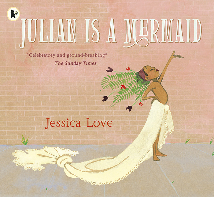
Jessica Love is the 2019 winner of the Klaus Flugge Prize. The Klaus Flugge Prize is awarded to the most promising and exciting newcomer to children’s book illustration. She won for her book Julian is a Mermaid (Candlewick / Walker Books), in which a young boy who loves mermaids takes part in a special mermaid parade, with the help of his nana. A joyful, positive story that adroitly questions gender stereotypes, it has been described as barrier-breaking and was also shortlisted for the CILIP Kate Greenaway Medal.

AOI’s Derek was on the jury, and was impressed with the passion and craft of the illustrations. He caught up with Jessica to find out more about her work, and the journey of creating Julian.
Where does your drive come from to tell stories?
I’ve always had it. I’ve been a working theatre actor for the last 15 years. It’s what I went to school for, and it’s what I’ve spent the majority of my adult life doing. But I always, always drew. And when I was a little kid, these two impulses were sort-of fused; I would sit at my desk drawing, making up stories but doing all the voices and getting really involved in the role-play–I was acting through drawing and I think that’s still essentially what I’m doing.
What brought you to Julian and his desire to express himself?
Because I was working on this story as an amateur – as in, I wasn’t a professional in any sense of the word, and illustration and writing weren’t even in my field – I didn’t treat it as a job, it was more of a “project” that I was deeply committed to. So all the big, philosophical and creative questions I was asking myself over the course of about three years went into the story. I was thinking a lot about gender, performance, creativity, and what it feels like to let yourself be seen, and what it means to give someone the gift of seeing them the way they see themselves, or want to.
In terms of your materials, you made a conscious choice to not use white paper as a background for this book. Can you tell us what promoted that decision?
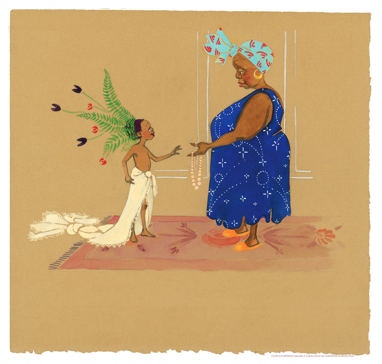
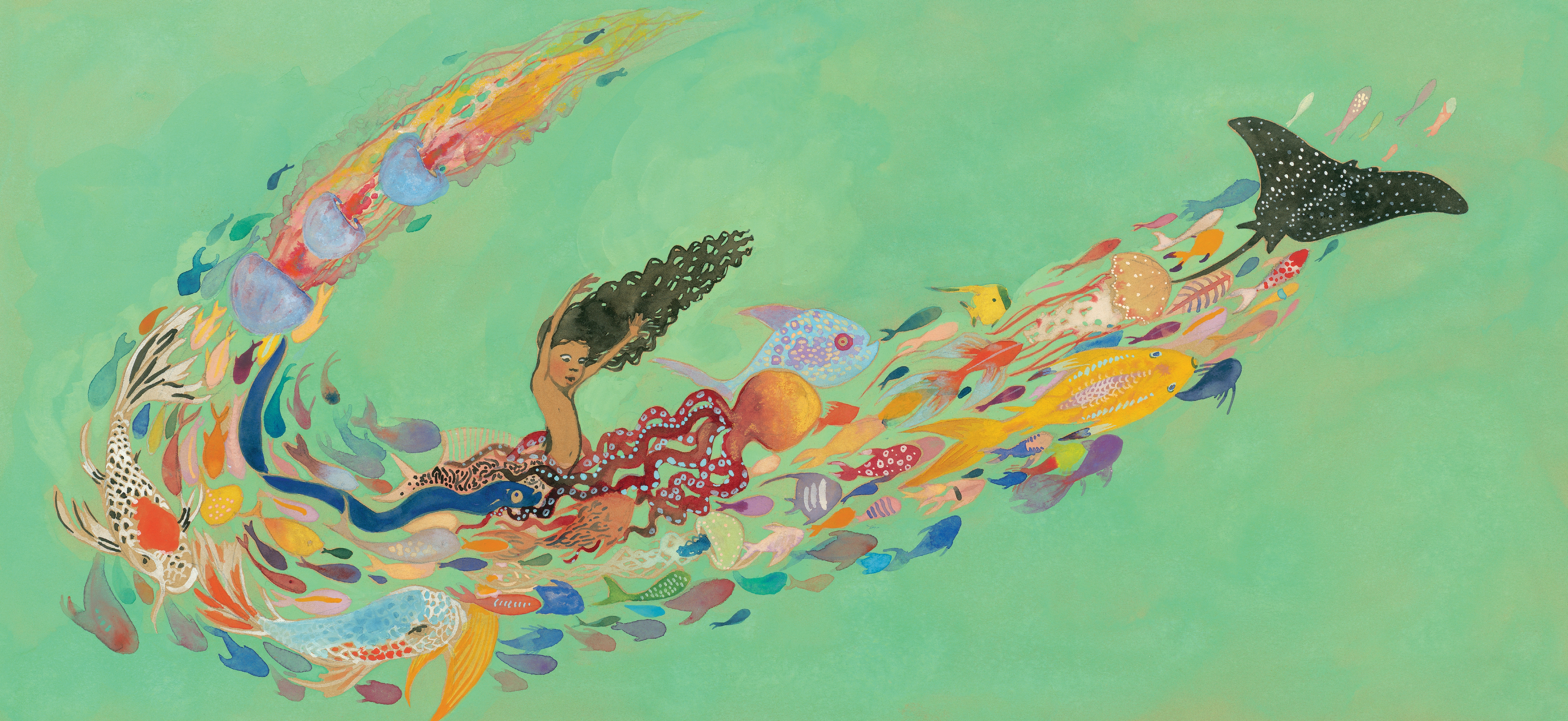
Yes. The brown paper is a both a philosophical and practical response to a technical problem. Originally I was working on white watercolor paper. Now, in my illustrations I use a lot of negative space, which on white paper, is white. I also had a lot of spreads with big washes of very light, sea-foam green water. Nearly all the characters in the book are brown skinned.
I found that when I scanned the artwork, the scanner was either set for the white paper, in which case Nana (Abuela in the United States edition) in particular would come out underexposed. It wasn’t picking up on subtle gradations of tone like a flush of the cheeks, or her laugh lines. At other times I’d set it for the characters but then the water spreads ended up being almost totally washed out.
And I suddenly remembered all of these dressing room conversations from my time studying drama at Juilliard. There was a kind of default mentorship amongst the black actors in the program, and the older students would teach the younger students what to keep an eye out for. Now, I remember this particular problem which was being outlined for the younger students, which was that very often cinematographers, lighting designers and photographers do not have experience shooting brown skinned people, because the industry standard favours white people.

This means that they would show up at photo shoots and the photographer wouldn’t have the right equipment to light their skin properly (you need different reflective equipment to light different skin tones, silver for white skin, gold for darker skin tones), and unless they were vigilant about making sure they were being lit correctly, they came out looking grey.
I started thinking about how I was having a similar technical problem, in that white was assumed to be “neutral”. And I started thinking about how white paper is a colour of paper, that is only achieved through bleaching. I started thinking about how the neutral in this story shouldn’t be white but brown – the colour of the trees it is made from in the first place. I asked my art editor if I could redo all the artwork on brown paper and, despite the fact that this late-in-the-game change would present many new hurdles for her in terms of figuring out how to reproduce the colour of the brown paper and find a printer that could do it, she just said “send me a sample.”
How did the book creation process work with Candlewick Press – was there lots of back and forwards or did you submit it fully finished?
By the time I found an agent I had drawn the whole story from beginning to end probably three times. The story was complete but there were many more pages – essentially it was longer. So when Candlewick acquired it they were clear about being a very collaborative publishing house which is true, and completely wonderful.
The notes I got from my editor Katie Cunningham and my art director Ann Stott were the kinds of pieces of direction I’d only gotten once or twice as an actor – just the kind of small, perfect adjustments that assure you that your collaborators see exactly where you’re trying to go, and can show you the clearest, simplest way to get there.
How important is winning an award to you commercially – and personally?
I don’t know how to convey how little I allowed myself to hope for when I first started working on this story. I wanted it to have success of course, but – and maybe this is part of my “rejection practice” as an artist – I did not allow myself to imagine it. So to have this sort of proof that what I was trying to do worked is invaluable to me – it’s evidence I can banish all the voices in my head that tell me I’m an idiot with no idea what she’s doing. Financially, as well, I am so grateful for the remuneration. What the Klaus Flugge Prize does for artists new to the field is such a practically helpful gift.

Jessica Love
Our Not A Hobby campaign focuses on the importance of the business side of illustration. How do you approach that?
I’m very new to the industry and feel like I’m still figuring out how to do it. I would say the simplest way I can put it is I try to be clear about what my organizing principals are. First I ask myself what do I want my life to look like? Do I want to be doing a lot of things at once or one thing at a time? I try to answer those big questions and then make a plan that serves those goals. In practical terms that meant paying someone else to do my taxes, and answering emails once a week. I think most artists find the admin part of the job to be totally loathsome, and I’m no exception here. I just try to bracket those activities so that when I switch over to the side of my brain that’s creative I’m not constantly undermining it by checking my inbox.
And relating to that, do you have any advice on negotiating fees with clients to ensure they are appropriate to the commission?
Oh god, this is such an important question. I think working backwards from what you need to be paid to stay on your budget. And then you raise the price depending on the degree to which you possess a level of expertise in that field. I find that walking clients through the process of how I arrive at my prices in a transparent way is usually met with understanding.
As you were establishing yourself as an illustrator how did you keep quality control over your portfolio and career – were there times you said no to certain jobs, target specific clients, consistently create new work?
There is nothing more draining than working on a job you don’t want to do. And you can usually feel it in your gut. I think if it’s going to drain you, creatively, don’t do it. If it’s going to make you feel like you’re full of bs, don’t do it. Make some cash another way – it allows you to keep your voice intact.
Find out more about Jessica here.
Back to News Page


