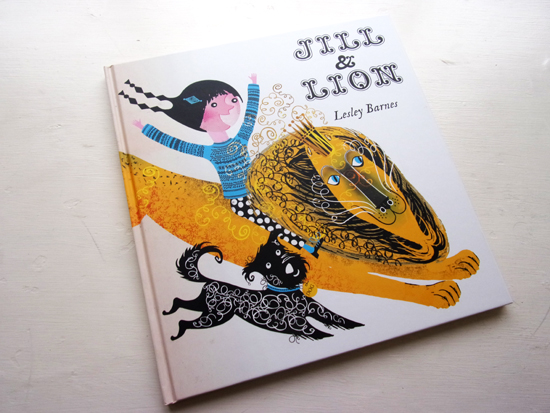
Jill & Lion – Book Review
Tate Publishing ISBN 9781849764377
Review by Peter Allen
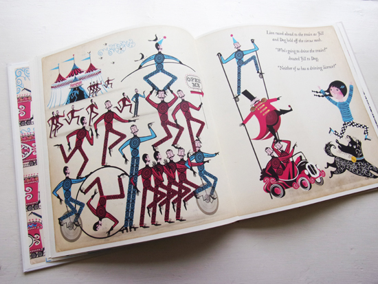
Jill and Lion is the sequel to the very popular tale of Jill and Dragon, the first children’s book by the Glasgow-based designer Lesley Barnes. It’s a large, square book that continues Tate’s tradition of publishing picture books in the digital era by concentrating on good design and quality printing, paying careful attention to the physical aspects of their books. Following the print or digital debate of recent times that predicted the imminent death of the printed book it would appear to be the best approach to adopt, for the opposite has come true. Effective design, good content and a strong physical identity – paper, binding, printing – have been combined to optimum effect to create a buoyant, specialised market for quality magazines and books.
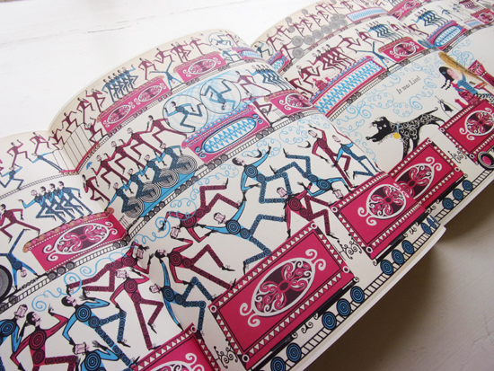
In this case, the large format of Jill and Lion enables the illustrations to be appreciated fully for the rich detail contained in the drawing and colouring. A smaller format would have caused the transparent overlays and fine line-work to blur and blend and look muddy.
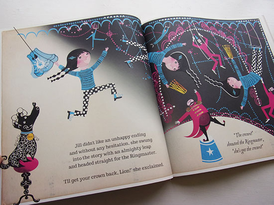
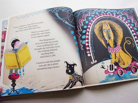 Jill and Lion includes some well thought out ideas, such as the centre gatefold spread that opens out into a metre-long frieze of a wacky train chase. And then there is the storyline that involves Jill becoming part of the story she is reading. Together with Dog, the pair help Lion to escape from the confines of his story where he is the unhappy star of a circus and to make a new start in a story of his own creation. This involves a lot of complicated twists and turns that start with us seeing Jill with her favourite story book from which tears are running.
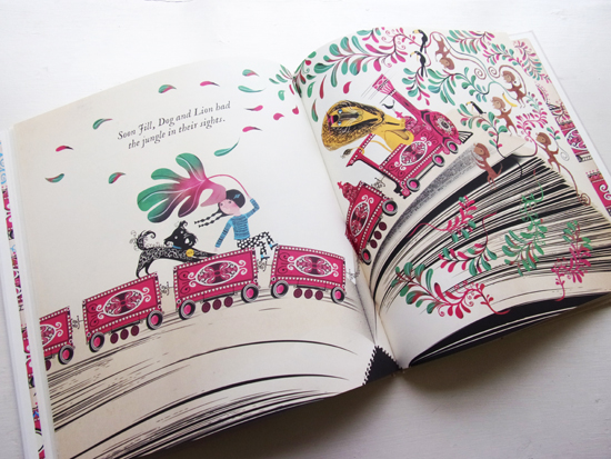
We then find her inside the self same book with the Lion (and Dog), being chased out of it only to plunge once again into a new book to begin a second story far away from life in the circus in the first book. It sounds like a nightmare of a brief to follow, but unperturbed, and using an array of visual tricks and devices, Barnes succeeds with much skill and visual dexterity in interpreting the many serious turns in the plot into images. The pages that combine photo collage; the book seen from outside looking in, and drawing; the story busting out from its pages, have a coherence that speaks loads about the breadth of her vision and capacity to work with a wide range of different media.
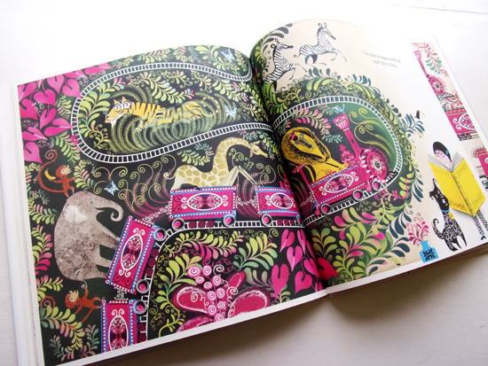
Barnes’ graphic treatment of the different spaces that the story occupies and the characters that inhabit them is richly decorative. In its forms and colours she reflects something of the quality found in printed books during times of economic depression such as the French Père Castor books from before the Second World War, or Puffin books from the 1940’s and 50’s printed in an England under rationing. The cost of printing was calculated on the number of print runs, a run for each colour, so savings could be made by restricting the colour palette used to create the illustrations. Barnes’ work captures the spirit of that age and appropriates its formal constraints, and whilst remaining very much the master of her art, she inserts herself into a tradition without falling into pastiche, the individuality of her voice is clearly visible across the wide range of her work, of which illustration forms a recent part.
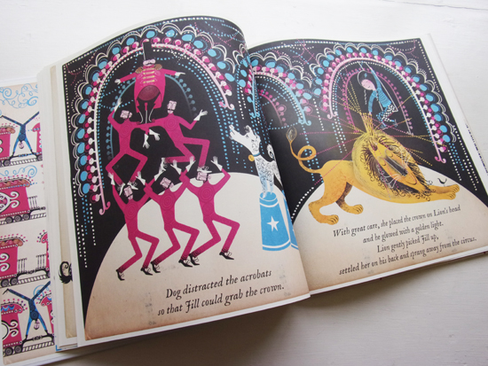
Her illustrations speak plainly of her interests as a designer, involving textile design and animation, all strongly influenced by mid-century design. She uses bold, geometric shapes and flat colours, like spot colours, to create patterns and subsequent forms that are both decorative and descriptive. The effect is like a display of Brocks fireworks, rockets, sparklers, Catherine-wheels, roman fountains, that sparkle, dazzle and explode.
Given the strength of Barnes’ designs it seems unnecessary to me to have used old, yellowing page edges to define the part of the story that takes place inside Jill’s favourite storybook. I find the combination of favourite and old as being somehow over-sentimental and contradictory in suggesting that good story books belong to a once golden age of children’s illustration. Whereas Barnes’ illustrations very much belong to the present, and express a wholly contemporary pleasure for shapes and patterns and colour equaling that found in vintage books. Maybe in the sequel to Jill and Lion, Jill will be there again on the opening page reading her favourite picture book, a future classic that hasn’t as yet been published but which, quite possibly, Lesley Barnes has already in mind..?!
I asked Lesley a number of questions prior to writing this review.
How did Jill And Lion come about?
My first book ‘Jill and Dragon’ was published by Tate in 2015, and introduced the characters of Jill and Dog. Both myself and Tate thought that Jill and Dog weren’t quite finished with their adventures (Jill has a very large book…) Dog also wanted to get more into the action, so we thought we should let him have an escapade.
This book is described on the cover as being the sequel of sorts to Jill and Dragon. How much did the success of the first story define the content and form of this second book?
‘Jill and Dragon’ introduced the idea of ‘the book within a book’ (Jill jumps into her favourite book to rescue the Dragon in one of the stories) and that was something I wanted to develop with ‘Jill and Lion’. I was obsessed with reading when I was little and the idea of diving into a book and rollercoasting through the pages is something I can really understand! I wanted the experience of leaping inside Jill’s book to be much more visceral this time – the pages forming tunnels and landscapes that the characters have to navigate. I also wanted to get across the idea that you can take an active role in your own story, rather than always being told what to do – reading isn’t a passive experience! Dog also has a voice in this book – it was nice to develop his character as he was rather a silent and reluctant participant in ‘Jill and Dragon’.
How much influence did Tate publishing have on your choice of story and the way it’s presented visually?
The Tate are great to work with, as unlike most other publishers, they are not so commercially focused and want to support the vision of artists and illustrators and enable them to have their ideas brought to life. My editors did help me out a lot with both ‘Jill and Dragon’ and ‘Jill and Lion’ though. It’s invaluable to have another pair of experienced eyes on the book!
Is there a period, artist, art form in particular that is important to the way you see and make things?
‘The eye has to travel’ (Diana Vreeland – legendary editor of American Vogue) I take inspiration from so many different sources and people. I think the answer to this question also relates to the answer below as I try to stay away from labels.
What do you think of the terms: retro, vintage, traditional? Do you consider them appropriate or relevant to your work and the way we look at, understand and appreciate it?
I don’t mind my work being referred to by any of those terms, but I think it’s good not to get too caught up with labels. I try to make things look the way that feels right – I’m pretty slow and draw and redraw things until it just ‘works’. I think it’s important not get too tied down to any one style or fashion – it would take all the enjoyment out of illustration for me if I was always asked to do the same things. I’ve been working on ideas for a very stylised pop-up book which involves a bit of fashion illustration, design history and paper engineering – and that has made me really excited about my own work again.
I’ve known about your work since your museum of childhood poster won a World Illustration Award. What influences the way you construct your images, generally and in relation to Jill and Lion? see below
Your use of colour and geometrical shapes are very important elements of your images’ designs, did you explore other ways of relating to them in your artistic practise before developing their use in your narrative works?
It’s very interesting as I find shapes much easier to work with and interpret than lines. I definitely build pictures up using strong shapes first, before I add any details or patterns. When I look at something I see it as a series of shapes – I think it’s just how I understand the world. I didn’t study illustration or art so I’m sure the self-taught way I work would look very strange to most people!
How easy/difficult do you find it to write the stories you illustrate?
I’m definitely not a writer, but I do like to tell stories whether it be with pictures, words or both. Working on a picture book when you are both the writer and illustrator is a very unique experience, as the book is a ‘dance’ between the words and the pictures.
Do you have plans already for a next book project?
Yes! I have a couple of projects on the go. Both are very different to the Jill series though. I’m very excited to be working with ‘Design for Today’ on a concept publication all about Kings and Queens. I’m also working on another idea that involves quite a bit of jiggery pokery and clever engineering…
Ideally, what project would you like to work on next?
I’d love to do more with textiles – I designed some lampshades and cushions last year which was really fun. I was thinking of creating an exhibition in a space filled with custom lampstands and lampshade designs that you could interact with – I think that would be a bit of a dream project.
How do you view book publishing at the moment, commercial and independent, does it support and/or encourage enough original or unusual projects to see the light of day?
I think it does. Children’s publishing has really exploded recently and I think publishers are also being much more experimental and accepting of different styles and stories. I think it’s really important to have supportive independent publishers (from magazines like OKIDO who gave me my first break and have always supported my work, to small publishers like Design for Today) I’m very lucky as I have the opportunity to work with both independent and more established publishing houses.
You may also be interested in these book reviews:
The Big Adventure of a Little Line
Back to News Page

