Illustrator of the Month: December
London based Member Steve Scott is the go-to guy for light-hearted, playful and intricate Illustration. As the final member feature for this year we eagerly chatted with Steve and Agent Chris Page about his process, concept designs and plans for the future.
Steve (based in London) is represented by agencies widely – by Members Jelly and Jacky Winter, and more recently Colagene in France and Canada.
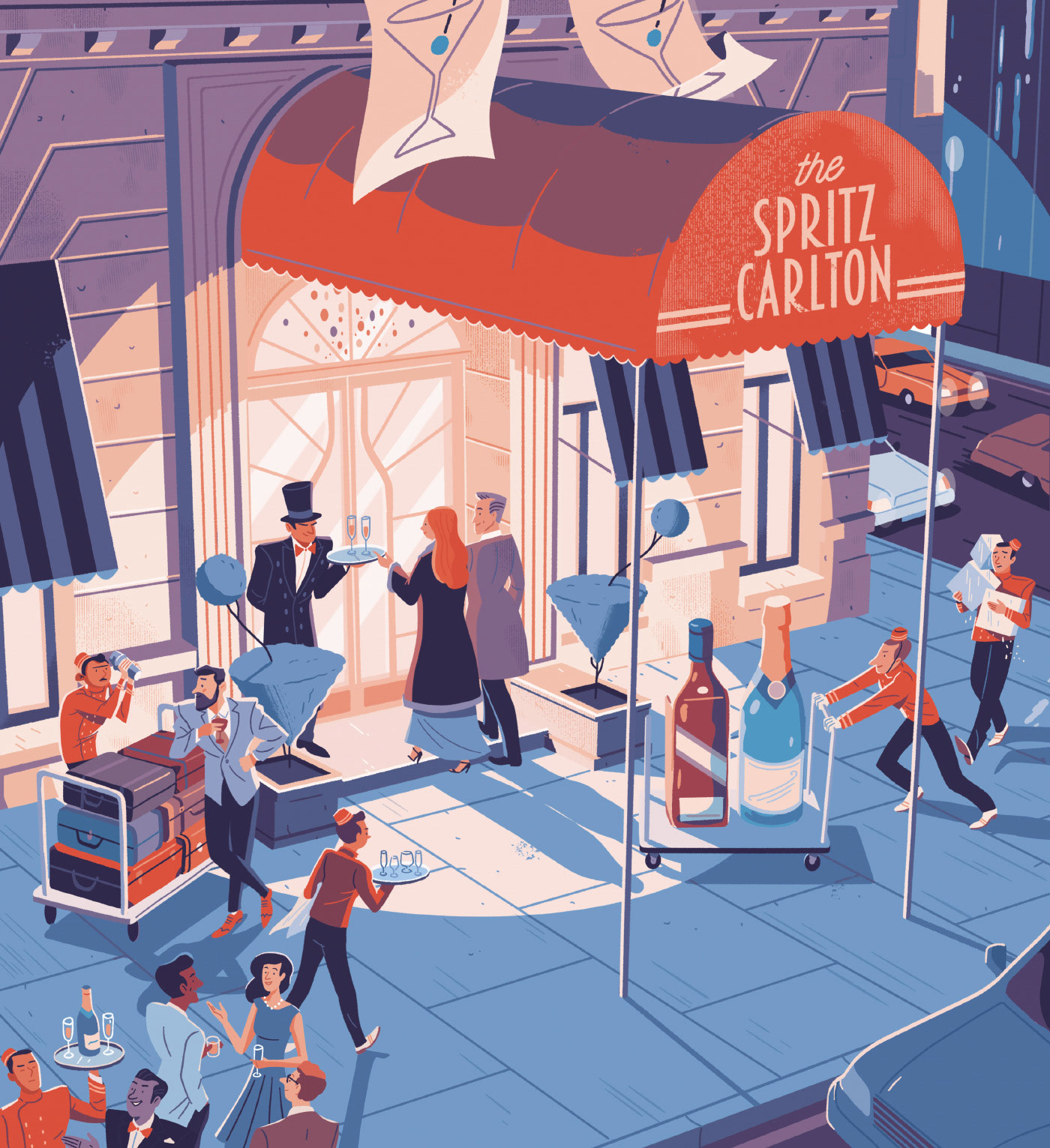
He works primarily in Editorial and Corporate areas of the industry. Having never formally studied architecture (or even Illustration!) he has remarkably developed a keen eye for modernist architecture, and references his own photographs and drawings when composing his awesome designs.
Steve’s Illustrated for notable clients such as Nokia, Sony Ericsson, Volvo, Mazda, Adobe, Apple, Wall St. Journal, Channel 4, Wired Mag, and has even created screen graphics for a Led Zeppelin tour.

You started as an Animation Director before you journeyed into Illustration. Can you tell us a little bit about your background and how it has enriched your practice?
When I was 16 my family moved to Australia. I went to art school, worked at Disney for a horrid year, drew comics, designed surf t-shirts, and became an art director for a magazine before stumbling back into animation in 1999.
Art school gave me a lot of scope to mess about. I ended up getting into sound art and performance… Ok, I formed an art rock band, but actually it was a very valuable experience. I met a really lovely guy called Sam Young, who wanted to publish comics. He roped me into a great community of comic artists, one of whom worked at Disney. He helped me find a job as an ‘in-betweener’ in the company after I left art school. This is essentially the person who draws the frames between the key frames of an animator. It taught me some basic lessons in animation and this proved invaluable later on in my career. It was a great experience but bloody hell, it was a slog!
Working an art director for a computer games magazine, one of my jobs was to create ads to promote the website. I would draw these full-page illustrations. It was fantastic to see your work in print, to see what worked and what didn’t.
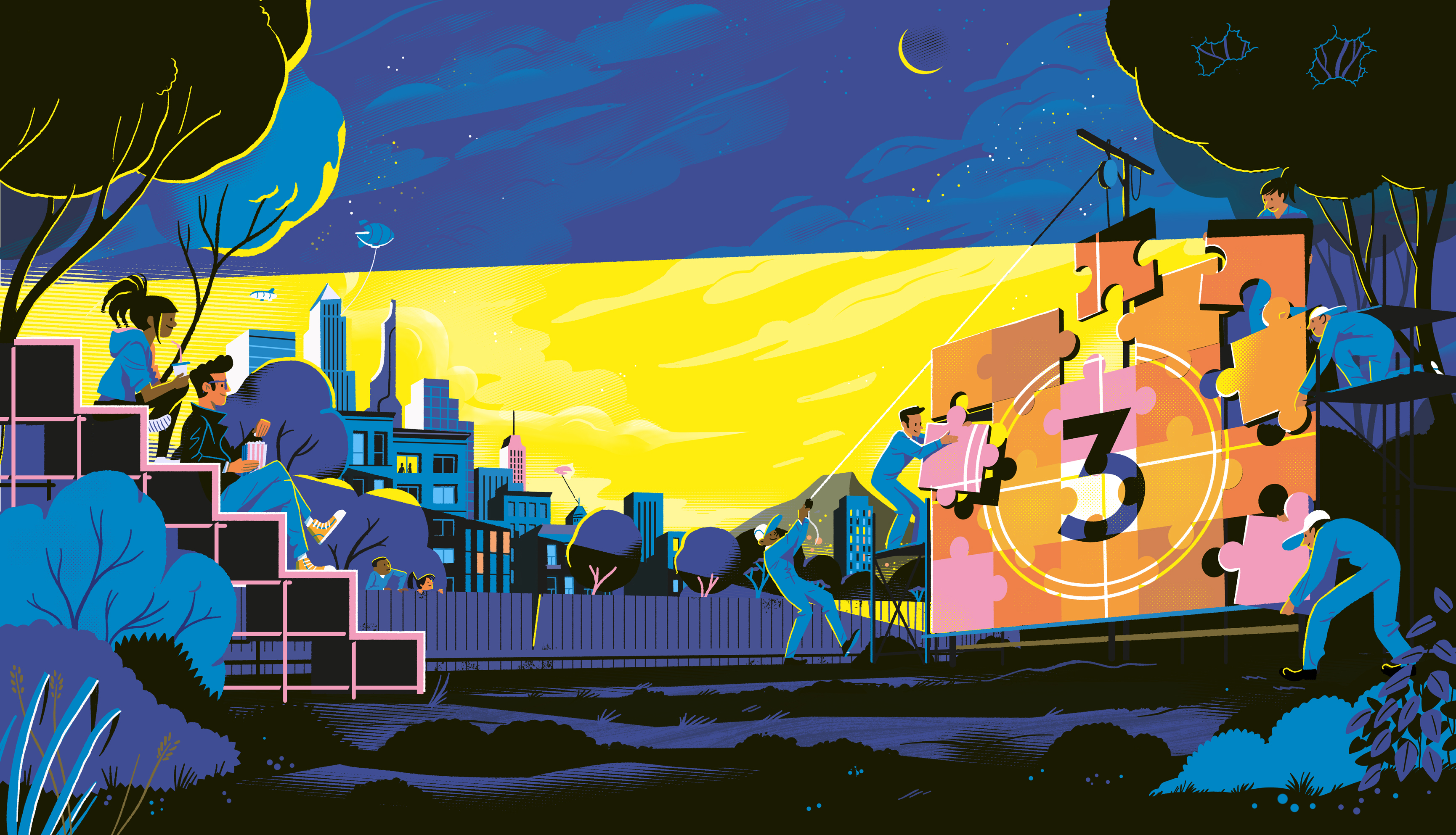 Eventually I quit my job(s) with the ambition to make a music video. I met a friend who was just learning Flash and we both realised together we could probably make a 3-minute animation. Before this point, the idea of making a film would have been a pipe-dream but we suddenly had the tools to make it come true. As I was in the band and was keen to promote us, we created a video for one of our songs. We made this film called ’Swingers International’ which was full of my obsessions at the time, lots of sixties spies, beatnik hangouts, space battles and psychedelia. It is online somewhere… but oh boy, you can tell it was my first animation.
Animation gave me the opportunity to try out lots of different graphic approaches and you had to work fast and efficiently to get everything done. It also makes you focus on narrative, what’s the story you want to tell in an image!
Can you share with us the process from the beginning of a project to the finished result?
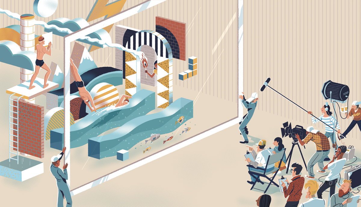
This always depends on your client. Some clients have very clear ideas about what they want, some are more open. With the Adobe – AFX project the brief was to illustrate a number of online articles. One was entitled ‘What is After Effect?’.
The difficulty was thinking how do you show the workings of a digital software, I didn’t want to draw a literal representation of the theme. So, to expand on the brief I drew on metaphors used in the software, such as camera, lighting and layering to make the topic more dynamic.
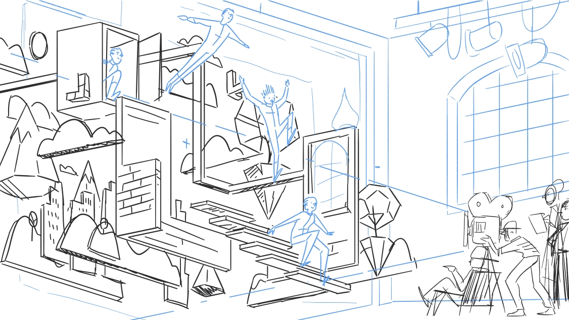
I thought this language: Cameras, lighting and layering would be a way into the subject. This led to the idea of a film crew. The last thing I wanted was a picture of someone actually using the software. I found tonnes of possibilities to draw fun characters in a film crew and it got me away from a literal representation. At the same time, I was looking at a lot of Memphis design furniture and I really wanted to use those shapes. I thought of an abstract space where the Memphis style objects were floating in layers.
The final thing I wanted to include was the concept of time, as there’s a timeline in After Effects. So, I thought of showing an action across time. For some reason, the idea of a diver diving into water popped into my head. I then drew three different moments in a dive.
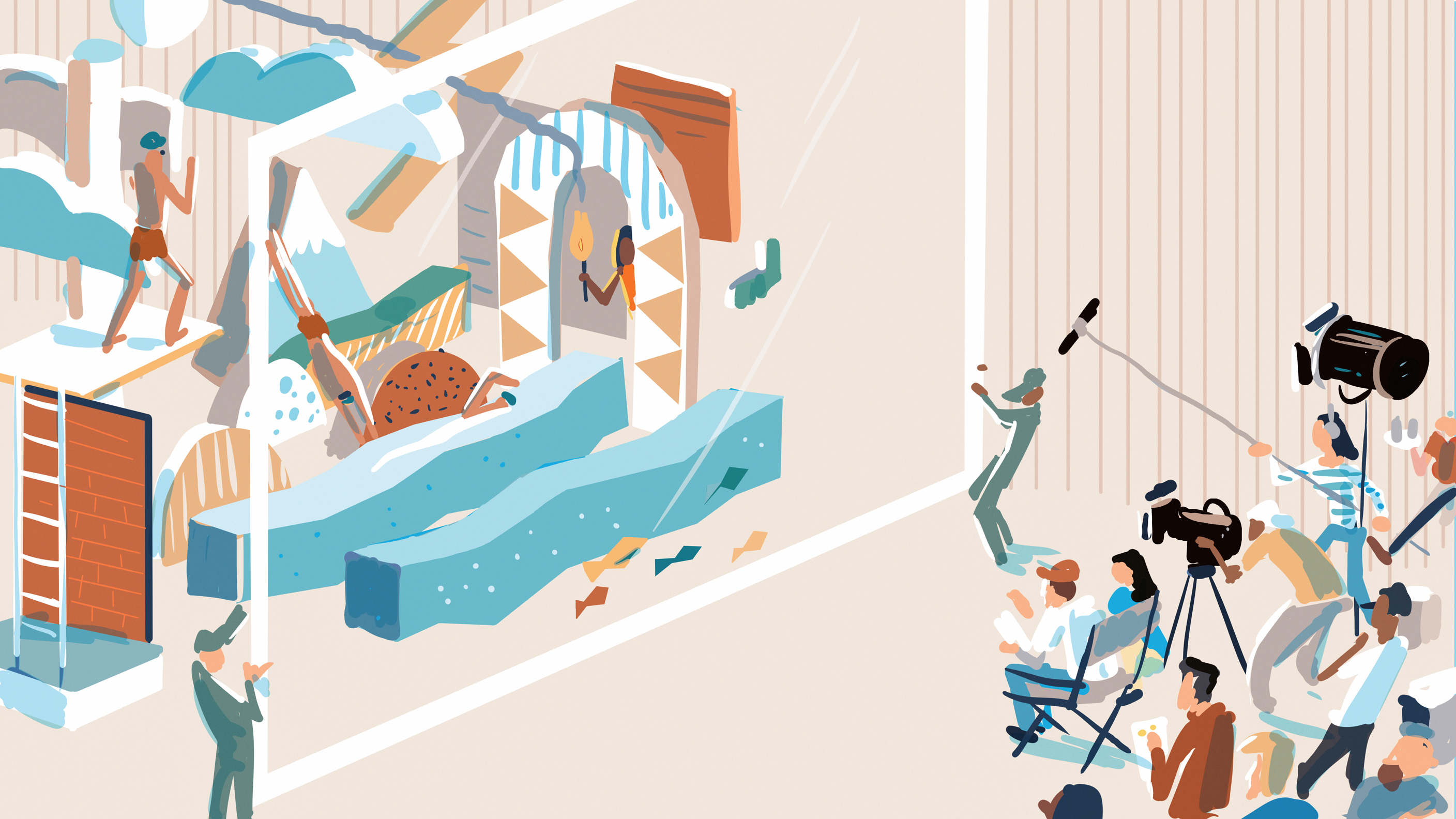
The comic artist Hergé was great at doing this. There’s a very famous panel in one of his comics which shows someone crouching at a sand dune and then another person next to him beginning to stand, and then a third running away. In your head you play it like a film and it introduces the concept of movement into a static medium.
By combining all these ideas, I finally had the image of a film crew in this weird Memphis-style setting. When I have the imagined idea, I create a bunch of quick sketches usually on scraps of paper. Once I have something I feel is working as a concept I then switch to drawing digitally on my Cintiq, or iPad. I use a program called ClipStudio. This way I can work quickly, and if I need to change something I have a everything on layers and it’s pretty easy to do tweaks.
I do a series of colour roughs to lock down a palette before moving onto the final image. I work lots in layers. I have done a lot of images where I’ve hit the layer limit on the software… never a good moment!
It’s hard looking at old drawings and feel there is always something I would approach differently. Generally, I end up with an image which is fairly different to anything I have illustrated before and that’s always an exciting place to be. I do find in illustration that if you draw something once, there is a danger of being typecast. Any opportunity to try something new is something I jump at!
It is fascinating to understand how you develop a scene. We imagine this takes a considerable time to build the compositions. How do you best manage your time?
I really love tight interlocking designs, playing with the planes of a flat image. In the end, a picture is a 2D plane.
Illustration is a flat medium that can give the illusion of depth. The artist Escher was brilliant at this, creating impossible architecture because he was playing with the pictorial space. Ever Meulen is another artist who does this really well. There’s this amazing picture of his called ‘What’s wrong with this picture’ that is all about playing with the illusion of space you get in a drawing.
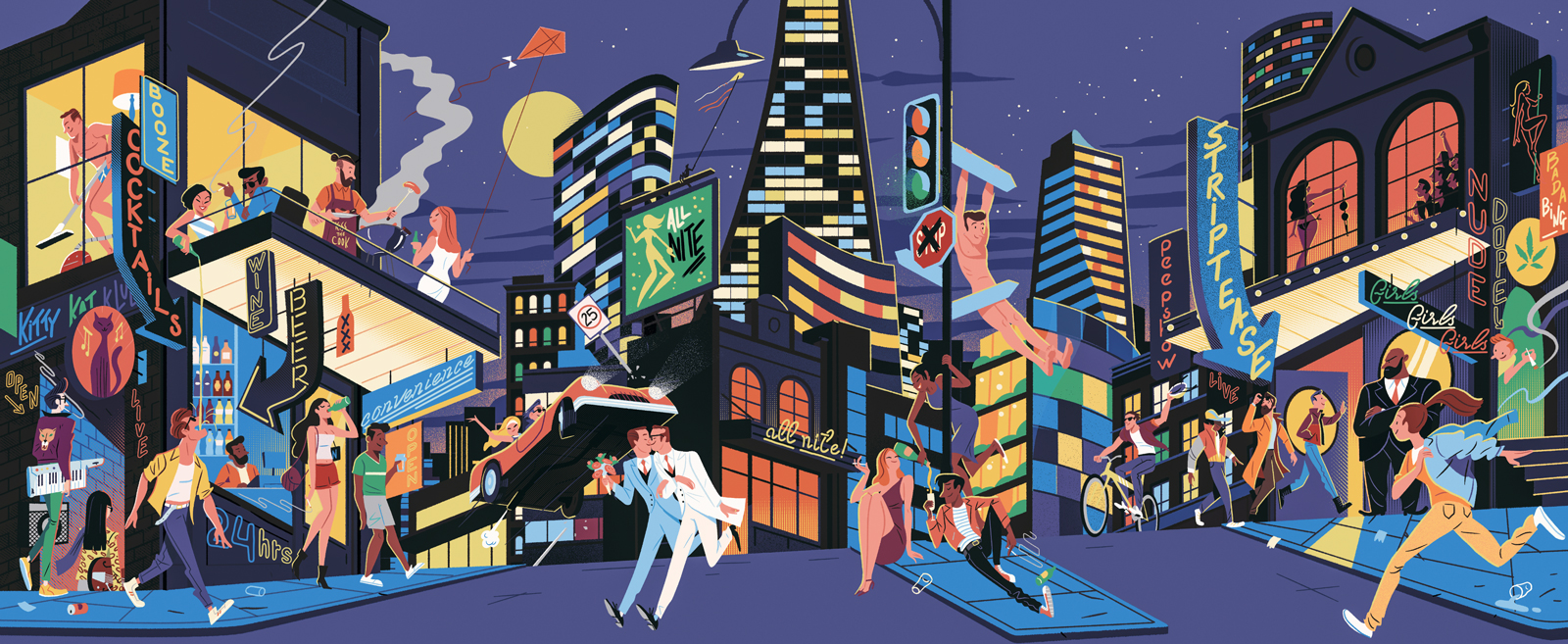 One way I approach this is to try and limit the number of angles I use, which is a tip I picked up from looking at Meulen’s work. Everything ties together. However this can look a bit diagrammatic, so then you battle this grid by adding lots of softer curves and rounder shapes to break things up.
In terms of time management, it’s just a matter of keeping it super loose until something locks together as a composition.
You have built an inspiring list of clients and you are represented by multiple agencies. What inspires you?
Well thanks! I feel lucky to be able to do this. It’s only in my 40s that I became a full-time illustrator and it does feel like a dream job.
In terms of inspiration, this is constantly changing. I’m really inspired by the environment around me. I love trying to draw something a bit magical out of the mundanity of my local shops, or the ramp road on the north circular. In terms of artworks, I’m a big fan of the atom style movement that came out of Belgium and France in the 80s. Drawing inspiration from artists like Yves Chaland, Ever Meulen & Serge Clerc.
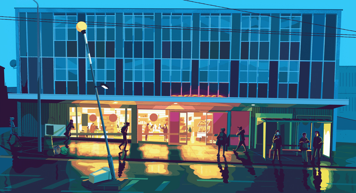
About three years ago I walked into a Japanese restaurant in Finchely and saw these amazing works by Hiroshige, and I’ve become pretty obsessed with Ukiyo-e and Shin Hanga prints. I travelled out to Tokyo earlier this year to find more of these works. This has definitely had an impact on my wanting to show more light and atmosphere in my images.
We spied your interpretation of Studio Dreams (in NoBrow 10) which reached us all in a familiar and comedic way. Is it important to apply humour into your work?
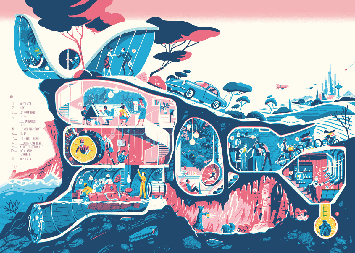
I loved doing this image. With Illustration I always go through this phase (and I don’t think it’s uncommon) of having the high of drawing an image, followed by a slowly sinking feeling of thinking that I can’t draw for toffee. So that’s why there’s an illustrator sitting smugly in one half of the drawing, while in the other half there’s an illustrator with head in hands sobbing.
But the there’s lots of wish fulfilment…
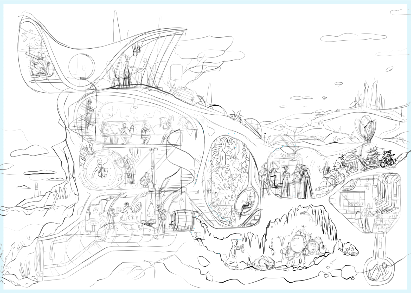 I’d love a biker gang that went and collected outstanding payments from clients, or someone who could handle my social media. I have a love/hate relationship with my Instagram account.
So yes, humour is important. I don’t want to take myself too seriously and the world can be a pretty grim place. If something in my work gets too pompous, my instinct is to want to take the piss out of it. I love that idea of the smile in the mind. Something that lodges an idea into the brain.
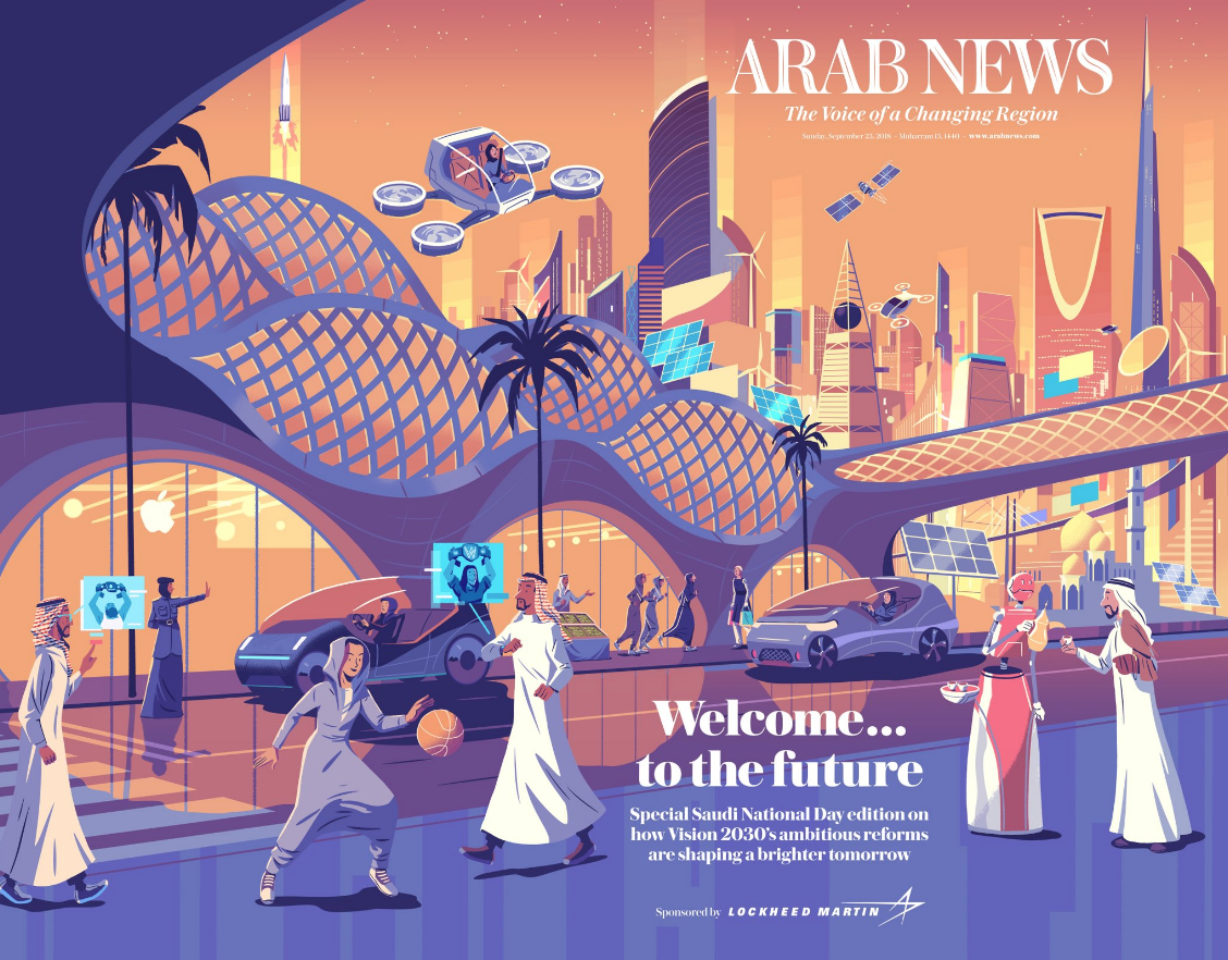
Final question (and on the topic of social)! We spied your recent futuristic Illustration for Arab News. Are you working on any new projects? Or have you any exciting plans for 2019, the future?
I really enjoyed creating the Arab News Illustration. I love retro-modernistic buildings because they communicate an optimistic vision of the future. It would be nice to do some more sci-fi work.
I always get to the end of the year regretting that I haven’t had enough time to do my own thing. I managed to do a little better this year, but next year I want to produce more. I’m doing a poster for the 59 parks project that has been a real battle to get right, but should be coming out soon.
I’m currently working on a 10-metre-wide print that will appear in the Louvre Mall… probably the closest I’ll get to being in the Louvre!
We also approached Chris Page from Jelly to get the agent’s perspective on working with Steve!
We have been lucky enough to have worked with Steve for quite a while now. As an Agency that treats animation and illustration with the equal gravitas, his ability to illustrate, direct and animate instantly appealed to Jelly’s sensibilities.
When we first met Steve his work was a mind-bending collection of brightly-coloured psychedelia that we absolutely loved. It was a bit of a hard sell though! Commercially I think we were optimistic in thinking that everyone would easily see how it could fit with a brand brief, but it seemed that Art Directors were a bit slower than us on the uptake… understandably, with hindsight.
Over time Steve has refined his style so that it has achieved the unique feel that everyone loves today. He has retained some of his retro-psych style, but combined it with classic comic book characterisation to create incredible populated worlds that draw the viewer in to his micro-universes. Each illustration has a brilliant sense of space and depth that makes you instantly go and live within it – and there is so much detail and character that each image begs repeat visits. As for those colours – oh my! There’s an instant sense of light and time, which helps tell the story.
Steve is a lovely guy too and a pleasure to work with. We have always enjoyed a very open and honest relationship, and I would consider him one of the cornerstones of Jelly’s definable ‘look’ (if there is one).
–
Thanks to both Steve and Chris for putting their valuable time into contributing to this feature. If you liked reading about Steve, you can gawp at the rest of his portfolio on his radiant website and Instagram.
Don’t miss last Illustrator of the Month, Children’s Book Illustrator Simona Ciraolo.
Back to News Page
