Illustrating Beavertown: an interview with Nick Dwyer
Picture this: you are visiting a bar, a pub or a shop, and you have to choose what you want to drink. You might select something familiar, but decide to try something new instead. In between the many well-known brands, you notice a colourful label or can design – it catches your eye, because it’s illustrated! and it looks tasty. You decide to buy it.
It’s an often a common scenario. From food to drink, packaging and branding has a power to persuade the consumer – and illustration can play a big role in this dynamic. Many times even, illustration can go beyond packaging and influence the complete identity of a brand.
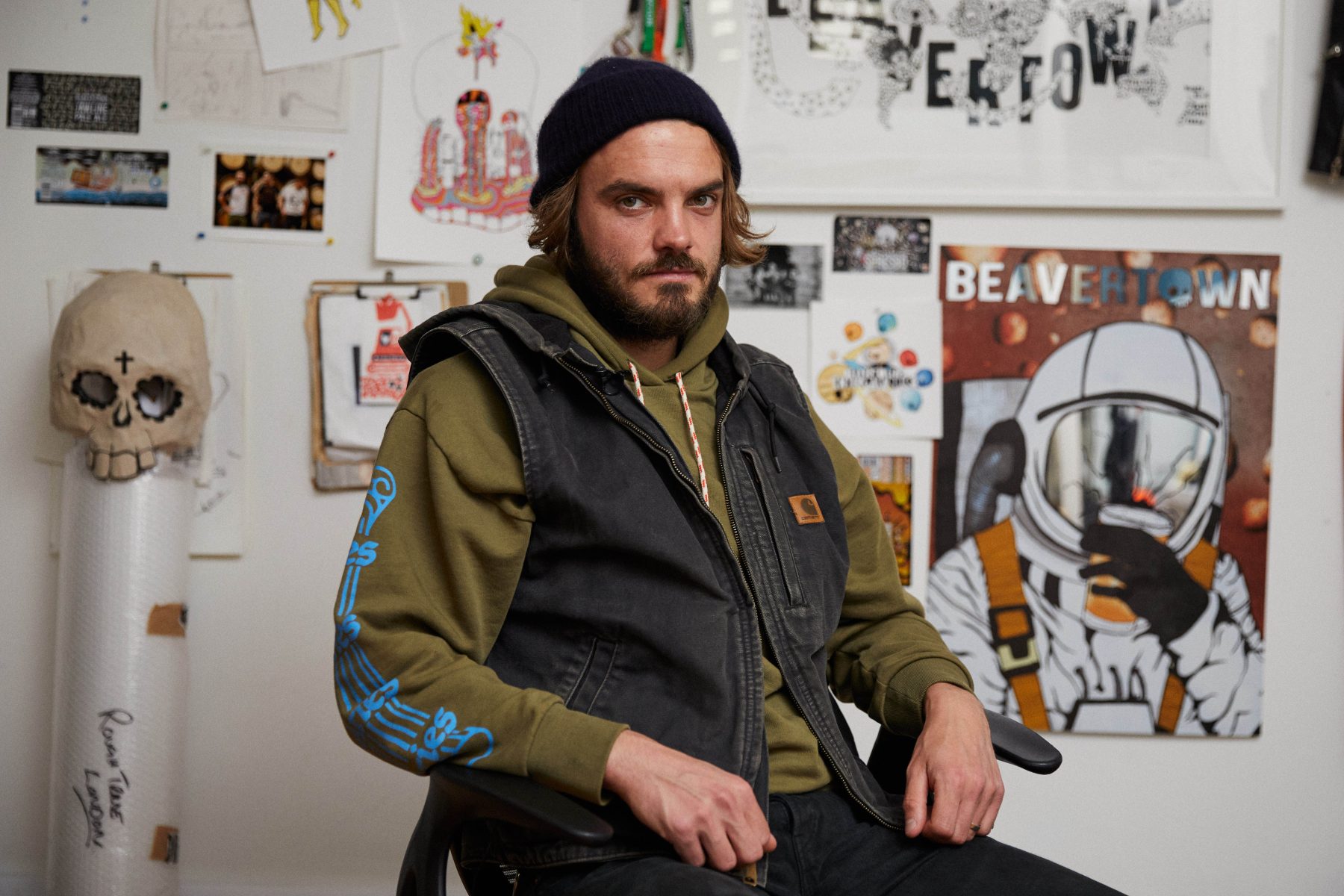
This is one of those cases. An award-winning graphic designer and illustrator, Nick Dwyer is responsible for the iconic designs across everything to do with Beavertown brewery (where he works as Creative Director). With the release of their new flavour, Bones, Nick has also recently designed the artwork for Beavertown’s first-ever advertising campaign, including fly posters, adverts on the sides of London buses and a mural erected in east London.
We interview Nick to learn more about his career journey to date, rules (and breaking them), and his new and upcoming projects.
For those who don’t know Nick Dwyer, can you give a summary of your career and how you got involved with Beavertown?
I accidentally found my way into the beer industry after graduating from art school. I was waiting tables and taking as many freelance illustration gigs as possible. A friend from college put me forward as the local artist for the local brewery, which at the time had begun out of a 50-litre rice pan as a hot liquor tank and had recently moved to the kitchen of a BBQ restaurant based in De Beauvoir Town (sometimes given the Cockney name Beavertown), in London.
That’s where I met Beavertown’s founder, Logan, and sketch by sketch, I embedded my artwork into their branding and beer cans. Eventually, I landed the creative director title. I am no longer just the guy who makes the labels; I now get to work on many cool projects, including designing a taproom (at Tottenham Hotspur Stadium) and Beavertown’s new pub, which opened earlier this month.
Is there a specific set of rules or process you have when illustrating for Beavertown (in comparison to other projects)?
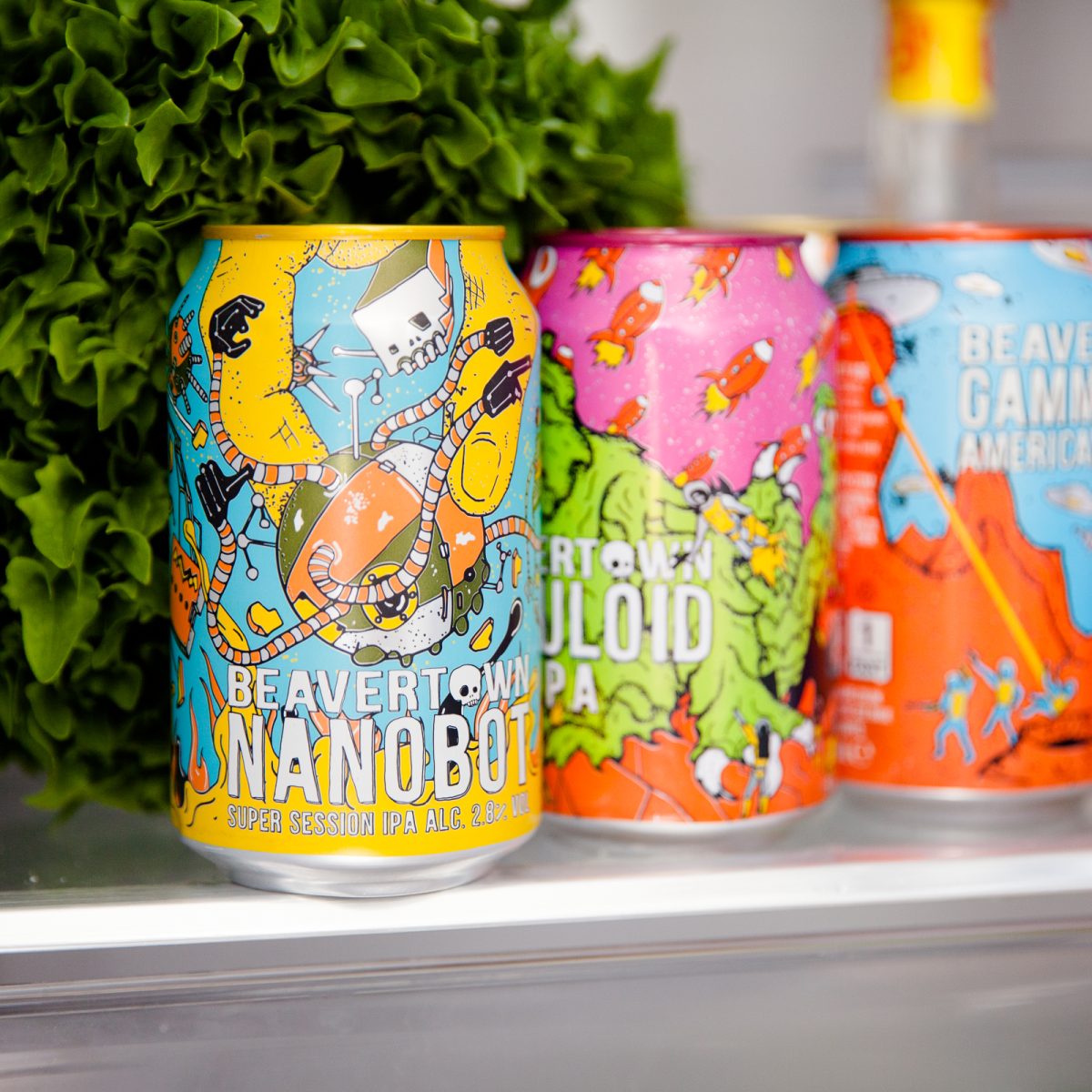
The rules are totally dependent on how people initially respond to elements of the brand. For example, the Gamma Ray space skeletons really resonated with people early on, so I went full throttle into trying to keep them front and centre of what we were doing at all times.
As our range grew, the number of colours (usually picked by Logan) and characters did as well. It was a case of picking what we thought were our colours, and using the more recognisable characters. It’s actually quite challenging to get the character from Neck Oil into marketing materials, but, whilst it sounds limiting, I make the rules (usually on the spot) so it’s a lot of fun finding ways they can all interact. In some ways it’s like writing a really surreal movie script.
It all leaks into other projects, but I recently had a project where I had total creative freedom and I drew a UFO. I probably need to have a word with myself.
How does Bones fit within Beavertown’s product range? Is there a story, or a different design angle you wanted to explore?
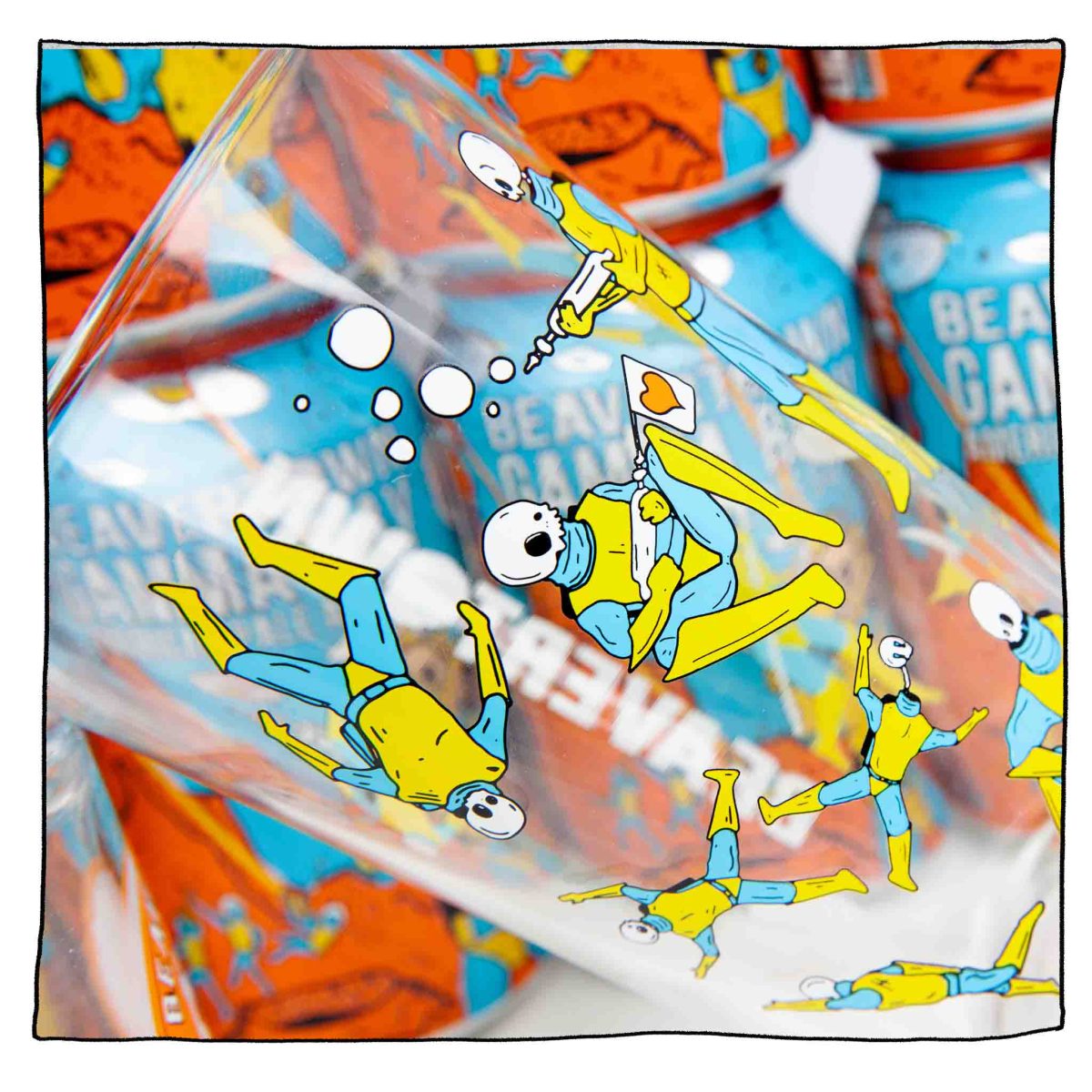
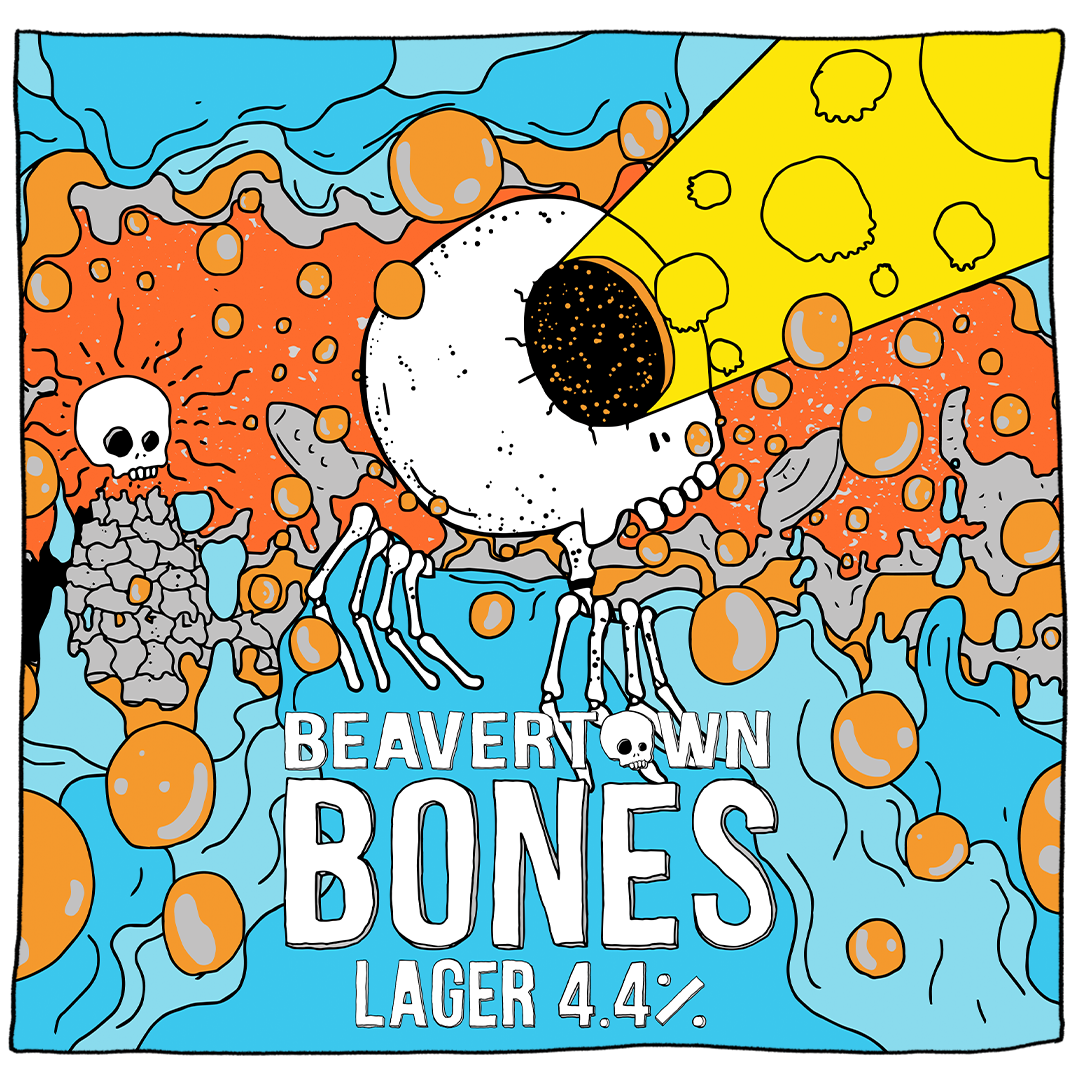
We’ve been working on our first lager for 5 years and we have perfected our new dead refreshing and crisp introduction to the category. Bones has been created to sit alongside the likes of Gamma Ray and Neck Oil as go-to choices for drinkers looking for the drinkability factor of a lager. I’ve also designed some exclusive merch to go alongside the launch, including glassware and tees, which I’m sure Beavertown fans will be delighted to get their hands on.
Which was your favourite or most challenging part of the campaign design process?
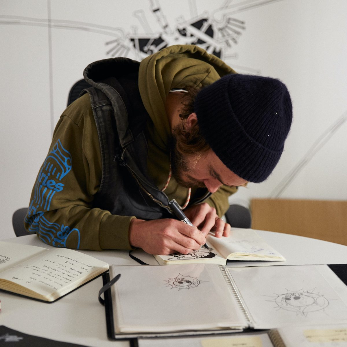
My favourite part was typically seeing our artwork go past on buses, adorned on stations and bus stops and a truly massive mural in the heart of where I studied / drank as I became an illustrator in east London. Additionally, friends and family all over the country got in touch to say we had also invaded their towns and cities.
The most challenging part of the process definitely has to be the essential step back in what I would pretentiously call the ‘intellectual’ side of our designs, and how busy I like to make them. Obviously an essential part of any campaign is making sure it appeals to as many people, plants and animals as possible, leaving very little to people’s imaginations (my favourite thing to do) and objectively not keeping anyone from ‘getting it.’ Making things that are bizarre, nonsensical and imaginative linear and concise is tough!
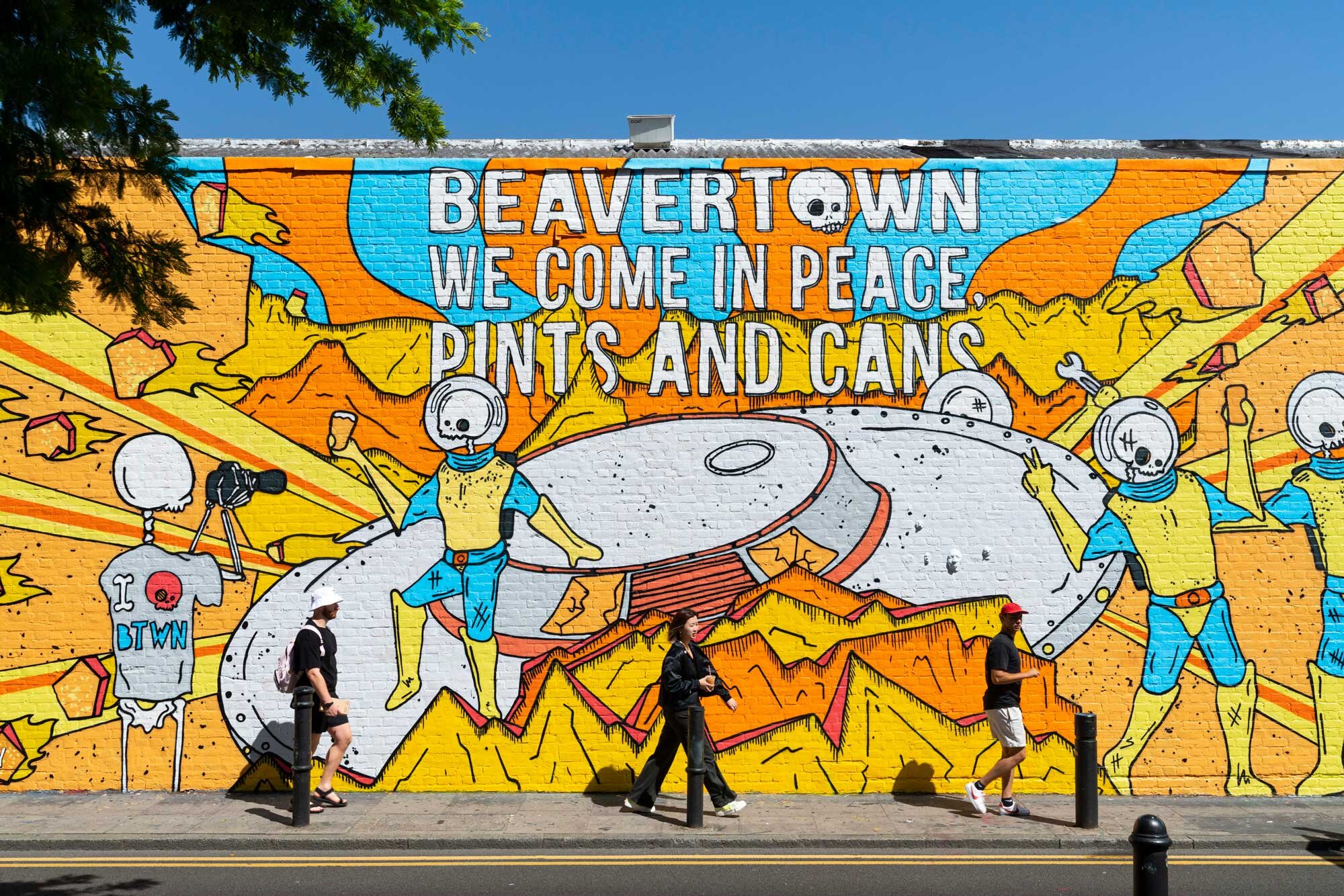
Illustration is certainly a key part of Beavertown. Do you think illustration has become pivotal to craft beer branding in the last decade?
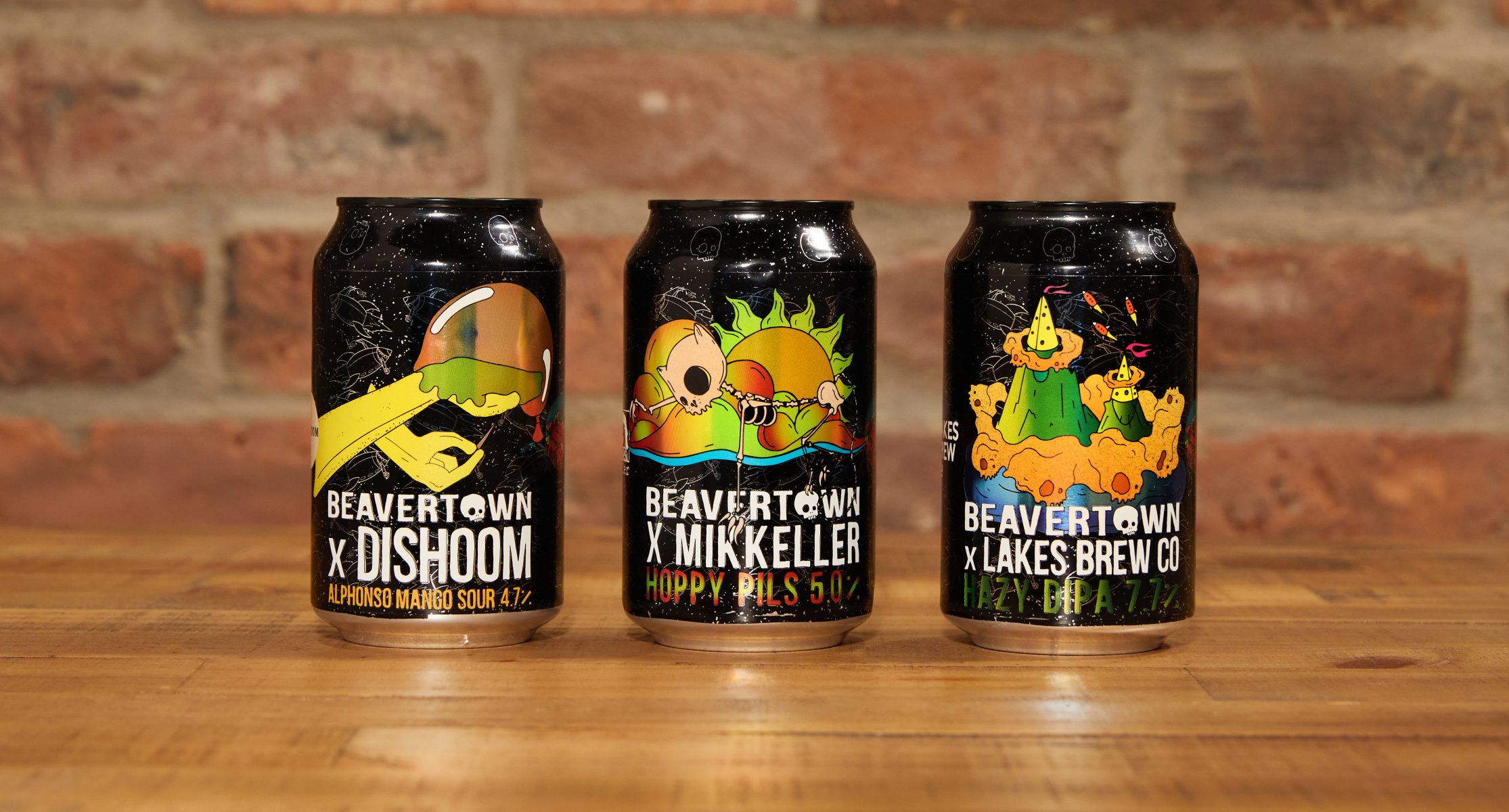
Absolutely, and mainly because it has such a broad spectrum of iterations and applications. I would be the first to say my illustrations are hardly groundbreaking innovations, but the fact they are wrapped around a can of beer is what made them exciting to people in the first place, as with the now full beer fridge of bright colours and tight lines from a wide variety of breweries (and wineries, and cider breweries etc).
People tend to apply arbitrary sets of rules to food and drink packaging based on the norm, and what we do is only a little out of the way of that – but it has an impact because of it. Additionally, being able to tell a short story, set a scene, blind people with colour or just make someone giggle while they are having a beverage is a great one-two punch of fun, and the ultimate goal.
What new projects can be expected from you and Beavertown in the future?
A new project I am really excited about is the opening of Beavertown’s first ever pub, Corner Pin, pouring all the brand’s creativity in its very own real-life venue in Tottenham. When it comes to the design, we didn’t hold back; think of the front door as a portal transporting visitors into an alternate universe. Halloween is always a big one for us, and we’re planning on bringing out some brilliant new products (watch this space!).
We are also releasing an amazing advent calendar for Christmas which will be bringing back some old favourites including 8Ball, Black Betty and Smog, as well as some other exciting re-releases.
Many thanks to Nick for his time and answers. Explore more of his work on his website and Beavertown’s instagram.
Back to News Page
