Eleanor Crow – Faber & Faber

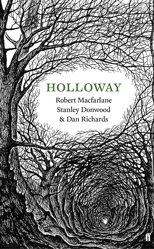
Holloway, Faber & Faber, 2013. Artwork by Stanley Donwood.
As an illustrator yourself, in your opinion what makes a successful cover illustration?
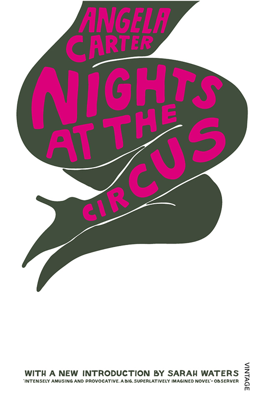
The best cover illustrations successfully integrate type and image, whether the type or lettering is by the designer or the illustrator. It needs to be as skillful as a brilliantly conceived poster – the type can’t be an afterthought, imposed awkwardly on the image. Parra is a brilliant imagemaker who utilises lettering. He created a wonderful Angela Carter paperback series for me many years ago – I think these have stood the test of time.
How does the process begin with an illustrator that you are commissioning?
It varies from cover to cover, and also depends on whether I’m working with an established illustrator or a recent graduate. Sometimes the brief is quite detailed, and I may even supply sketches showing the approximate sizing and hierarchy of the type, and how much space is available. Other times, the illustrator has the text and carte blanche, particularly if they are a strong conceptual thinker, and bring a great deal of experience to the table. I like to see very early roughs and ideas – I know the illustrator’s style, and I can see how their sketched thoughts might shape up. It helps me plan ahead to the type. But equally, some illustrators produce incredibly polished roughs. This is great when we’re on a tight turnaround for cover approvals. Each time it’s a different process.

Is Just a Movie, Faber & Faber, 2011. Artwork by Jeb Loy Nichols.
How do you feel the artist and commissioners relationship works best?
It’s all about trust. The commissioner selects an illustrator whose work feels right for the tone of the text, for the voice of the author, whilst keeping an eye on the commercial potential of the cover, and its ability to draw in the readers for the book. It works best when the illustrator feels that they have creative freedom, that their working processes are understood, and that the commissioner will work with them in a collaborative way, with designs that are sympathetic to the artwork. Books are out there a long time, and ‘speak’ for the book. It has to feel right.

Nights at the Circus, Vintage, 2006. Illustration by Parra / Big Active.
After fifteen years as an in-house designer, at Random House and Faber & Faber, and formerly art director at The Folio Society, how has the commissioning landscape changed during this time?
There are more illustrators and fewer books. I wish we could work with all the amazing illustrators whose work we like.

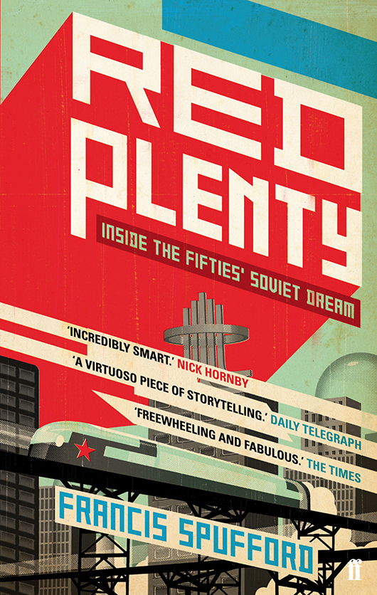
Red Plenty, Faber & Faber, 2011. Illustration by Tavis Coburn / Dutch Uncle.
What is the most effective way for illustrators to submit their work to you?
One or two sample images with a link to their website is probably best. We’ll bookmark the site if we like the work. Postal samples are fine too; just keep it simple – the work needs to speak for itself. We work with agents and individuals, graduates and superstars, so don’t feel daunted if it’s your first time sending out work. Unfortunately we may not be able to reply, but please be reassured – we look at everything that comes in, and save promising work for future reference.
Back to News Page
