Driving Business – The importance of a Great Website, Part 2
Driving business is all about solid market research and communicating your best work to your audience in a clean, clear and eye catching way. Your website and online shop are huge marketing tools so it’s important you maximise their potential.
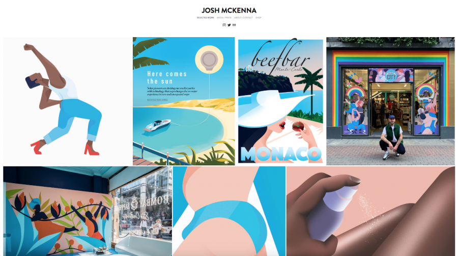
Website by Josh McKenna
As part of our #NotaHobby Campaign, we’re deep diving into all things illustration business success and longevity so join us for the second instalment of Driving Business – The Importance of a Great Website as we chat to AOI members Josh McKenna and Niki Groom. Working across industry from advertising and packaging to editorial & live illustration, these illustrators have worked with the likes of Instagram, Vogue, Bombay Sapphire, & Clinique to name just a few.
What do you think potential clients want to see when they come to an illustrators website?
Josh McKenna: For me social media has changed the way I use my website, Instagram has made everything super visual so I think clients want to see immediate imagery when on an illustrators web page. My online website is laid out out a grid much like an Instagram profile with my work indexed and on show as soon as you enter the site.
Niki Groom: Clear images, simple navigation, and an easy way to contact you. Every person who comes to your site will navigate it a different way, so the simpler the better. Also it’s really important to see how it works on a phone, some sites are great on a laptop but not on a phone.
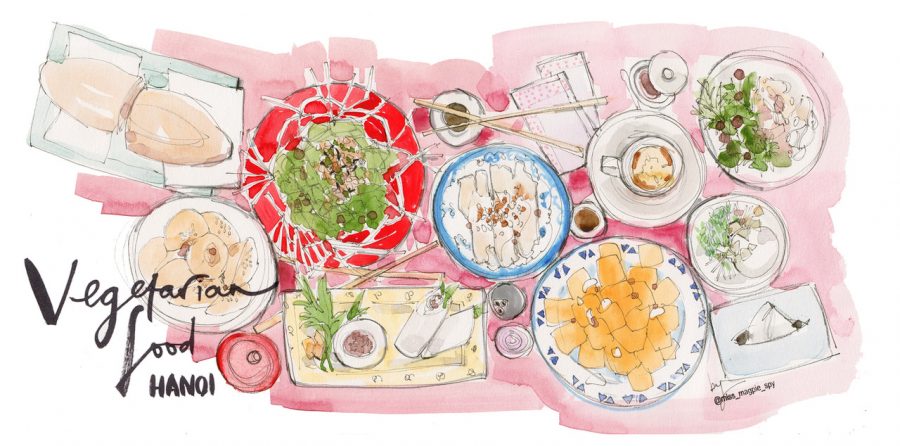
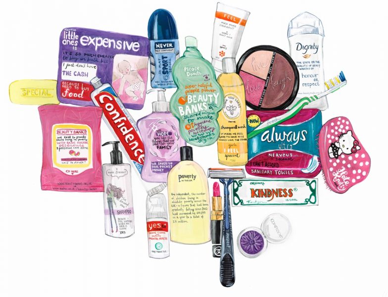
Illustration by Niki Groom
What would you say to other illustrators is the most important thing to consider when building their portfolio?
NG: I think it’s important to really showcase the type of work you want to get commissioned to make more of. At one point I was only getting commissions for fashion illustrations for the fashion & beauty industry, because there was nothing in my portfolio to suggest I could produce anything else. So I worked hard on new areas of my website (such as travel and reportage) and as a result have now had commissions to draw buildings and I have a regular reportage column.
If you don’t feel like a piece of work looks strong then don’t hide it in your portfolio, take it out and do something new. Another thing I’d say is don’t try to do everything. I’m not interested in doing digital work and that’s fine, I leave that for people better skilled than me. I keep focused on my strengths and make sure the work is consistent from page to page.
I think there’s an element of fake it til you make it with your portfolio. Invest time (and money, if you can) to make it look professional and you’ll attract the right work. The most important thing for traditional artists is to make sure your scans are good and any photos are really sharp. I’ve invested a lot in photographers over the years for this reason.
JMcK: Consistency is key. Make sure your illustrations work together as one so a client can really see your style come through.
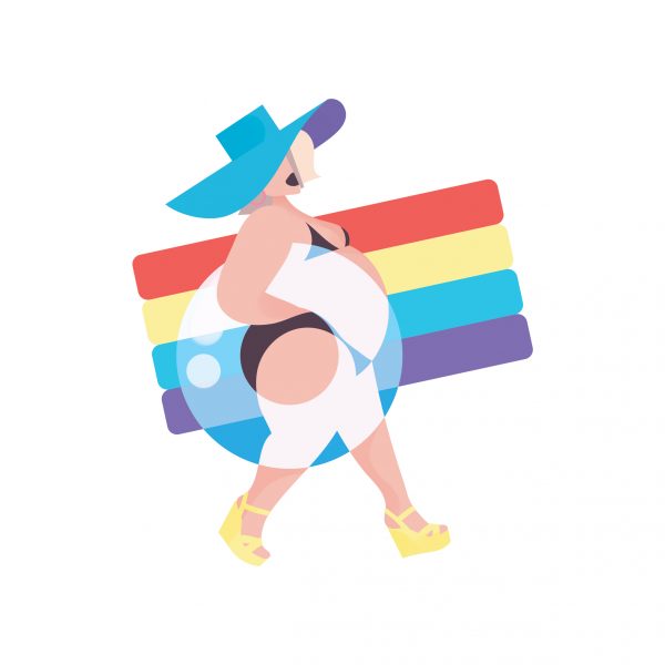
Illustration by Josh McKenna
What considerations do you have when choosing how to arrange your thumbnails ie gifs v static, details v full project, bare illustration x work in context.
JMcK: I usually go for the illustration in full on my website and social medias as I think it’s the best for showing the highest quality. Saying that, if I have produced artwork for bottles, merchandise or a mural it’s always nice to show that in context.
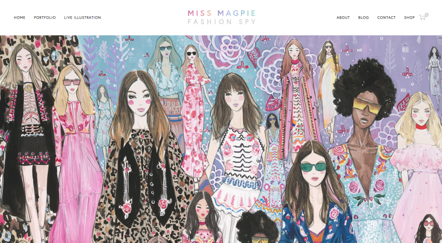
Illustration by Niki Groom
What was the change you made in your portfolio that had the most impact?
NG: I took lots of work out when my website was redesigned so only the best stuff is left. I think I kept some of it in at is was commissioned by brands that sounded impressive, but years on and my work has improved so I’ve been brave and taken it out. I still probably have too much on my website, but I see it as something that is always changing and is never finished. I edit it every month or so, adding some new pieces in and deleting pieces that catch my eye too much! At the moment I have my portfolio in sections (fashion, beauty, faces, travel, reportage, food) and that means it’s not one long scrolling page of different work (that’s what my instagram portfolio is for).
Do you feel of your website ie colours, user interface/navigation, contemporary design are key in communicating to high quality/serious commissioners?
JMcK: I think having a clean, simple to use and colourful, consistent website helps to keep my brand looking professional and therefore easily commissionable.
Illustration by Niki Groom
How do you drive traffic to your portfolio / shop? – Do you have a specific marketing strategy for your commercial work and your products?
NG: I don’t have a written strategy, but I generally use social media to drive people to my website portfolio. As well as putting direct links to my website on Instagram and Twitter, I now regularly post to Linked In too. I also see my Instagram grid as another portfolio so I make sure that’s super slick.
In terms of my shop, again social media is the biggest driver. My best sales are from A1 prints of my paintings. I share the process of these on instagram stories and live, this drives nearly all of my traffic and sales. Often there are stories attached and I donate a certain % of lots of my prints to charities, so there’s an element of storytelling involved that I really enjoy.
My blog is also a good way of driving people to my website, and I get some influencer work as a result – another revenue stream for me that I plan to grow in the future.
I freely admit that whilst I’m good at PR and Marketing, that I’m not good at sales. I feel I could sell a lot of prints if I could just crack that. If anyone reading this has any tips then do get in touch! My website sales have grown each year though: 2017 – £2574 / 2018 – £3283 / 2019 on track for £5000 (these are all turnover)
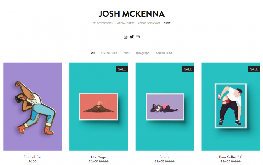
Online Shop by Josh McKenna
You’ve got a great online shop, how has this affected your business/income?
JMcK: My print shop is a fun little side addition to my regular commission work. I don’t make a huge amount from print sales but I get satisfaction from my followers when they buy them and send me pictures of them up in their homes.
What are your top tips for displaying your shop items, product shots, mock ups, in situ, etc – Your shop has to back up your brand and tone of voice
NG: When I did my stationery range in 2015 I wanted to do everything properly so sent my cards to a brilliant photographer with props to take some really great shots. These worked out really well and I still feel happy that the images are on brand (clean / fresh / pops of bright colour). However, when I started to sell prints I knew this wasn’t feasible financially, so I now buy stock imagery from Shutterstock and mock the work up into frames.
For me it’s really important that my shop is in-keeping with the rest of my website so great imagery is really important. The functionality is pretty much all determined by the template I use on Squarespace, but despite using a template I did pay a designer to design the site for me and I think that shows.
Huge thank you to Josh and Niki for their time and amazing insight!
More invaluable advice in Part 1 with Illustrators Claudine O’Sullivan & Sam Taylor and don’t miss all our other Business & Negotiation Insights. Find out how you can take control of your career here. Illustration is #NotaHobby!
As part of our #NotaHobby campaign, AOI Members can now benefit from an exclusive 20% discount when building a website with Squarespace, the all-in-one solution for building websites and selling online. Learn more by visiting www.squarespace.com/aoi and our Discounts platform.
Back to News Page

