Driving Business – The importance of a Great Website, Part 1
No matter if you are a newbie or a seasoned pro, a portfolio is essential to showcase the best of your work (and yourself) to potential clients. In order to do that, you will need a website that stands out. You do not need to be an expert in web development; You can simply use some great online services to achieve a unique online space that feels right for you.
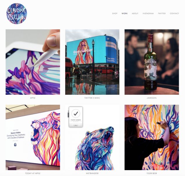
Website by Claudine O’Sullivan
A slick design is important, and so is following a few good tips, but you also have to be analytical and make sure you are ticking the right boxes. – Are you clearly showing who you’ve worked for so far? Is your portfolio appealing to your dream potential clients? How can you lay everything out and show your full potential? As mentioned so often in our Business Insights and #NotAHobby campaign: Communication is key, and that’s exactly what your website is there for.
With this in mind, we approached four established Illustrators who’ve created personal and engaging online portfolios, and are constantly driving traffic to them. In this first part, we start off with Sam Taylor and AOI Member Claudine O’Sullivan: Two commercial Illustrators whose combined client lists include the likes of Apple, MTV, Island Records, Nickelodeon, and many more.
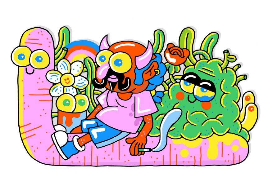
Illustration by Sam Taylor
What would you say to other illustrators is the most important thing to consider when building their portfolio?
Claudine O’ Sullivan: Prioritise the work you love, and the type of work you want to do and be commissioned for. A personal project that can clearly show your style and way of working can be more beneficial than a client project that isn’t really you.
What do you think potential clients want to see when they come to an illustrator’s website?
Sam Taylor: I think they want to see a few things, but mainly what your work is like. – This is the most important thing. Do you have a particular style? Does it seem like your work can be flexible? Can it be both? Can you fulfil their specific brief but also maintain your ‘thing’? I want clients to see that I have a specific style but I am also open to any brief, no matter how big or small or mainstream or alternative.
I also think they want to see if your work can sync up with their project, and they might want to see who you’ve worked for in the past.; If you’ve worked with a similar sized company as theirs they know that you must be professional. – You’ve completed projects before, they’re out there in the real world and here’s the proof:, it’s on your website. That’s got to instil some confidence.
Another thing I’ve heard that clients like to see is personal work. They want to see what you can come up with when there’s no brief – when you can go nuts and do whatever you want.
How do you drive traffic to your portfolio and/or shop? Do you have a specific marketing strategy for your commercial work and your products?
CO’S: Instagram is my main platform for sharing my work, and I find it really useful for driving people to my store. A lot can be said for real life marketing, too. – I do a good few fairs and markets that drive both print sales there and then, online sales afterwards and also puts me on the radar to potential clients. I always have a business card on me and a hefty stack at any event. I also use Instagram to share commercial work and my process.
In terms of a strategy for getting clients, it’s a bit of a domino effect and constant graft. Be professional and be good to work with, it’s not just about drawing. Then, keep in touch.
Illustration by Claudine O’Sullivan
Was there ever a piece of advice or feedback that changed the way you thought about your portfolio?
ST: Don’t make a rod for your own back. Only have things in your portfolio that you enjoyed making or want to make again. I only have stuff on my website that I loved doing or personal work that hints at possible future commissions in an area I’d like to get involved in.
Also, even though I have a lot of work on my site I’m always trying to cut it back and refine it. It’s hard to do because I want to show a lot of stuff, but there’s no point in having too much old work or similar things. – It’s a balancing act.
How do you mix your personal work with your commissioned work?
ST: I like them to blend together. If a commission comes in then I give it my focused attention, but I’m constantly drawing my own stuff and having my own ideas, so naturally they both influence each other. I might have a job for a magazine about a subject I didn’t know about that I want to draw more, so sometimes it works that way. Or if I’m doing a job that requires coming up with a new character I might keep drawing the character after that commission is over.
Most of the time my client work is representative of where my personal stuff is at that time. I’m happy to just crack on with the clients brief or get involved with my own ideas, whatever it takes to make the outcome as good as it can be.
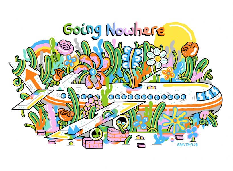
Illustration by Sam Taylor
You’ve got a great online shop. – How has this affected your business/income?
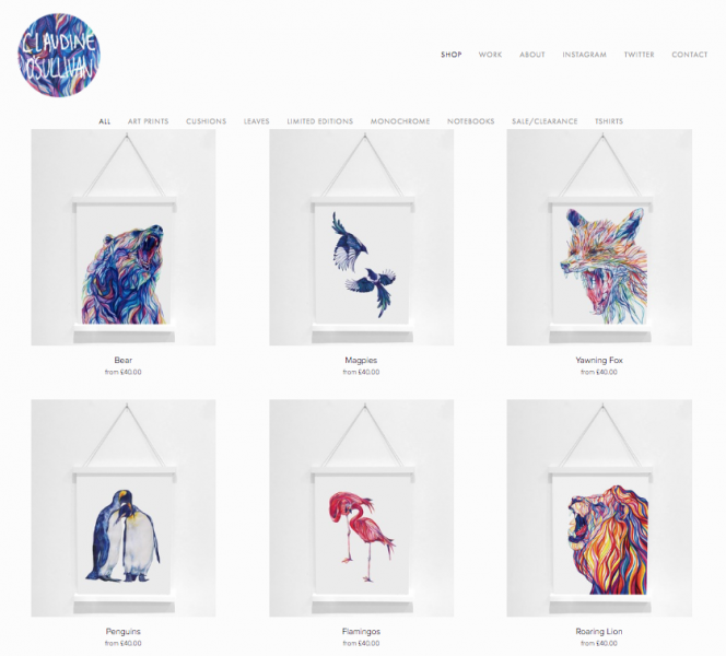
CO’S: My online shop is where it all started! As mentioned, personal work gets you client work. Now the print/shop section of my site is like a separate portfolio of my personal pieces, showcasing my stripped back, simplified pencil on paper style. It’s clear how these have been a starting point for my client portfolio and how my style has developed to meet different briefs and mediums.
From a business perspective prints are still an important part of my income; from my store directly, through bespoke orders and also via independent stores and wholesalers. I’ve taken a few months of maternity break when my daughter was born last year, and even though I’m back to work now, I’m working less than before. Now more than ever print orders and wholesale orders are a really important source of income for me.
What considerations do you have when choosing how to arrange your thumbnails?
ST: I like it to be as varied as possible, especially on my home page. GIFs next to photos from an event, static illustrations, full bleed, spots, products next to editorials. It’s like a Greatest Hits that includes live performances, studio recordings and demos, haha. You’ve got to show that you can take on any brief, any time, anywhere.
I think a good way of achieving this is to balance your projects in the way they are laid out: Have big client jobs next to personal work, editorial stuff next to exhibitions. Really try to show your ability to work on a broad range of projects whilst still being explicitly you.
I put clients that you may consider in contrast next to each other, like The Guardian next to Nickelodeon. I want to show my potential future client that my work can be used in many different ways. I’m not just a skateboard guy or a newspaper editorial guy – I’m willing to be flexible and make things more child friendly or XXX adult rated, it just depends on the brief. It’s fun for me to never know where a brief is going to come from.
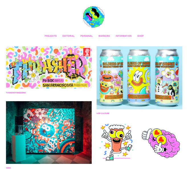
Website by Sam Taylor
Do you feel that elements like interface, navigation and contemporary design are key in communicating to high quality commissioners?
CO’S: I think communication is the most important thing. You could forever be tweaking and complicating your site, and if you have the skills and time to do it that’s not a bad thing. For me I keep it really simple – I make sure my most recent work is up there once I’m sharing it on Instagram, I have a mix of work and clients, all in my identifiable style.
My store is a pet of my site. The simple layout means it works well on iPhones and iPads which is a really important factor that can sometimes get overlooked when designing on a desktop. It also means I can easily keep it up to date.
Online Shop by Claudine O’Sullivan
We want to thank Sam and Claudine for their time and amazing insight!
Watch out for Part 2 out later this week, with Illustrators Nikki Groom and Josh McKenna.
As part of our #NotaHobby campaign, AOI Members can now benefit from an exclusive 20% discount when building a website with Squarespace, the all-in-one solution for building websites and selling online. Learn more by visiting this page.
Back to News Page

