AWARDS ISSUE: Winners Part 2
Varoom presents a selection from the many Awards winners from across the globe featured in issue 23 (available here) This extract reveals the thoughts behind the AOI Illustration Awards winning works by Joe Caslin (Public Realm) and Edd Baldry (Editorial).
Joe Caslin
Our Nation’s Sons
New Talent: Public Realm
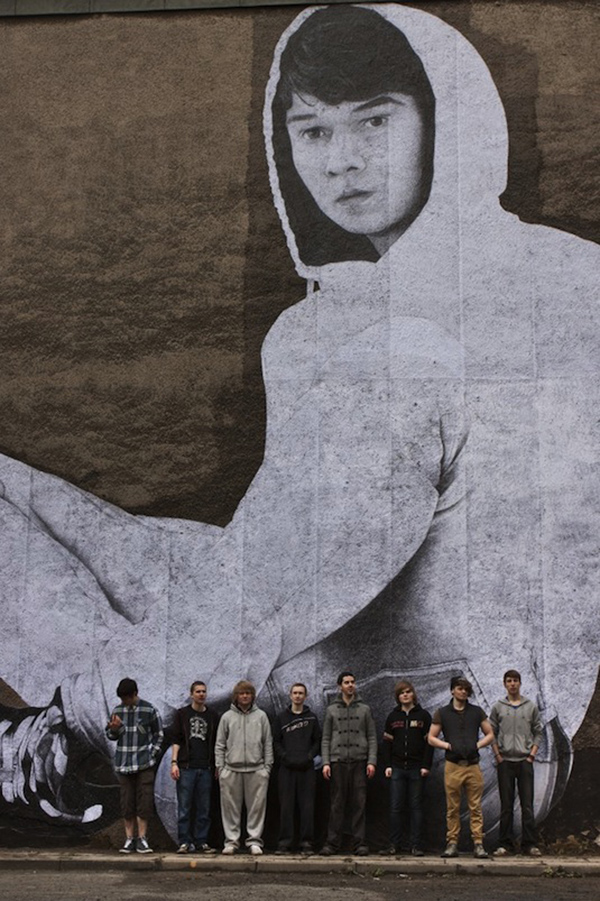
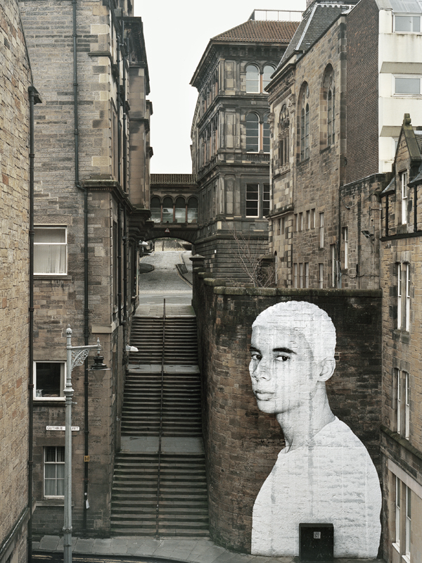
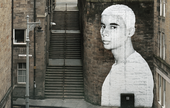
Brief: The aim of the project is to install large-scale portrait drawings of young men at specific locations throughout Edinburgh City. As a nation we have pushed a significant number of our young men to the very edges of society and created within them feelings of neglect and apathy. It is now time to empower these young lads and give them a sense of belonging.
I cannot fix the complex problems of apathy and disillusionment by simply sticking a drawing to a wall. However, I can create something more meaningful than any political promise and generate a more positive social impact than many published articles, news broadcasts or speeches.
A drawing has the power to go further than words. But a 40ft drawing has the potential to resonate and disrupt the visual landscape of a city. It has the power to pull a passer-by from the mundane, the power to trend and the power to gain real social momentum. It will re-establish respect for and showcase the capabilities of our nation’s sons.
Materials: Drawing – Paper and Pencil
Paste-ups – Paper, wallpaper paste, brushes, ladders, cherry pickers, elbow grease and a group of eight young ‘Tyros’.
Research: Michelangelo, Channel 4, George the Poet & meetings with “The Secretary”
Process: Find them, draw them, get them to stick them up.
Resistances: Funding and any formal recognition of Street Art as a legitimate art form.
Insight: It is easier to ask for forgiveness than for permission.
Distractions: Emailing bureaucrats & Greece (Specifically Crete)
Numbers: 30 & 6 & Double
AfterWords: Get up off your arse and do it.
Ardnanagh, Roscommon, Ireland
Edd Baldry
Scouse: A Class Accent
Winner: Editorial
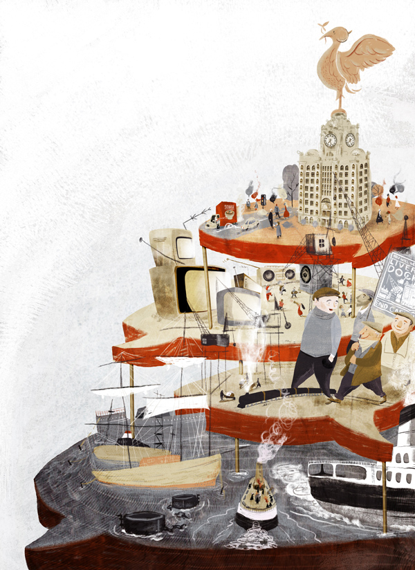
Brief: To illustrate an interview with a cultural historian explaining the cultural history of how Liverpool’s accent – through slavery, immigration, industry, industrial action and cultural happenings – has developed in to modern-day ‘scouse’.
Materials: Paper, pencil, scanner, Photoshop and a bunch of custom textures and brushes that I have on the computer.
Research: I spent quite a bit of time looking at the physical geography of Liverpool to see if I could map the development as incoming migration – alas that wasn’t to be. More basic stuff was looking at photos of the Mersey, the Liver-building, dock workers and reading the article many times.
Process: All reasonably straightforward. I gave six thumbnails to Tom Lynton, the Art Director at Red Pepper, to look through, with one coming back as the clear choice. That was then worked up to a proper pencil sketch and then the final piece tumbled out the following day.
Resistances: Never having visited Liverpool was a challenge. I also found it very difficult to think of ‘Liverpool’ without thinking of Liverpool FC, but that really wasn’t talked about at all in the piece I was illustrating, so needed to work around my lack of imagination. I also needed it to be clear that the image was, at least in part, about speech and communication but didn’t want to resort to speech bubbles being randomly shoved in front of every character.
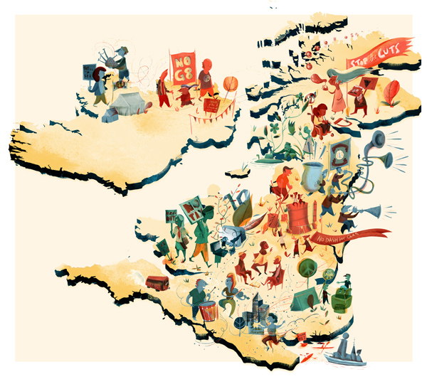
Insight: That Scouse, and by extension Liverpool can, thankfully, be communicated without resorting to LUFC or the Beatles.
Distractions: I got the brief on New Year’s eve and it needed to be in soon after the New Year so the thumbnails were done when I’d have preferred to have been in bed!
Numbers: 33. Number of characters I managed to cram into the image.
AfterWords: I wish I’d had the whole page to use in the magazine. The illustration had to accommodate a column of text, which means it needed to taper to the right, which make it look slightly odd when reproduced as a stand-alone image.
London, UK
Back to News Page

