Andrew Davidson & The Artworks – a decade of design with Rolex
As we’re always keen to feature longterm commissions, we got in touch with Steph Alexander-Jinks at The Artworks to talk about a particularly special project in their group. Steph highlighted their longstanding commission with Swiss luxury watchmaker Rolex, and illustrator Andrew Davidson a seasoned professional in the Agency’s roster. Offering the perfect opportunity for an insight into their ten year long collaboration!
The brief centres on the famed tennis Monte-Carlo Masters that takes place each year in the east point of France, bordering Monaco. A hub of many great sporting events which welcomes visits from players and athletes across the world in Poker, Boxing, Racing and much more.
Monte-Carlo masters has been around since 1897, and is partnered by one of the most recognisable high-end watch manufacturers Rolex, who took the creative lead and approached the Agency. The tournament prize offers an immense $5 million to the winning player, not to be sniffed at!
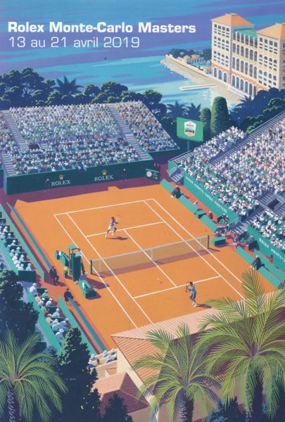
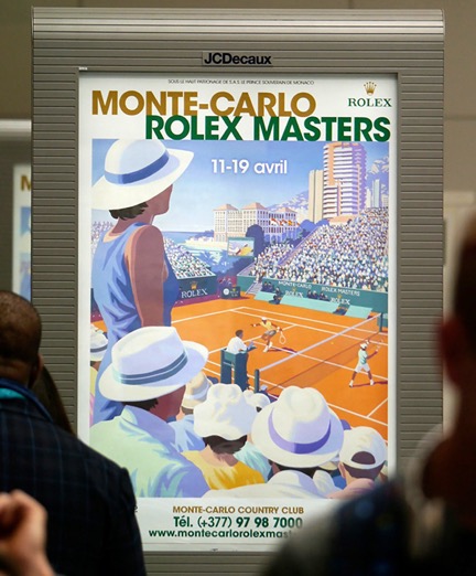
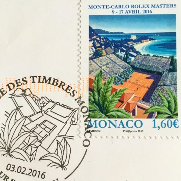
Now in it’s tenth year, Steph and Andrew discuss their work for the prestigious event poster – which reaches international exposure in advertising, programme covers and merchandising and even state stamps!
A decade of Posters for the prestigious international tennis tournament in Monaco is an incredible achievement. How did this project come about?
Steph: Andrew’s artwork work was spotted at Wimbledon which was a previous project he did through us, he worked with them a lot. The most prestigious of those was Andrew’s illustrations of the spectator’s faces that have been beautifully etched into the glass doors that go into centre court.
Andrew: Having worked as an illustrator for over 37 years, I have been commissioned to work on a huge variety of jobs. From personal commissions, producing pack designs, corporate identity logos, book covers, to these poster designs for Rolex’s sponsored Tennis tournament at the Monte Carlo tennis club!
Were you involved in the decision for Andrew Davidson being selected for this project? (Did it stem from his interest in the sport or the clients?)
Steph: Andrew was the artist they wanted purely because of his style. We had to submit a comprehensive presentation of his work once they had got in touch with us. There were a few people on the table. Andrew does love Tennis but they didn’t know that and it wasn’t a consideration for the selection.
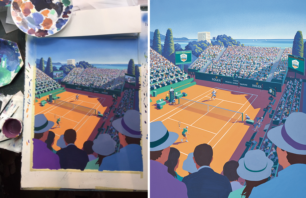
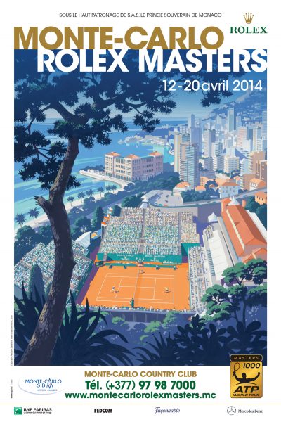
Andrew: The brief for the poster has been to show the clay court, the town, the crowds and the sea. Until you actually see this coastline of the northern Mediterranean, it’s difficult to imagine the strong light and intense colours. The client on occasion is the BEST I have ever worked for. Decisive, professional, respectful and so generous. After the first Poster they very kindly asked me to work on the second and so on.
As it’s the tenth year, can you explain the key to Andrew’s longstanding relationship with the Rolex/Monte-Carlo Masters? (Has consistency been important over the years?)
Steph: He was commissioned just for one year initially but every year they commission him again and again, he has a great relationship with them. Its all about mutual respect and they are a great client to deal with. They really let Andrew put his own take on the ideas and very much trust him. Another keen part of the relationship is that Andrew has been invited to Monaco each year to the tournament itself where he uses this time to soak up the atmosphere and collect the research for the next years poster.
Andrew: With such a commission I tend to look and listen. Time is always short, so I try and put down what I see in a pocket sketchbook and work out an idea, based on the court, crowd, sea, town requirements. Then backed up some reference photographs. This job was only intended as a one off, and I have never taken for granted, so I feel particularly grateful that they have asked me ten times.
What are your thoughts on the nostalgic elements of these images?
Steph: I think this captures the essence of the place the tournament itself, the beauty of the grounds, the location and the sport. Andrew’s work naturally lends itself to this but he always makes it look current along side the nostalgia. I think this is one of reasons they chose him. I know I am biased, but he really is the best of the best, a true ‘Master’.
Each poster has a consistent colour theme and identifiable Masters court and grounds. Which is your favourite poster from the series and why?
Steph: If I had to pick one it would be 2014, as Andrew was so excited when he got back from his trip and told me he really wanted to find a new perspective so he went for a really long and high walk. This is how he got this amazing view. This optimises the drama of the Masters and how it takes over the location, and they become a part of each other. Andrew is the kind of artist that really understands this and wants to communicate it to the audience. He was taken aback by this stunning view and he wanted to share it in his work.
Andrew: On this occasion, I felt that they might like to look ‘in another direction’. Before meeting up with the comms team at the event, I went up into the hills behind the courts with my sketch book and quickly drew the composition I saw in front of me. Which was lucky, because when I met up with the client they confirmed they would like to try a different approach and use someone else. I took out my book and showed the sketch suggesting that maybe this might be the answer.
These Illustrated Posters would look amazing animated. Have you any plans for the future of this series?
Steph: Not as yet but we are always thinking ways to develop projects so you never know!
—
Thanks to both Steph and Andrew for taking the time to share this spectacular collaboration. Crossing our fingers for the next one
Back to News Page

